The KLI Boost App

Kotak Mahindra Life Insurance Company Limited
KLI Boost
One Stop Mobility Solution for all KLI's Advisors
Introduction
About Project
To design a one stop mobility solution for all KLI's agents and partners enabling them to perform their day to day tasks and activities in a faster, simpler and smarter way!
Problem Statement
A platform where partners, advisors can keep track and perform day to day activities in a faster way.
Business Goal
To design a seamless platform & help user's gain more business.
Audience
Below are the persona's we targeted and try to solve their painpoints and address their goals
Advisors & agents
- No realtime updates on what is happening with their sales, targets and achievements,
- No clear growth path,
- No motivation to upscale/upgrade
Managers (CEO, Advisor)
- No birds eye view on team/company target v/s accomplishments,
- Reports
Discover
We worked with different stakeholders to understand product, and a regular connect with them helped us understand user stories and needs
Gaps that we identified
- Need of an Insightful dashboard
- Saving time by maintaining policies at your finger tips without comprising on flow
- Gamifying user experience to boost performance of an individual
Design Thinking Process
Design thinking is a methodology that attempts to solve complex problems in a creative and user-centric way. Core features of the design thinking methodology include:

Empathize
Understand the problem of the user for whom you are designing.

Define
Form a problem statement.

Ideate
Generate creative solutions to this problem.
Prototype
Build a tangible representation of this solution.

Test
Validate this solution with your target audience.
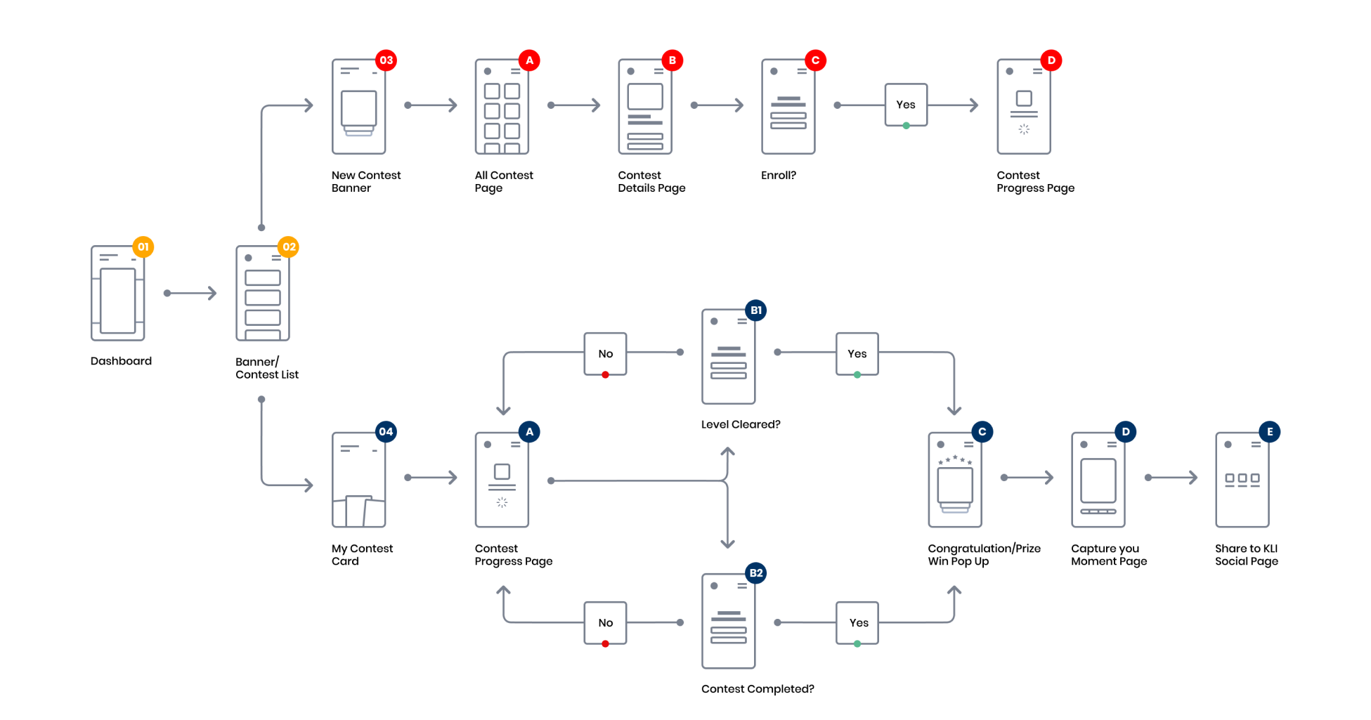
User Flow
After gathering all the necessary information and the user scenarios our team started creating different flows which help them with a holistic view of the application overall.
Architecture
High-fidelity
Wireframes
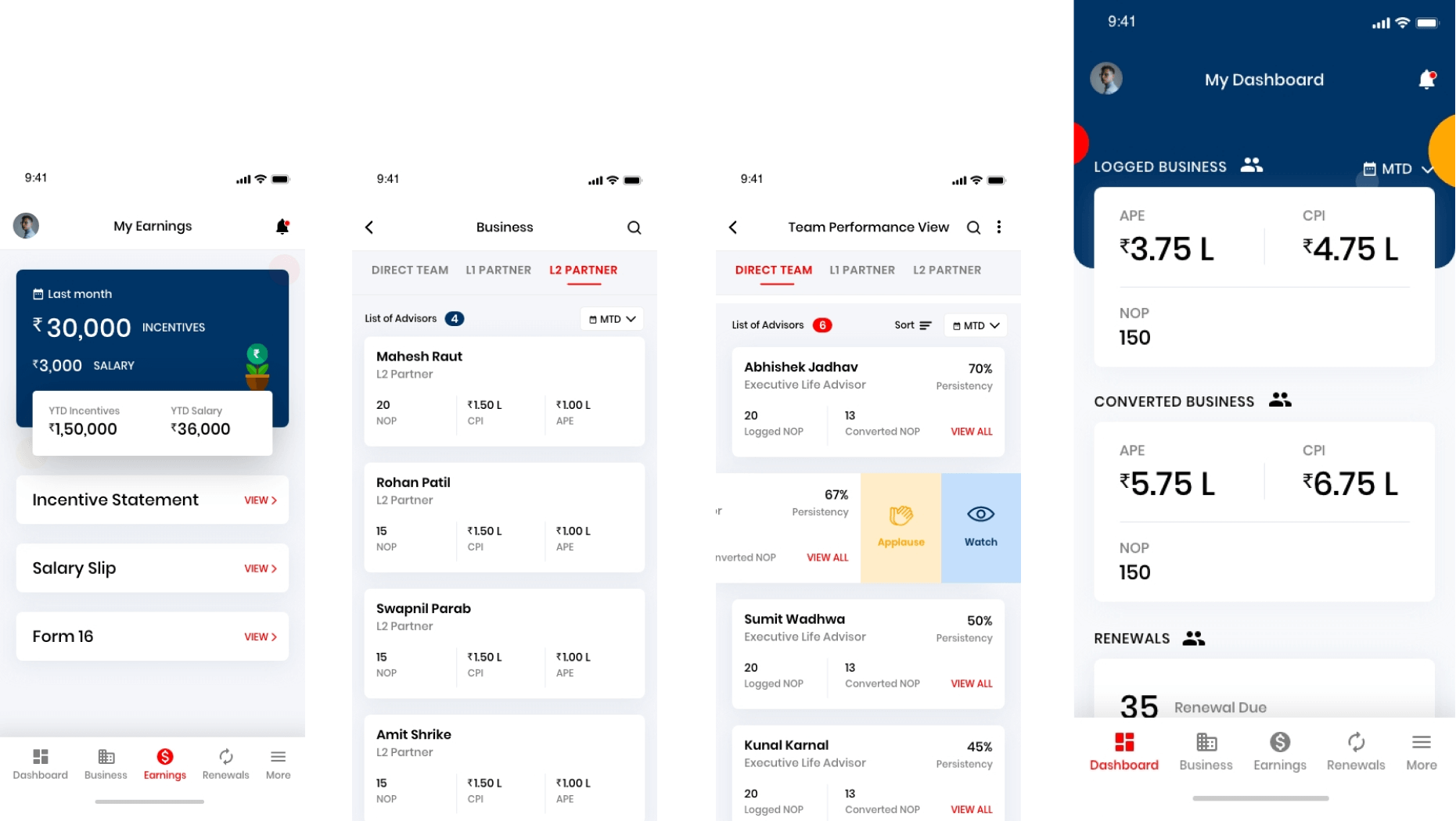
Our team crafted this high-fidelity wireframes once the UX strategy was ready and converted it into clickable prototype.
Typography & Colors
While initiating the visual design directions, we explored and selected a combination of warm and monochrome colors for this app.
Fonts & Colors
Font
- Light 300
- Regular
- Medium
- Semi Bold
- Bold
- Extra Bold
Font adds a great deal of emotions in the design
Choosing the right font was indeed essential for us while crafting the personality of HootOut brand. Font Rubik is an amazing font which rightly fit with the overall design experience we created.
-

#003366
Blue -

#FF0000
Red -

#FFA702
Yellow -

#000000
Black
-

#808080
Gray -

#CCD6E0
Columbia Blue -

#F4F6FA
Cultured -

#FFFFFF
White
User interface design
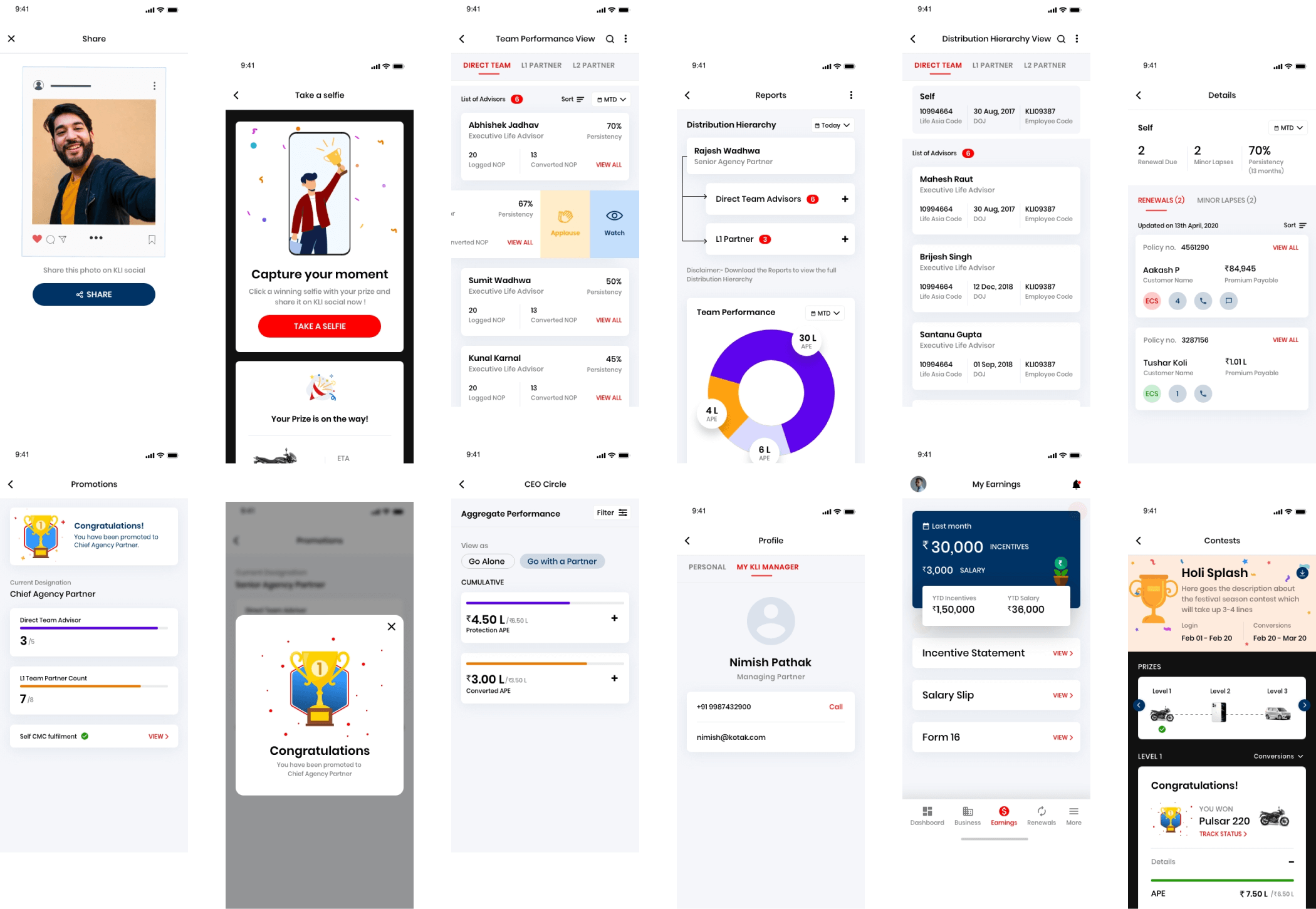
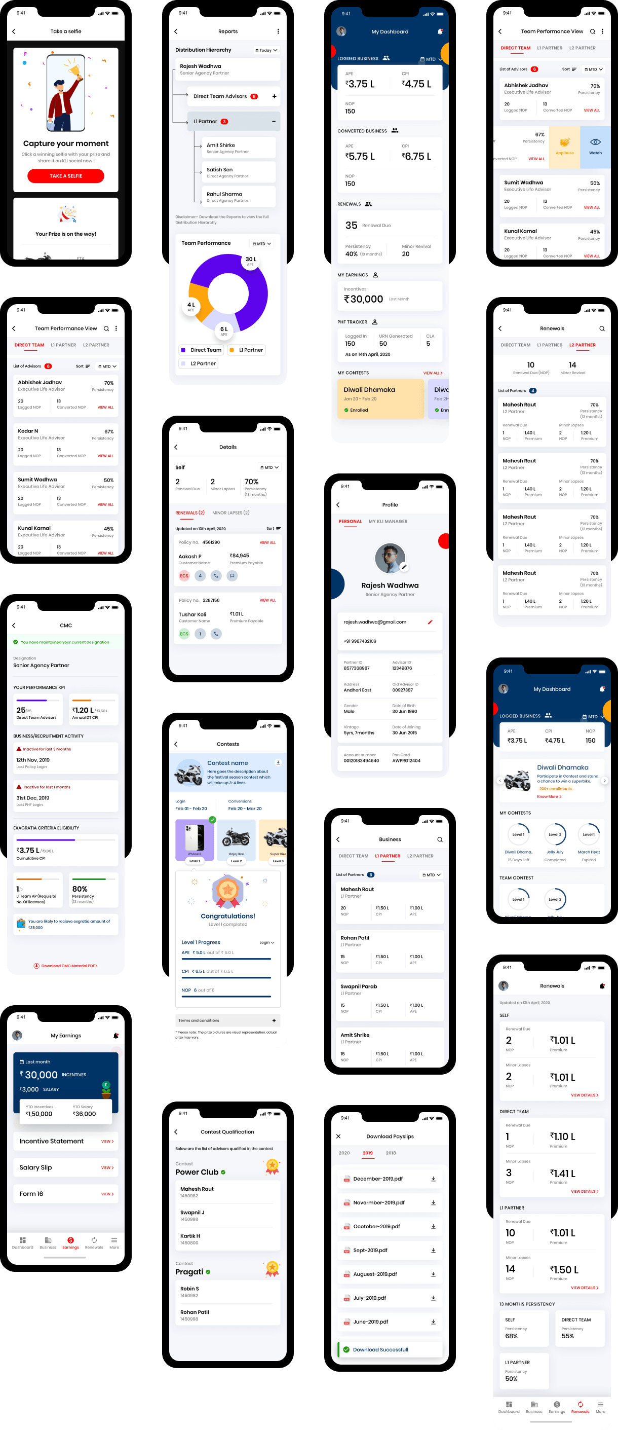
Here we go with the user interface design for the core screens of the app below. These were indeed the most important screens to engage the user's attention.
Visualization
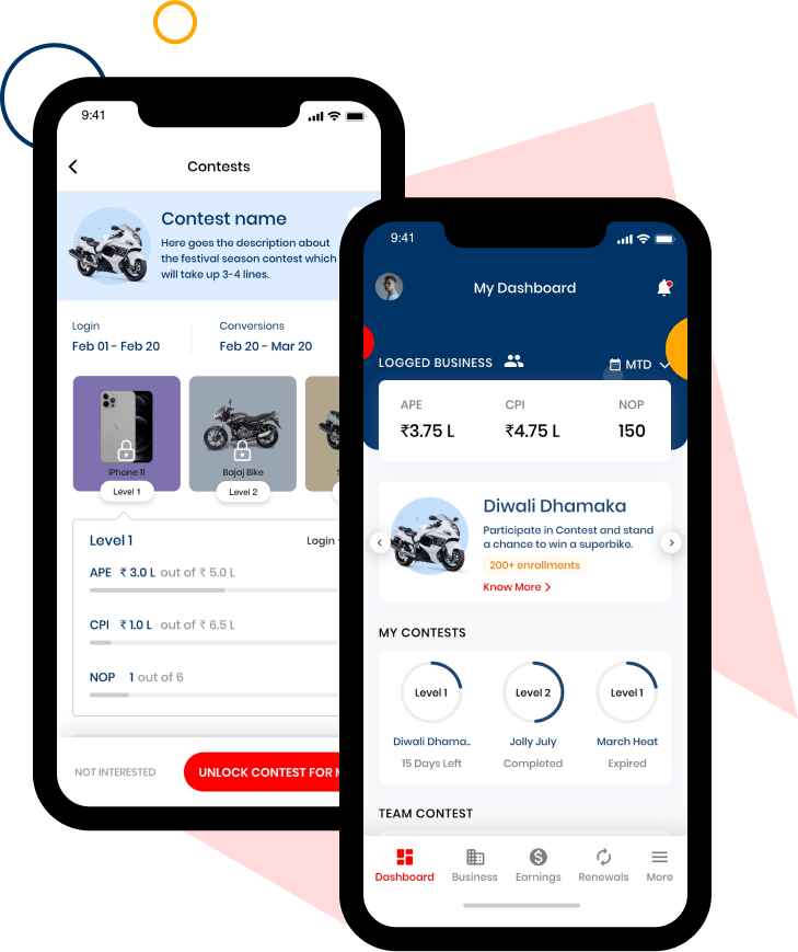
Contests-on-Dashboard
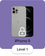
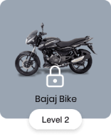
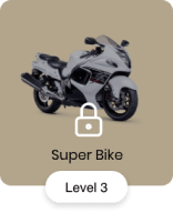
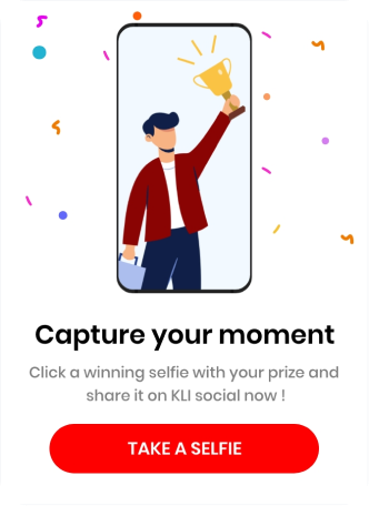
Gamifying the experience to get the best of the users and presenting them with exciting rewards.
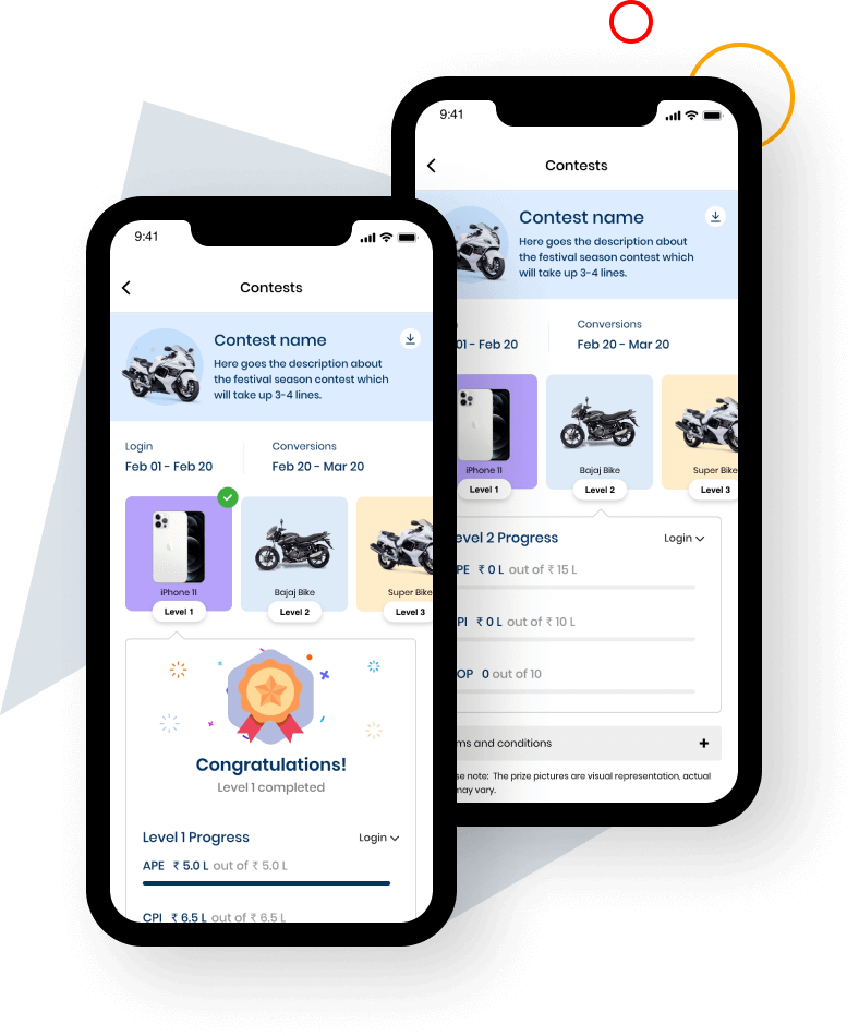
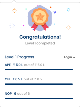
Rewards
A motivational & interactive design for advisors and partners as soon as they complete a level.
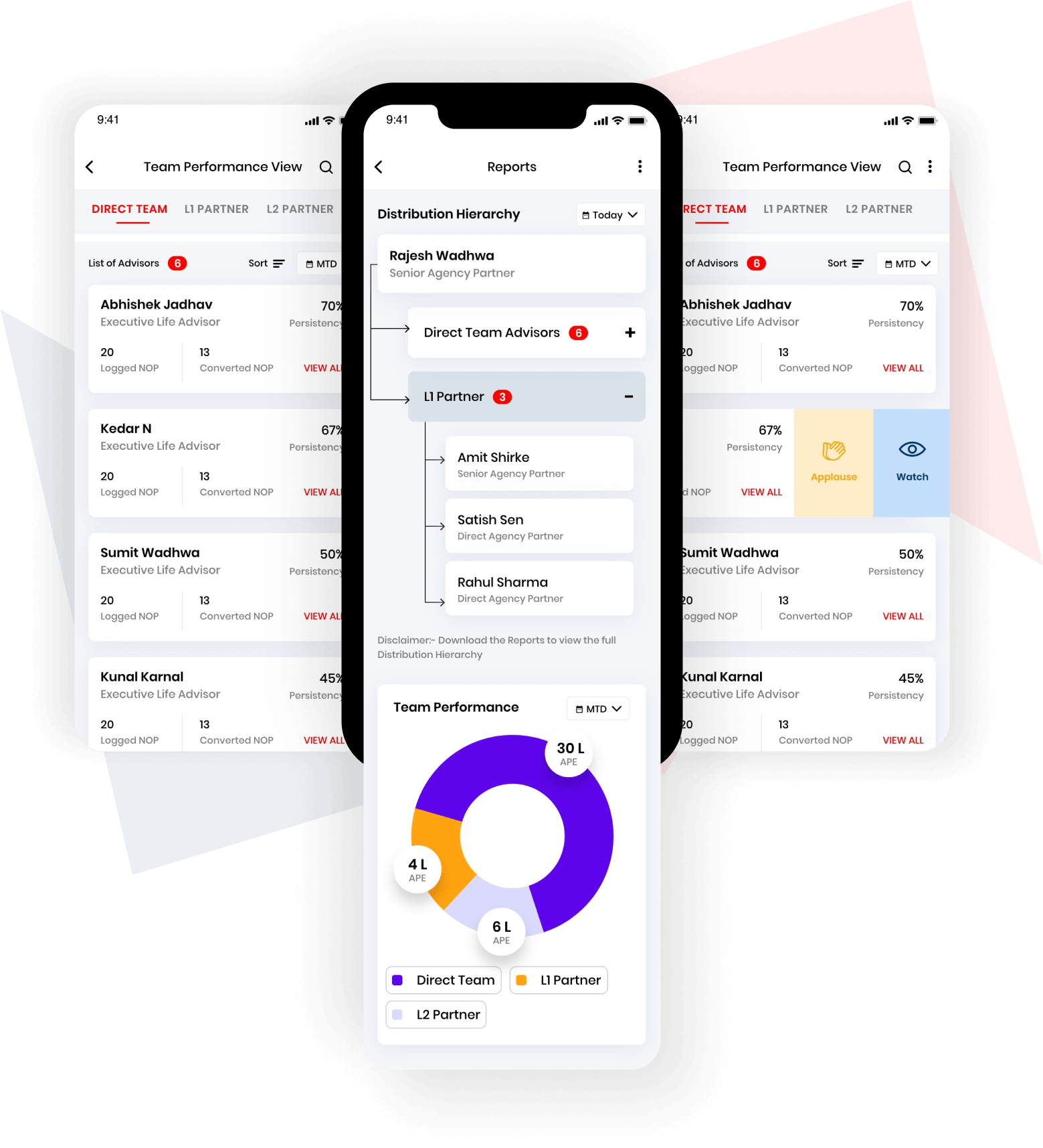
Reports Summary
A birds eye for managers to download reports weekly, monthly & quarterly
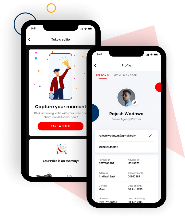
User profile
A space where advisor's can update their profile
-
-

Rajesh Wadhwa
Senior Agency Partner
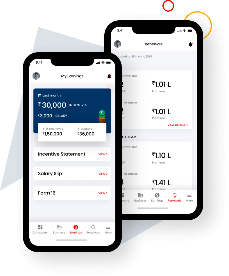
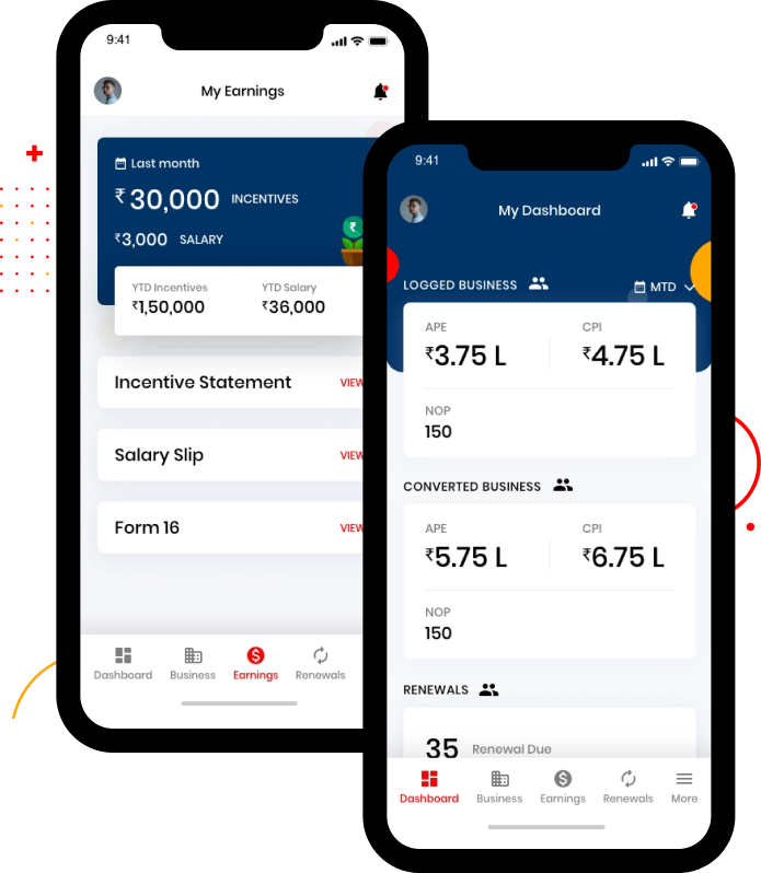
Incentives
Keep track of earnings and incentives and manage taxes on the go
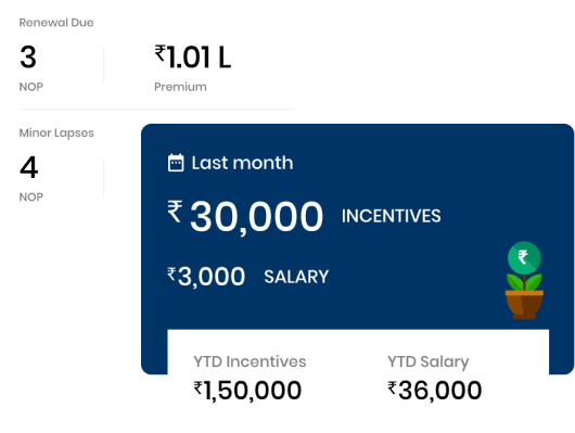
Other Screen
Out of hundreds of screens here are few more from the app itself.
Micro Interaction
Impact
30%
Increase in contests participations
4.1
Average Rating
100K+
Downloads
Start Your Journey with Us
Schedule a Meeting
