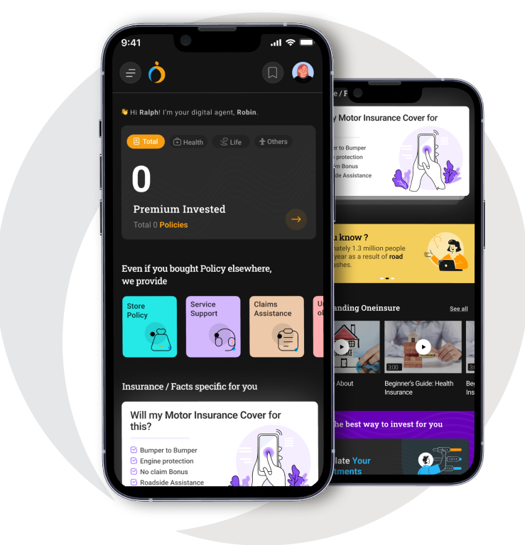
About Project
To identify the gaps in the current user experience and redesign the mobile application
Goal
To provide a credible and secure platform for users to manage all their insurance policy-related concerns
Problem Statement
To give thousands of consumers a one-stop solution for all their insurance-related problems which includes smooth claim assistance, educative content, and a clear indication of the different services which the user can avail on their policies

Challenges
Directly showing different call-to-actions to the user without giving them a reason / motivation to use the app
Giving options like portfolio analysis and blogs/articles on the homepage which will not help to convert new users
The way information is prioritized and presented does not highlight the benefits of OneInsure
Design Process

UX Research
We have interviewed multiple insurance policyholders for qualitative research, to get a better understanding of their current experiences & pain points.
Click to view more info like portfolio study, storyboard, etc.



Analyse
The data collected from the interview we analyzed and helped us to arrive at a better solution as it gave us an in-depth understanding of the user
Target user
User uses oneinsure application to check the status of all the policies as it helps them to keep track of up-coming renewal & premium payment.
Age Group
25 - 60


Working Professional

Homemakers

Policyholder
Insights
<<<<<<<<<< Existing Users
User uses oneinsure application to check the status of all the policies as it helps them to keep track of up-coming renewal & premium payment.
User uses oneinsure application to check the status of all the policies as it helps them to keep track of up-coming renewal & premium payment.
User use the appplication to store the policy & for reminders
An agent suggested the application, the user uses it for paying the premium, storing the policy & for setting the reminder for premium payment.
The user uses the application to store the policies which are not received from OneInsure.
Oneinsure doesn't provide detailed inoformation about the policy, user visits policybazar and then buy it from OneInsure.
Facing issues with the login due to OTP
Insights
Insights from the overall user using different insurance applications for buying, renewal payment of insurance, etc
The process of getting insurance through an agent takes longer time & paperwork is tedious
Incomplete information about hospitals impaneled, hidden charges on insurance
Too much paper for verification, the user would prefer it online or in some card format
Reminder for policy renewal & premium payment as the user, have to pay a fine on delayed payment
Unnecessary spam calls after registering on different insurance applications
Surrendering the policy was difficult as it took longer time than expected

Vision
To provide a credible and secure platform for users to manage all their insurance policy related concerns
- Share knowledge about insurance with user
- Providing one-stop solution / 360 degree view
- Building emotional connections with users - Confidence as an emotional benefit
- Establish credibility to instill trust
- To be able to serve all right from advanced users to beginners who know nothing about insurance
- Customized Solutions
- Expert Assistance
OneInsure's mission is to create an impact in the insurance segment and change the lives of those who are looking to secure themselves & their closed ones
Increasing the volume of customers by making OneInsure accessible to all
Make people more educated and confident about buying and using insurance services


Information architecture
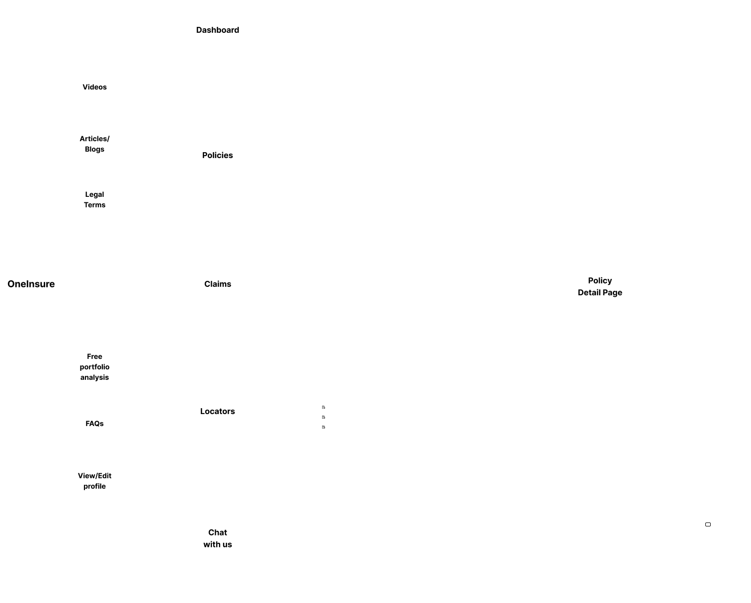
Flow chart

Situation
I have downloaded and registered on the OneInsure app
I already have 1 motor and 1 health insurance policy
Motivation
I want to be able to see my policy details, renewal dates, validity and other services which i can avail from OneInsure app
Expected outcome
To be able to store my policy in the app without too much hassle and be able to view the details and services which OneInsure provies
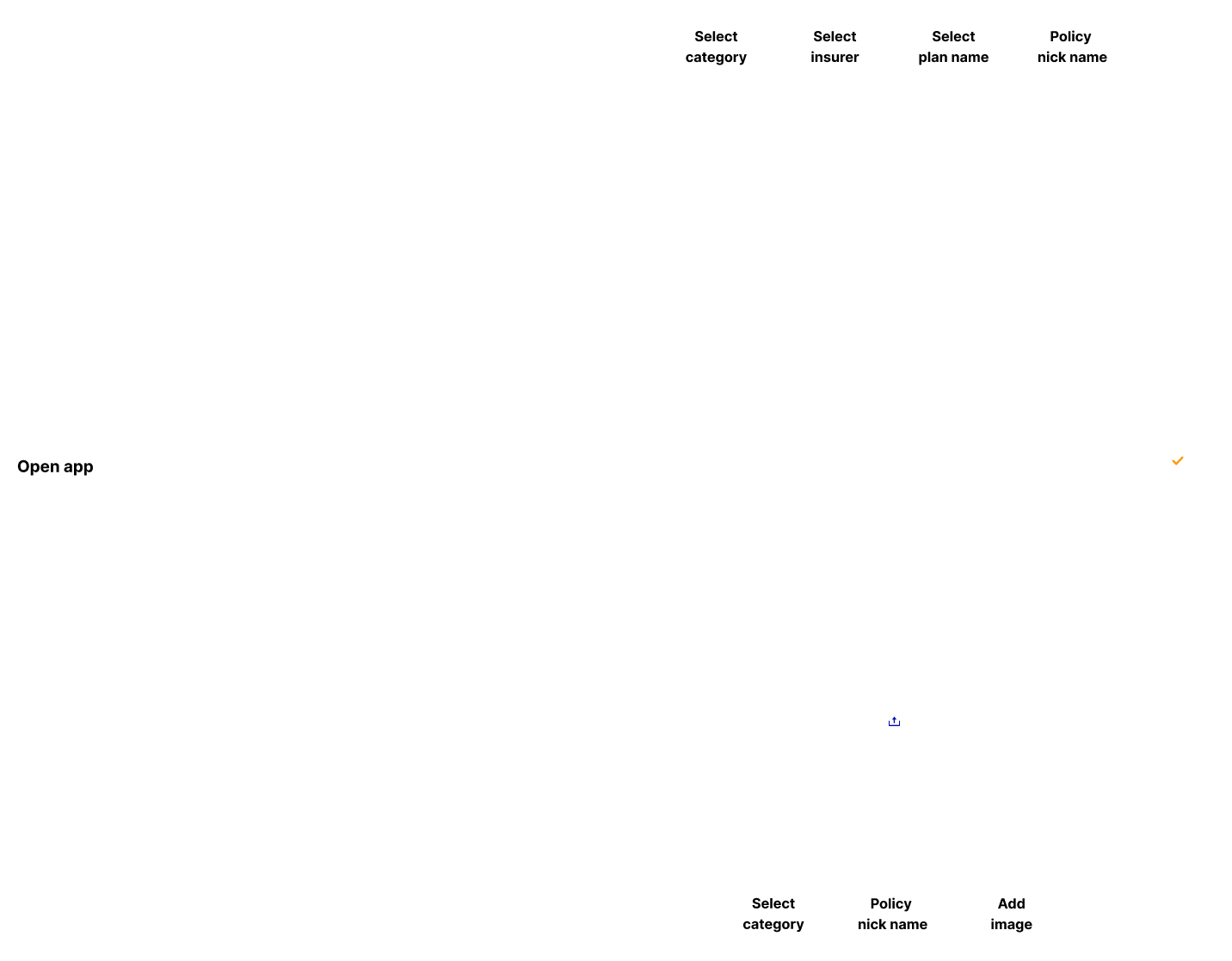
Wireframes

Visual Guideline
Primary Colors
100%
#F69F12
100%
#28B7F7
100%
#28B7F7
Typography Displayed
Aa
Roboto
Medium
abcdefghijklmnopqrstuvwxyz
abcdefghijklmnopqrstuvwxyz
Font Size
Roboto Slab - Heading
Roboto - Heading 2
Roboto - Heading 3
Roboto -Body 1
Roboto - Body 2
64px
18px
16px
14px
12px

User Interface Design
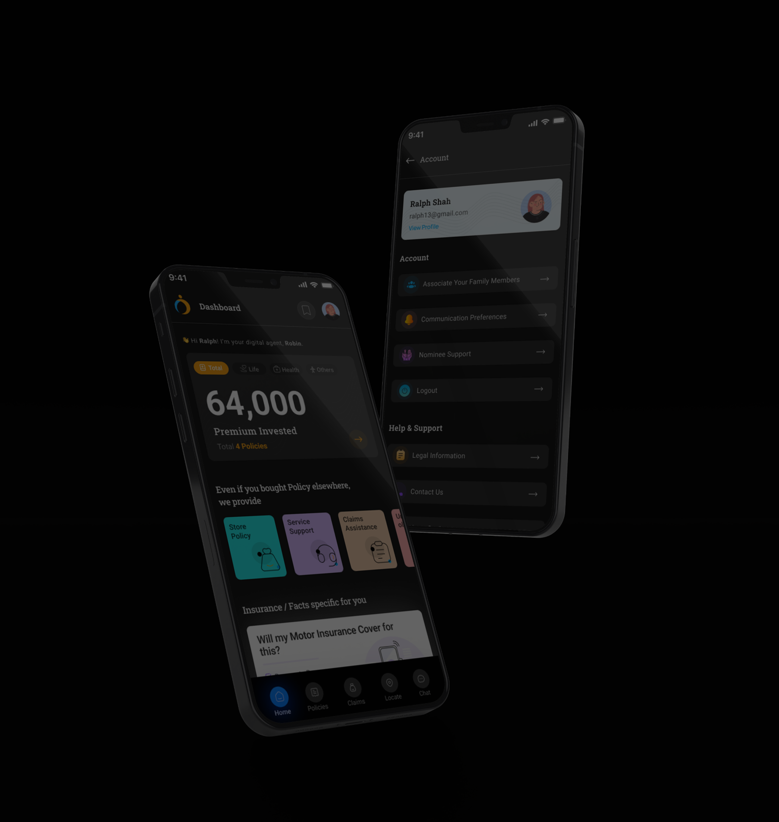
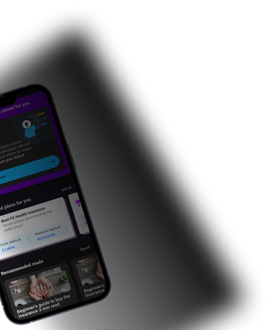
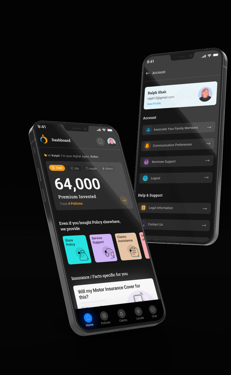
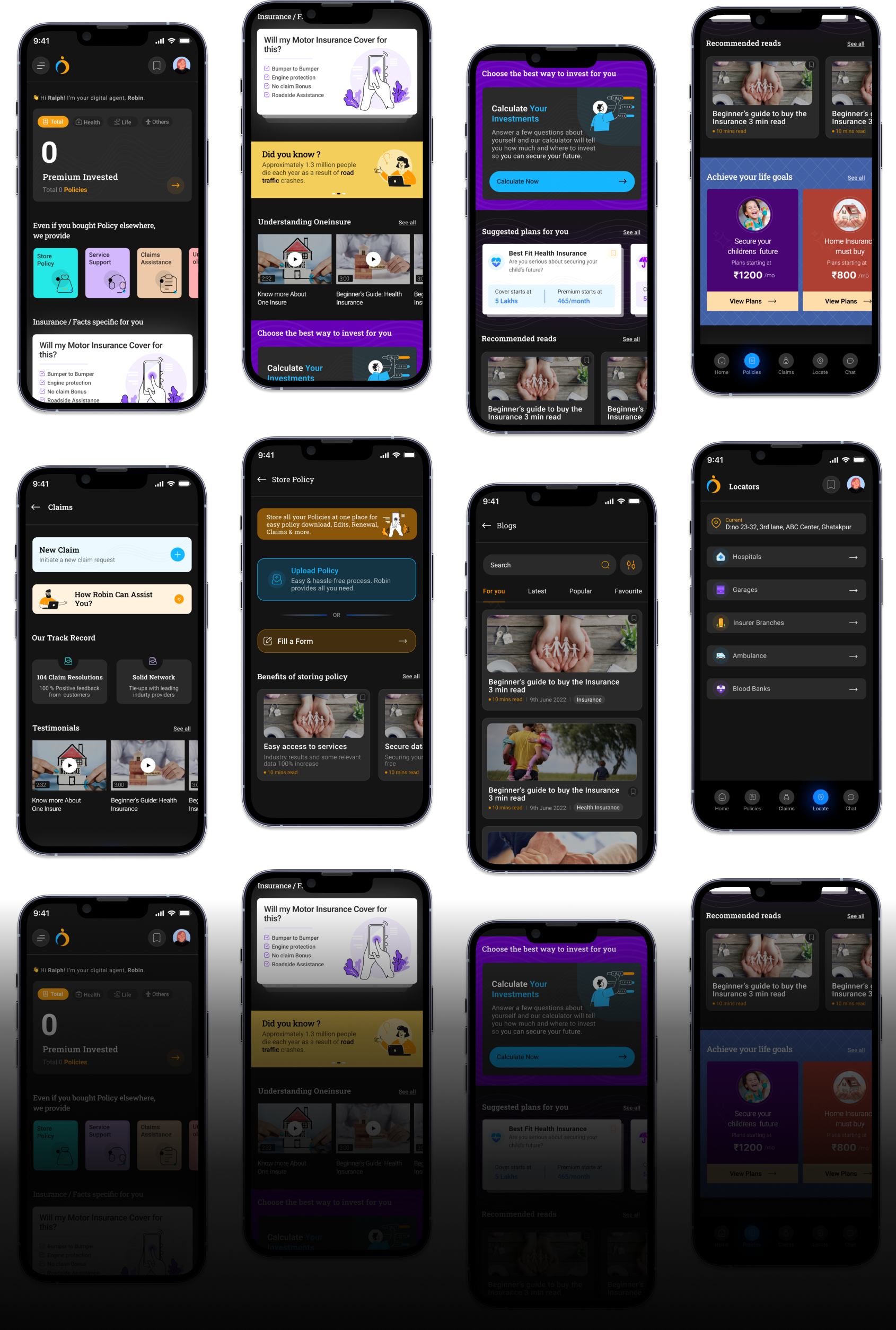
User interface design is to make a statement of their own. Keeping the brand identity with the latest theme approach leaves a strong impact on our users from the start


Welcome
I'm your digital agent to assist you with

Claims
Initiation, tracking and settlement

Services
Support throughout Policy Lifetime

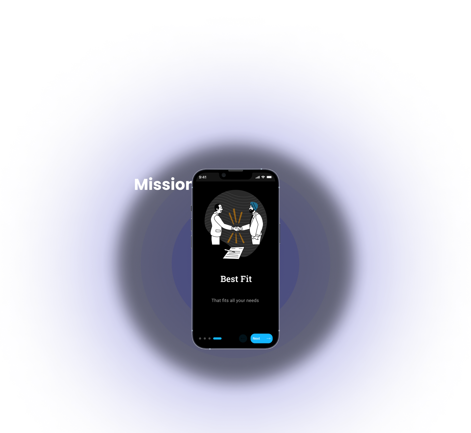
Best Fit
That Fits all your needs

Policy Understanding
Know your policy benefits


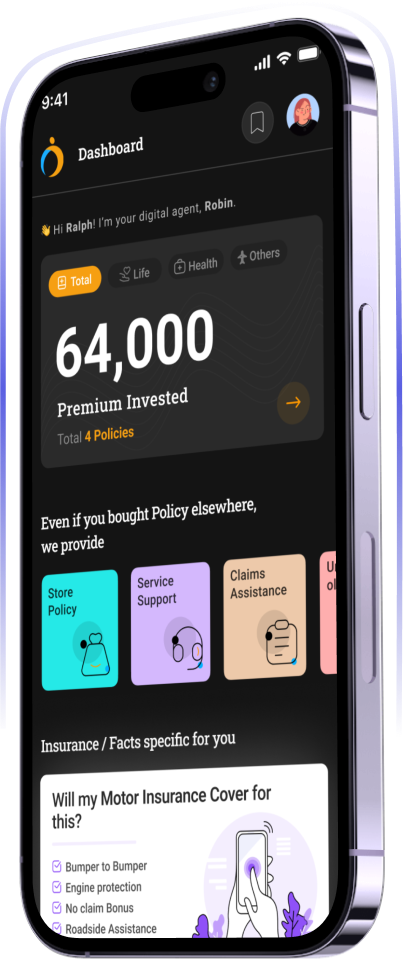
Summary Card
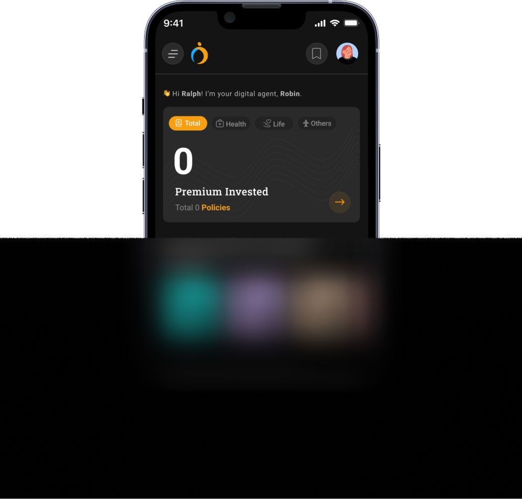
Helps you to keep a track of total amount invested & number of policies
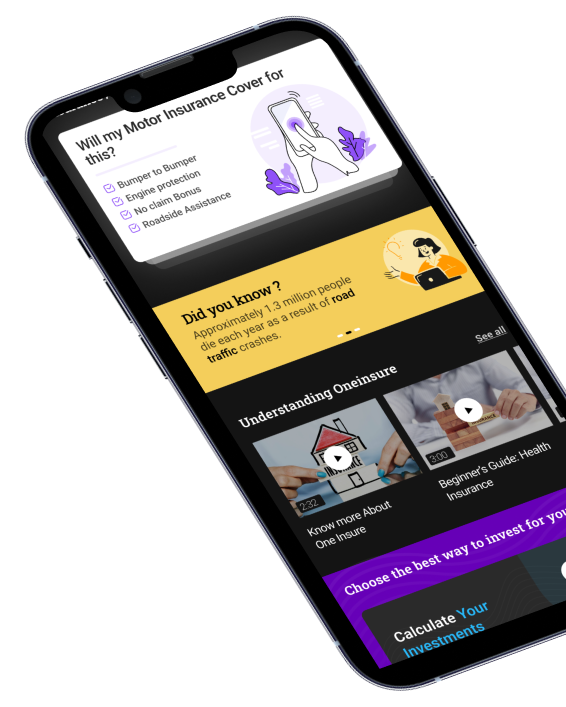
Insurance Fact and Did you know?
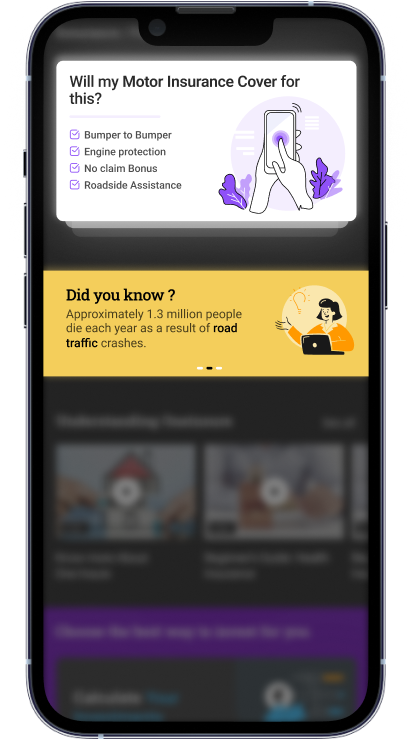
Helps you to understand what all covers under your insurance policy.
Help you to acquire new knowledge & facts about insurance
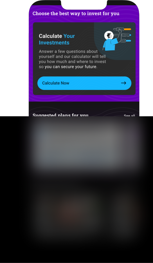
Calculate your investment
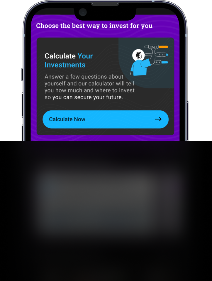
A calculator that ask you few questions & guide you to invest wisely
Locators
Help you to quickly locate Hospitals, Garages covered under the policy, Insurance Branches, Ambulances & Blood Banks.
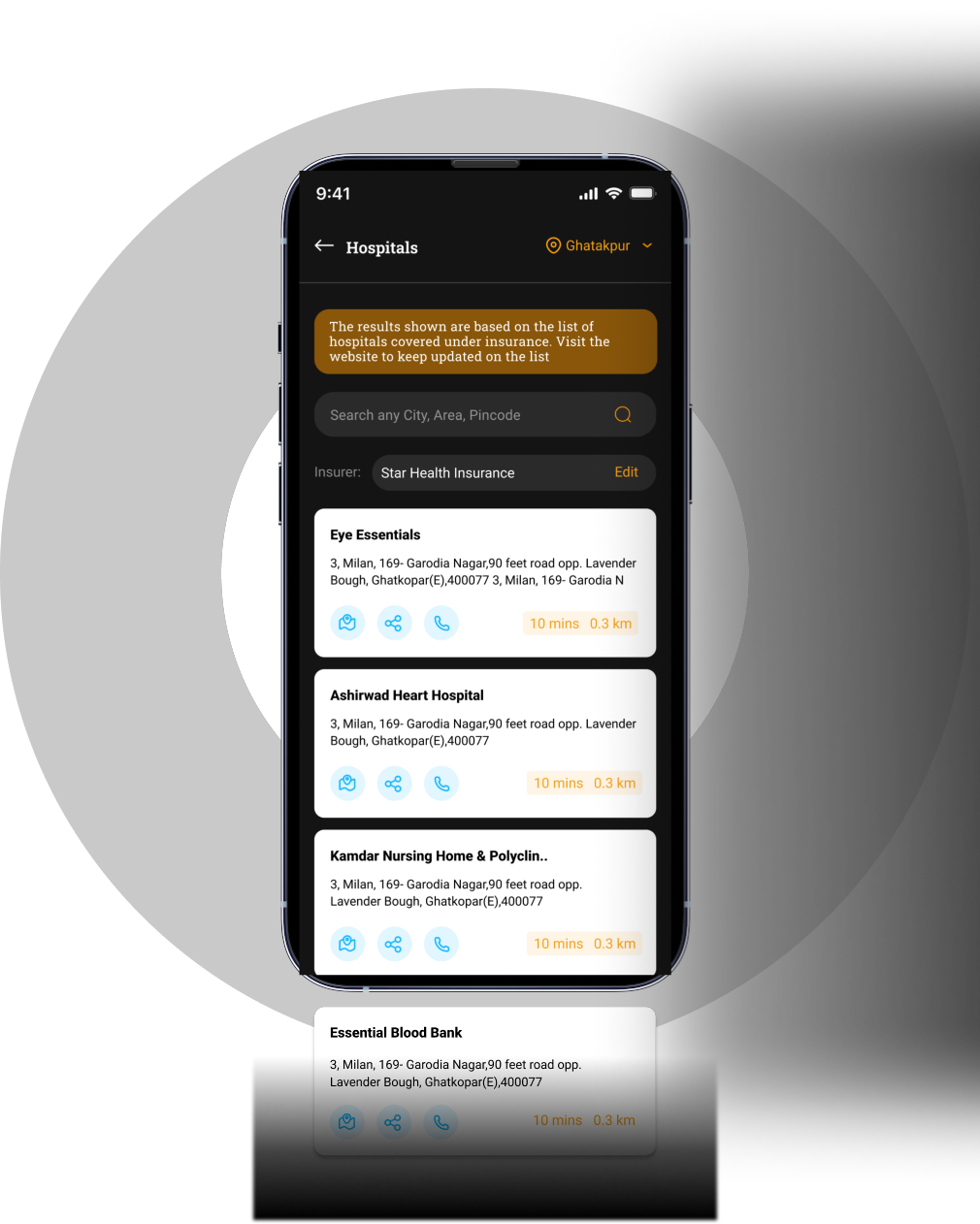
Store Policy
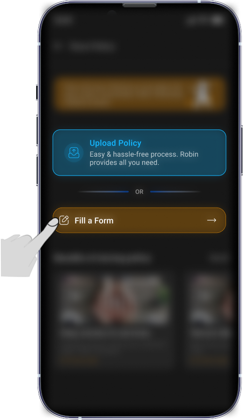
A Easy way to store policy by uploading or filling a form

Other Screens


Start Your Journey with Us
Schedule a Meeting
