
A New Age Integrated HR Technology Platform.
- HCM
- Recruitment
- Core HR Processes
- Employee Financials
- PMS
- Employee Movement
- MIS & Analytics
- Discovery
- Task Flows
- Wireframes
- IA
- Visual Design
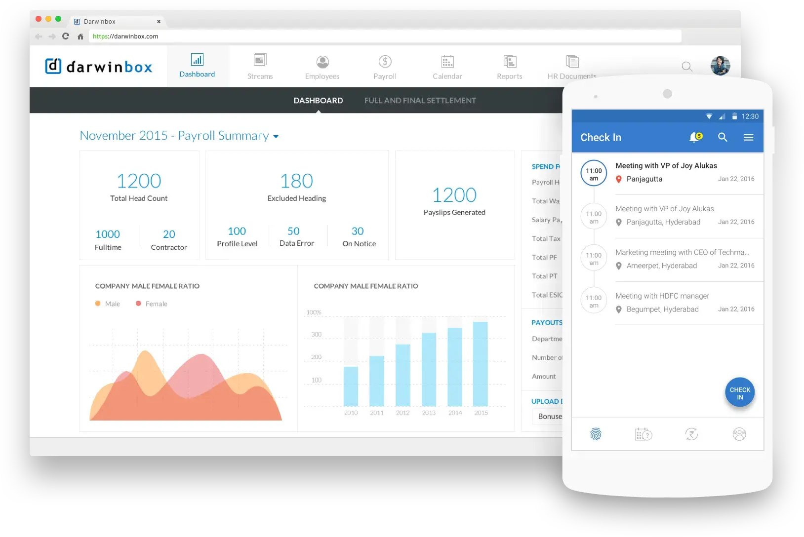
Problem Statement
Today, working professionals' product usage for personal needs (e.g Uber, Facebook) and business needs at work are at complete dissonance. Enterprise tools lag far behind today's consumer apps in quality of technology, usability and scalability.
Can we bridge this new "digital divide" and build HRMS Platform that is as effective as their daily use products.
The application shall keep in mind the various facets of today's Professional who is informed, wishes to be connected, on-the-go, and for whom getting the work done is more important than doing the work about work.
Design Challenge
- How to UBERIFY HRMS space?
- Enterprise products are always complex, but their UX need not be.
- Can a productivity tool like HRMS be as engaging as a Consumer application?
How we date

Listen & Understand

Ask More Questions

Whiteboard
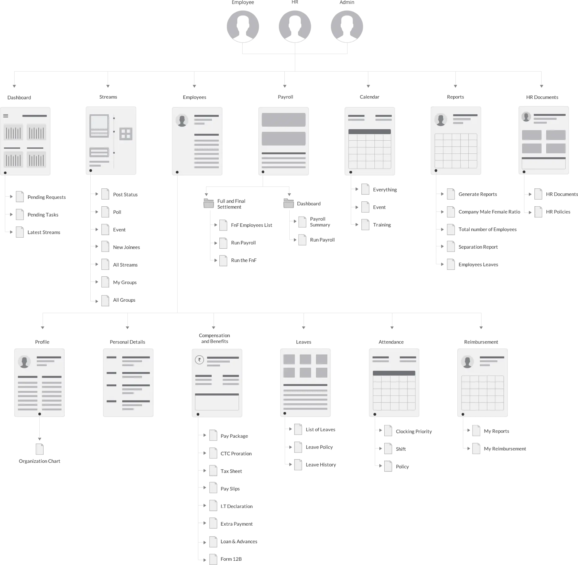
Role Based Work Flow
One of the key tasks in Enterprise Applications is to understand the BIG picture and focus on the right problems. Employees and HRs play the key roles in determining the effective usage and engagement of the HRMS product. We focused on how to simplify their daily tasks and make them more productive. There is no second chance for first impression One other goal was to make sure the application was self-service and had very low touch points in terms of support. Hence all the initial steps in setup process for Admin were simplified
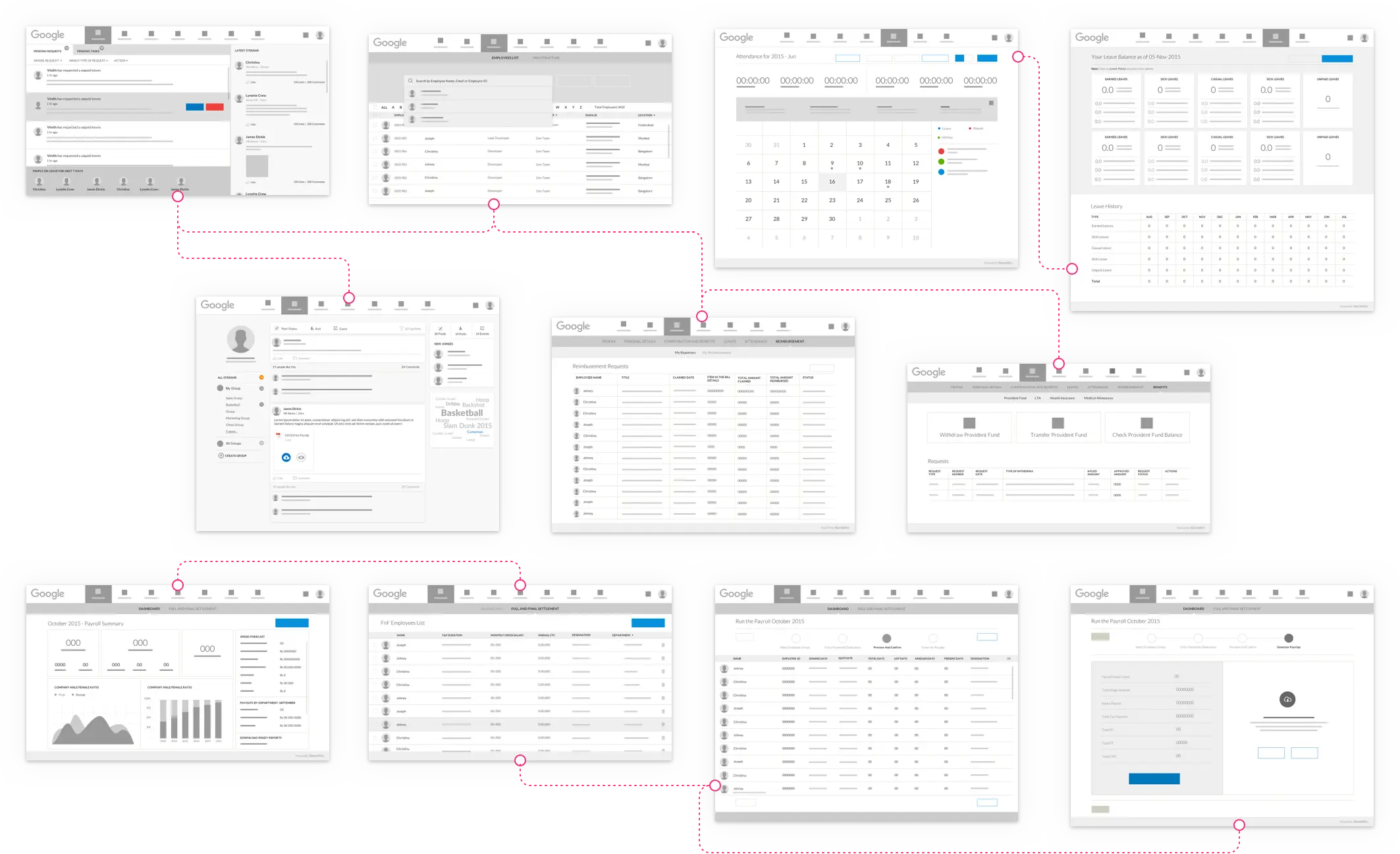
Mock-up…Iterate…Simplify…
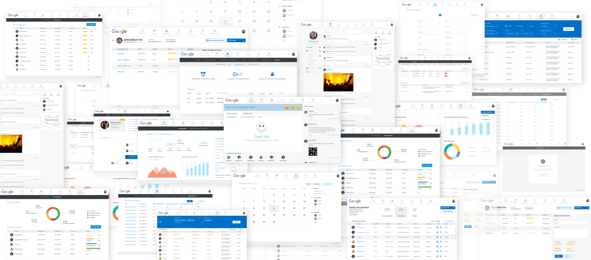
Wireframe speaks volumes We strongly believe design helps in fine-tuning product requirements, sometimes wireframes helps product teams to understand how complex or simple the solutions is turning to. Hence we do not hesitate to wireframe our ideas and get early feedback from the stakeholders. This helps both the parties to deep-dive into design marathons.
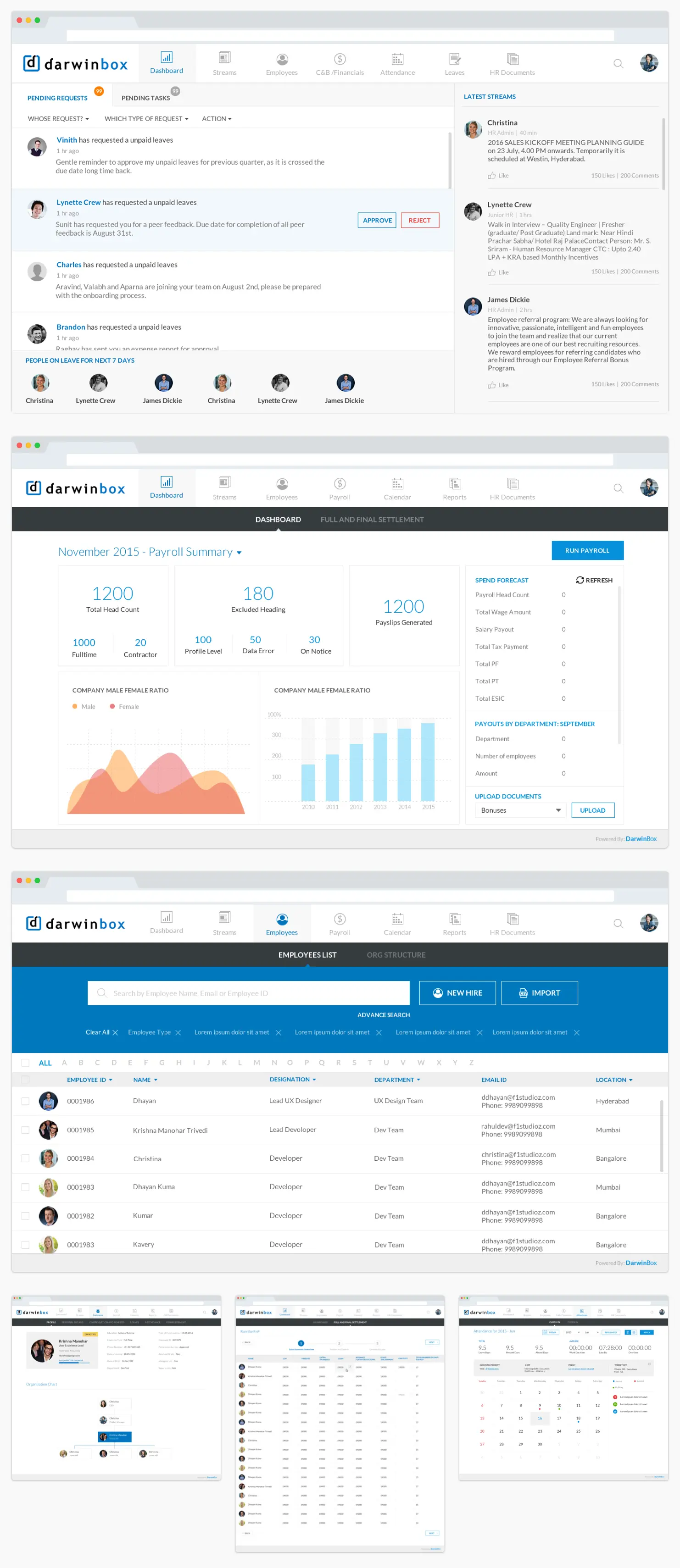
Love making begins
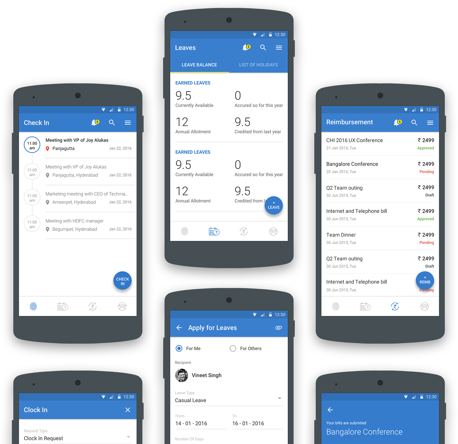
Android native mobile app
Straight from my heart
Start Your Journey with Us
Schedule a Meeting


