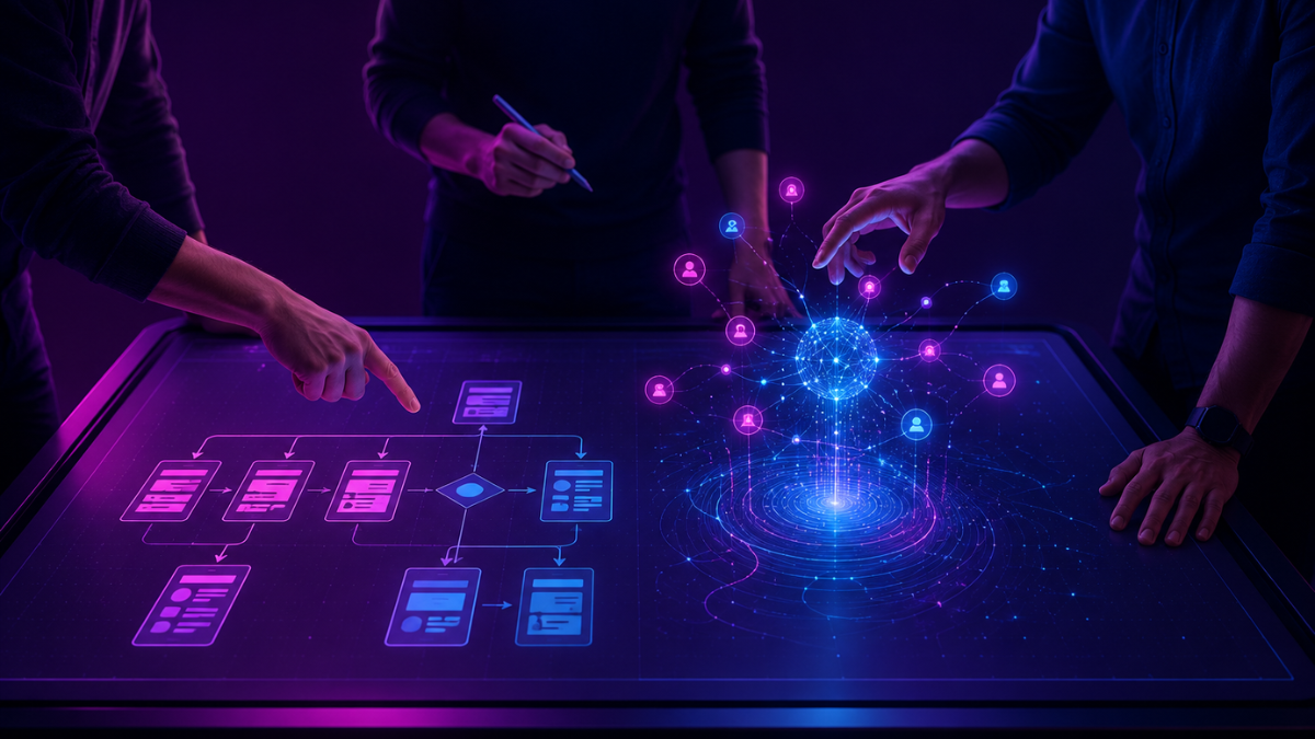

What Is the Difference Between AI UX and Traditional UX Design?
Traditional software responds to user commands. AI-powered systems attempt to predict, generate, recommend, and adapt in real time. That single


Traditional software responds to user commands. AI-powered systems attempt to predict, generate, recommend, and adapt in real time. That single

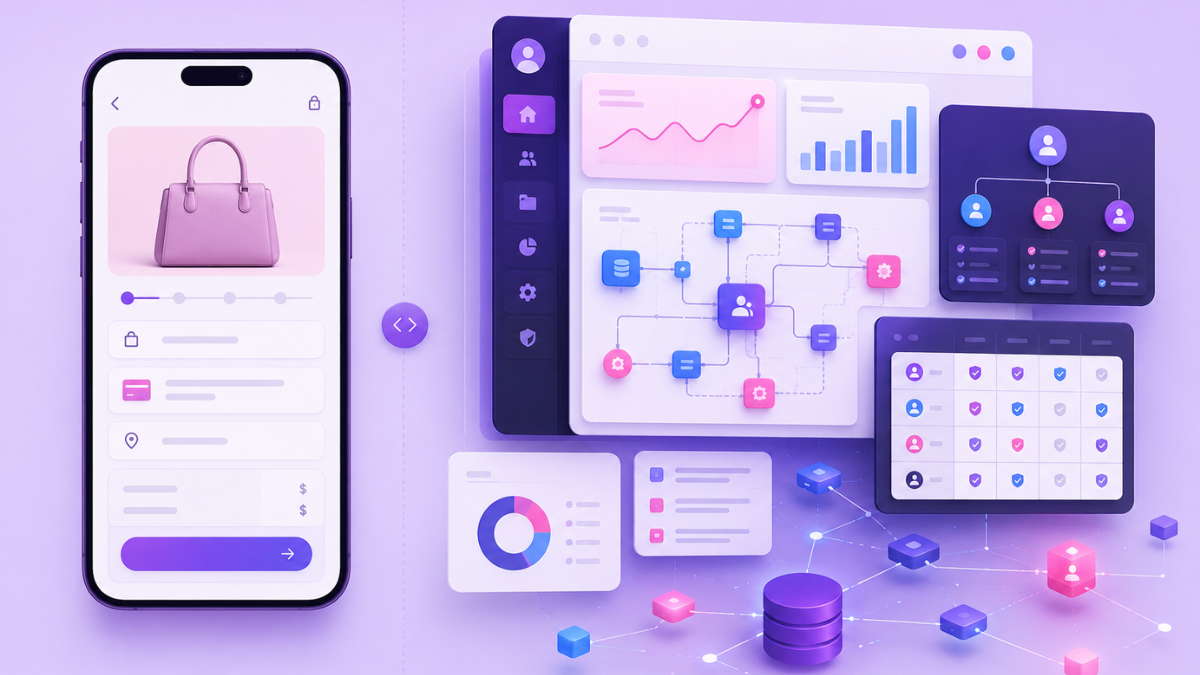
Organizations invest millions of dollars building enterprise platforms, yet many of these systems struggle with usability, low adoption, and inefficient
Employees spend a significant portion of their workday interacting with digital tools – yet inefficient software and poor usability can

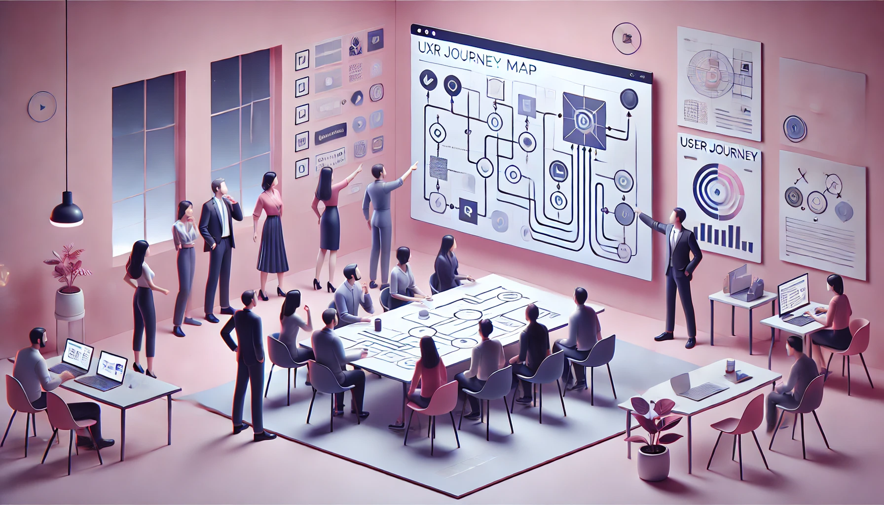
A consumer app may have a handful of primary user journeys. Enterprise platforms, on the other hand, often support hundreds
Companies invest billions of dollars every year in enterprise software platforms with the expectation that these systems will improve efficiency,
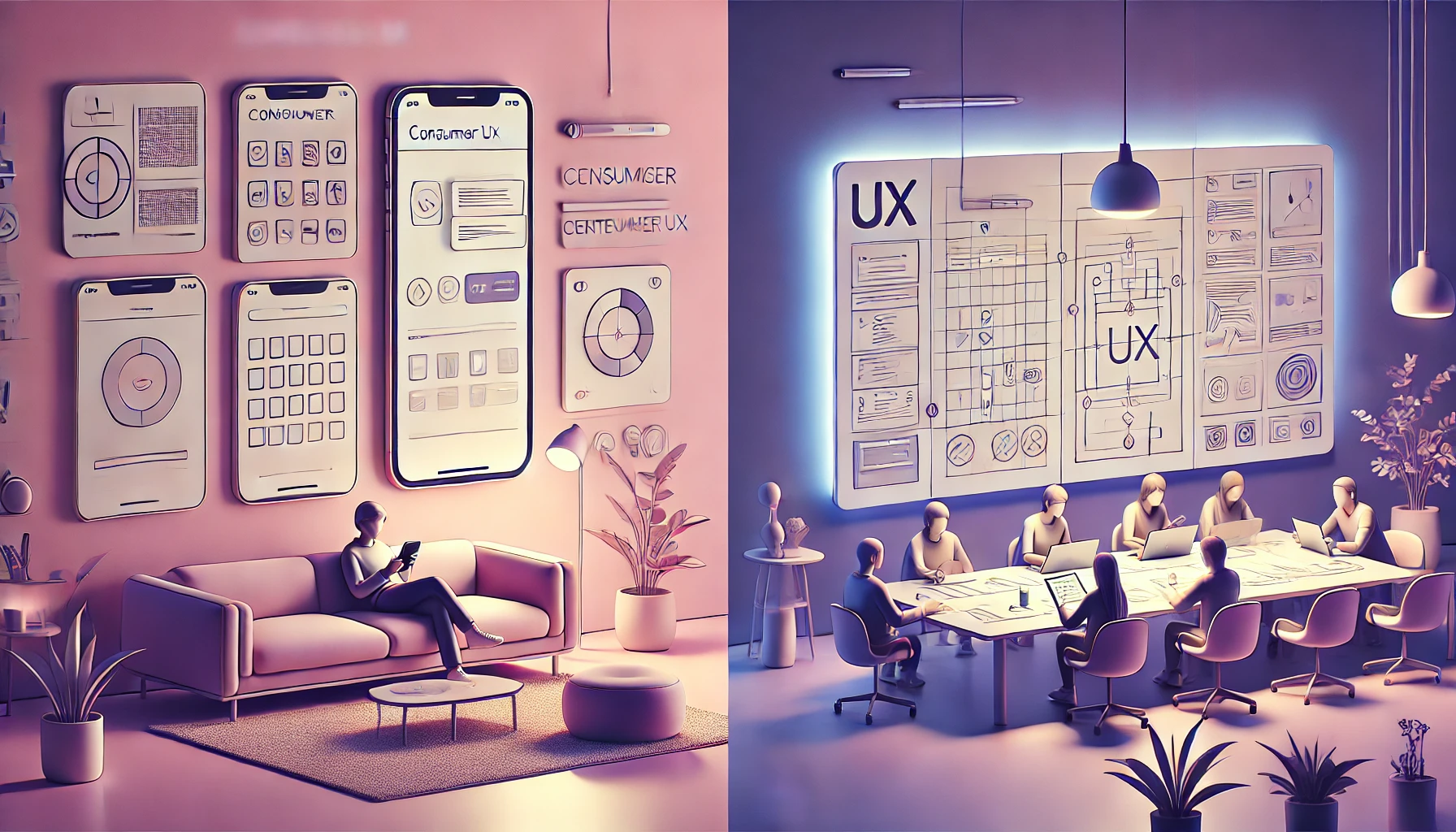

Most digital products today focus on delivering smooth, intuitive user experiences – but enterprise software often tells a different story.
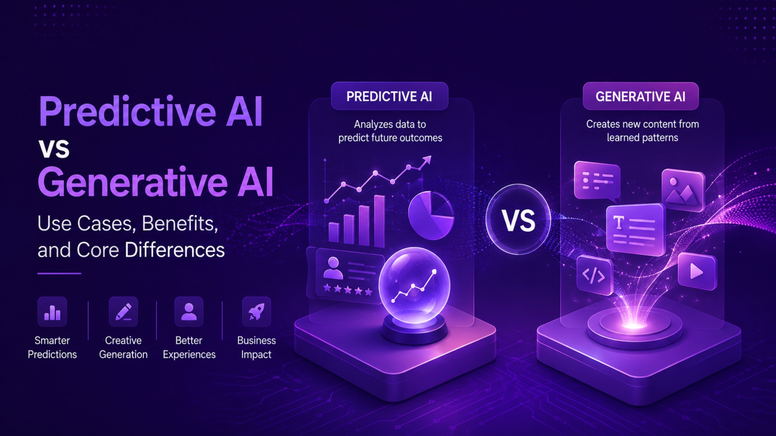

Predictive AI analyzes historical data to forecast outcomes, while generative AI creates new content from patterns learned during training. Both
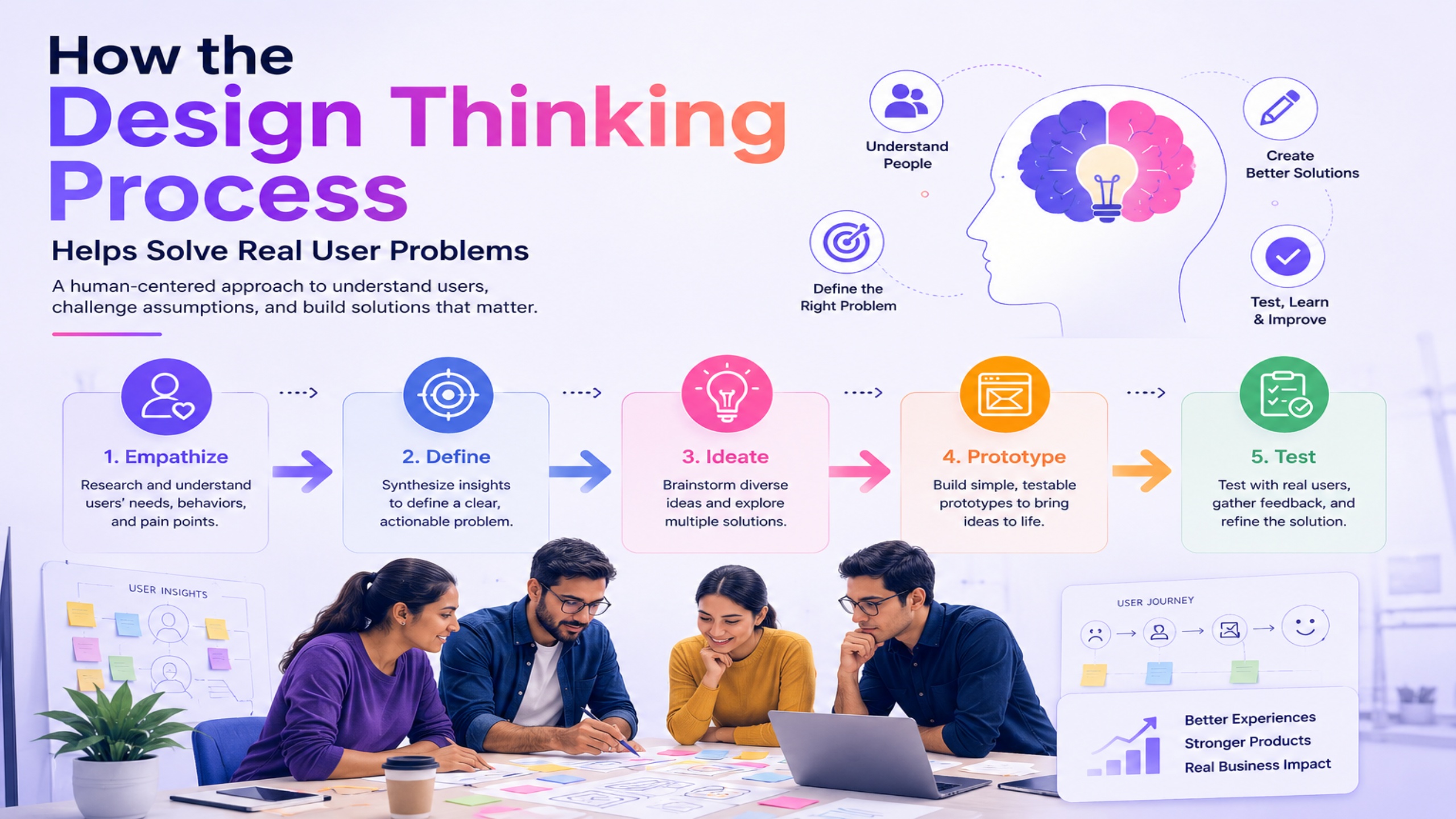
The design thinking process is a structured, human-centered problem-solving framework that helps product teams identify real user needs, challenge flawed
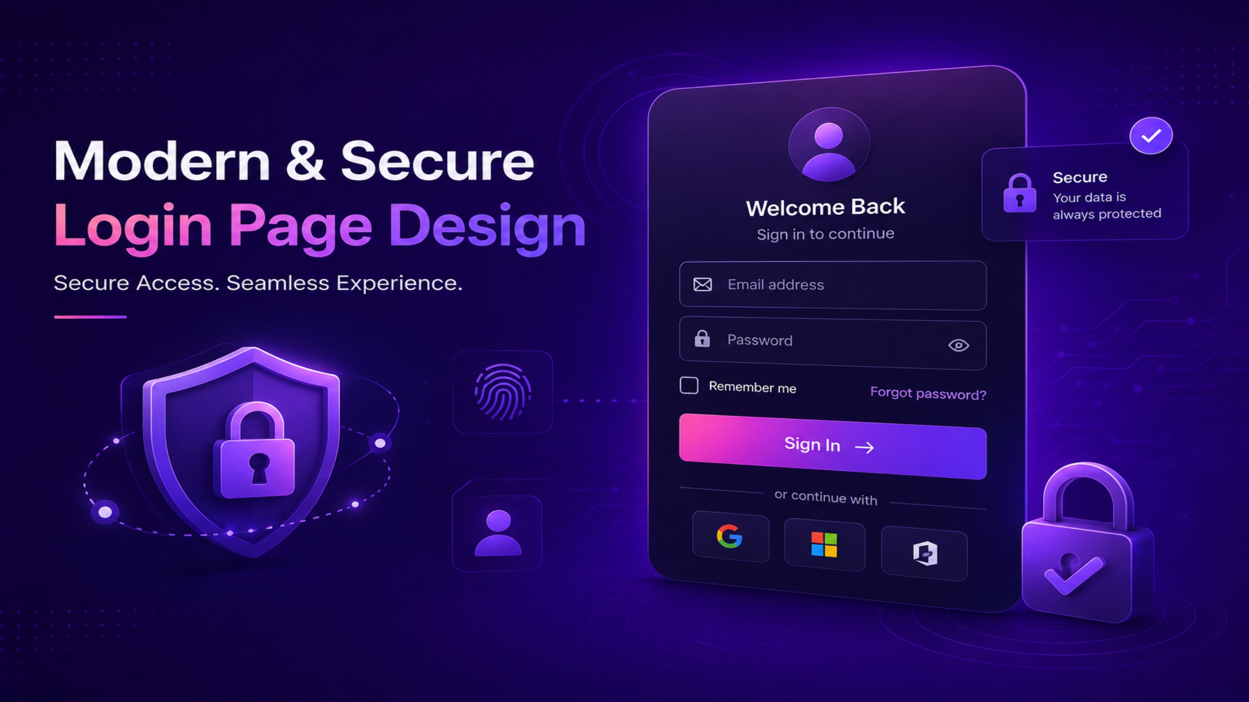
A modern and secure login page design balances authentication security with usability, minimizing user friction without compromising account protection. It
Organizations spend billions on enterprise software every year, yet studies consistently show that nearly 70% of enterprise software features go