
A modern and secure login page design balances authentication security with usability, minimizing user friction without compromising account protection. It shapes the first interaction users have with your product, making it a critical touchpoint in the broader framework of UX design best practices for enterprise applications. Done right, it builds digital trust, reduces drop-off, and reinforces your brand’s commitment to secure user access.
Why Login UX Is a Security and Business Problem Simultaneously
Authentication experiences sit at the intersection of cybersecurity and conversion optimization. Most product teams treat login as an afterthought, a gateway before the “real” product. That mindset leads to abandonment, support overhead, and security vulnerabilities. Enterprise decision-makers and SaaS founders need to understand that a weak authentication UX costs both users and revenue.
Research consistently shows that login friction directly impacts activation rates. When users encounter confusing error messages, slow OTP verification, or poorly structured password recovery flows, they don’t wait; they leave.
For enterprise applications, the stakes are higher. Employees interacting with internal platforms, SaaS tools, or client portals expect secure account access without the friction that slows productivity. Identity verification must be seamless, not obstructive.
Product teams improving authentication workflows often also explore how the Design Thinking Process Helps Solve Real User Problems before redesigning onboarding experiences because login is rarely just a form; it’s a user journey checkpoint.
What Makes a Modern and Secure Login Page Design
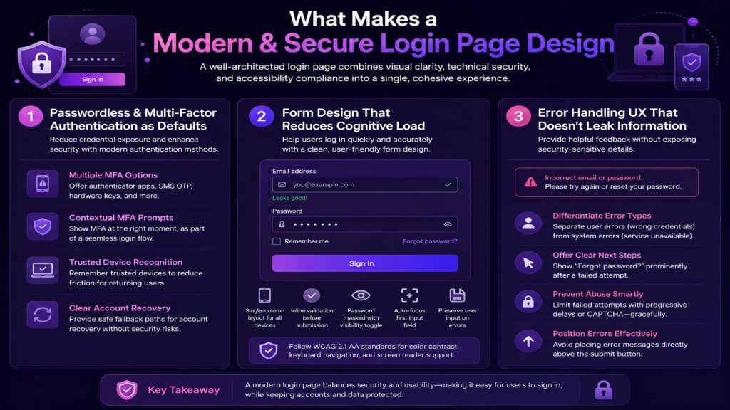
A well-architected login page combines visual clarity, technical security, and accessibility compliance into a single, cohesive experience. The goal is not to make security invisible; it’s to make it feel effortless. Here’s what separates considered authentication UX from generic form design.
1. Passwordless and Multi-Factor Authentication as Defaults
Passwords are the weakest link in most authentication flows. Passwordless login methods, such as magic links, biometric authentication, passkeys, and single sign-on (SSO), reduce credential exposure while improving usability. For enterprise login systems, SSO integration with identity providers like Okta, Azure AD, or Google Workspace is no longer optional; it’s expected.
Multi-factor authentication (MFA) adds a critical security layer. However, its UX implementation determines whether users comply willingly or circumvent it entirely. Best practices include:
- Offering multiple MFA options: authenticator apps, SMS OTP, hardware keys
- Displaying MFA prompts contextually, not as an interruption, but as part of the secure login flow
- Allowing trusted device recognition to reduce friction for returning users
- Providing clear fallback paths for account recovery without exposing security gaps
2. Form Design That Reduces Cognitive Load
Login form design directly influences how quickly and accurately users authenticate. Cognitive load increases when forms are cluttered, labels are ambiguous, or error states are unhelpful.
Apply these principles:
- Use a single-column layout for both desktop and mobile authentication
- Display inline validation to confirm email format before submission, not after
- Keep password fields masked by default with a visible toggle for accessibility
- Auto-focus the first input field so users can begin typing immediately
- Never reset the entire form on an error. Preserve the username field and highlight only the error
Enterprise accessibility compliance matters here. WCAG 2.1 AA standards require sufficient color contrast on error states, keyboard navigability, and screen reader-compatible field labeling.
3. Error Handling UX That Doesn’t Leak Information
Generic errors frustrate users. Overly specific errors create security vulnerabilities. The balance is informative-but-secure messaging. A message like ‘Incorrect email or password’ is intentionally ambiguous; it prevents user enumeration attacks while still communicating that something went wrong.
Effective login error handling follows this structure:
- Distinguish between user errors (wrong credentials) and system errors (service unavailable)
- Provide actionable next steps. ‘Forgot password?’ should appear prominently after a failed attempt
- Limit failed attempts with progressive delays or CAPTCHA challenges, but trigger these gracefully, not abruptly
- Avoid sending error states directly above the submit button, where attention is lowest
Security vs. UX Convenience
Selecting the right authentication method depends on your user base, security requirements, and platform constraints. This comparison helps product leaders and engineers make informed decisions during authentication flow design.
| Authentication Method | Security Level | UX Convenience | Best For |
| Username + Password | Low–Medium | Medium | Legacy systems, low-risk apps |
| Password + SMS OTP | Medium | Medium | Consumer SaaS, onboarding flows |
| Authenticator App (TOTP) | High | Medium–High | Enterprise users, internal tools |
| Magic Link (Email) | Medium–High | High | Low-friction B2B SaaS onboarding |
| Biometric Login (Face/Touch) | High | Very High | Mobile-first enterprise apps |
| Passkeys / WebAuthn | Very High | High | Modern SaaS, security-critical apps |
| SSO / Federated Identity | Very High | Very High | Enterprise platforms, SAML/OIDC environments |
Designing for Thumb Zones and Biometrics
Mobile authentication is no longer a secondary consideration for many enterprise applications; it’s the primary access point. A responsive login design that works on desktop but frustrates mobile users is not a responsive design. It’s an incomplete one.
Mobile login UX requires adapting both the interaction model and the visual layout:
- Place the primary CTA (sign-in button) within thumb reach, bottom-center of the viewport
- Use native keyboard types: email keyboards for username fields, numeric for OTP inputs
- Implement biometric authentication, Face ID, Touch ID, or Android fingerprint as the default for returning users
- Design for one-handed use: critical actions should not require stretching to the top of the screen
- Optimizing for network variability, loading states, and skeleton screens prevents users from assuming a failure during slow authentication
For enterprise mobile applications, session management UX matters. Automatic session timeout with a graceful re-authentication prompt rather than a jarring logout preserves workflow continuity while enforcing security policy.
Common Login UX Mistakes and How to Fix Them
These are the authentication design failures product teams encounter most often and the corrective patterns that address them effectively.
| Login UX Mistake | User Impact | Recommended Fix |
| Vague error messages (‘Login failed’) | User confusion, repeated failed attempts | Use specific-but-secure messages: ‘Incorrect email or password.’ |
| No password visibility toggle | Typos, accessibility failures | Add a show/hide toggle with ARIA labels |
| Form resets on error | Frustration, abandonment | Preserve the username field; highlight only the error field |
| No ‘Remember Me’ or trusted device option | Friction for returning users | Add device trust with session token management |
| MFA without fallback options | Lockout risk, user frustration | Provide at least 2 MFA methods + recovery codes |
| No SSO option for enterprise users | Productivity loss, IT overhead | Integrate SAML/OIDC SSO as a login option |
| Poor mobile keyboard experience | Input errors, slow authentication | Use inputmode=’email’ and inputmode=’numeric’ |
| CAPTCHA on every login attempt | Unnecessary friction for legitimate users | Trigger CAPTCHA only after multiple failed attempts |
Building User Trust Through Visual Security Signals
Security perception is a UX design challenge as much as a technical one. Users make split-second judgments about whether a login screen is safe. Product and design teams must consciously engineer digital trust indicators into authentication interfaces.
Effective trust signals in login page design include:
- HTTPS lock icon and secure connection indicators visible in the browser chrome, but also reinforced in UI copy (‘Your connection is secure and encrypted’)
- Recognizable brand consistency: matching the color system, typography, and logo presentation of the broader product or marketing site
- Transparent data handling: ‘We never share your credentials’ or ‘Two-factor authentication is enabled for your account’ messages that reassure without over-explaining
- Visible security certifications or compliance indicators for enterprise logins (SOC 2, ISO 27001, GDPR badges in appropriate contexts)
- Real-time login notifications, ‘A new sign-in was detected on your account,’ that make users feel monitored in a protective, not surveillance-like, way
AI-assisted security experiences are emerging as a new layer of trust design. Adaptive authentication systems that analyze login context, device, location, time of day, and apply risk-based MFA triggers deliver stronger security with less friction for normal usage patterns. This is where UX design and enterprise security architecture converge.
Teams evaluating AI-assisted authentication tools often start by understanding the broader AI landscape, exploring resources like Predictive AI vs Generative AI: Use Cases, Benefits, and Core Differences to determine which AI model types are powering adaptive security systems in modern SaaS platforms.
Accessibility and Inclusive Authentication Design
Accessibility in login UX is not optional; it’s a legal requirement in many jurisdictions and a UX quality signal that separates enterprise-grade products from underprepared ones. WCAG 2.1 AA compliance means every authentication element must be keyboard-navigable, screen reader-compatible, and operable without fine motor precision.
Critical accessibility considerations for login pages:
- All form fields require visible labels; placeholder text alone fails accessibility standards
- Error messages must be programmatically associated with their form fields using aria-describedby
- Focus states must be clearly visible do not suppress the browser’s default focus ring without replacing it
- Color alone cannot convey error or success states; always pair color with iconography or text
- Timeout warnings for session expiration must be announced to screen readers, not silently logged out
- CAPTCHA must have an audio alternative for users with visual impairments
For enterprise login systems serving diverse workforces, accessibility compliance is also an employment law concern. Products used by enterprise clients are increasingly required to meet VPAT (Voluntary Product Accessibility Template) standards before procurement approval.
Reducing Abandonment Without Sacrificing Security
Login abandonment is a measurable conversion problem. When users exit the authentication flow, the immediate cause is almost always friction too many steps, unclear instructions, or a perceived lack of trust. Frictionless login experience design does not mean fewer security measures. It means better-sequenced ones.
Conversion optimization for authentication flows:
- Implement progressive disclosure: show only the email field first, then reveal the password field or authentication method based on the user’s account type
- Use social authentication (‘Continue with Google’) for consumer-facing products, but make it secondary to SSO for enterprise contexts
- Pre-fill username fields on recognized devices to eliminate repeated data entry
- Provide a prominent, clearly labeled ‘Forgot password?’ link above the fold — not buried below the submit button
- Remove all unnecessary navigation from the login page: headers, footers, and promotional content distract and reduce completion rates
- Use skeleton loading screens during authentication checks to communicate progress, reducing the perception of slowness
Conclusion
Every decision in a modern and secure login page design, from the placement of the MFA prompt to the language in your error states, communicates something about your product’s relationship with its users. For enterprise applications, that relationship must convey competence, security, and respect for the user’s time simultaneously.
Authentication UX is not a design exercise conducted in isolation. It requires input from security architects, product managers, engineers, and accessibility specialists working from a shared understanding of user behavior. Products that integrate these perspectives produce login experiences that convert higher, support less, and retain longer.
The shift toward passwordless authentication, biometric login, and AI-assisted security is already underway. SaaS founders and enterprise product teams that invest in frictionless, accessible, and trust-rich authentication workflows today will have a measurable competitive advantage as user expectations continue to rise.
Secure onboarding is not a feature. It is the foundation of every subsequent interaction users have with your product. Design it accordingly.
Frequently Asked Questions (FAQs)
What makes a login page secure from a UX design perspective?
A secure login page design combines technical protections, such as HTTPS, rate limiting, and encrypted session management, with UX patterns that guide users toward safe behavior. This includes clear error messaging that avoids information leakage, accessible MFA prompts, biometric authentication options, and trust signals like security indicators and transparent data handling notices.
How do companies reduce login friction without weakening security?
Enterprise teams reduce authentication friction by implementing risk-based MFA that only triggers on unusual login behavior, offering passwordless options like passkeys and magic links, enabling trusted device recognition, and using SSO for employee-facing platforms. Frictionless login design eliminates unnecessary steps not necessary security layers.
What should a modern login page include for enterprise applications?
Enterprise login pages should include SSO options for federated identity, multi-factor authentication with multiple method choices, session management controls, branded trust signals, accessibility compliance, and mobile-optimized layouts. Password recovery flows and account lockout procedures must also be clearly communicated and easily accessible within the authentication UI.
How does biometric authentication improve login UX?
Biometric authentication, such as Face ID, Touch ID, and fingerprint recognition, eliminates password memorization and OTP entry for returning users. It’s faster, more intuitive, and reduces authentication failure rates. For mobile enterprise applications, biometric login is now the expected default. It balances high security assurance with a frictionless user experience.
What are the most common login UX mistakes in SaaS products?
The most common login UX mistakes include vague error messages that confuse users, form resets after failed attempts, missing password visibility toggles, no fallback MFA options, CAPTCHA applied to every login attempt, and poor mobile keyboard handling. Each of these drives measurable abandonment and increases support volume for authentication-related issues.