
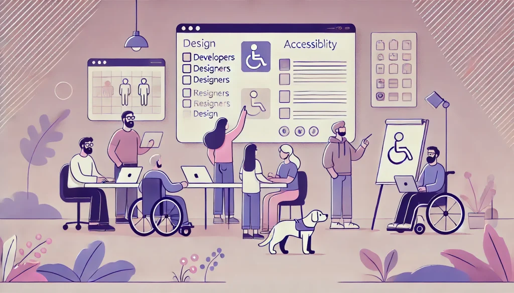
The internet is meant to be a universal space – a place where everyone can access information, communicate, and participate fully. But for millions of people living with disabilities, this experience often falls short. Accessible web design isn’t just a nice-to-have; it’s a necessity. As front-end developers, designers, and product teams, we carry the responsibility of making the web more inclusive and usable for everyone.
Globally, over 1.3 billion people live with some form of disability, according to the World Health Organization. That’s about 16% of the world’s population. These include visual, auditory, motor, and cognitive impairments. When websites and applications are not designed with accessibility in mind, they risk excluding a large and diverse user base.
Fortunately, accessibility is not a mystery. It’s a discipline – one grounded in empathy, standards, and clear best practices. Here’s how front-end developers can actively design and build for inclusion from the start.
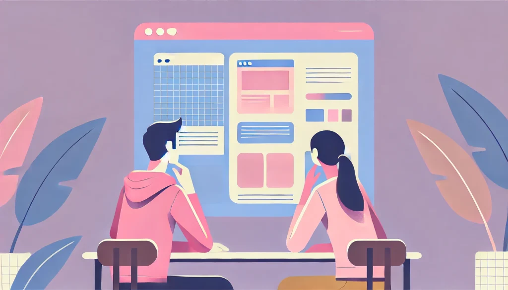
Semantic HTML is Foundational

Accessible design begins with meaningful, semantic HTML. Too often, developers use <div> and <span> elements to structure everything, relying heavily on JavaScript for interaction. But this can be a barrier for assistive technologies like screen readers.
Using elements like <header>, <nav>, <main>, <article>, <section>, and <footer> provides context. Similarly, form elements like <label>, <fieldset>, and <legend> help users understand relationships between inputs. Screen readers depend on this structure to communicate the page effectively.
Keyboard Navigation Should Be Native

Many users rely entirely on their keyboard to navigate the web. Whether due to mobility impairments or personal preference, keyboard support is a non-negotiable. Every interactive element – buttons, links, modals, dropdowns – should be reachable and operable via the Tab, Enter, and Arrow keys.
Focus indicators should always be visible. Removing the default :focus outline without providing an alternative is a common anti-pattern. Instead, customize it to fit the brand while maintaining visibility.
Color and Contrast Matter More Than You Think
According to WebAIM’s 2025 report, 79.1% of homepages had low contrast text, making it difficult for users with low vision or color blindness to read. The W3C recommends a minimum contrast ratio of 4.5:1 for normal text and 3:1 for large text.
Using color alone to convey information is another issue. Think of links, error messages, or charts. Always pair color cues with text or icons. For instance, use both red text and an “X” icon to indicate an error. Tools like Chrome DevTools, Axe, or the WCAG Color Contrast Checker can help identify problem areas.
Alt Text and Image Descriptions Aren’t Optional

Every image must have an alt attribute. For decorative images, use alt=”” so screen readers skip them. For meaningful images, write descriptive and concise alt text that explains the image’s purpose. Complex infographics may need long descriptions elsewhere on the page.
Avoid phrases like “image of” or “picture of.” Screen readers already announce it’s an image. Instead, focus on what the image conveys in context.
Forms Need to Speak Clearly
Forms are common pain points for users with disabilities. Every input should have an associated <label>, and placeholders should never replace labels. Placeholder text disappears when users type, which can be confusing or inaccessible.
Use aria-describedby to point to helpful instructions or error messages. Ensure form errors are announced dynamically and clearly, not just visually. For example, if a required field is empty, display an error message that is both readable by screen readers and visible near the input.
Use ARIA, But Use It Right
ARIA (Accessible Rich Internet Applications) attributes are powerful, but they can be overused or misused. The general rule is: use native HTML elements first, and reach for ARIA only when necessary.
For example, rather than building a custom button with div and adding role=”button” and tabindex=”0″, just use a <button>. It already has keyboard support and the correct semantics.
When ARIA is necessary, use it thoughtfully. aria-live, aria-label, aria-expanded, and aria-hidden are useful in dynamic interfaces. But test thoroughly, because improper use can cause confusion or silence for screen reader users.
Don’t Forget Responsive and Scalable Design

Accessibility also intersects with responsive design. Users may zoom in, use screen magnifiers, or rely on larger fonts. Avoid fixed pixel heights or widths, and instead use flexible layouts like em, rem, or percentages.
Let text resize without breaking layouts. Use relative units in media queries. Ensure interactive elements are large enough to tap easily – at least 44×44 pixels, as recommended by WCAG.
Captioning, Transcripts, and Audio Controls
For multimedia content like videos or podcasts, captions and transcripts are essential. Closed captions benefit users who are deaf or hard of hearing, but also people in noisy or quiet environments.
Ensure video players have accessible controls. Auto-playing audio should always be avoided or at least easy to pause. This affects not just usability but also cognitive load and user control.
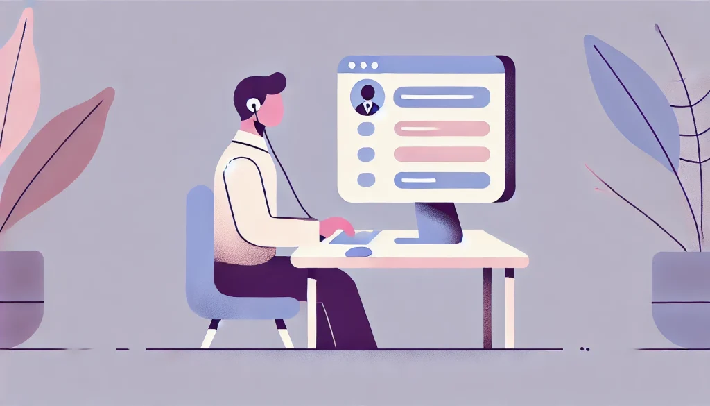
Testing with Real Users and Tools
Accessibility testing must go beyond automated tools. While tools like Axe, WAVE, or Lighthouse catch around 20–50% of issues, they can’t fully replace manual checks or user feedback.
Use screen readers like NVDA (Windows), VoiceOver (Mac/iOS), or TalkBack (Android) to test key flows. Try navigating your site with only a keyboard. Conduct usability tests with users who have disabilities, and listen carefully to their experiences.
Legal Compliance Is Only the Starting Line

Many regions now have legal frameworks enforcing digital accessibility. The Americans with Disabilities Act (ADA) in the U.S., the European Accessibility Act, and India’s Rights of Persons with Disabilities Act (RPWD Act) all include web accessibility provisions.
But compliance shouldn’t be the only driver. Accessible design enhances SEO, improves performance, boosts usability for all users, and builds brand trust. In fact, 71% of users with disabilities will leave a website that’s hard to use, and 82% would spend more on sites that are more accessible.
Accessibility Is a Shared Responsibility
Front-end developers play a crucial role in shaping the experience of a digital product – but they don’t work in isolation. Accessibility should be embedded in the entire product lifecycle – from design to development, testing to content writing. Everyone on the team needs to understand the value of inclusive design.
Accessibility is not a one-time fix. It’s an ongoing commitment to listening, learning, and improving. The more inclusive we make the web, the more powerful and universal it becomes.
In a digital world striving for innovation, real progress lies in inclusion. Accessible front-end design isn’t about doing more work – it’s about doing the right work.
Also Read: The Evolution of Front-End Development: Trends to Watch in 2025


