
Your product has 100+ screens. Does the button look the same on every one of them? If you hesitated, you have a design system problem.
That moment of hesitation shows up around the time a product crosses 50 screens, the team doubles, or a second product line spins up. What once felt like a tight, coherent interface starts feeling like five apps stitched together. The answer isn’t a redesign – it’s a design system. This guide covers everything you need to build, scale, govern, and measure one that teams actually use.
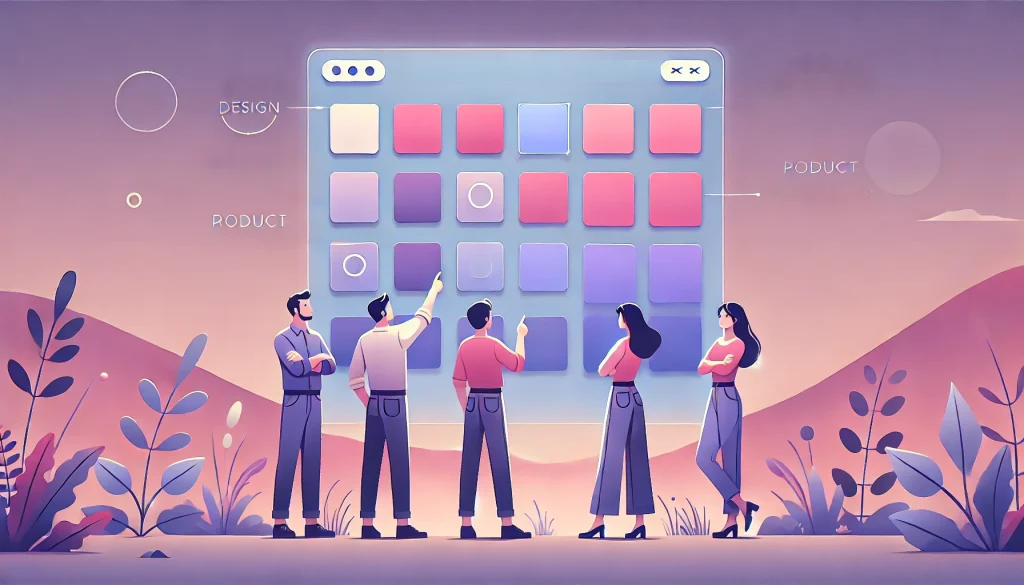
What Is an Enterprise Design System?

A design system is a centralized, living ecosystem of reusable UI components, design tokens, interaction patterns, accessibility standards, and developer documentation – governed by clear rules about how they’re used and maintained.
It’s worth clarifying what it isn’t. A style guide is a static PDF nobody reads after week one. A UI kit is a Figma file with visual components but no logic, documentation, or code connection. And a design system is not a one-time project – it’s a living product that must evolve continuously alongside what it supports.
The simplest analogy: a UI kit is a recipe card. A design system is a fully equipped, professionally managed kitchen.
Why Enterprise Products Need One

Consistency. When ten independent teams build without a shared system, you get ten different button styles, ten different modal behaviors, and ten different error patterns. None are wrong in isolation. Together, they produce an interface that feels incoherent – and users feel it even when they can’t articulate it.
Speed. Without reusable components, every feature starts from zero. Development doesn’t get faster as the product matures – it gets slower, because the surface area of inconsistency grows with every sprint.
Handoff. Designers design in Figma. Developers interpret in code. Every interpretation introduces deviation. Multiply that across hundreds of components and thousands of handoffs, and the gap between design intent and shipped product becomes enormous and expensive.
Scale. Products that feel fine at 10 features often break at 100. Navigation collapses, consistency disappears, and the interface becomes a maze.
Why Most Design Systems Fail

Most failures aren’t technical. They’re adoption failures driven by five recurring patterns.
- No developer integration. The system lives only in Figma. Designers use it; engineers ignore it because there’s no code connection, no component library, no prop documentation.
- No governance. Nobody officially owns the system after launch. Components go undocumented, tokens drift, and within 18 months the system is out of date.
- Built in isolation. The design system team builds components they think are needed, not what product teams actually use. The result is a system that’s comprehensive on paper and irrelevant in practice.
- No documentation. Components exist but nobody knows when to use which variant, what the interaction rules are, or what accessibility requirements apply.
- No adoption measurement. Teams are assumed to be using the system but nobody verifies it with data. In reality, they’ve quietly built their own components and moved on.
Best Practices

Start with an audit. Before building anything, inventory what exists. How many button variations are in the product today? How many modal patterns? The audit is the evidence base for every decision that follows.
Design tokens first. Establish your foundational variables – colors, spacing, typography – before designing any components. Tokens are the foundation. Build components on top of an undefined foundation and you’ll spend enormous time refactoring later.
Build for developers AND designers. If developers can’t use the system easily, it effectively doesn’t exist for half your team. Document components the way developers think – props, variants, states, code snippets – not just visual examples.
Document everything. Every component needs usage guidelines, do’s and don’ts, accessibility specifications, and state documentation. Documentation is a first-class deliverable, not an afterthought.
Govern like a product. The design system needs its own backlog, roadmap, and release cycle. Without product-level governance, it will always lose to feature work in the priority queue.
Measure adoption. Track which components are used, which are ignored, and where teams are deviating. A system with no adoption metrics is flying blind.
Plan for contribution. Build a structured process that allows any team to propose and contribute components. Without it, the system becomes a bottleneck that product teams route around.
How to Build One: 5 Steps
Step 1 – Audit. Catalog every existing UI element across the product. Identify redundancies, inconsistencies, and gaps. This is your starting point.
Step 2 – Token architecture. Build the three-layer token structure: Global tokens hold raw values (blue-500: #1A73E8). Semantic tokens assign purpose (color-action-primary: blue-500). Component tokens handle specific overrides (button-primary-bg: color-action-primary). This hierarchy is what makes theming, dark mode, and multi-brand support possible.
Step 3 – Component design. Build from atoms (buttons, inputs) to molecules (search bars, cards) to organisms (data tables, headers). Every component must include all states: default, hover, active, disabled, error, loading, and empty. Missing states are the most common cause of inconsistent implementation.
Step 4 – Documentation. Each component needs usage guidelines, accessibility requirements, code specs, prop definitions, and visual do’s/don’ts. A component without documentation is an incomplete component.
Step 5 – Governance setup. Establish ownership, contribution workflow, versioning strategy, and adoption tracking from day one – not after launch.
Design Tokens, Multi-Brand, and Accessibility

Design Tokens
Tokens are named variables that store visual decisions as code-readable values. Instead of hardcoding #1A73E8 throughout your codebase, you reference color-action-primary. The value lives in one place. When you need to update it, you change one token and every component that references it updates automatically – no find-and-replace, no missed instances. Tokens also export to CSS, iOS, and Android, ensuring the same decisions apply across all platforms. When designers and developers share the same token names, the translation gap between Figma and code disappears entirely.
Multi-Brand
Enterprise organizations often need multiple products or brands with distinct visual identities but shared underlying functionality. The solution is a shared component architecture with brand-specific token layers on top. Every brand gets different color, typography, and visual tokens – swap the layer, and the same components render with a completely different identity. This eliminates 60–80% of redundant design and development work across product lines.
Accessibility
Accessibility must be built into every component by default, not audited as an afterthought. That means WCAG 2.2 AA contrast ratios on all text and interactive elements, full keyboard navigation (tab, enter, escape, arrow keys), proper ARIA labels and roles for screen readers, visible focus indicators, logical tab order, and reduced-motion alternatives for animations. Beyond being the right thing to do, accessible design systems provide legal protection under the ADA and European Accessibility Act, expand market reach to the roughly 15% of the global population living with a disability, and improve usability for everyone.
Developer Handoff and Governance

Handoff
Good handoff documentation covers every component state – including the ones developers most often have to guess at. It uses prop-based structure that maps to how developers actually think. It explicitly lists every design token used in a component. It includes code snippets developers can pull directly. And it lives in a searchable, always-current platform like Storybook or ZeroHeight – not in static files that go stale.
Governance
The three governance models are: a dedicated design system team (highest quality, requires real headcount), a federated model (each product team contributes, scales better but needs coordination), and a hybrid (small core team plus structured product team contributions – the most common and sustainable approach).
Every contribution should follow a consistent process: Request → Review → Design → Build → Document → Release. Establish a regular versioning cadence – monthly minor releases, quarterly major versions – with changelogs and migration guides so teams know what to expect. Have a clear deprecation policy with advance notice and migration paths. Track component usage rates, deviation instances, and documentation currency as ongoing health metrics.
A design system without governance is a Figma file with an expiration date.
Migration and ROI

Migration
Start with an inventory that maps every legacy component to its replacement. Run old and new systems in parallel during the transition – no big-bang switchover. Migrate module by module, starting with the highest-visibility areas. Write per-component migration guides showing old-to-new prop changes and behavioral differences. Set measurable adoption milestones with dates: 30% migrated by week 4, 80% by week 10, 100% by week 16.
ROI
The returns are measurable and significant. Pre-built components deliver 40–60% faster feature development. Precise specs and documented states produce up to 70% fewer revision rounds between design and engineering. Standardized components mean 30% less QA time per release. And a well-documented system accelerates new team member ramp-up by 2–3x.
A design system doesn’t cost money. It saves multiples of what it costs.
FAQs
What’s the difference between a design system and a UI kit?
A UI kit shows what components look like. A design system includes components, tokens, interaction logic, accessibility, developer docs, and governance. Recipe card vs. managed kitchen.
How long does it take to build one?
A foundational system takes 12–16 weeks. Complex products can take up to 20. A focused quick-start sprint can deliver tokens and 20–30 core components in 4 weeks.
How do you get developers to actually use it?
Document like developers think – props, states, variants. Provide code-ready specs. Use tools like Storybook that integrate into existing engineering workflows.
Can one system support multiple brands?
Yes – shared architecture with brand-specific token layers. Same interactions, different visual identity. Saves 60–80% of redundant work across brands.
We tried before and it failed. Now what?
Most failures are adoption failures: no dev integration, no governance, no documentation. Audit why it failed, address those root causes specifically, then rebuild.
Conclusion
An enterprise design system is operational infrastructure – the single source of truth that unifies products, accelerates development, and eliminates UI fragmentation. It’s not a style guide. It’s not a side project. It’s the foundation everything else is built on.
The question isn’t whether you can afford to build one. It’s whether you can afford not to – while your teams rebuild the same button for the 47th time.