

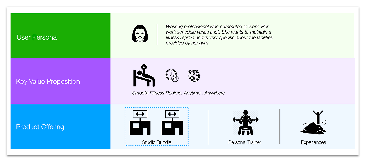
Following is summary of the project with a Singapore based startup in the fitness domain
Product “Hypber”
Hyper is a Singapore based startup which intends to simplify the health regime management who otherwise have a very busy work schedule. The mobile app provides three services which are as follows:
- Ability to book multiple gyms as per convenience and choice of facilities into a bundle , instead of registering to a single gym and same set of facilities.
- Ability to book personal trainers either from the gym or working independently
- Ability to book fitness events which are conducted independently
Requirement
The requirement of the project was to simplify or fix the user experience of the app already designed which currently seem to be either complicated or broken
UX problems identified
We did a week long understanding of the product and business use cases and analysis of the existing app and listed the problems impacting the user experience:
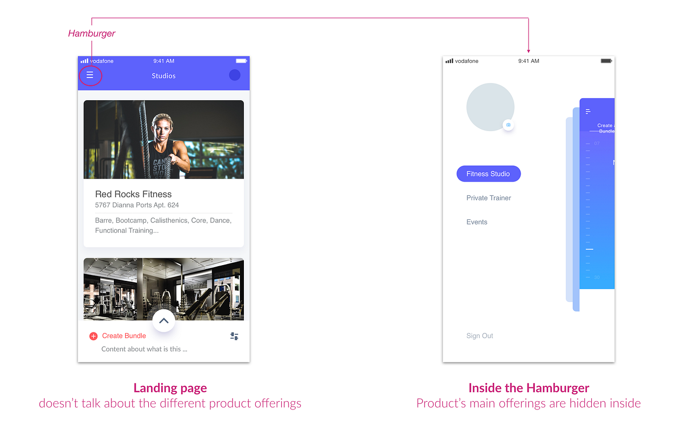
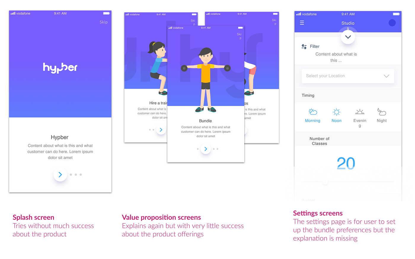
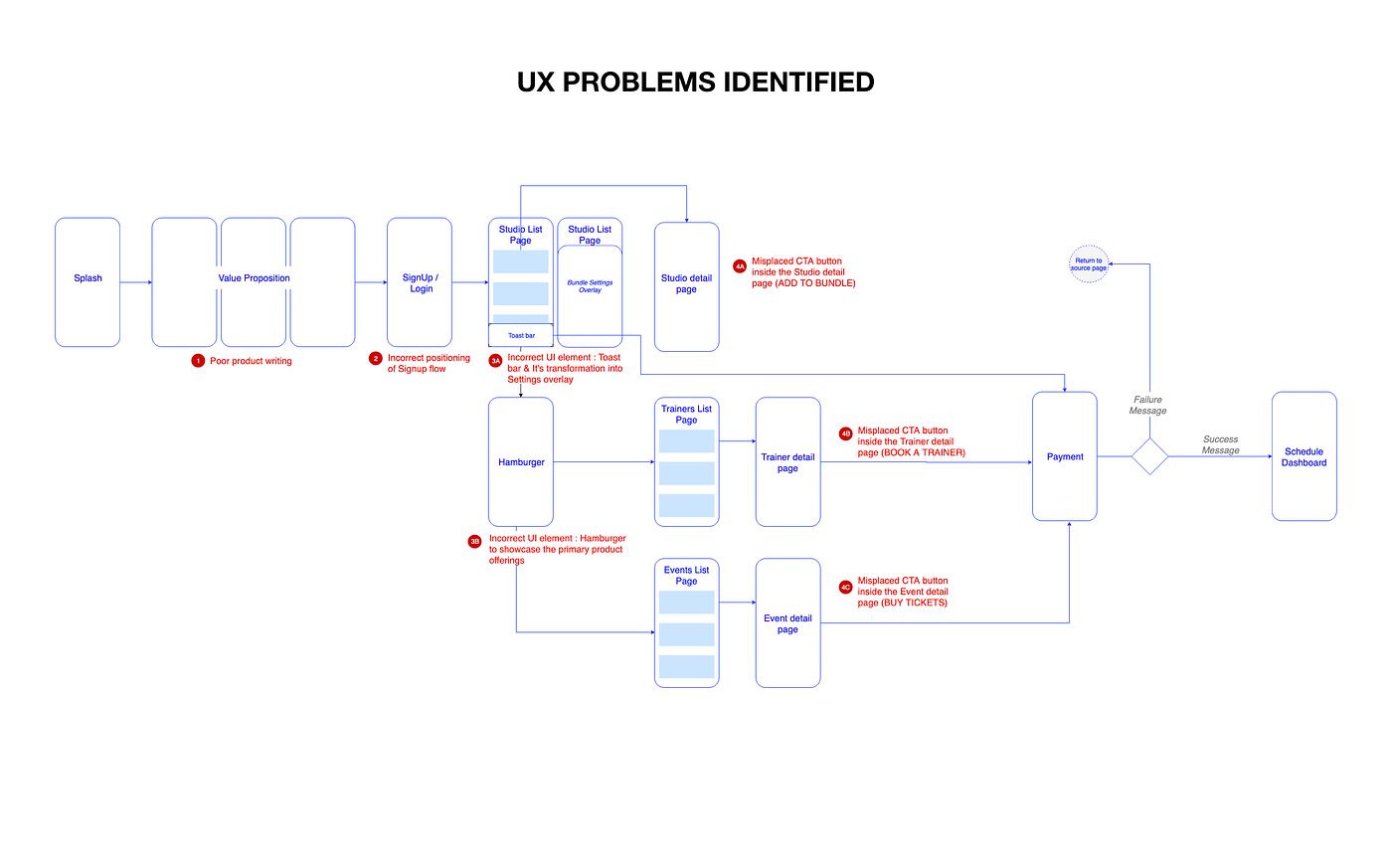
#1 Unclear about what the app is offering
- The product offerings is not evident due to the choice of UI element. The main product offerings were hidden inside a fancy hamburger menu.
- The value proposition pages during the beginning of the app which is not effective due to poor product writing and transient nature of the sliders
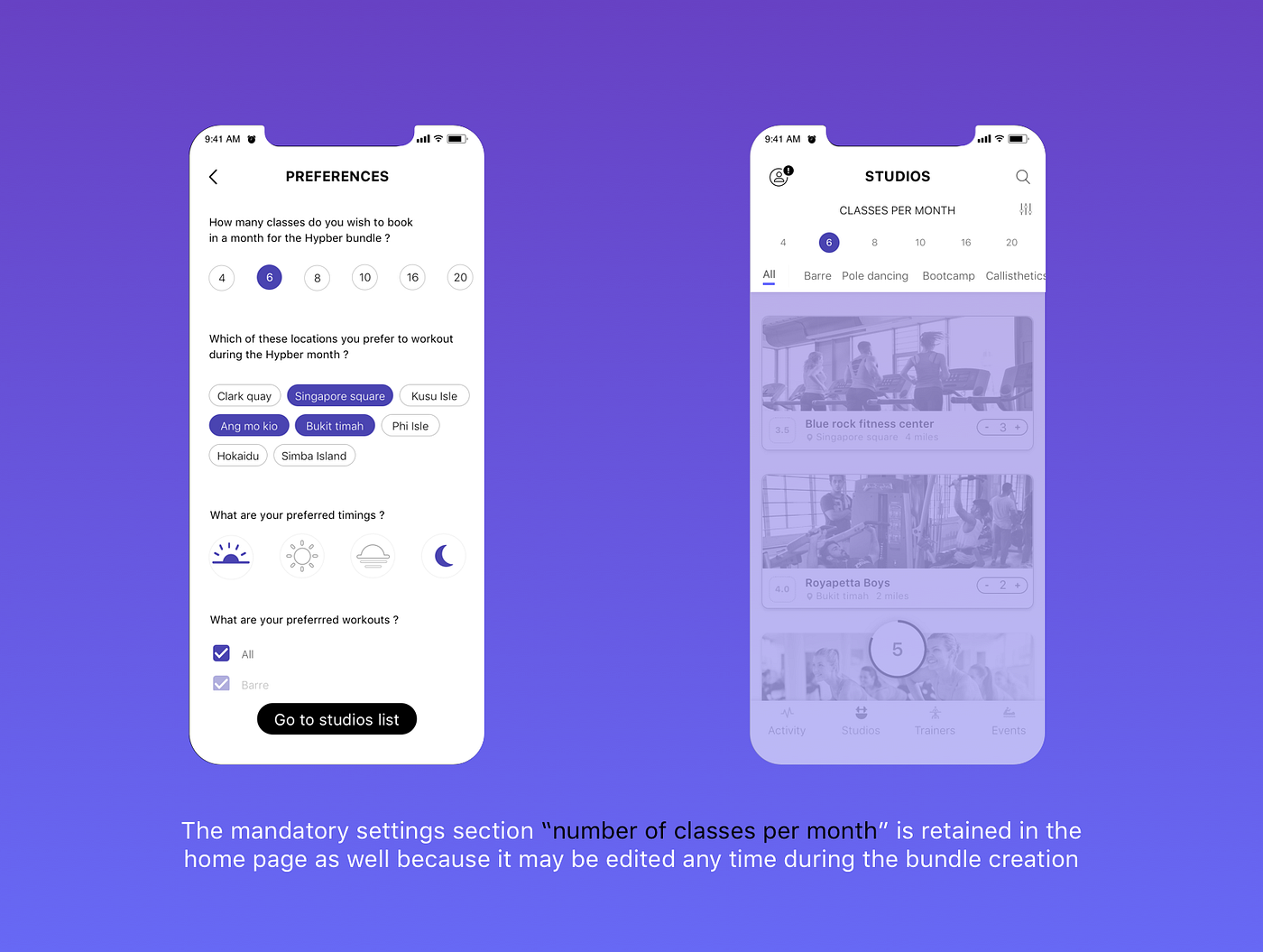
- The settings page where the bundle requirements are collected by the user the app does a very poor job of explaining the main offering; again poor product writing
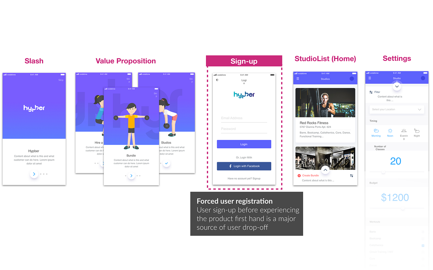
#2 Forced Sign-up
- To make the problem worse, the user flow for the first time user had one extra hurdle to reach the main screen i.e. the sign-up comes even before the user had experienced the product.
#3 Wrong choice of UI for the main CTA & Incorrect interaction
- The first wrong choice of UI is the hamburger which has been explained above already.
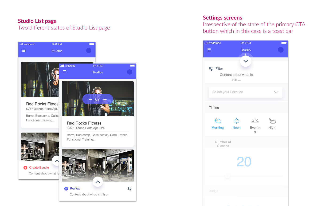
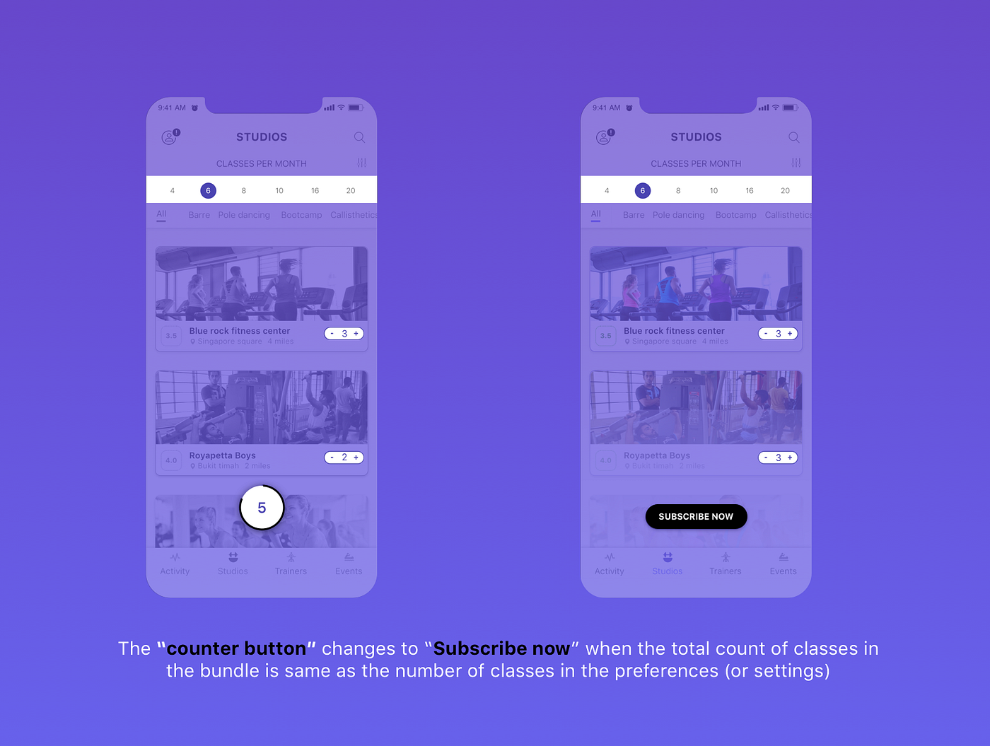
- The bottom toast bar to create bundle which is the primary CTA. The bottom toast bar’s caption changes dynamically (either CREATE BUNDLE or REVIEW) which is confusing. The user doesn’t get to see the main CTA i.e. CREATE BUNDLE until the number of classes selected by the user is same as bundle settings.

- When the user taps on the CREATE BUNDLE or REVIEW (the bottom toast bar UI) it opens up the settings page which is unintuitive and incorrect interaction
4# Incorrect positioning of the secondary CTA button
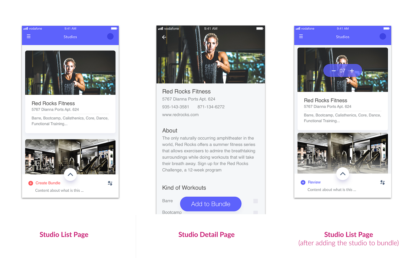
- There is no way to add a studio to the bundle in the main studio list page; The user can only add a studio Bundle only from the studio detail page. However, the user can increase the number of classes from a studio while from the Studio list page but only after adding the same to the bundle. This is very inconsistent and un-intuitive interaction design.
Other problems identified
- Incorrect proportion and alignment issues at almost every screen
- Incorrect illustrations which did not match to the brand image the product wanted to reflect

Following is the summary of the UI solutions provided which is explained in detail later

Top 3 UI Solutions provided in detail
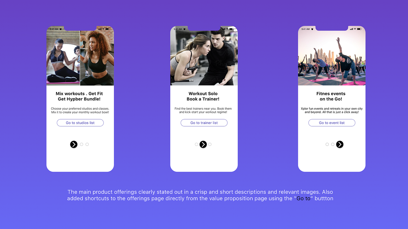
#1 Better product communication through crisp and clear product writing
#2 Part of the settings page always visible during the bundle creation mode
#3 Dynamic UI to handle dynamic states
For the final video of click-through prototype of the onboarding experience CLICK HERE