Contextualizing and deconstructing the “law of parsimony” in the context of design.

Some designers may be familiar with the “laws of UX”, a set of guiding principles for designers in the form of a website (and later book) created by Jon Yablonski. There are 20 laws, ranging from philosophical paradigms to theories used in Mathematics, Psychology Economics, like the Pareto Principle or Fitt’s Law. One of these laws is Occam’s Razor.
What is Occam’s Razor?
The team at F1 Studioz chose Occam’s Razor as the first topic to kick off our “study group” sessions — a weekly community-wide meeting where we gather to discuss, dissect and understand core theories and practices that can be applied to our own work.
Occam’s Razor is a law that states that amongst a set of competing hypotheses that predict the same outcome, the hypothesis which makes the fewest assumptions should be selected. Although William of Ockham is credited with the construction of this law, the core idea — that of simplicity — has been expressed by many of the ancient great thinkers, such as Aristotle, Ptolemy, and Newton. The first question we asked ourselves was “why razor?” The answer can be found in understanding what the functionality of a razor is in daily life. It shaves off unnecessary things with precision, leaving only the necessary elements.
Occam’s razor is a metaphorical razor in that it shaves off complex theories, only leaving the most simple and necessary explanation.
Contextualizing Occam’s Razor in the world of design
Occam’s Razor is a principle implies simplicity, elegance, and necessity. Steve Jobs, whose mantra is “simplicity is the ultimate sophistication”, is the most well-known example of someone who has applied Occam’s Razor to the core of their design thinking.

This mantra is evident in Apple’s clean website design, the physical stores with high ceilings, glass, and open layout, the elegance of the aluminum Chromebook…

But, in Job’s words “Simple can be harder than complex. You have to work hard to get your thinking clean to make it simple.”
This begs the question “does simplicity imply ease of use?”
It seems that, in the context of designing a User Interface, the designer should reduce the clutter of excess buttons, pop-ups, and tooltips. Instead, simplify by reducing the options the user has to avoid potentially making a “mistake”. Reduce the distraction of bright animations and colorful backgrounds which interfere with the visual contrast. However, merely reducing features is not the answer. Thinking critically about what is essential and what is useful is more important than following the trend of “minimalistic design”.
It can be risky to conflate simplicity with correctness and ease.
The Breaking Points of Occam’s Razor
We took a critical approach in our study group, questioning everything and arguing that popular opinions are not necessarily true in all cases.
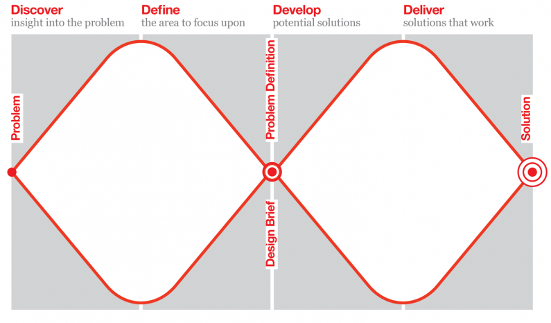
Firstly, simplicity does not always have to be reductive in nature. The double diamond quite directly contradicts this idea. One has to zoom out. To complicate things to eventually simplify them. Processes can become complex to make the final product simpler. Simplification can also be addictive.
Second, as Anne-Laure Le Cunff puts it in an article in Ness Labs:
“The biggest mistake people make with this mental model (Occam’s Razor) is to assume it reasonable to transpose a philosophico-scientific principle to messy day-to-day challenges. It may also be used as a way to gloss over complex but crucial components in an argument, thus falling prey to confirmation bias — our natural tendency to interpret information in a way that affirms our prior hypotheses.”
Can a designer really compare explanations of outcomes from A/B tests and solutions for various problem spaces with all other things being equal?
Consider all alternatives
Ultimately, one should not equate simplifying with ruthless reduction, correctness, or ease of use. Instead, a designer should get consistent feedback on the work and iterate. Having several design alternatives and thinking critically about these choices, carefully considering each consequence, is more fruitful than blindly following the law of parsimony.


