A mood board is a visual representation of ideas. It is a collage or a collection of materials that could easily deliver the look and feel of the brand. These boards are the colorful visual representations used to communicate the mission of a particular design, brand, or project. In fact, a mood board is a storytelling board that could deliver the users the essence of the project with a look at it. Not just delivering the story but also a well-designed mood board that carries emotion in it. This is the kind of sign language used to understand how the users feel when they use the product or service designed.

Are users having a great user experience?
Or are they facing any challenges? If yes, then what can we improvise to make sure it is great?
A mood board helps the designer understand the pain points that the user might feel after using the product or the service. A mood board can be done in any form. These visual representations can be in physical as well as digital forms. A physical mood board can be done using sticky notes and some other aids. But the problem with a physical mood board is that it can’t be virtually used as a team.
The display items over a mood board may include sketches, fabrics, color palettes, textures, shapes, typography, and several other design elements.
How to make a mood board?
A mood board can be made using various ways. Each different situation might need a different mood board. In web or app design projects, a digital board is recommended to collect references from animations, micro-interactions, and typography; however, having a physical board in the office can be a constant reminder to everyone who sees it. Let’s discuss these types further below.
In the meanwhile follow these key steps for creating effective and user-centered mood boards:
- Understand your purpose: Before jumping into the making of a mood board, it’s better to decide on the purpose of the project at first. You might have different ideas on designing the board, but it’s always better to start the project by being targeted.
- Find your tone: The tone-setting will give an idea of how the design board is going to be. So having a few keywords or choosing some community hashtags will set the team’s tone in the right manner. Setting the tone doesn’t limit one’s exploration but it provides the team with a direction. Later on, monotone will help viewers understand the story better. A more famous process says that, decide on 4–5 adjectives that you want people to perceive you as. Like loud, exciting, calm, soothing, etc., And design accordingly.
- Research: Now the next step would be to gather more information on the predetermined purpose and tone. You can also Gather notes taken during meetings, survey data from users, and interviews with customers to try to extract insights for the project. Now, look out for the visual references.
- Variety of elements: At this point, you might have a direction. This is more like a UX research process. Initially, you divide the areas to be worked on. Then you dig deeper into each of these areas. You are free to use any type of element to enhance its presence. Use photography, web design suggestions from around the internet.
- Be picky: And finally let’s not randomly keep things on the mood board, instead use only pieces that will help the direction. Using other things would hamper the mood board’s story behind. Also, the size and the jargon used for a visual reflects the importance of that particular visual.

Different Ways of Mood Boarding
There are two ways of making a mood board look aesthetic and simple. Physical mood boards and Digital mood boards. Both types are important, hold their own value depending on the situation. Let’s talk it out:
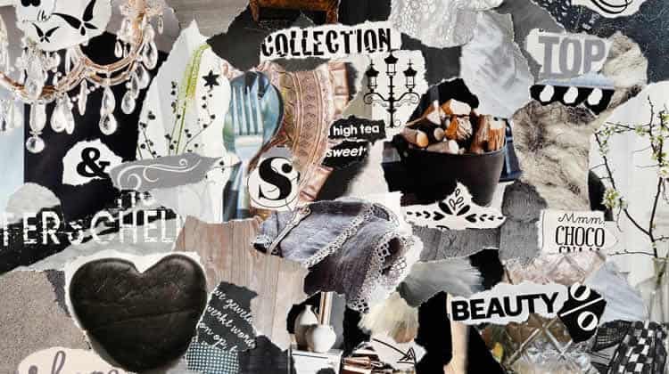
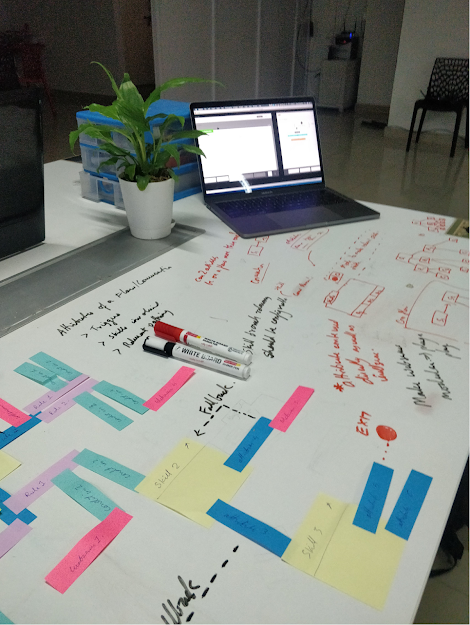
Physical Mood Board: A physical one is all about creating a more tangible approach while creating a design board. Of course, it is limited to physical space. But it is great when it comes to in-person presentations. Also, one gets to use various elements on this mood board including photographs, colors, sticky notes, etc.,
Drawbacks to this may involve not finding all the aspiring and relevant designs that you may want to incorporate into the mood board. But there is always a chance of printing it out and sticking it along. Don’t you agree?
Now that you have decided on making a physical mood board, it’s time to curate the relevant content. For more inspiration and information one can always use magazines, journals, paints, fabrics, colors, sketch pens, books, etc.,
A few best physical mood boards look like this:
Digital Mood Board: Digital mood boards are way more flexible than physical mood boards. It is easily shareable, and there are many platforms from where the images could be curated. And there is no limit to the physical space where the mood board can be designed. And there is no particular way of doing a mood board. There is just more flexibility and information flow.
Where can you create your digital mood board?
- There are a few digital tools on which a mood board can be done. They are as follows:Behance: This platform claims to be the world’s largest space for creatives. You can save any boards on your profile without having to browse in the future. A very easy-to-use platform for UX experts and UI designers.
- Adobe XD: Without pre-defined templates, photoshop allows you to have creative freedom and explore your interests. This tool promises to give a personalized experience according to the one who makes the mood board.
- Photoshop: A powerful tool for the experts and specialists of the design industry. With a variety of options, this tool gives a sense of artistic control to the mood board creator.
- Niice: Niice allows customization at several levels. This is a wholesome design tool if one wants to create a mood board. With the support for video embeds and 3d models, this could also support SEO. There is no limit on the type of images one could include in this tool.
- Invision: This tool helps you share your Boards with anyone supporting all the devices. Boards support the entire design process — from initial idea to handoff. Also one gets to keep your design process together into a familiar, central location. You can either create your mood board here on the tool or just import an already existing board.
There are a couple of simpler and easier tools like Canva, Pinterest, and Instagram to help designers and marketers create their mood boards. These are created by just using a drag and drop editor among the pre-defined templates or by uploading pins and grouping them into boards. On the other hand, Instagram is a never-ending mood board, plus it’s also a great way to curate and follow great inspirational mood boards.
A few inspiring mood boards:
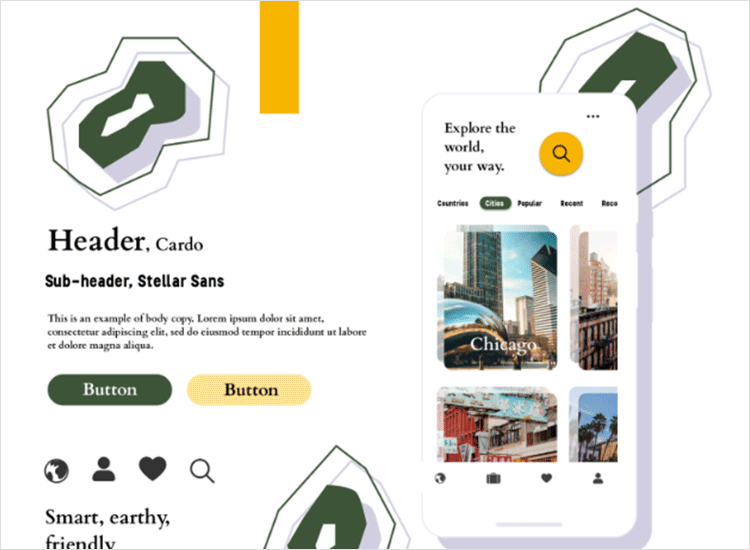
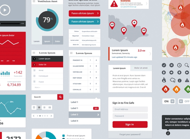
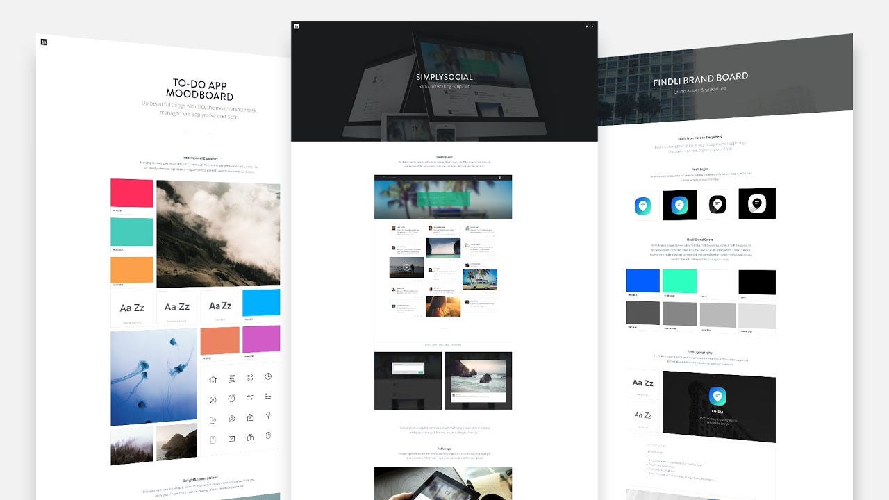
Inspiration boards help us in curating content giving you ideas on the storytelling and also provides in more image content. A few inspiring mood boards with better design:
Finally, Mood boarding can help designers in saving their time and effort. Once a storyboard frame is designed, it can be further edited and reused for different purposes. It is a way of displaying and exploring one’s own creativeness. As mentioned it’s always convenient to revise on the mood board rather than changing the prototypes. So why wait, happy mood boarding!


