
Did you know over 30,000 SaaS products now compete for attention in 2025? What’s even more interesting is that AI has fundamentally changed the rules of competition. GitHub Copilot, ChatGPT, and similar tools have commoditized code – anyone with an idea can now build features. Your competitors can replicate your functionality in weeks, not months.
So what’s left? Design is your only defensible moat.
But here’s the problem most founders miss: 78% of SaaS churn doesn’t happen because you’re missing a feature. It happens because of friction – confusing navigation, unclear value propositions, workflows that fight against muscle memory. Your users aren’t leaving for a competitor with better technology; they’re leaving because using your product feels like work.
Our 2025 State of SaaS Design Report revealed something startling: companies with mature design systems achieve 2x faster ARR growth compared to those treating design as an afterthought. This isn’t correlation – it’s causation. When users can complete tasks without thinking, when your interface anticipates their needs, when every interaction builds confidence rather than confusion, retention becomes inevitable.
The stakes have never been higher. In a market where feature parity is assumed, user experience is the battleground where retention wars are won or lost. A single poorly designed workflow can cost you millions in lifetime value. One confusing onboarding flow can tank your activation rates by 40%.
By the end of this guide, you’ll understand how to audit your current product for friction points, design workflows that users can’t live without, and scale your UI without descending into chaos. You’ll learn the exact frameworks that separate products users tolerate from products they advocate for. This isn’t theory – it’s the operating system behind every successful SaaS company you admire.
The Fundamentals of SaaS UI/UX
What is SaaS UI/UX Design?
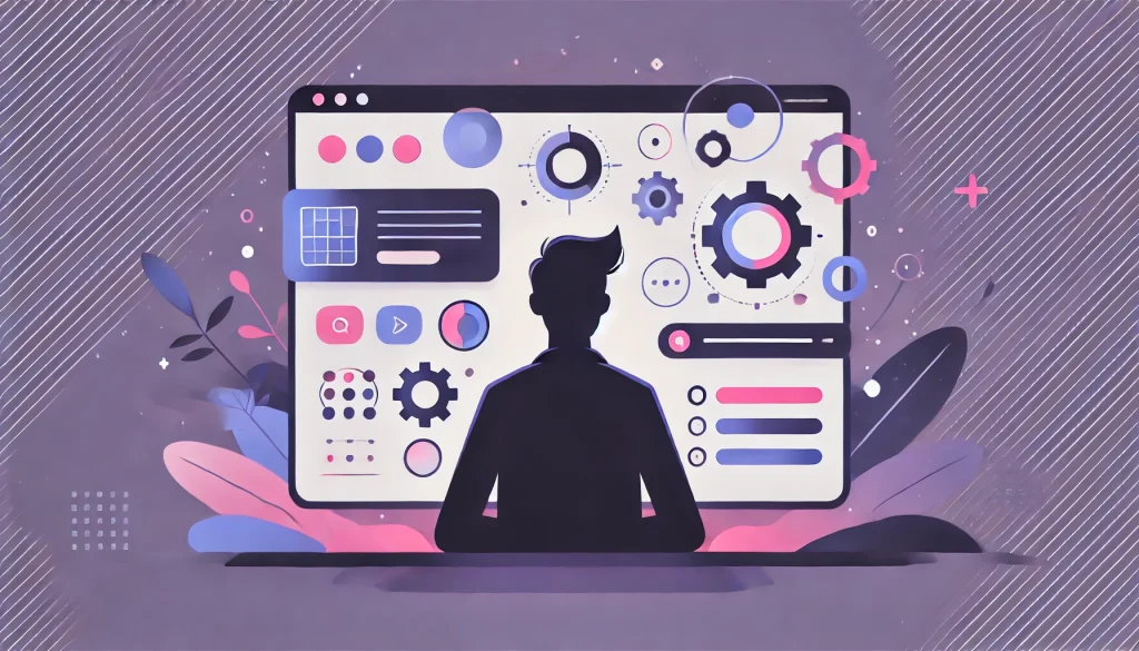
Let’s kill a myth immediately: SaaS UI/UX design is not about “making things pretty.” It’s the bridge between human intent and machine logic. It’s making workflows efficient, invisible, and fast.
Think of it this way: every SaaS application is a translator. On one side, you have a human who needs to accomplish something – approve expense reports, analyze customer data, deploy code. On the other side, you have databases, APIs, and complex business logic. UI/UX design is the interface that makes that translation feel natural rather than mechanical.
This requires a Utility-First Mindset. Your users aren’t browsing your app for entertainment. They’re not hanging out in your interface the way they scroll Instagram. They have a job to do, and your interface is the tool they use to do it. The faster they can complete that job and move on with their lives, the better your design is.
Every pixel should serve utility. Every animation should communicate its state. Every color should encode meaning. When you adopt this mindset, you stop making aesthetic decisions and start making efficiency decisions.
B2B vs. B2C Design: The Complexity Gap
Marketing websites sell promises. SaaS applications deliver utility. This fundamental difference separates consumer products from business software, and most designers fail because they treat them the same.
| Dimension | B2C Design | B2B SaaS Design |
| Decision Speed | Impulse purchases (seconds) | Committee evaluation (weeks) |
| Emotional Driver | Aspiration, FOMO, delight | Risk reduction, efficiency gain |
| Interface Complexity | Simple, linear flows | Dense data, multi-role access |
| Success Metric | Conversion rate | Time-to-value, retention |
| User Behavior | Exploration, browsing | Goal-oriented, repetitive tasks |
| Visual Approach | Bold, emotional, trendy | Conservative, functional, trusted |
Consumer apps can afford to hide functionality behind clever interactions because users are exploring. Business users are executing. They need power, not discovery. They need keyboard shortcuts, bulk actions, and customizable views – not animated mascots.
The complexity gap is real. B2C designers optimize for the first impression. B2B designers optimize for the thousandth use. If your interface doesn’t get faster and more powerful with repeated use, you’re designing for tourists, not residents.
The Neuroscience of Efficiency
Understanding how the brain processes interfaces isn’t optional – it’s foundational. Two principles govern whether your users feel competent or overwhelmed:
Miller’s Law explains why your navigation shouldn’t have more than 7 items. The average person can hold 7 (plus or minus 2) chunks of information in working memory. When you present 15 top-level menu options, you’re forcing users to scan, re-scan, and forget what they were looking for. Cognitive load isn’t just annoying – it’s exhausting. Users experiencing high cognitive load make more errors, take longer to complete tasks, and eventually seek alternatives.
Dopamine Loops explain why great SaaS design feels rewarding even for boring tasks. When a user completes payroll processing in your app and sees a green checkmark with “1,247 employees paid successfully,” their brain releases a small hit of dopamine. This neurochemical reward makes them associate your product with accomplishment. Design these “high-five moments” deliberately – confirmations that are specific, immediate, and celebratory transform utility into satisfaction.
The best SaaS interfaces don’t just reduce friction; they create positive reinforcement loops that make users want to return.
The 5-Stage Implementation Process

Every successful SaaS design follows a structured methodology. Here’s the Standard Operating Procedure that transforms chaos into clarity:
Stage 1: Discovery 2.0
Traditional user research asks “What features do you want?” Jobs-to-be-Done (JTBD) interviews ask “What are you trying to accomplish?” This difference is everything.
Users don’t want a reporting dashboard – they want to prove to their CEO that marketing spend is working. They don’t want bulk email tools – they want to re-engage churned customers without writing 500 individual messages. When you understand the actual job, you design solutions that fulfill intent rather than implement requests.
Discovery means spending 2-3 weeks conducting JTBD interviews with power users, analyzing support tickets for patterns, and mapping the ecosystem of tools your product competes with. You’re not validating assumptions – you’re discovering reality.
Stage 2: Definition
Before drawing a single pixel, you must answer: where does data live, how does it flow, and who can access what? This is Object-Oriented UX (OOUX) – structuring your information architecture based on the objects users mentally model.
For a CRM, those objects might be Contacts, Companies, Deals, and Activities. For a project management tool: Projects, Tasks, Users, and Files. Define the relationships between these objects (a Deal belongs to a Company; a Task belongs to a Project) and suddenly, your navigation structure reveals itself.
Skip this step and you’ll redesign interfaces three times because you didn’t plan for how data moves through the system.
Stage 3: Ideation & Wireframing
Low-fidelity wireframes solve logic problems before visual design creates emotional attachment. Use grayscale boxes and actual content (not Lorem Ipsum) to test:
- Can a user complete their primary workflow in under 5 clicks?
- Does the hierarchy make the most important action obvious?
- Are you solving an interface problem or a process problem?
This is where you make cheap mistakes. Moving a rectangle in Figma takes seconds; rewriting React components takes days.
Stage 4: Prototyping
High-fidelity interactive prototypes in Figma allow you to test the interface as if it’s real – without writing code. Build micro-interactions, loading states, error handling, and edge cases. If your prototype can’t handle “What happens when a user uploads a 500MB file?” then your developers won’t know either.
Prototypes are your specification document. They replace 50-page requirement docs with clickable truth.
Stage 5: Testing & Validation
Use tools like Maze or UserTesting to validate flows before developers write a line of code. You’re looking for:
- Task success rate: Can users complete the workflow at all?
- Time on task: How long does it take compared to competitors?
- Error rate: Where do users get confused and backtrack?
Testing with 5 representative users will reveal 85% of usability issues. Testing with 15 users catches almost everything. Don’t ship hunches – ship evidence.
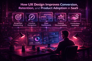
The 4 Pillars of SaaS Success
1. Activation: The First 5 Minutes
The Empty State Paradox kills more SaaS startups than bad code. New users sign up, see a blank dashboard with a generic “Get Started” button, and immediately question whether your product is worth the learning curve. They have decision fatigue. They have buyer’s remorse. They have Slack messages piling up. You have 300 seconds to prove value before they tab away forever.
The fix isn’t a 10-minute explainer video (which 4% of users will watch). It’s contextual onboarding – smart tooltips that appear exactly when needed, pre-populated sample data so they can explore real functionality, and a progress checklist that shows them how close they are to their first win.
Stripe does this brilliantly. Their dashboard for new developers shows test transactions immediately, so you can see what your integration will look like with actual data. You’re not imagining value – you’re experiencing it.
Your Time-to-Value (TTV) metric must be under 5 minutes. That’s the threshold where users commit rather than churn. Every second beyond that is compounding risk.
Master the art of the welcome with our guide: SaaS Onboarding Best Practices: How to Activate New Users Fast.
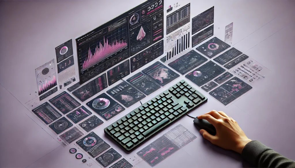
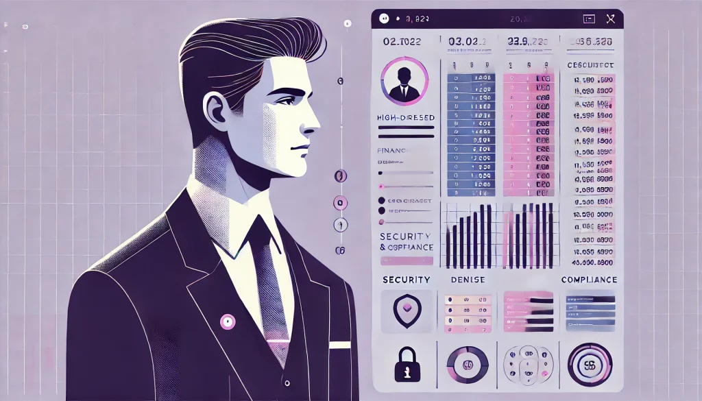
2. Intelligence: Dashboards & Data Visualization
The fastest way to lose a user’s trust is showing them 50 metrics on one screen. This is “Data Vomit” – the mistaken belief that more information equals more value. It doesn’t. It equals paralysis.
Great dashboard design follows Progressive Disclosure: show the big number first, let them drill down for details. If revenue is up 23% this quarter, that’s the hero. If they want to know which product line drove that growth, they click into a breakdown. If they want to know which sales rep closed the biggest deals, they click again.
Use “Traffic Light” signaling – red, amber, green – to communicate status instantly. Before a user reads a single number, they should know whether things are good, concerning, or critical. This is pre-attentive processing: the brain’s ability to understand visual patterns before conscious thought kicks in.
Avoid vanity metrics. “1.2M page views” means nothing if the business question is “Are we retaining customers?” Show metrics that enable decisions, not metrics that enable slide decks.
Learn to organize chaos in our deep dive: Designing SaaS Dashboards: How to Visualize Complex Data.
3. Retention: Stopping the Churn
Friction is the silent killer of SaaS businesses. Every unnecessary click, every confusing label, every workflow that requires users to remember context from three screens ago – these are revenue leaks.
A Heuristic Evaluation (UX Audit) finds these leaks by analyzing your product against established usability principles. You’re hunting for:
- Dead ends: Screens where users can’t move forward without backtracking
- Rage clicks: Users clicking the same element repeatedly because they think it’s broken
- Form fatigue: Asking for information you already have or could infer
Here’s a data point that should terrify you: a 1-second delay in load time correlates with a 5% increase in churn probability. Speed isn’t a nice-to-have – it’s a retention strategy.
The companies that win retention battles are the ones that obsessively remove friction. They don’t add features to solve retention problems; they remove obstacles.
Stop the leaks in your revenue: Why Users Leave: How a UX Audit Reduces SaaS Churn.
4. Scalability: The Design System
Design Debt is what happens when you ship fast without documenting patterns. Six months later, you have 15 different button styles, 23 shades of blue, and no two forms that work the same way. New developers take twice as long to build features because they’re constantly asking “Which component should I use here?”
A Design System solves this using Atomic Design principles:
- Atoms: Individual elements (buttons, inputs, labels)
- Molecules: Simple combinations (a search field with a button)
- Organisms: Complex components (a navigation header with logo, search, and user menu)
When you build a component library, developers code 40% faster because they’re assembling Lego blocks instead of designing every piece from scratch. Even better: when you fix a bug in the Button component, it’s fixed everywhere that button appears. No more hunting through 500 screens.
Figma made design systems mainstream. Storybook made them developer-friendly. There’s no excuse for not having one if you’re serious about scaling.
Scale without the chaos: SaaS Design Systems: Scaling Your UI Without the Chaos.
Designing for Specific Verticals
Generic SaaS design fails because every industry has unique constraints, mental models, and regulatory requirements. Here’s what matters for three critical verticals:
FinTech & Data Privacy
Trust is your entire product. Users are handing you access to their bank accounts, transaction history, and financial future. If your interface looks like it was built in a weekend, they’ll assume your security was too.
Dense data tables are unavoidable – financial users need to see transaction details, not simplified summaries. But density doesn’t mean chaos. Use monospaced fonts for numbers (so columns align), subtle zebra striping for row scanability, and inline editing so users don’t jump between screens to fix errors.
Security badges matter more than you think. Display SOC2 compliance certifications, encryption standards, and two-factor authentication status prominently. These aren’t marketing fluff – they’re buying signals.
Compliance-first design means building audit trails into the interface. Every action should be logged, every data export should be tracked, every permission change should be visible. Regulators will ask for these records; make them easy to produce.
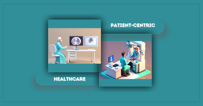
HealthTech & Accessibility
WCAG 2.2 AA Compliance isn’t optional for healthcare software – it’s legally mandated. But beyond compliance, you’re designing for tired doctors at the end of 12-hour shifts, elderly patients with declining vision, and administrators who use screen readers.
High contrast isn’t just about accessibility – it’s about reducing errors. When a doctor is prescribing medication at 2am, a low-contrast interface isn’t just annoying, it’s dangerous. Large hit areas (minimum 44×44 pixels for touch targets) reduce mis-clicks that could have life-or-death consequences.
Consider the context: healthcare workers are constantly interrupted. Your interface should save state aggressively, allow users to pick up exactly where they left off, and never punish them for context-switching.
MarTech & Creativity
Marketing technologists want power tools, not guided experiences. Canvas-based interfaces (drag-and-drop email builders, workflow automation designers) give them the control they crave.
But power users still need guard rails. Use smart defaults, suggest optimizations, and provide templates that showcase best practices. The goal is “easy to start, hard to master.”
Visual feedback is critical for creative tools. When a user changes an email template’s color scheme, show them the change in real-time across mobile, desktop, and dark mode simultaneously. Don’t make them preview and switch contexts.
The Economics of Design
Let’s talk about what quality SaaS design actually costs – because the sticker shock makes founders cut corners, and cutting corners costs more in the long run.
How Much Does SaaS Design Cost?
MVP Design: $15,000 – $30,000
For early-stage startups validating product-market fit, this covers user research, wireframes, and high-fidelity designs for 3-5 core workflows. You’re not building a design system; you’re building evidence that your product solves a real problem. Focus on utility, not polish.
Enterprise Redesign: $50,000 – $150,000+
For established products with technical debt, legacy users, and complex migration needs. This includes comprehensive UX audits, design system creation, user testing across multiple personas, and migration strategies that don’t alienate power users. The scope often includes 20+ unique screens, responsive design, and dark mode variants.
The Hidden Cost of Bad Design
Poor UX generates support tickets. Every “How do I…?” email costs you $15-25 in support time. Multiply that by hundreds or thousands of confused users, and bad design is costing you six figures annually.
Worse: bad design requires developer rework. When your team builds a feature based on vague requirements, then rebuilds it after user testing fails, then rebuilds it again after launch when users complain – you’ve spent 3x the engineering time you would have with proper design upfront. A $30k design investment that prevents $200k in wasted development isn’t expensive; it’s a bargain.
Hiring: Freelancer vs. Agency vs. In-House
| Approach | Cost | Speed | Best For | Risk |
| Freelancer | $50-150/hr | Slow (one person) | Small updates, niche expertise | Availability gaps, limited scope |
| Agency | $100-250/hr | Fast (full team) | Product overhauls, rapid scaling | Higher cost, less product context |
| In-House | $80k-180k/year | Medium (culture alignment) | Ongoing iteration, deep product knowledge | Recruiting difficulty, narrow perspective |
Early-stage startups should use agencies to build the foundation, then hire in-house to maintain and iterate. Trying to hire a full design team before product-market fit is burning capital on headcount instead of validation.
The Future: 2025 & Beyond
AI and Intent-Based UI
We’re moving from “clicking” to “asking.” Generative UI powered by large language models will transform how users interact with complex software. Instead of navigating through menus to create a report, users will type “Show me Q4 sales by region, filtered for deals over $50k” and the interface will generate the view dynamically.
This doesn’t eliminate UI designers – it elevates them. Someone needs to design the constraints, the output templates, and the feedback loops. Bad prompt interfaces are just as confusing as bad graphical interfaces.
The winners will be products that blend traditional UI (for repeated, learned workflows) with conversational interfaces (for novel, complex queries). Don’t abandon everything you know about information architecture; augment it.
Spatial Computing in Enterprise
Apple Vision Pro and similar spatial computing devices will unlock new paradigms for data-heavy industries. Imagine a supply chain manager viewing a 3D map of global inventory, pinching to drill into a specific warehouse, then gesturing to reassign shipments.
This isn’t science fiction – it’s already happening in niche enterprise verticals. The challenge is designing for 3D space without sacrificing the efficiency users have built using 2D interfaces. Early adopters will gain competitive advantages in visualization-heavy industries (logistics, architecture, scientific research), but mainstream adoption requires solving input speed (typing in spatial interfaces is still slow).
Frequently Asked Questions
What is the most common SaaS UX mistake?
Assuming users will figure it out. They won’t. If your interface requires a manual, your interface is broken. The most common mistake is designing for how you (the founder who’s lived with this product for months) think about the problem, not how a new user thinks about it.
How often should you redesign a SaaS product?
Major redesigns every 3-5 years; continuous micro-improvements weekly. Redesigns are expensive and risky – they alienate power users who’ve built muscle memory. Instead, adopt a continuous improvement model: test small changes, measure impact, iterate. Reserve full redesigns for when your design system can’t support new functionality or when you’re migrating to new technology.
How do you measure the ROI of a SaaS UX redesign?
Track activation rate (% of new users who complete onboarding), time-to-value (how long until first “aha moment”), and net revenue retention (are existing customers expanding usage?). A successful redesign should improve activation by 15-30%, reduce support tickets by 20-40%, and increase NRR by 5-10 percentage points within 6 months.
What is the difference between a UI Designer and a Product Designer?
UI Designers focus on visual execution – typography, color, layout. Product Designers own the entire problem space – user research, interaction design, business logic, and measuring outcomes. Product designers ask “Should we build this?” UI designers ask “How should we build this?” Most SaaS companies need product designers.
Should early-stage startups invest in expensive design?
Define “expensive.” Paying $30k for proper user research and wireframes before writing code is cheaper than paying engineers $150k/year to build the wrong thing. But don’t pay for pixel-perfect visual design before you’ve validated product-market fit. Prioritize utility over aesthetics until you have paying customers.
Why is mobile UX hard for B2B SaaS?
Business users need power, and mobile screens offer limited real estate. You can’t fit a 12-column spreadsheet on a phone. The solution isn’t cramming desktop UI into mobile – it’s designing companion experiences. Desktop for complex workflows; mobile for approvals, notifications, and quick edits.
Is Dark Mode necessary for B2B SaaS applications?
Not necessary, but increasingly expected. Users who work late or have eye strain appreciate it. It’s a signal that you care about user preferences. But implement it properly or don’t do it at all – half-baked dark modes with illegible text are worse than no dark mode.
What is the “Empty State” paradox in SaaS?
The moment after signup when users see a blank dashboard and have no idea what to do next. You’ve solved their problem in theory, but without data, they can’t see the solution. Fix this with sample data, contextual tutorials, or import wizards that get them to value faster.
How do you handle accessibility (WCAG) in complex dashboards?
Build it in from the start, not as an afterthought. Use semantic HTML, ensure keyboard navigation works for every interaction, provide text alternatives for data visualizations, and test with screen readers. Complexity is not an excuse for inaccessibility – it’s a reason to be more rigorous.
Single Page Application (SPA) vs. Multi-Page: Which is better for UX?
SPAs feel faster (no page reloads) but can be harder to bookmark and share. Multi-page apps feel more familiar but suffer from load times. The right answer: hybrid. Use SPA architecture for workflow-heavy sections where users stay in one context; use multi-page for marketing and content where SEO and shareability matter.
What are the best tools for SaaS design in 2025?
Figma for design and prototyping, Maze or UserTesting for user research, Storybook for component documentation, Amplitude or Mixpanel for product analytics. But tools don’t make designers – thinking does.
How long does a typical SaaS redesign take?
3-6 months for a comprehensive redesign. 4-8 weeks for discovery and definition, 6-10 weeks for design and prototyping, 8-12 weeks for development and testing. Rushing this timeline produces mediocre results; taking longer creates scope creep.
What questions should I ask when hiring a SaaS design agency?
Ask to see case studies with measurable outcomes (not just pretty screenshots). Ask how they conduct user research and what their testing process looks like. Ask how they handle disagreements when stakeholders want different solutions. Ask about their process for knowledge transfer – you should own all design files and documentation when the engagement ends.
What is a “UX Audit” and how much does it cost?
A UX Audit is a systematic evaluation of your product against usability heuristics. Expert evaluators use your product like real users, document friction points, prioritize issues by severity, and provide actionable recommendations. Cost ranges from $5k for a lightweight assessment to $25k+ for comprehensive audits with user testing. It’s the fastest way to identify what’s costing you customers.
Conclusion: UX Is Business Logic Made Visible
Every abandoned shopping cart, every cancelled subscription, every support ticket that asks “How do I…?” – these aren’t user failures. They’re design failures. Your users aren’t stupid; your interface is unclear.
The companies winning in 2025 understand that product design isn’t the paint on the walls – it’s the architecture of the building. It’s the difference between a tool people have to use and a tool people choose to use.
Start with a UX audit to understand where you’re bleeding revenue. Then implement a design system to scale without chaos. Focus on activation, intelligence, retention, and scalability – not as separate initiatives, but as an interconnected system.
The saturation crisis isn’t going away. AI will keep commoditizing features. But design – thoughtful, user-centered, business-driven design – remains your defensible advantage.