

Did you know users form an opinion about your website in just 0.05 seconds? That split-second judgment can make or break your business. The harsh reality is that many websites look visually appealing but fail to convert visitors into customers. Why? Because they ignore the fundamental principles of User Experience (UX).
This comprehensive guide is your one-stop solution for mastering UI/UX design. Whether you’re a beginner looking to understand the basics or a seasoned designer seeking advanced strategies, we’ll cover everything from fundamental design principles to SEO optimization techniques. You’ll learn how to create interfaces that not only look stunning but also drive real business results.
We’ll explore the definitions and differences between UI and UX, understand their business impact, discover practical tips and industry-leading tools, navigate career opportunities, and uncover how design directly influences your search engine rankings.
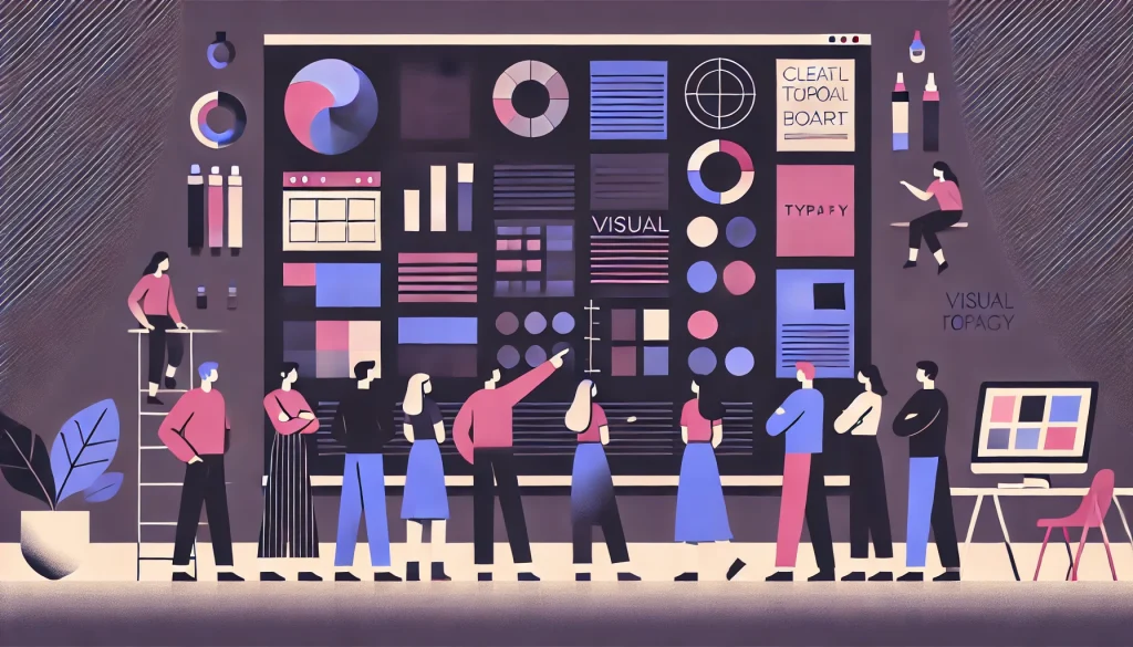
What is UI/UX Design? (The Fundamentals)

Defining User Interface (UI)
User Interface is all about the “look” of your digital product. It encompasses every visual element users interact with: color schemes, typography choices, button designs, icons, images, and layout composition. Think of UI as the aesthetic layer that makes your product visually appealing and on-brand. A UI designer crafts the visual language that communicates your brand identity while ensuring every element is polished and professional.
Defining User Experience (UX)
User Experience focuses on the “feel” of interacting with your product. It’s about usability, the smoothness of the user journey, and overall satisfaction. UX designers obsess over how users navigate through your site, whether they can find what they need effortlessly, and if the experience leaves them feeling accomplished rather than frustrated. Good UX is invisible because everything just works naturally.
Key Differences
Here’s a simple analogy: UI is the car’s sleek paint job and beautifully designed dashboard, while UX is the powerful engine underneath and the comfort you feel during the drive. You can have a gorgeous-looking car that’s uncomfortable to drive, or a mechanically perfect vehicle that looks outdated. Neither scenario is ideal.
Related Reading:- UI vs UX: The Complete Difference, Importance, and Examples for Beginners
How They Work Together
UI and UX are two sides of the same coin, and both are essential for success. A stunning interface with poor usability will frustrate users, while an intuitive experience wrapped in an unattractive design won’t inspire trust. The magic happens when beautiful design meets seamless functionality. Great products marry visual appeal with effortless interaction, creating experiences that users love and return to repeatedly.
Want a deeper breakdown? Read our detailed guide here: [Difference Between UI and UX: A Simple Explanation]
Why UI/UX is Important for Business & SEO

Impact on Conversion Rates
A good design is a conversion machine. When your interface is intuitive and visually guides users toward desired actions, conversion rates skyrocket. Consider this: a well-designed checkout process can reduce cart abandonment by up to 35%. Clear calls-to-action, strategic color choices, and frictionless forms turn casual browsers into paying customers. Every design decision either brings users closer to conversion or pushes them away.
Building Brand Credibility
A broken, outdated, or confusing website destroys trust instantly. Users make snap judgments about your business credibility based on your website’s appearance and functionality. Professional design signals that you’re established, trustworthy, and worth doing business with. Conversely, a poorly designed site makes visitors question whether you’re legitimate, pushing them straight to your competitors.
The Google Ranking Factor
Google actively considers user experience when determining search rankings. Page load speed, mobile responsiveness, intuitive navigation, and user engagement metrics all feed into Google’s algorithms. Sites that provide better experiences rank higher because Google wants to direct users to quality destinations. Your design choices directly impact your visibility in search results.
See how UX directly impacts your rankings in our detailed post: [How User Experience Affects SEO]
Beginner Best Practices: The Must-Haves
Intuitive Navigation
Follow the “Don’t Make Me Think” principle coined by usability expert Steve Krug. Your navigation should be standard, predictable, and immediately understandable. Place your menu where users expect it, use clear labels instead of creative jargon, and ensure users can reach any page within three clicks. When users have to hunt for basic functions, they leave.
Visual Hierarchy
Guide your user’s eye through strategic use of size, color, and emphasis. Your most important heading (H1) should be the largest and most prominent. Secondary headings (H2) come next, followed by body text. Use bold colors for primary actions and muted tones for supporting elements. When everything is emphasized, nothing stands out. Create a clear path for the eye to follow from most to least important information.
Consistency
Maintain the same color palette, fonts, button styles, and design patterns across your entire site. Consistency builds familiarity and trust. Users should feel like they’re navigating one cohesive experience, not jumping between different websites. Create a design system with reusable components and stick to it religiously. Inconsistency feels unprofessional and disorienting.
Mobile Responsiveness
In 2026, mobile responsiveness isn’t optional – it’s mandatory. Over 60% of web traffic comes from mobile devices, and that number continues climbing. Your site must look perfect and function flawlessly on screens of all sizes. Test on actual devices, not just browser simulators. Buttons should be thumb-friendly, text should be readable without zooming, and content should reflow naturally.
Just starting out? Explore our [Beginner-Friendly UI/UX Tips & Principles]
Advanced UI/UX Strategies

Micro-Interactions
Small animations and feedback loops create delightful moments that elevate your interface from functional to memorable. When a user likes a post and a heart icon bounces playfully, or when a button subtly changes color on hover, these micro-interactions provide immediate feedback and add personality. They confirm that actions have been registered and make the interface feel alive and responsive.
Data-Driven Design
Stop guessing and start measuring. Use analytics platforms and heatmaps to understand actual user behavior. Where do users click? Where do they drop off? How far do they scroll? Tools like Hotjar reveal the truth about how real users interact with your design. Let data inform your decisions rather than personal preferences or assumptions. A/B test different versions and let the numbers guide you toward what actually works.
Accessibility (WCAG)
Designing for accessibility isn’t just ethical – it’s good business. Approximately 15% of the world’s population has some form of disability. Ensure sufficient color contrast ratios so text is readable for users with low vision. Add alt text to images for screen reader users. Make sure your site is fully navigable via keyboard. Following Web Content Accessibility Guidelines (WCAG) expands your audience and often improves usability for everyone.
Conversion Rate Optimization (CRO)
Design every element with conversion in mind. Use contrasting colors for call-to-action buttons so they command attention. Place important actions above the fold. Reduce form fields to absolute essentials – every additional field decreases completion rates. Use social proof like testimonials and trust badges near conversion points. Write action-oriented button text (“Get My Free Trial” beats “Submit”). Every pixel should work toward your business goals.
Ready to level up? Learn [Advanced UI/UX Strategies for Higher Conversions]
Common UI/UX Mistakes to Avoid

The Cluttered Interface
Cramming too much information onto one screen overwhelms users and makes it impossible to focus. Whitespace isn’t wasted space – it’s breathing room that lets important elements shine. Remove unnecessary elements, break content into digestible chunks, and give each section room to breathe. When everything competes for attention, users absorb nothing and leave frustrated.
Slow Loading Speed
Heavy uncompressed images and bloated code create frustratingly slow load times that send users running to competitors. Every second of delay increases bounce rates exponentially. Optimize images, minimize code, leverage browser caching, and use content delivery networks. In our impatient digital age, speed is a feature that directly impacts both user satisfaction and search rankings.
Confusing Navigation
“Mystery meat” navigation – where users can’t tell what happens when they click – is a conversion killer. Don’t use vague labels, hidden menus, or unconventional navigation patterns that require experimentation. Users shouldn’t have to guess or hunt. Make navigation obvious, labels descriptive, and the site structure logical. Confusion creates frustration, and frustrated users don’t convert.
Poor Form Design
Asking for excessive information in signup forms creates unnecessary friction. Every additional field increases abandonment rates. Request only what’s absolutely necessary. Use smart defaults, provide inline validation so users catch errors immediately, and clearly mark which fields are required. Progress indicators for multi-step forms reduce anxiety. Make giving you information as painless as possible.
UI/UX Tools & Resources
Industry Standard Tools
Figma has emerged as the industry favorite for its cloud-based collaboration features, allowing entire teams to work simultaneously on designs. Adobe XD integrates seamlessly with other Adobe products and offers robust prototyping capabilities. Sketch remains popular among Mac users for its lightweight interface and extensive plugin ecosystem. Each tool has strengths, but Figma’s collaborative features make it the go-to choice for most modern design teams.
Research & Testing Tools
Hotjar provides heatmaps, session recordings, and user feedback tools that reveal how visitors actually interact with your site. Google Analytics offers comprehensive data about user behavior, traffic sources, and conversion paths. Microsoft Clarity delivers free heatmaps and session recordings with no traffic limits. These tools transform guesswork into informed decisions by showing you exactly what users do on your site.
Performance Tools
Google PageSpeed Insights analyzes your site’s loading performance and provides specific recommendations for improvement. It measures Core Web Vitals – the metrics Google uses to evaluate user experience. Regular performance audits using this free tool help you identify bottlenecks before they hurt your rankings and user satisfaction.
Tips for Students & Interns

Building a Portfolio
Case studies matter infinitely more than pretty screenshots. Don’t just show final designs – walk viewers through your process. Explain the problem you were solving, your research methods, design iterations, and the measurable results. Employers want to understand how you think, not just see what you can create. Include 3-5 strong case studies that demonstrate different skills and problem-solving approaches.
Learning Resources
YouTube channels like The Futur and DesignCourse offer free, high-quality content. Platforms like Coursera, Udemy, and Interaction Design Foundation provide structured learning paths. Follow design blogs like Nielsen Norman Group and Smashing Magazine to stay current. The best designers never stop learning – they consume content daily and constantly refine their craft.
Landing an Internship
Technical skills get your foot in the door, but soft skills seal the deal. Practice presenting your work clearly and confidently. Learn to accept feedback gracefully. Show genuine enthusiasm for the company’s products. Ask thoughtful questions during interviews. Demonstrate that you’re not just a skilled designer but someone people want to work with. Culture fit and communication skills often matter as much as design ability.
SEO Integration with UI/UX (Technical Deep Dive)

Core Web Vitals
Google measures user experience through three key metrics. Largest Contentful Paint (LCP) measures loading performance – your main content should load within 2.5 seconds. Interaction to Next Paint (INP) evaluates interactivity and responsiveness – pages should respond to user input within 200 milliseconds. Cumulative Layout Shift (CLS) tracks visual stability – elements shouldn’t unexpectedly shift as the page loads. These metrics directly impact your search rankings.
Bounce Rate & Dwell Time
When users immediately leave your site (bounce) or spend minimal time on pages, it signals to Google that your content isn’t valuable. Good design keeps users engaged longer by making content easy to scan, navigation intuitive, and information accessible. The longer users stay and the more pages they visit, the stronger the quality signal you send to search algorithms.
Mobile-First Indexing
Google now predominantly uses the mobile version of your site for indexing and ranking. If your mobile experience is poor, your desktop site’s quality is irrelevant. Ensure your mobile site contains all the same content as desktop, loads quickly on cellular connections, and provides an excellent touch-based navigation experience. Mobile-first isn’t a trend – it’s the current reality of search.
FAQs
Q: What are the 5 golden rules of UI design?
The five golden rules are: Consistency (maintain uniform design patterns throughout), Simplicity (eliminate unnecessary complexity), Feedback (acknowledge user actions immediately), Tolerance (prevent errors and make recovery easy), and Accessibility (ensure everyone can use your interface regardless of ability). These principles create interfaces that feel intuitive and reliable.
Q: What is the 60-30-10 rule in UI design?
This is a timeless color theory principle that creates visually balanced interfaces. Use your primary brand color for 60% of the design (backgrounds, large sections), a secondary complementary color for 30% (supporting elements, sections), and a bold accent color for 10% (call-to-action buttons, highlights). This ratio prevents color chaos while ensuring important elements stand out.
Q: What is the difference between a Wireframe and a Prototype?
A wireframe is the skeleton – a basic structural blueprint showing layout and content placement without visual design. Think of it as the architectural plan for your interface. A prototype is a working model that simulates actual interaction and functionality. Users can click through a prototype to experience the flow, while wireframes simply illustrate structure. Wireframes come first, prototypes follow.
Q: Does website design affect Google rankings?
Absolutely. Google considers design directly through Core Web Vitals (loading speed, interactivity, visual stability) and indirectly through user behavior signals. When users bounce quickly, spend minimal time on pages, or don’t navigate deeper into your site, Google interprets this as poor quality. Good design keeps users engaged, which signals value to search algorithms.
Q: How do I fix a high bounce rate with UI design?
Improve navigation so users can quickly find what they need. Speed up loading times by optimizing images and code. Create a clear visual hierarchy so content is easy to scan. Use engaging headings and break content into digestible sections. Ensure your site is mobile-responsive. Make your value proposition immediately obvious. When users instantly understand what you offer and can easily explore, bounce rates plummet.
Q: Why is mobile-first design important for SEO?
Google uses “Mobile-First Indexing,” meaning it primarily crawls and ranks the mobile version of your website. If your mobile site is broken, slow, or missing content, your desktop site’s quality is irrelevant – you’ll rank poorly. Since most searches now happen on mobile devices, Google prioritizes the experience most users actually have.
Q: Is UI/UX design a good career in 2026?
Absolutely. Demand for skilled designers continues growing as businesses recognize that good design directly impacts revenue. Salaries are competitive and the work is creatively fulfilling. The integration of AI tools makes the field even more exciting, allowing designers to focus on strategy and creativity while automating repetitive tasks. It’s an excellent time to enter the field.
Q: Can I get a UI/UX job without a degree?
Yes. The design industry cares far more about demonstrated ability than formal credentials. A strong portfolio showcasing your process through detailed case studies will open more doors than a degree without practical work. Many successful designers are self-taught. Focus on building a killer portfolio, contributing to real projects, and networking within the community.
Q: How much time does it take to learn UI/UX design?
You can grasp the basics in 1-3 months of focused learning. Becoming job-ready typically takes 6 months of consistent practice, including building several portfolio projects. True mastery is a lifelong journey – even experienced designers continuously learn and evolve. The timeline depends on your dedication, natural aptitude, and whether you’re learning full-time or alongside other commitments.
Q: Is Figma better than Adobe XD?
Figma has become the industry standard primarily due to its superior collaboration features. Multiple team members can work on the same file simultaneously, and browser-based access means it works on any platform. Adobe XD integrates well with other Adobe products, which matters if you’re already in that ecosystem. For most teams in 2026, Figma is the default choice.
Q: Do UI designers need to know HTML and CSS?
It’s not mandatory, but basic understanding helps tremendously. Knowing HTML and CSS lets you communicate more effectively with developers, understand technical constraints, and ensure your designs are feasible to implement. You don’t need to be an expert coder, but familiarity with web technologies makes you a more valuable and effective designer.
Conclusion

UI/UX design is a fascinating blend of creativity, psychology, and technology. It’s where artistry meets science, where beautiful aesthetics serve strategic business goals, and where empathy for users drives every decision.
Good design is an investment with exceptional ROI. The right interface can multiply conversions, strengthen brand credibility, improve search rankings, and create loyal customers who become your best advocates.
Whether you’re a business owner looking to improve your digital presence, a designer honing your craft, or someone considering a career in this dynamic field, the principles in this guide provide a solid foundation. Start implementing these strategies today, measure your results, and continuously refine your approach.
The digital landscape will continue evolving, but one constant remains: users will always gravitate toward experiences that make their lives easier, more enjoyable, and more productive. Design with that truth at the center of everything you create, and success will follow.