
As UX designers, we have the power (and duty) to build experiences that include, not exclude. Accessibility means creating digital products that are usable by everyone, including people with disabilities—visual, auditory, cognitive, motor, or otherwise.
With over 1 billion people globally experiencing some form of disability, integrating accessibility principles into UX design isn’t just ethically sound—it’s also a smart move for reaching a broader audience and ensuring compliance with legal standards like WCAG (Web Content Accessibility Guidelines) and ADA (Americans with Disabilities Act).
And yet, accessibility remains widely overlooked. 94.8% of home pages had detected WCAG 2 failures. This improved slightly from 95.9% in 2024. That means the vast majority of the internet is still not usable by everyone.
Here are the top 7 accessibility principles every UX designer should follow to ensure your designs are inclusive, usable, and impactful.
1. Perceivable: Make Content Visible and Understandable
Users must be able to perceive the information presented—it shouldn’t be invisible to any of their senses.
How to apply:
- Text Alternatives: Provide alt text for images so screen readers can describe them to visually impaired users.
- Captioning and Transcripts: Include captions for videos and transcripts for audio content.
- Contrast and Color: Ensure sufficient color contrast between text and background. Avoid relying solely on color to convey meaning (e.g., red for error). Low contrast text is the most common accessibility error – found on 83.6% of home pages.
- Scalable Text: Let users resize text up to 200% without losing functionality.
Pro tip: Use tools like WebAIM’s contrast checker and test your designs in grayscale to check color reliance.
2. Operable: Make All Interactions Accessible
All users must be able to interact with the interface, whether by mouse, keyboard, touch, or assistive technologies.
How to apply:
- Keyboard Navigation: Ensure users can navigate the entire UI using just the keyboard (Tab, Enter, Arrow keys).
- Focus Indicators: Clearly show which element is currently selected or in focus.
- Avoid Time Traps: Avoid auto-rotating carousels or timed pop-ups that users can’t control.
- Skip Links: Let users skip repetitive content (like navigation menus) to jump straight to the main content.
Pro tip: Test your interface without a mouse—this alone will uncover many accessibility gaps.
3. Understandable: Keep It Clear and Predictable
Users should not have to decipher how your interface works or what your content means.
How to apply:
- Plain Language: Use simple, concise language. Avoid jargon unless it’s essential—and define it when used.
- Consistent UI: Place similar elements in familiar places across pages (e.g., navigation at the top, CTA buttons in consistent colors).
- Form Guidance: Label all form fields clearly, use placeholder text wisely, and offer examples if needed. Flag errors with helpful suggestions to correct them. Missing form labels were found on 55% of homepages in the WebAIM study.
- Readable Fonts: Use legible typefaces and adequate spacing between lines and elements.
Pro tip: A readability score (like Flesch-Kincaid) can help evaluate if your content is digestible for a wide audience.
4. Robust: Build for Today and Tomorrow

Designs should work across different devices, browsers, and assistive technologies—now and in the future.
How to apply:
- Semantic HTML: Use appropriate HTML tags (e.g., <button> instead of <div> for clickable items).
- ARIA Roles: Where semantic tags fall short, use ARIA (Accessible Rich Internet Applications) roles to inform assistive tech how to interpret elements.
- Responsive Design: Ensure layouts adapt smoothly to different screen sizes and orientations.
- Code Quality: Keep your code clean, validated, and well-structured to reduce chances of breaking accessibility tools.
Pro tip: Run automated accessibility checks using tools like Lighthouse, axe DevTools, or WAVE, but always follow up with manual reviews.
5. Give Users Control: Respect Autonomy and Comfort
Users should be in control of their experience and not be forced into interactions that overwhelm them.
How to apply:
- Pause/Stop/Hide Options: Let users pause auto-playing media, stop animations, or hide distracting elements.
- Adjustable Settings: Allow customization of font size, contrast, or layout (e.g., high contrast mode, dark mode).
- Avoid Triggers: Design with neurodivergent users in mind—limit flashing content that can trigger seizures (e.g., flashing faster than 3 times per second).
Pro tip: Apply the “Reduce Motion” setting from the user’s OS or browser preferences when applicable.
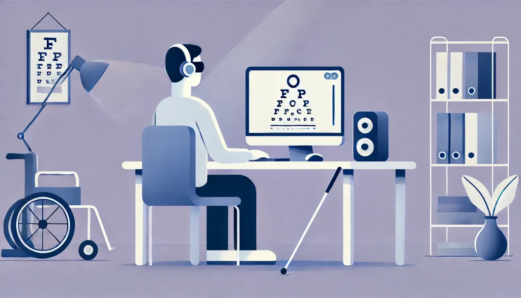
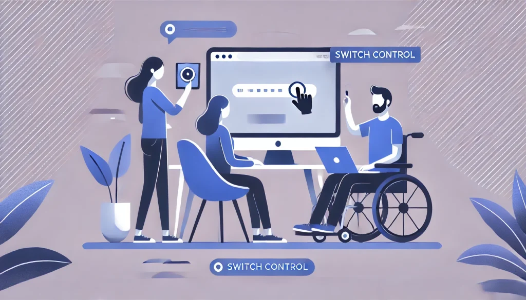
6. Design for Assistive Technology: Think Beyond the Screen

Many users rely on assistive technologies like screen readers, switch controls, voice input, or braille displays. If your design isn’t compatible with these tools, it’s effectively invisible to them.
How to apply:
- Logical Reading Order: Make sure the content flows logically when read aloud by a screen reader.
- Descriptive Links and Buttons: Avoid vague labels like “Click here.” Use meaningful, context-rich text like “Download the annual report.”
- Live Region Announcements: Use ARIA live regions to notify users of changes (e.g., form submission errors) without forcing them to hunt for updates.
Pro tip: Use screen reader simulators or test with real assistive devices (e.g., NVDA, JAWS, or VoiceOver).
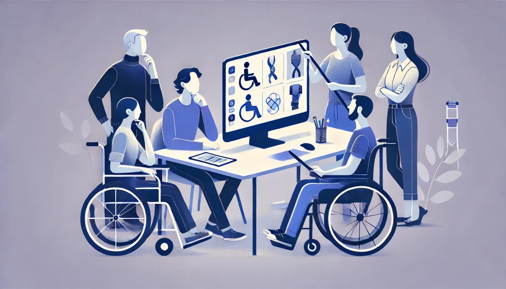
7. Involve Real Users: Test with Diverse Abilities
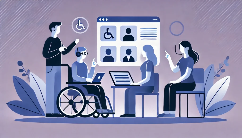
Designing for accessibility is good. Designing with accessibility in mind—by involving people with disabilities—is better.
How to apply:
- Inclusive User Research: Include users with a range of disabilities during interviews, testing, and usability studies.
- Persona Expansion: Build accessibility considerations into user personas (e.g., someone who’s blind, has dyslexia, or limited dexterity).
- Feedback Loops: Keep gathering feedback from users with different abilities post-launch, and iterate.
Pro tip: Partner with accessibility advocates or organizations to recruit diverse testers and gain deeper insights.
Final Thoughts: Accessibility Is Everyone’s Job
Accessibility in UX isn’t just about ticking boxes or passing audits—it’s about empathy, usability, and building inclusive experiences that reflect the diversity of the real world. It makes your product better for everyone, not just for users with disabilities. For example, captions help users in noisy environments. Keyboard-friendly interfaces benefit power users. Clear content aids non-native speakers.
As a UX designer, you wield the tools to dismantle digital barriers. Apply these 7 accessibility principles to your workflows—not just at the end, but right from the start. Advocate for accessibility in your teams. And remember: inclusion isn’t a feature. It’s a foundation.
Also Read: How to Design for Everyone: A Guide to Accessible UI/UX


