
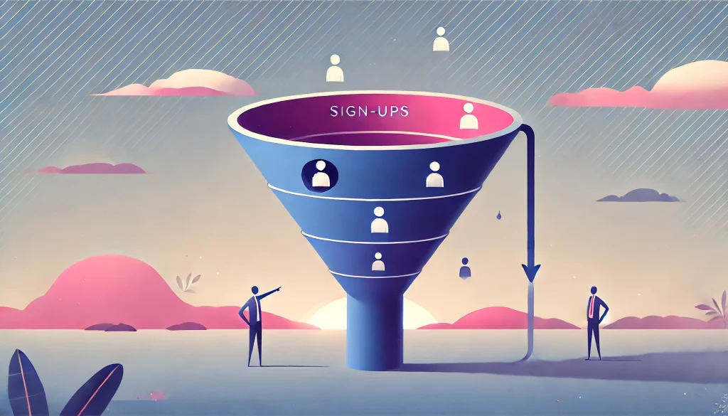
40-60% of users who sign up for your SaaS product will log in once and disappear forever. Not because your product is bad, but because they got lost in those critical first five minutes.
Think about it. A user just gave you their email address. They’re excited, they’re curious, they’re ready to solve their problem. Then they land on your dashboard and… nothing. No guidance. No clear next step. Just a blank screen staring back at them. They close the tab, intending to come back later. They never do.
This is the onboarding crisis, and it’s costing you more than you think.
The difference between acquisition (getting someone to sign up) and activation (getting them to actually use your product) is the difference between a lead and a customer. You can have a thousand signups, but if none of them activate, you have nothing.
The goal isn’t to show features. It’s not to give a grand tour of every button and dropdown menu. The goal is to reduce the Time-to-Value (TTV) to zero. Get your users to their “Aha! Moment” as fast as humanly possible.
Effective onboarding is just one part of a comprehensive SaaS UI/UX Design Strategy, but it’s arguably the most critical part. Everything else, your beautiful interface, your powerful features, your brilliant engineering means nothing if users bounce before they see it.
This guide is your implementation manual. We’re going to break down the psychology, the proven patterns, the real-world examples, and the metrics you need to turn signups into active users.
The Psychology of Onboarding (Why Users Click)

The “Aha! Moment” Explained
Every successful SaaS product has an “Aha! Moment,” that exact second when a user realizes, “This tool is going to save me time, money, or sanity.”
For Slack, it’s when you send your first message and see how fast communication flows. For Zoom, it’s when you start your first video call and realize it actually works without technical headaches. For Dropbox, it’s when you drag a file into a folder and watch it sync across devices in real-time.
The Aha! Moment isn’t about understanding your product. It’s about experiencing its value firsthand. It’s visceral, immediate, and emotional. Your entire onboarding process should be engineered to deliver this moment as quickly as possible.
What’s your product’s Aha! Moment? If you can’t answer this in one sentence, you have a problem. Go talk to your happiest customers and ask them: “When did you realize this product was valuable?” Their answer is your North Star.
The Zeigarnik Effect (Checklists)
Humans hate unfinished tasks. This psychological phenomenon, called the Zeigarnik Effect, explains why you can’t stop thinking about that half-watched Netflix series or that project you started but never completed.
Smart SaaS companies weaponize this effect with progress indicators and checklists. The trick is to start users at 20% completion right from the start. Why? Because they’ve already “created their account,” so they’re not staring at 0%. This small psychological nudge makes a massive difference.
✓ Account Created (20%)
○ Add Your First Project (40%)
○ Invite Team Members (60%)
○ Complete Your Profile (80%)
○ Generate Your First Report (100%)
Look at that checklist. You’re already 20% done! Don’t you want to finish? That’s the Zeigarnik Effect in action. LinkedIn uses this brilliantly with their profile completion bar. Even successful professionals can’t resist getting to 100%.
The key is to make each step genuinely valuable, not just busywork. Each completed task should move users closer to that Aha! Moment, not further from it.
Proven Onboarding Patterns (The “How-To”)
1. Contextual Guidance (vs. The “Product Tour”)
Let’s be honest: the traditional product tour is dead. You know the one, where a modal dialog forces you through 15 steps of “Click here, then click here, now click Next, Next, Next” while you frantically look for the skip button.
Users don’t skip these tours because they’re lazy. They skip them because they’re trying to accomplish something specific, and your tour is getting in the way. It’s like being forced to watch a training video when you just want to use the bathroom.
The solution is contextual tooltips. These are small, unobtrusive bubbles that appear only when a user interacts with a specific feature for the first time. They provide just-in-time information exactly when it’s needed.
Bad Example: “Welcome to our dashboard! Let me show you where everything is…” (15 steps later) “…and that’s how you export data!”
Good Example: User hovers over the export button for the first time. A small tooltip appears: “Export your data as CSV or PDF.” That’s it. No interruption. No friction.
Intercom, Appcues, and Userflow have made this pattern their entire business model. There’s a reason it works.
2. The “Empty State” Strategy
Here’s a problem most designers ignore: a dashboard with no data looks broken. A user logs in, sees empty charts, blank tables, and zero activity, and their first thought is, “Did something go wrong?”
This is called the Empty State Problem, and it’s one of the biggest onboarding killers.
The solution comes in three flavors:
Option A: Dummy Data
Pre-populate the dashboard with sample data that shows what the interface looks like when it’s working. Make it clear it’s demo data with a banner: “This is sample data to show you around. Add your real data to get started.”
Option B: Templates
Instead of starting from scratch, offer pre-built templates. Notion does this brilliantly. You never see a blank page. You see 50 template options for meeting notes, project plans, and team wikis.
Option C: Visual Guidance
If you can’t use dummy data, use illustrations and clear calls-to-action. Show users exactly what will appear in this empty space and give them a big, obvious button to create it.
Bad Empty State: [Blank white space with a tiny “Add Data” link in the corner]
Good Empty State: [Friendly illustration] + “Your projects will appear here. Ready to create your first one?” + [Big “Create Project” button]
3. Persona-Based Onboarding
Not all users are the same, so why would you onboard them the same way?
The smartest SaaS companies ask one simple question during signup: “What is your role?” or “What are you trying to accomplish?”
Based on the answer, they customize the entire onboarding experience:
- Marketers see campaign templates and analytics dashboards
- Developers get API keys and integration guides
- Admins land on team management and security settings
HubSpot does this masterfully. Depending on whether you select “Marketing,” “Sales,” or “Service,” you get a completely different first-time experience tailored to your goals.
This isn’t just good UX. It’s good business. When users see content relevant to their role, they’re 3x more likely to activate because they immediately understand how the product fits their workflow.
4. The “Do It For Me” Button (AI)
Here’s the newest pattern in onboarding: don’t teach users how to do something. Just do it for them.
Instead of a tutorial on “How to Build Your First Report,” imagine a button that says “Generate Report with AI” and creates a fully formatted report based on their connected data in 10 seconds.
This is the future of onboarding. Users don’t want to learn your interface. They want results. AI-powered shortcuts get users to value instantly, then they can learn the details later if they care.
Canva does this with their “Magic Design” feature. Upload a few photos, click one button, and boom, you have a professional presentation. You didn’t learn anything about Canva’s interface, but you got value immediately. That’s the point.

5. Frictionless Sign-Up (SSO)
Every additional field in your signup form is a conversion killer. Every password requirement, every email confirmation, every mandatory step is a chance for users to abandon the process.
The gold standard is Single Sign-On (SSO).
“Sign up with Google” or “Sign up with Microsoft” removes 90% of the friction. No password to remember. No email to confirm. Just two clicks and they’re in.
Some companies worry about email verification. “What if it’s not a real email?” Here’s the counterintuitive truth: let them in first, verify later. Get them to experience value before you ask for verification. Once they’ve had their Aha! Moment, they’ll gladly confirm their email to keep using the product.
Notion, Figma, and Airtable all follow this pattern. Sign up with Google, land directly in the product, start creating. Email verification can wait.
Real-World Examples (Case Studies)
Slack (The “Bot” Approach)
Slack’s onboarding is legendary because they turned a traditionally dry experience into a conversation.
When you first join Slack, you don’t see a tutorial or a product tour. You see Slackbot, an automated assistant that chats with you like a colleague. It teaches you how to send messages, create channels, and customize settings through natural dialogue.
Why this works: It’s interactive, it’s friendly, and it mimics the exact activity you’ll be doing in Slack every day (having conversations). You learn by doing, which is the most effective form of learning.
The genius move is that Slackbot stays with you forever. Whenever you use a keyboard shortcut, it congratulates you. Whenever you seem stuck, it offers help. It’s ambient guidance that never gets in the way.
Notion (The “Template” Approach)
Notion solved the blank page problem better than anyone. When you sign up, you’re immediately presented with a gallery of templates: meeting notes, project trackers, personal journals, company wikis.
You never start from zero. You start from 80% complete, then customize from there.
Why this works: It demonstrates value immediately. You see what’s possible before you learn how to build it. It’s aspirational. Users think, “I want my workspace to look like that.”
Templates also serve as silent tutorials. By exploring a pre-built template, you learn Notion’s building blocks (databases, linked pages, toggles) without sitting through a tutorial.
Grammarly (The “Demo” Approach)
Grammarly’s onboarding is brilliantly simple. They give you a demo document filled with intentional errors and say, “Fix this.”
You immediately start editing, seeing real-time suggestions, and experiencing the product’s value. Within 30 seconds, you’ve corrected grammar, improved clarity, and adjusted tone. You didn’t learn about Grammarly’s features. You experienced them.
Why this works: Learning by doing is exponentially more effective than learning by watching. The demo is low-stakes (you can’t break anything) and high-value (you see immediate results).
This pattern works for any SaaS product. Instead of explaining what your product does, give users a sandbox to play in with pre-populated data and let them discover value themselves.
Metrics: How to Measure Success
Defining Your Activation Metric
Here’s a critical mistake: treating “signup” or “login” as your activation metric.
Creating an account is not activation. Logging in is not activation. Those are prerequisite steps, not value moments.
Your activation metric should be the smallest action that correlates with long-term retention. This is different for every product:
- Dropbox: User uploads at least one file
- Slack: Team sends 2,000 messages
- Facebook: User adds 7 friends in 10 days
- Twitter: User follows 30 accounts
- Asana: User creates a project and adds at least one task
For your product, ask yourself: “What is the minimum viable action that indicates someone understands and will continue using this product?”
Once you define this metric, measure what percentage of signups reach it within the first 7 days. That’s your activation rate, and it’s the single most important metric for early-stage SaaS growth.
Once users activate, the next challenge is presenting meaningful data. Learn how to design smarter dashboards that visualize complex SaaS data.
Analyzing Drop-Off Points
You can’t fix what you don’t measure. Tools like Mixpanel, Amplitude, or Heap let you build funnel reports that show exactly where users abandon your onboarding flow.
A typical funnel might look like this:
1,000 users signed up
800 completed profile setup (20% drop)
600 connected a data source (25% drop)
400 created their first project (33% drop)
300 invited a team member (25% drop)
Look at that. You’re losing 33% of users between connecting data and creating a project. That’s your problem area. That’s where you need to focus.
Maybe the “Create Project” button isn’t prominent enough. Maybe users don’t understand what a “project” is in your system. Maybe the form is too long. You won’t know until you investigate, but at least you know where to look.
Run this analysis monthly. Onboarding is never “done.” It’s an ongoing optimization process.
As your product grows, a scalable design system ensures onboarding flows remain consistent across features.
Common Mistakes to Avoid
Mistake 1: Front-Loading Value (Making Them Watch Before They Touch)
The worst onboarding flows force users to watch a video, read documentation, or complete a tutorial before they can touch the product.
Users came here to solve a problem, not to go back to school. Let them play first, learn later. Provide help resources for those who want them, but never block the experience with mandatory education.
Mistake 2: Asking for Credit Cards Too Early
Nothing kills conversion faster than asking for payment information before users experience value. If you’re worried about free trial abuse, implement usage limits instead of paywalls.
The sequence should always be: Experience Value → Understand Benefits → See Pricing → Convert. Not the other way around.
Mistake 3: Zero-State Confusion (Leaving Them Alone on a Blank Page)
We covered this earlier, but it’s worth repeating because it’s so common. Never, ever leave a new user staring at an empty dashboard with no guidance.
If you can’t show demo data or templates, at minimum provide a clear call-to-action with a big button that says “Get Started” and leads somewhere meaningful.
The blank page might feel clean to designers, but to users, it feels broken.
FAQ
What is a good user activation rate for B2B SaaS?
Industry benchmarks vary widely, but most successful B2B SaaS products aim for a 25-40% activation rate within the first 7 days. Anything above 40% is excellent. Below 20% indicates serious onboarding problems. The key is defining what “activation” means for your specific product, then relentlessly optimizing toward that metric.
How do you calculate Time-to-Value (TTV)?
TTV is measured as the time between signup and the moment a user completes your defined activation metric. If your activation metric is “user creates first report,” and it takes an average of 45 minutes from signup to report creation, your TTV is 45 minutes. The goal is to reduce this number as much as possible without sacrificing quality.
What is the difference between User Onboarding and User Activation?
Onboarding is the process, the steps and experiences you design to guide new users. Activation is the outcome, the measurable moment when a user experiences core value and is likely to return. You can have great onboarding that fails to activate users if it doesn’t lead them to meaningful actions quickly enough.
How long should the onboarding process take for a new user?
For simple SaaS products, aim for 5-10 minutes maximum. For complex enterprise tools, 20-30 minutes is acceptable. The critical principle is that users should reach their first moment of value within this timeframe, even if they don’t fully understand every feature. You can teach advanced capabilities later.
Why do users drop off during the sign-up process?
Common culprits include too many required fields, unclear value propositions, slow loading times, confusing navigation, technical errors, lack of SSO options, mandatory email verification before product access, and poor mobile optimization. Each additional friction point compounds, so removing even one obstacle can significantly improve conversion rates.
If churn continues after onboarding, conduct a UX audit to identify hidden friction points costing you retention.
What is the Zeigarnik Effect in user onboarding?
The Zeigarnik Effect is a psychological principle stating that people remember incomplete tasks better than completed ones and feel compelled to finish them. In onboarding, this manifests as progress bars and checklists that show users they’re already partway through setup, motivating them to complete the remaining steps.
Should I use a product tour or a checklist?
Use both, but strategically. Checklists guide the overall onboarding journey and leverage the Zeigarnik Effect. Contextual tooltips (mini-tours) provide just-in-time guidance when users interact with specific features. Avoid mandatory full-screen product tours that force users through every feature before they can use the product.
How does “perceived value” impact onboarding success?
Perceived value is what users believe they’ll gain versus what they’ll have to invest (time, effort, money). If setup feels like it will take 30 minutes and users aren’t sure they’ll benefit, they’ll abandon. The solution is to demonstrate quick wins early, using dummy data, templates, or AI-assisted features to show value before asking for significant time investment.
How do you onboard users for a complex enterprise SaaS?
For complex products, use role-based onboarding to show only relevant features, offer implementation specialists or dedicated onboarding calls for high-value accounts, create a sandbox environment with pre-populated data so users can explore safely, break onboarding into phases where core features are learned first and advanced capabilities come later, and provide video walkthroughs and documentation for self-service learning.
How do you fix the “Empty State” problem in dashboards?
Use dummy data to show what the dashboard looks like when populated, offer templates so users start with pre-built configurations, display illustrations with clear CTAs explaining what will appear in the empty space, use progressive disclosure to hide empty sections until users have data to populate them, and provide a prominent “Import Data” or “Connect Source” button that’s impossible to miss.
Conclusion: Your Action Plan

Onboarding isn’t a one-time project. It’s an ongoing optimization process that directly impacts your activation rate, retention, and ultimately, revenue.
Start here:
- Define your activation metric – What specific action indicates a user has experienced value?
- Map your current funnel – Where are users dropping off?
- Implement quick wins – Add contextual tooltips, fix empty states, reduce signup friction
- Test persona-based approaches – Can you customize onboarding based on user roles?
- Measure relentlessly – Track your activation rate weekly and iterate
Remember, the goal isn’t to show every feature. The goal is to get users to their Aha! Moment as fast as possible. Everything else is secondary.
Your users are ready to love your product. Don’t let poor onboarding get in the way.