
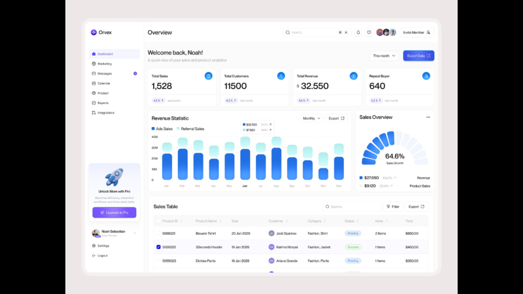
SaaS UI/UX design is the process of creating simple, useful, and easy-to-navigate experiences for Software-as-a-Service applications. It helps people complete tasks, understand information, and use software without unnecessary confusion.
Good SaaS UX design goes beyond attractive screens. It improves how users interact with dashboards, forms, navigation, onboarding flows, and everyday workflows.
For example, consider a sales manager using a customer relationship management (CRM) platform. The manager should be able to check team performance, find customer information, and review sales opportunities without moving through multiple confusing screens.
This is where effective SaaS product design makes a difference.
In this guide, you’ll learn SaaS UX best practices, essential UI design patterns, real product examples, the design process, common mistakes, and ways to measure UX performance.
What Is SaaS UI/UX Design?
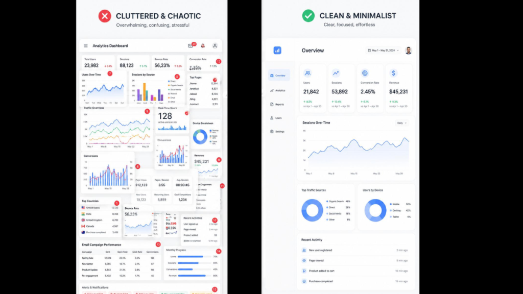
SaaS UI/UX design focuses on making cloud-based software easy to understand, efficient to use, and consistent across different workflows. It combines user interface design (UI) with user experience design (UX).
UI design focuses on what users see and interact with, including buttons, menus, icons, forms, tables, and dashboards.
UX design focuses on how the product works, how users complete tasks, and whether the overall experience helps them achieve their goals.
For example, in a project management platform:
- UI design determines how the task board, buttons, filters, and navigation appear.
- UX design determines how easily users can create projects, assign tasks, track progress, and collaborate.
Both are important. A well-designed interface should look clear and help users work efficiently.
How Is SaaS UX Different from Traditional Website UX?
A marketing website usually helps visitors learn about a company, explore its services, or make a purchase.
A SaaS application is different because users often return to it every day to complete specific tasks.
| Factor | Website UX | SaaS UX Design |
| Main goal | Inform or convert visitors | Help users complete tasks |
| User interaction | Browsing and navigation | Repeated workflows and actions |
| Interface complexity | Often limited | Can involve complex information |
| Personalization | Usually basic | Often based on user roles |
| Success metrics | Leads, conversions, engagement | Activation, task success, retention |
| Common examples | Corporate websites, landing pages | CRM, ERP, analytics platforms |
For SaaS applications, the challenge is not only making a good first impression. The product should remain easy to use as customers become more experienced.
This is especially important in B2B SaaS UX design, where different users may have different responsibilities, access permissions, and information needs.
Why Is SaaS UX Design Important?
Good SaaS UX design helps users understand the product, complete important tasks, and find value in the software.
A product may offer powerful features, but those features have limited value when users struggle to find or use them.
1. Makes Onboarding Easier
New users need to understand what the product does and how to begin.
A complicated signup process, unclear setup instructions, or an empty dashboard can make the experience difficult.
Effective SaaS onboarding guides users toward their first meaningful result.
For example, a project management tool can help a new user create their first project, add tasks, and invite a teammate instead of showing every feature immediately.
2. Reduces User Friction
User friction occurs when people face unnecessary difficulties while completing a task.
Common examples include:
- Confusing navigation
- Too many form fields
- Unclear error messages
- Repeated data entry
- Important actions hidden inside menus
Removing these obstacles makes routine work easier and more predictable.
3. Supports Product Adoption
Product adoption happens when users start using a product’s features as part of their regular work.
Clear navigation, helpful feedback, and well-organized features can make it easier for users to adopt new workflows.
For example, contextual guidance can help an existing CRM user understand a newly introduced reporting feature without searching through documentation.
4. Supports Customer Retention
When users can complete their work reliably, they have fewer reasons to abandon a product because of usability problems.
However, UX is only one factor influencing SaaS retention. Product value, pricing, reliability, customer support, and competitive alternatives also matter.
5. Helps SaaS Products Scale
As a SaaS product grows, it often gains new features, user roles, dashboards, and integrations.
A consistent interface and scalable design system make it easier to introduce these changes without creating an unnecessarily complicated experience.
Build a Better SaaS User Experience
From complex dashboards to seamless user journeys, F1 Studioz helps businesses design intuitive, scalable SaaS products that users love.
Talk to Our UX Experts →SaaS UI/UX Design Best Practices
The most useful SaaS UX best practices are clear navigation, simple onboarding, consistent components, meaningful feedback, accessible interfaces, and workflows built around real user needs.
Here are the principles that matter most when designing a SaaS application.
1. Keep Navigation Simple
SaaS navigation should help users find important features without unnecessary searching.
Group related functions together and use labels that people already understand.
For example, a CRM platform might organize its primary navigation around:
- Dashboard
- Contacts
- Companies
- Deals
- Reports
- Settings
Avoid adding every feature to the main menu. Less frequently used functions can be placed in relevant sections.
For complex enterprise applications, role-based navigation can help people focus on the features needed for their work.
Best practice: Test navigation with real users to check whether they can find important features quickly.
2. Design Around User Roles
Different users may need different information from the same SaaS application.
Consider a sales platform:
| User role | Main requirement | Useful interface elements |
| Sales representative | Manage daily sales activities | Tasks, contacts, follow-ups |
| Sales manager | Monitor team performance | Pipeline, reports, targets |
| Administrator | Manage platform access | Permissions, accounts, settings |
| Business leader | Review business performance | Trends, forecasts, key metrics |
Showing every user the same dashboard can create unnecessary complexity.
A better approach is to prioritize information based on responsibilities while allowing users to access additional features when needed.
This approach is particularly useful in enterprise UX design and multi-user SaaS platforms.
3. Make Onboarding Action-Oriented
Successful SaaS onboarding should help users complete a meaningful task rather than simply explain the interface.
Instead of displaying a long product tour, guide users through the actions that provide value.
For example, an email marketing platform could help users:
- Create their first audience.
- Import contacts.
- Choose a campaign template.
- Preview an email.
- Send a test campaign.
A progress indicator can help users understand what they have completed and what comes next.
Helpful onboarding patterns include sample data, contextual tooltips, setup checklists, and clear empty states.
For a deeper explanation, read our SaaS onboarding and activation guide.
4. Use Consistent UI Components
Consistency makes SaaS applications easier to learn.
Buttons, forms, menus, icons, notifications, and filters should behave predictably across different screens.
For example, if a blue primary button represents the main action on one page, using the same visual treatment for similar actions elsewhere can reduce confusion.
A design system helps teams define and reuse these components.
It can include:
- Typography and color rules
- Buttons and form elements
- Navigation patterns
- Data tables and cards
- Spacing and layout guidelines
- Interaction states
- Accessibility requirements
As a SaaS platform grows, consistent components also make collaboration between designers and developers easier.
Learn more in our SaaS design systems guide.
5. Make Dashboards Easy to Understand
A SaaS dashboard should help users understand important information and decide what action to take.
The goal is not to display as much data as possible.
For example, a customer support dashboard might prioritize:
- Open support tickets
- Urgent customer issues
- Average response time
- Pending assignments
- Recent support activity
Additional reports and detailed analytics can be available through filters and drill-down views.
Use clear headings, readable charts, meaningful labels, and consistent number formatting.
Where possible, connect insights to relevant actions.
For more practical patterns, explore our SaaS dashboard design guide.
6. Reduce Unnecessary Steps
Every extra interaction adds effort, especially when users repeat the same task every day.
Look for opportunities to simplify workflows without removing necessary controls.
For example, a finance SaaS product could allow users to approve multiple eligible expenses in a batch rather than opening every expense individually.
Other useful patterns include smart defaults, autocomplete, saved filters, keyboard shortcuts, and inline editing.
However, fewer clicks do not always mean better UX. A high-risk financial action may need additional confirmation.
The goal is to remove unnecessary effort, not important safeguards.
7. Design Clear Feedback and Error Messages
Users should understand what happens after they perform an action.
When a user saves a report, uploads a file, or changes a setting, the interface should clearly communicate the result.
Useful feedback includes:
- Success messages
- Loading indicators
- Validation messages
- Warning notifications
- Undo options
- Confirmation before important actions
Instead of displaying an unclear error such as “Something went wrong,” explain what happened and what the user can do next.
For example:
“Your file could not be uploaded because it exceeds the supported size. Please choose a smaller file.”
Clear feedback helps users recover from errors without unnecessary support requests.
8. Build Accessibility into the Design
Accessible SaaS design helps people with different abilities use a product effectively.
Important considerations include readable text, sufficient color contrast, keyboard navigation, visible focus indicators, descriptive labels, and screen-reader support.
For data-heavy applications, avoid using color alone to communicate status.
For example, an overdue task should include a clear text label rather than relying only on a red indicator.
The WCAG 2.2 guidelines provide a useful reference for accessible digital interfaces.
Accessibility requirements can also depend on the product, jurisdiction, and applicable regulations.
SaaS UI Design Patterns Every Product Should Consider
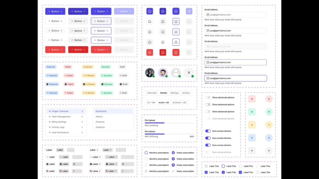
UI design patterns are reusable solutions to common interaction problems.
A good SaaS interface uses familiar patterns where they help users complete tasks more easily.
| UI pattern | What it does | Example use |
| Sidebar navigation | Organizes product features | CRM and project management |
| Search and filters | Helps users find specific information | Customer databases |
| Data tables | Displays detailed records | Financial and analytics platforms |
| Progressive disclosure | Reveals complexity when needed | Advanced settings |
| Empty states | Guides users when no data exists | New dashboards |
| Bulk actions | Supports repetitive tasks | Email and inventory tools |
| Role-based dashboards | Prioritizes relevant information | Enterprise SaaS |
| Status indicators | Communicates progress and outcomes | Task management |
When Should You Use Progressive Disclosure?
Progressive disclosure means showing users the most important information first and revealing additional details when needed.
For example, a reporting dashboard may display total revenue, growth, and important alerts.
Users who need more information can open a detailed report or apply filters.
This helps beginners avoid unnecessary complexity without limiting experienced users.
How Should SaaS Applications Handle Empty States?
An empty state appears when a page has no content to display.
Instead of showing a blank screen, explain why the page is empty and provide a useful next action.
For example:
No projects yet. Create your first project to start organizing your team’s work.
You can also provide templates, sample data, or setup guidance where appropriate.
Real SaaS UI/UX Design Examples
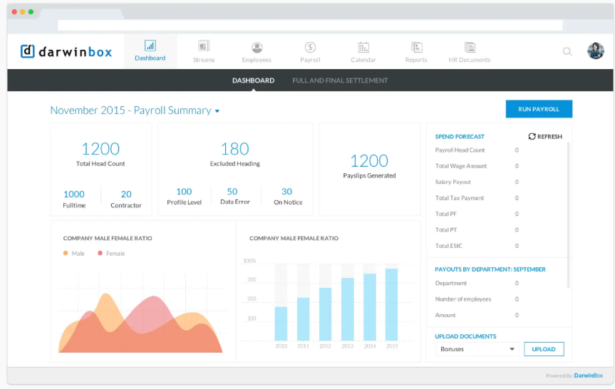
Studying established SaaS products can help teams understand how common UX problems are addressed.
These examples illustrate design approaches rather than prove that one product has better usability than another.
1. Notion: Flexible Workspaces
Notion combines documents, databases, and project workflows in a flexible workspace.
Its use of reusable templates provides a useful example of how SaaS products can help users get started without creating everything from scratch.
UX lesson: Templates and sensible defaults can reduce setup effort, but too many configuration choices can also overwhelm new users.
2. Linear: Task-Focused Navigation
Linear is a useful example for studying issue tracking, project organization, and keyboard-driven workflows.
The product emphasizes moving between tasks and maintaining context during everyday work.
UX lesson: For frequently repeated workflows, fast navigation and predictable interactions may be more useful than decorative interface elements.
3. Stripe: Clear Financial Workflows
Stripe provides a useful reference for studying payment-related workflows, transaction data, developer tools, and financial dashboards.
Its interfaces demonstrate the importance of organizing complex information around specific tasks.
UX lesson: Financial interfaces should communicate data accurately, make transaction status clear, and support efficient investigation of issues.
4. Slack: Communication and Feedback
Slack offers useful examples of message organization, channel-based navigation, notifications, and collaboration workflows.
Its interface also demonstrates how user preferences influence notification management.
UX lesson: Collaboration software should make important communication easy to find while helping users manage interruptions.
What these SaaS products have in common: Their interfaces are designed around recurring user activities rather than visual appearance alone.


The SaaS UX Design Process
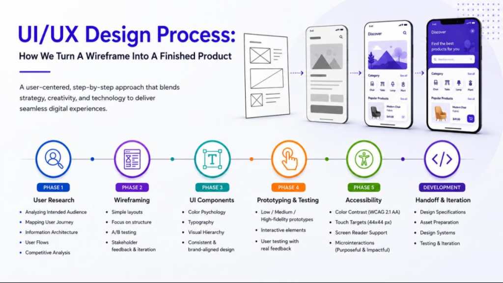
A structured SaaS UX design process helps teams understand user needs before investing heavily in interface development.
The following five stages provide a practical starting point.
Step 1: Research Your Users
Start by learning who uses the product, what they need to achieve, and where they experience difficulties.
Useful UX research methods include:
- User interviews
- Surveys
- Usability testing
- Customer support analysis
- Product analytics
- Competitor research
For example, if users regularly abandon an onboarding flow, investigate where they stop and why.
Do not assume the problem is always the screen design. Users may also be confused about the product’s value or setup requirements.
Step 2: Plan User Flows and Navigation
Once the main user problems are clear, organize the product around important tasks.
Create user flows that show how people move from one step to another.
For example:
Login → Dashboard → Open Project → Assign Task → Save Changes
At this stage, define navigation, information architecture, user permissions, and relationships between product features.
Complex B2B SaaS platforms may benefit from object-oriented UX thinking, where the interface reflects familiar business objects such as contacts, deals, tasks, and projects.
Step 3: Create Wireframes
Wireframes are simple layouts that show how a screen will be organized.
They help teams test navigation, content hierarchy, and user flows before spending time on detailed visual design.
Tools such as Figma can be used to create low-fidelity wireframes.
Focus on whether users can understand the layout and complete important tasks.
Step 4: Build and Test Prototypes
An interactive prototype helps people experience important workflows before development.
Prototypes should cover more than the ideal user journey.
Test situations such as:
- Incorrect information
- Missing data
- Failed uploads
- Loading delays
- Limited permissions
- Unexpected user actions
These scenarios are important because real users rarely follow a perfectly planned path.
Step 5: Test, Improve, and Measure
Usability testing helps teams find problems before and after launch.
Ask representative users to complete realistic tasks and observe where they struggle.
Measure task completion, errors, time on task, and user feedback.
Use the findings to improve the product and test again.
SaaS UX design is an ongoing process. User expectations, product requirements, and business needs change over time, so the experience should continue to improve.
How to Improve SaaS Onboarding and Retention
Onboarding and retention are connected, but they measure different parts of the customer experience.
Onboarding helps users understand the product and reach an initial useful outcome.
Retention reflects whether users continue returning and finding value over time.
Improve the First User Experience
A good first experience should help users understand:
- What the product does
- What they should do first
- How to complete a useful action
- Where to find help
Avoid forcing users to configure every feature before they can experience value.
Improve Everyday Workflows
Once users become familiar with the product, speed and efficiency become more important.
Consider introducing saved views, bulk operations, recent items, keyboard shortcuts, and personalized settings based on actual user needs.
Use UX Audits to Identify Friction
A UX audit reviews an application to identify usability problems.
It may examine navigation, forms, user flows, content clarity, visual consistency, and accessibility.
A useful audit should explain what the issue is, who it affects, how serious it is, and what should be improved first.
Read our guide to SaaS UX audits and churn to understand how usability issues can influence the customer experience.
How to Measure SaaS UX Performance
SaaS UX performance is best measured through a combination of usability metrics and product outcomes. No single number can explain the quality of the entire experience.
| UX metric | What it measures | Why it matters |
| Task success rate | Percentage of tasks completed successfully | Measures usability |
| Time on task | Time needed to complete a task | Shows workflow efficiency |
| Error rate | Mistakes during task completion | Reveals friction |
| Activation rate | Users reaching a defined first-value event | Measures early adoption |
| Time-to-value | Time taken to reach a meaningful outcome | Evaluates onboarding |
| Feature adoption | Usage of a specific feature | Shows whether users find it useful |
| Retention rate | Users continuing over a defined period | Measures ongoing engagement |
How Do You Measure the ROI of SaaS UX Design?
To measure SaaS UX ROI, compare the product’s performance before and after a design improvement.
For example, if a product team redesigns an onboarding workflow, it can monitor:
- How many users finish onboarding
- How long setup takes
- How many users experience errors
- How many support requests relate to setup
- How many users reach the activation event
Where possible, use controlled experiments or comparable user cohorts to distinguish the impact of UX changes from other influences.
This provides stronger evidence than assuming every business improvement was caused by a redesign.
Common SaaS UX Design Mistakes
Even products with useful features can create frustrating experiences when basic UX problems are ignored.
1. Showing Too Many Features at Once
Overloading the interface with options makes it harder for users to identify important actions.
Better approach: Prioritize common workflows and reveal advanced functionality when needed.
2. Designing Without User Research
Teams sometimes organize products around internal assumptions instead of real user behavior.
Better approach: Use interviews, product analytics, and usability testing to understand what users actually need.
3. Ignoring Empty and Error States
A polished main screen does not help users when they encounter missing information or an unexpected error.
Better approach: Design loading, empty, success, warning, and failure states alongside the main interface.
4. Making Dashboards Too Complex
Adding charts and metrics without a clear purpose can make reports difficult to understand.
Better approach: Organize dashboard information by user role, priority, and decision-making needs.
5. Ignoring Mobile Workflows
Some B2B SaaS applications are mainly used on desktop, but users may still need mobile access for approvals, alerts, or quick updates.
Better approach: Prioritize the tasks users actually need on smaller screens rather than shrinking every desktop feature.
6. Failing to Maintain UI Consistency
Different component styles and interaction patterns create unnecessary learning effort.
Better approach: Establish shared UI standards and maintain them as the product grows.
SaaS UX Design for Different Industries
Different industries have different user needs, workflows, and risks. SaaS design should reflect these requirements.
FinTech SaaS UX Design
Financial software often involves sensitive information, transactions, reporting, and complex data.
Important UX considerations include clear financial tables, accurate labels, understandable transaction status, permission controls, and confirmation for high-impact actions.
For example, users should be able to distinguish between a pending payment, a successful transaction, and a failed transaction without relying only on color.
HealthTech SaaS UX Design
Healthcare applications may serve clinicians, administrators, patients, and support teams.
Their workflows can involve sensitive information and decisions where mistakes have serious consequences.
Useful design priorities include accessible controls, clear patient information, reliable error handling, and workflows that support interruptions.
Healthcare applications should also be designed according to the privacy, safety, and accessibility requirements applicable to their intended markets.
MarTech SaaS UX Design
Marketing technology platforms often involve campaign management, analytics, automation, and customer segmentation.
Users need to work with complicated information while completing repetitive tasks.
Useful patterns include campaign templates, editable workflows, filters, preview tools, and clear performance dashboards.
Enterprise SaaS UX Design
Enterprise platforms often support multiple departments, teams, and permission levels.
Their interfaces may need to handle large datasets, complex approval processes, and integration with other business systems.
Role-based navigation, reusable components, accessible data tables, and well-organized workflows are especially important.
How Much Does SaaS UI/UX Design Cost?
SaaS UI/UX design costs depend on the scope, complexity, research requirements, number of user roles, and the level of design support needed.
A small SaaS application with a few core workflows usually requires less design effort than a large enterprise platform with multiple dashboards, integrations, and permission levels.
The cost can also change depending on whether the project involves:
- A new product or an existing application
- UX research and usability testing
- Wireframing and interactive prototypes
- UI component design
- A design system
- Accessibility reviews
- Developer handoff and ongoing improvements
Freelancer vs. Agency vs. In-House Team
| Option | Best suited for | Main consideration |
| Freelance designer | Specific features or smaller projects | Availability and specialist coverage |
| UX design agency | Cross-functional projects and redesigns | Scope, coordination, and external cost |
| In-house designer | Continuous product improvement | Hiring, management, and ongoing investment |
There is no single best choice for every SaaS company.
An early-stage business may benefit from focused external support, while an established SaaS company may need an in-house design team supported by specialist partners.
Before comparing costs, define the outcomes you expect, the workflows involved, and the design deliverables required.
AI-Powered SaaS UX Design in 2026
AI is changing how users interact with SaaS applications.
Instead of relying only on menus, filters, and manual searches, users can increasingly interact with AI assistants to find information, summarize data, and complete supported tasks.
For example, a sales manager might ask an AI-enabled CRM:
“Show me deals that have not progressed in the last 30 days.”
The application could identify the relevant records, explain the results, and provide a filtered view.
However, adding an AI assistant does not automatically improve user experience.
Best Practices for AI-Powered SaaS Interfaces
Make AI actions understandable. Users should know what the system is doing and what information it is using.
Provide supporting information. Important recommendations should be accompanied by relevant data or explanations.
Allow users to review actions. High-impact changes should not happen without suitable controls.
Communicate uncertainty. AI-generated results can be incomplete or incorrect, so the interface should help users recognize limitations.
Keep familiar workflows available. Traditional navigation, filters, and direct controls may remain more efficient for repetitive tasks.
The strongest AI-powered SaaS experiences combine useful automation with transparency, accessibility, and user control.
SaaS UI/UX Design Checklist
Use this checklist when reviewing a new SaaS application or improving an existing product.
| Area | What to check |
| Navigation | Can users find important features easily? |
| Onboarding | Can new users reach a meaningful outcome? |
| User roles | Does the interface reflect different responsibilities? |
| Dashboard UX | Are the most important metrics and actions easy to find? |
| Forms | Are inputs clear, relevant, and easy to complete? |
| Feedback | Does the product explain success, errors, and loading? |
| Design consistency | Do similar components behave consistently? |
| Accessibility | Can people navigate and understand the interface with different abilities? |
| Mobile UX | Are important mobile tasks practical to complete? |
| Performance | Does the interface remain usable while data loads? |
| AI features | Can users understand, review, and control AI-supported actions? |
| UX measurement | Are task success, adoption, and friction being tracked? |
If multiple areas need improvement, prioritize the problems that have the greatest effect on important user workflows.
How F1 Studioz Approaches SaaS UX Design
At F1 Studioz, our work focuses on experience design, product strategy, and digital product usability.
We work with enterprise organizations, SaaS companies, and B2B technology businesses that need to simplify complex digital experiences.
Our multidisciplinary team brings together UX designers, researchers, product strategists, and engineers to address product challenges involving dashboards, user journeys, multi-user workflows, and scalable interfaces.
Our approach considers both user needs and business requirements.
Experience in Enterprise and SaaS Product Design
Our work includes enterprise UX design, SaaS product design, UX research, data visualization, and scalable design systems.
These capabilities are important when designing software used by different teams, handling complex information, or supporting large numbers of product features.
Examples from Our Work
Energy simulation platform: Our published work includes a design system with more than 1,000 components for an energy simulation platform. This demonstrates the importance of maintaining reusable UI patterns across complex digital products.
Contact center platform: F1 Studioz reports an 80% increase in user adoption for a contact center platform following workflow simplification and usability improvements.
AI-driven revenue platform: Our portfolio also includes work on an AI-driven revenue platform, with a published forecasting-accuracy outcome of 98%.
These are examples of outcomes reported by F1 Studioz and should be understood in the context of their respective projects, not as guaranteed results for other SaaS products.
Explore our company experience and product design approach.
Why Experience Matters in SaaS UX Design
Designing a complex SaaS product requires more than knowledge of interface trends.
Teams need to understand user roles, business processes, system limitations, information architecture, accessibility, and how designs will work during development.
Combining UX research, design, and engineering knowledge helps teams make practical decisions about complex product experiences.
If you are planning a new SaaS product or improving an existing application, connect with our UX design team to discuss your requirements.
Frequently Asked Questions About SaaS UI/UX Design
1. What is SaaS UI/UX design?
SaaS UI/UX design is the process of creating user-friendly interfaces and workflows for cloud-based software applications. It focuses on usability, navigation, dashboards, onboarding, accessibility, and helping users complete tasks efficiently.
2. What makes a good SaaS UX design?
Good SaaS UX design combines clear navigation, simple workflows, consistent UI components, helpful feedback, and accessible interactions. It should be based on actual user needs and evaluated through usability testing.
3. What is the difference between SaaS UI and SaaS UX?
SaaS UI refers to the visible and interactive parts of a software application, such as buttons, forms, and dashboards. SaaS UX covers the complete experience of using the product, including task completion, navigation, and usability.
4. How do you design a SaaS application?
Start with user research, identify important workflows, organize the information architecture, create wireframes, build prototypes, and test the experience. Use the findings to improve the design before and after development.
5. What are SaaS UX best practices?
Important SaaS UX best practices include role-based interfaces, simple onboarding, clear dashboard hierarchy, reusable components, accessible design, meaningful feedback, and testing with representative users.
6. Why is UX important for B2B SaaS?
B2B SaaS applications often involve complex workflows, multiple user roles, and repeated tasks. Good UX helps users access relevant information, reduce unnecessary effort, and work more efficiently.
7. How can SaaS UX design reduce churn?
SaaS UX improvements can address usability problems that contribute to customer frustration. Better onboarding, simpler navigation, clearer workflows, and reliable interactions can support retention when the product also delivers ongoing value.
8. What are the most important SaaS UX metrics?
Useful SaaS UX metrics include task success rate, time on task, error rate, activation rate, time-to-value, feature adoption, and retention. The right metrics depend on the workflow and business objective.
9. What is a SaaS design system?
A SaaS design system is a collection of reusable UI components, interaction guidelines, and design standards. It helps product teams maintain consistency while developing and improving software interfaces.
10. How much does SaaS UX design cost?
SaaS UX design costs depend on product complexity, research needs, workflow requirements, design deliverables, and the team involved. A limited feature redesign and a complete enterprise product redesign require different levels of effort.
11. What are common SaaS UX mistakes?
Common mistakes include complicated onboarding, unclear navigation, crowded dashboards, inconsistent components, weak error handling, and designing features without understanding user needs.
12. How is AI changing SaaS UX design?
AI is introducing conversational interfaces, intelligent search, automated assistance, and data summaries into SaaS applications. Effective AI UX still requires clear feedback, reliable information, transparency, and user control.
13. How often should you redesign a SaaS product?
There is no fixed redesign schedule. SaaS products should be improved continuously based on usability findings, user feedback, product changes, and business needs. A major redesign may be appropriate when existing workflows or architecture no longer support the product.
14. How do you choose a SaaS UI/UX design agency?
Look for relevant SaaS experience, practical case studies, a clear research and testing process, understanding of complex workflows, and the ability to work with product and engineering teams. Ask how the agency measures outcomes and transfers design knowledge.
Conclusion
Good SaaS UI/UX design makes software easier to understand, use, and manage.
Whether you are building a new SaaS platform or improving an existing product, start with user needs. Focus on clear navigation, practical onboarding, useful dashboards, consistent components, and workflows that help people complete tasks.
Continue measuring the experience as the product grows. Usability testing, product analytics, and customer feedback can help identify what needs to improve.
For growing SaaS and enterprise products, the goal is not simply to create attractive screens. It is to build an experience that supports real work, adapts to changing needs, and remains useful over time.