
Responsive design is a way of building websites and product interfaces so a single layout automatically adjusts to fit any screen -phone, tablet, laptop, or ultra-wide monitor -using flexible grids, scalable images, and CSS breakpoints instead of separate versions for each device.
That’s it. That’s the whole concept. Everything else in this guide is about doing it well, especially when your product isn’t a simple marketing site but a dense B2B dashboard where getting this wrong means users can’t actually do their jobs.
Why Responsive Design Still Matters in 2026
It’s a fifteen-year-old idea (Ethan Marcotte coined the term back in 2010), so it’s fair to ask whether it’s still relevant now that most traffic patterns and devices have stabilized. Three reasons it hasn’t gone anywhere:
1. One codebase, one maintenance bill
Every device-specific version you build is another thing that breaks, another thing to test, another thing to update every time your design system changes. A single responsive codebase means one place to fix bugs and one place to ship new features.
2. Google indexes mobile-first -full stop
Google has crawled and ranked sites using the mobile version of their content as the primary basis for indexing since fully rolling out mobile-first indexing. If your mobile experience is broken or stripped-down, that’s the version Google is judging you on, not your desktop site. [Confirm current guidance against Google Search Central’s mobile-first indexing documentation before publishing -link directly.]
3. It’s tied to Core Web Vitals, not just “looks”
Layout shift, load speed, and interaction responsiveness -the metrics Google actually measures for ranking and that directly affect conversion -are all harder to control when you’re maintaining fragmented, device-specific layouts. A clean responsive build gives you one set of performance problems to solve instead of three.
What Is Responsive Design vs. Adaptive Design?
These get confused constantly, and the difference actually matters for how you plan a build.
| Responsive Design | Adaptive Design | |
| How it works | One fluid layout that reflows continuously as screen width changes | Several fixed layouts, and the site detects screen size and serves the matching one |
| Development effort | Lower one layout, one codebase | Higher -typically 3+ separate layouts to design and maintain |
| Performance | Good, but loads all layout logic regardless of device | Can be faster per-device since only the relevant layout loads |
| Best for | Content sites, marketing pages, most SaaS products | Highly complex interfaces where each device needs a genuinely different experience (e.g., a data-dense enterprise dashboard shown very differently on mobile vs. desktop) |
| Maintenance over time | Easier -change once, it applies everywhere | Harder -a design system change means updating every fixed layout |
Which one do you actually need? Ask three questions before you decide:
Does your mobile user need the same functionality as your desktop user, or a genuinely reduced version of it?
If mobile is just “the same thing, smaller,” go responsive. If mobile needs a fundamentally different workflow (common in enterprise tools where desktop does heavy data entry and mobile is just for checking status), adaptive earns its extra cost.
Do you have the dev resourcing to maintain multiple fixed layouts long-term?
Adaptive isn’t a one-time cost -every future design change multiplies.
How fast do you need to ship?
Responsive is almost always faster to build and iterate on.
For most SaaS and enterprise products, responsive wins by default. Adaptive is a deliberate, expensive choice you make for a specific reason -not a default.
Responsive Design Checklist Before Launch
Before shipping a responsive product, review the following:
- Navigation works across all breakpoints
- Touch targets meet accessibility guidelines
- Images scale without affecting performance
- Typography remains readable
- Tables remain usable
- Forms are easy to complete
- Layout shifts are minimized
- Components behave consistently
- Performance is optimized
- Tested on real devices
How to Build a Responsive Website (Step-by-Step)
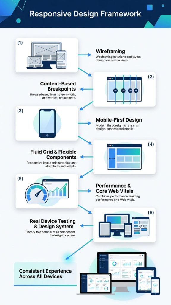
1. Start with wireframes, not pixels
Sketch layout structure -where navigation, content, and key actions sit -before you touch color or typography. The goal at this stage is testing information hierarchy across screen sizes, not making it pretty yet.
2. Set your breakpoints based on your content, not a template
Breakpoints are the screen widths where your layout restructures, defined with CSS media queries. Common starting ranges:
- 320–768px -phones
- 768–1024px -tablets
- 1024px+ -laptops, desktops, large monitors
Treat these as a starting point, not gospel. The right breakpoints are wherever your content actually breaks -test on real devices and adjust.
3. Design mobile-first
Build the mobile layout first, then expand up to larger screens, rather than designing desktop and shrinking it down. This forces you to prioritize only what’s essential, which almost always produces a cleaner desktop layout too. Common mobile-first patterns: collapsing full navigation into a hamburger menu, stacking multi-column layouts into single columns, and enlarging touch targets for finger input instead of cursor precision.
4. Use a fluid grid, not a fixed one
A fluid grid divides your layout into columns sized with relative units (%, vw, fr) instead of fixed pixels, so the layout stretches and compresses naturally instead of breaking at arbitrary widths.
5. Handle images and typography with modern CSS, not just max-width
The old standard is still correct -width sets a base size, max-width: 100% stops images from overflowing their container -but two things have moved on since most “how to” guides were written:
- Container queries now let a component respond to the size of its own container, not just the browser viewport. This matters enormously for design systems, where the same card component might sit in a full-width hero or a narrow sidebar and needs to look right in both -something viewport-only media queries can’t handle.
- clamp() for fluid typography lets font size scale smoothly between a minimum and maximum instead of jumping at fixed breakpoints:
h1 {
font-size: clamp(1.5rem, 4vw, 3rem);
}
This one line replaces what used to take multiple media query overrides.
6. Test on real devices, and design the system, not just the page
Rigorously testing across real devices and browsers catches the layout bugs that simulators miss. But if you’re building for a product (not a one-off marketing page), don’t stop at testing individual pages -document your breakpoints, spacing scale, and component behavior in an actual design system. That’s what keeps responsive behavior consistent as new features ship, instead of every new page reinventing its own rules.
How We Approach Responsive Design for Enterprise SaaS Products
Designing a responsive marketing website is relatively straightforward. Designing a responsive enterprise application is a different challenge altogether.
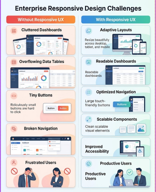
Enterprise products often contain large datasets, dashboards, tables, analytics, approval workflows, forms, and multiple user roles. Simply stacking these elements into a single-column mobile layout rarely creates a usable experience.
At F1Studioz, we start by understanding how different users interact with the product before designing layouts for different screen sizes. Rather than resizing screens, we redesign workflows where necessary.
Our responsive design process typically focuses on:
- Understanding user goals across devices
- Prioritizing critical tasks for each screen size
- Simplifying navigation without hiding important functionality
- Making complex dashboards readable on smaller screens
- Designing reusable components that work across layouts
- Validating designs through usability testing before development
The objective isn’t to make every screen look identical. It’s to ensure users can complete their tasks efficiently, regardless of the device they use.
Enterprise UX Challenges That Responsive Design Must Solve
Responsive design becomes significantly more complex in enterprise products because users rely on data-rich interfaces to perform critical business operations.
Some of the most common challenges include:
Large Data Tables
Financial reports, HR systems, and analytics dashboards often contain hundreds of columns and rows.
Instead of forcing horizontal scrolling, designers should prioritize the most important information while providing progressive disclosure for secondary data.
Complex Navigation
Enterprise platforms frequently include dozens of modules.
Navigation should adapt based on screen size without increasing the number of steps required to complete key tasks.
Multi-step Workflows
Processes like employee onboarding, approvals, procurement, or sales forecasting often span multiple screens.
Responsive layouts should preserve workflow continuity while reducing unnecessary scrolling.
Different User Roles
Managers, administrators, executives, and employees have different priorities.
Responsive design should consider user context—not just screen size.
Responsive Design Examples From Real Enterprise Products
Generic examples (Shopify, a news site) are easy to find anywhere. Here’s what responsive design actually looks like in dense, data-heavy B2B products -the harder version of this problem:
- Darwinbox -F1Studioz transformed DarwinBox from a traditional, complex HRMS concept into a consumer-grade enterprise product by simplifying workflows, designing role-based experiences, reducing onboarding complexity, enabling self-service, and creating a scalable UX that became a competitive advantage.
- Capillary -A tool to track, monitor, and change campaign budgets across multiple accounts and Ad Campaign platforms, all from one centralized dashboard.
- Aviso -F1Studioz transformed Aviso’s AI-powered sales platform into an intuitive enterprise experience by simplifying AI-driven forecasting, organizing complex sales data, unifying multiple workflows, improving dashboard usability, and making predictive insights easier for sales teams to trust and act on. .
Metrics That Measure Responsive Design Success
Responsive design should improve measurable business outcomes.
Track metrics such as:
| Metric | Why It Matters |
| Mobile Bounce Rate | Indicates whether mobile users leave immediately |
| Task Completion Rate | Measures whether users finish important actions |
| Time on Task | Shows efficiency |
| Core Web Vitals | Measures loading and stability |
| Form Completion Rate | Reflects usability improvements |
| Session Duration | Indicates engagement |
| Mobile Conversion Rate | Measures business impact |
| User Satisfaction (SUS/NPS) | Captures qualitative feedback |
Common Responsive Design Mistakes
- Designing desktop-first, then shrinking it down. You end up cutting content reactively instead of prioritizing it deliberately, and mobile always feels like an afterthought because it is one.
- Treating breakpoints as fixed rules instead of content-driven decisions. The standard 320/768/1024 ranges are a starting point. If your content breaks at 900px, your breakpoint is 900px.
- Ignoring container-level responsiveness in component-based design systems. A component that only responds to viewport width will look wrong the moment it’s reused in a narrower container -increasingly common as teams build with reusable component libraries.
- Skipping real-device testing. Simulators don’t catch everything -actual touch targets, actual load times on actual connections, actual rendering quirks per browser.
- Not documenting responsive behavior in the design system. Without it, every new feature reinvents breakpoint logic from scratch, and consistency erodes fast.
Building a Complex Enterprise Product?
Responsive design goes beyond resizing layouts. Our UX experts help SaaS and enterprise teams create data-rich, intuitive experiences that work seamlessly across desktop, tablet, and mobile devices.
Metrics That Measure Responsive Design Success
A responsive design project isn’t successful simply because it looks good on every screen. The real measure of success is whether users can complete their tasks efficiently, regardless of the device they’re using.
Whether you’re redesigning a SaaS platform, an enterprise application, or a marketing website, tracking the right metrics helps you understand if your responsive design is improving the user experience and delivering business value.
1. Mobile Conversion Rate
For websites, this could mean purchases, demo requests, or form submissions. For SaaS products, it might be account creation, feature adoption, or task completion.
If desktop users convert significantly better than mobile users, it often indicates usability issues such as difficult navigation, slow loading pages, or forms that are hard to complete on smaller screens.
2. Task Completion Rate
One of the most important UX metrics is whether users can successfully complete their intended task.
For example:
- Submitting a leave request in an HRMS
- Creating a sales report
- Completing a checkout
- Scheduling an appointment
A higher task completion rate indicates that your responsive design supports users instead of creating friction.
3. Time on Task
Responsive layouts should help users complete tasks efficiently—not add unnecessary clicks or scrolling.
If users consistently take longer to perform common actions on mobile than on desktop, it’s worth reviewing navigation, content hierarchy, and interaction patterns.
The goal isn’t always to reduce time, but to remove unnecessary effort.
4. Core Web Vitals
Responsive design and performance go hand in hand.
Monitor Google’s Core Web Vitals to ensure your responsive experience remains fast and stable across devices:
- Largest Contentful Paint (LCP): Measures how quickly the main content loads.
- Interaction to Next Paint (INP): Measures how responsive the page feels after user interactions.
- Cumulative Layout Shift (CLS): Measures visual stability and unexpected layout movements.
Strong Core Web Vitals contribute to better user experiences and can also support search visibility.
5. Bounce Rate and Engagement
A high mobile bounce rate may indicate that users struggle with navigation, readability, or page performance.
Compare engagement metrics across devices, including:
- Bounce Rate
- Engaged Sessions
- Average Engagement Time
- Pages per Session
Large differences between desktop and mobile often reveal responsive design issues that need attention.
6. Accessibility and Usability Scores
A responsive interface should also be accessible.
Regularly evaluate factors such as:
- Touch target size
- Text readability
- Keyboard navigation
- Color contrast
- Screen reader compatibility
Usability testing and accessibility audits often uncover issues that analytics alone cannot identify.
7. User Satisfaction
Quantitative metrics tell you what users are doing. User feedback helps explain why.
Collect qualitative insights through:
- Usability testing sessions
- Customer interviews
- Session recordings
- Heatmaps
- Surveys such as the System Usability Scale (SUS) or Net Promoter Score (NPS)
These insights help identify pain points that may not appear in analytics dashboards.
Key Metrics at a Glance
| Metric | What It Measures | Why It Matters |
| Mobile Conversion Rate | Business outcomes on mobile devices | Reveals whether responsive design supports user goals |
| Task Completion Rate | Users successfully completing key actions | Measures overall usability |
| Time on Task | Efficiency of completing workflows | Identifies friction in responsive layouts |
| Core Web Vitals | Performance and visual stability | Supports both user experience and SEO |
| Bounce Rate & Engagement | User interaction across devices | Highlights device-specific experience issues |
| Accessibility & Usability | Inclusive design quality | Ensures the interface works for a broader audience |
| User Satisfaction (SUS/NPS) | Overall perception of the experience | Validates improvements beyond analytics |
Measure Outcomes, Not Just Layouts
Responsive design is not simply about adapting a layout to different screen sizes. Its success should be measured by how effectively users can complete tasks, how efficiently they interact with the product, and whether the experience drives meaningful business outcomes. By tracking these metrics consistently, teams can move beyond creating responsive interfaces and build products that perform well for both users and the business.
FAQs
What is responsive design in simple terms?
Responsive design means a website or app automatically adjusts its layout to fit whatever screen it’s viewed on -phone, tablet, or desktop -using one flexible codebase instead of separate versions for each device.
What’s the difference between responsive and adaptive design?
Responsive design uses one fluid layout that continuously reflows at any screen width. Adaptive design uses several fixed layouts and detects which one to serve based on device size. Responsive is cheaper to build and maintain; adaptive can offer more tailored experiences for very different device use cases.
Does responsive design affect Core Web Vitals?
Yes. A well-built responsive site typically performs better on layout shift and load speed than fragmented device-specific builds, because there’s one set of assets and logic to optimize instead of several. Poor responsive implementation (unoptimized images, unnecessary reflows) can hurt Core Web Vitals just as easily.
Is responsive design still relevant with AI-generated interfaces?
Yes -if anything, more so. As more traffic comes through AI assistants, voice interfaces, and unpredictable embedded contexts (not just standard phone/desktop browsers), a layout system built to adapt fluidly to unknown constraints is more future-proof than a fixed set of device-specific designs.
What are common responsive design breakpoints?
A common starting set is 320–768px for phones, 768–1024px for tablets, and 1024px+ for desktops -but the right breakpoints for your product depend on where your specific content and layout actually break, not a universal standard.
Do I need a design system to do responsive design well?
Not for a single marketing page. For any ongoing product, yes -without documented breakpoints, spacing rules, and component behavior, responsive consistency degrades every time a new feature ships.
Ready to Build a Responsive Product Users Love?
Whether you’re designing a new SaaS platform or modernizing an enterprise application, our UX experts create responsive experiences that improve usability, performance, and business outcomes across every device.
Talk to Our UX Experts →