With the rise in digital experience and access to super-fast internet, we are also witnessing a decrement in the patience level of users. In times like these making visitors and users stay on your website for a longer duration and making them complete their goal becomes quite difficult. This is where the concept of Wayfinding comes into the picture.
The fundamental purpose of Wayfinding is to give the users enough clues to guide them to the next steps to complete the tasks. The design principles are concerned with making information spaces effectively navigable and easily understood.

Key Strategies Involved in Wayfinding are:
- Information Architecture: With the magnificent amount of unstructured information and data available on the internet, it is very challenging for the human brain to actually understand it. This is where designers & developers take charge and incorporate the concept of Information Architecture — the art and science of organizing and labeling websites, and online communities to support usability and findability
- Card Sorting: It is the process of analyzing and evaluating Information architecture, in groups using actual cards, pieces of paper, or one of several online card-sorting software tools.
- User Journey: The path taken by a user to complete the task and reach the end goal when using a website is known as User Journey. User Journey is created to make the flow on the website easier and easily accessible.
- Primary/Secondary Navigation: Primary navigation is the principal navigation interface on a website. Secondary navigation appears in conjunction with primary navigation.
Let’s take a look at some digital products with good user journey experiences:
>> Basecamp: From the initial step until the last step along with the description for the side steps, basecamp has a very well-crafted strategy for getting the user started and accustomed to the product.

>> Netflix: Netflix not only provides one of the best binging experiences but also makes sure the users are onboarded well. They have a very clean and defined step-by-step guide for walking the users through the whole process.

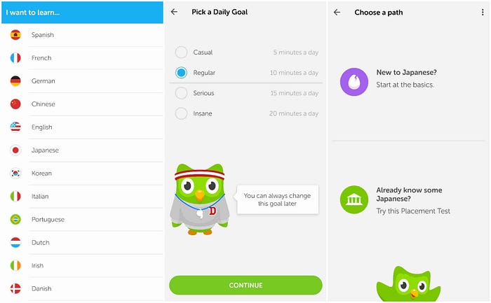
>> Duolingo: Probably one of the most colorful and visually pleasing onboarding is provided by Duolingo. Users select their language and choose their goal right from the landing page. By enabling users to get into core functionality from the start of their app experience, Duolingo presents itself as highly intuitive.

Hence, after seeing all these examples one thing that we can clearly say is that while designing a website or an app and incorporating the concept of Wayfinding it is important to understand that, the user exactly knows what they are looking for and what their goal is, they just need help with reaching the goal!!


