
If you’ve ever tried updating a brand color across a website, an app, and an email template – you know it’s rarely as simple as it sounds. You tweak it in Figma, ping the dev team, and hope it’s implemented correctly everywhere.
But what if you could manage all of that with just one update? That’s the promise of design tokens. So how are they different from your good ol’ style guide? Let’s explore.
First, What Are Traditional Style Guides?

Traditional style guides, also called brand guidelines or design systems, are rulebooks for visual consistency. They define things like:
- Color palettes
- Typography (font families, weights, sizes)
- Iconography and logos
- UI components (buttons, forms, cards, etc.)
- Spacing and grid systems
These guides are usually created in PDF documents, Sketch/Figma files, or web-based manuals. They are human-readable references that ensure brand consistency across teams and platforms.
Pros of Style Guides:
- Great for visual alignment
- Help onboard designers and marketers
- Ensure brand identity stays intact
But here’s the catch: Traditional style guides are often static, manual, and disconnected from code. When a color or font changes, developers have to update it manually across the product – leading to potential inconsistencies and errors.
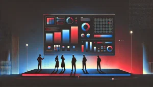
What Are Design Tokens?
Design tokens are the atomic design values stored as code. Think of them as platform-agnostic variables used in design systems – the smallest units of a design language, such as:
- color-primary: #1A73E8;
- font-size-base: 16px;
- spacing-small: 8px;
These tokens are stored in a structured format like JSON, and can be referenced across multiple platforms (iOS, Android, web, email) to ensure design consistency – but in a programmable, scalable way.
Example:
Instead of manually telling devs, “Use #FF5733 for the primary button background,” you define it as:
json
CopyEdit
{
“color”: {
“primary”: {
“value”: “#FF5733”
}
}
}
This token can then be pulled into CSS, Android XML, Swift, or Flutter styles with minimal translation.
Design Tokens vs Style Guides: Key Differences
| Feature | Traditional Style Guides | Design Tokens |
| Format | Visual documentation (PDFs, Figma) | Structured data (JSON, YAML) |
| Readability | Human-readable | Machine-readable |
| Update process | Manual | Automated |
| Integration with code | Low | High |
| Platform scalability | Limited | Strong (multi-platform ready) |
| Consistency enforcement | Depends on humans | Enforced by code |
| Ideal for | Branding, onboarding | Product UI, design systems, automation |
Why Design Tokens Matter More Than Ever

Today’s digital products aren’t just built for one screen — they’re made for websites, mobile apps, tablets, smartwatches, and more. With so many platforms to manage, keeping your design consistent everywhere is a real challenge. Traditional style guides, while still useful, often can’t keep up with the complexity.
Design tokens offer a smarter way forward.
They turn design decisions – like colors, typography, and spacing – into reusable code variables that work across platforms. This makes it easier to apply and update styles consistently, without manually syncing every element across screens.
And teams are catching on fast.
According to the Design Systems Report 2025 by Zeroheight, 84% of design systems now incorporate design tokens, up from just 56% the previous year – a clear sign of how essential they’ve become in modern workflows.
Similarly, the State of Design Tokens 2024 report by Supernova reveals that nearly 70% of designers have started using Figma variables, with another 19% planning to adopt them soon. This shows a strong industry shift toward componentized, token-driven design.
Moreover, a case study by Smallstep reports that implementing design tokens with Figma and Token Studio led to a significant reduction in UI development time, thanks to easier updates and fewer handoff errors.
Design tokens don’t just improve efficiency. They help teams speak a common language, scale design systems, and create better, more cohesive experiences for users across platforms.
Real-World Example: Google’s Material Design
Material Design – Google’s design system – has long used tokens to scale its UI language across Android, iOS, and web.
With the introduction of Material You, Google updated its token system to accommodate dynamic theming — where UI elements adapt to the user’s wallpaper or system preferences.
Imagine updating your app’s theme globally in minutes — because you’re not chasing colors or margins, you’re just updating a handful of tokens. That’s the power of design tokens.
When Do You Still Need a Style Guide?

Make no mistake – design tokens don’t replace style guides. They complement them.
Style guides are still crucial for:
- Branding and visual identity
- Voice and tone guidelines
- Art direction
- Marketing collateral
- Cross-functional communication
Design tokens handle the technical backbone, but style guides tell the story of your brand.
The two need to work together. Think of the style guide as your brand’s philosophy and design tokens as the syntax your digital products speak.
Challenges in Adopting Design Tokens
Of course, no transition is frictionless. Teams may face hurdles like:
- Lack of token tooling or frameworks
- Legacy design systems built on static files
- Resistance to changing workflows
- Need for cross-team coordination between design and engineering
But with modern tools like Style Dictionary, Tokens Studio for Figma, and Specify, implementing and managing tokens is becoming easier than ever.
Future-Proofing Your Design System

As design and code become more tightly integrated, it’s clear that the future belongs to living, evolving design systems. And design tokens are the fuel they run on.
In an era of personalization, dark mode, accessibility, and rapid experimentation, relying solely on traditional style guides is like building skyscrapers with blueprints and no BIM (Building Information Modeling).
If you want:
- Faster iterations
- Fewer bugs
- Smooth multi-platform design
- A scalable design-dev handoff
…then it’s time to introduce design tokens into your workflow.
Final Thoughts
Design tokens are not just a trend — they are the logical next step in the evolution of digital design systems. They bring clarity, automation, and control to an otherwise chaotic landscape of pixels, paddings, and hex codes.
Style guides will always have their place — but to scale design in today’s multi-device, multi-platform world, you need more than guidelines. You need smart, codified, dynamic rules.
And that’s exactly what design tokens offer.
Also Read: Scaling Your Design System: Challenges and Best Practices for Enterprises


