

Do you remember the time when most websites just looked like mere Word documents? They were pretty functional but extremely bland!
Those were the times when web dev hinged on one tool alone, that was HTML. There was no concept of style or aesthetics.
But in the last decade, with the exceptional evolution of user experience, aesthetics has become a cornerstone of web design alongside functionality.
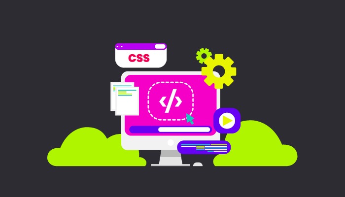
This is where CSS comes into play.
So, whenever you come across a really good-looking website that has cool colors and that makes you want to keep browsing through it for hours and hours on end, it is all because of CSS.
According to a survey CSS is being used by 97.1% of websites in the world.
CSS is the key to keeping users hooked to your platform in today’s digital landscape where the attention span of people is plummeting with each passing day
“Aesthetic design is a key factor in user engagement. If your website doesn’t look good, users will move on.”
Neil Patel
In this blog, we are going to dive deeper into CSS and take a look at how it is revolutionizing UI development for enhanced UX.
Transforming UI Development for Enhanced UX
CSS plays a pivotal role in transforming UI development. This enhances the overall output for user experience.
It takes UX/UI to the next level by delivering a cohesive and visually pleasing design that works seamlessly across various platforms.
The responsive layouts ensure a smooth user experience on any device.
With CSS-powered animations and transitions, interfaces become not just functional but engaging.
CSS allows smart separation of content and style simplifying development, enabling quicker iterations and updates that boost user satisfaction.
CSS grants designers the freedom to craft visually appealing interfaces tailored to diverse user needs. This, in turn, significantly enhances the overall user experience and usability of web applications.
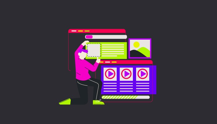
What is CSS and How to Incorporate It?
To understand CSS, let us first understand what HTML is and what it does.
HTML is a standard markup language that is used to create the structure of the website. It shapes the website content by specifying elements and their arrangement.
CSS on the other hand, is a styling language that provides a style to your website by accentuating HTML. CSS governs the presentation and the layout of different HTML elements, making your web pages aesthetically appealing.
Think of HTML as nailing pieces of wood together to make the furniture while CSS adds the polishing and upholstery that gives the furniture a premium and appealing look.
So, in essence, HTML provides structure to your website while CSS provides dimensions.
Here is an example of an HTML code:
<!– Button Component –>
<button class=”button”>Click me</button>
<!– Card Component –>
<div class=”card”>
<img src=”image.jpg” alt=”Card Image” class=”card__image”>
<div class=”card__content”>
<h2 class=”card__title”>Card Title</h2>
<p class=”card__description”>Card Description</p>
</div>
</div>
This code defines two components: a button and a card.
The button has a class “button” and displays the text “Click me.”
The card consists of an image, title, and description, each within specific classes (“card__image,” “card__title,” “card__description”).
It forms a modular structure for creating consistent UI elements.
Here is an example of a CSS code that styles a button with the class ‘button.'”:
/* Button Styles */
.button {
display: inline-block;
padding: 10px 15px;
font-size: 16px;
background-color: #3498db;
color: #fff;
border: none;
border-radius: 4px;
}
The class “.button” encapsulates styling rules, providing a consistent look for all elements of this class.
It sets properties like display, padding, font size, background color, text color, border, and border-radius, creating a visually appealing and consistent appearance for buttons with this class.
Now that we know what CSS is and what it does, let us see the different ways to incorporate CSS.
There are three ways to add CSS:
- Inline
- Internal
- External
Inline CSS
Inline CSS embeds style declarations directly within the HTML elements. Using Inline CSS, we can apply style on a per-element basis. Inline CSS is used to apply a style using the style attribute of an HTML element.
It is great for quick styling and provides high specificity, however, CSS using this style cannot be reused across different elements.
Internal CSS
Internal CSS embeds declarations within the <style> element in the <head> section of an HTML page.
This method separates the HTML content and enhances the readability and maintainability of code.
Using internal CSS is slightly better than inline, however, it can only be used for a single page.
External CSS
External CSS embeds style declarations in a distinct CSS file, separate from the HTML document.
We can use external CSS by adding its link to the <head> section of every HTML page.
Using external CSS is the quickest and easiest way to write maintainable and reusable CSS.
It has a high reusability as It can be used anywhere throughout your web page. If required, it can be used in other projects as well.
Follow a Design System for Consistency
Consistency is extremely important for ensuring a smooth and pleasing UI/UX. It prevents your projects from looking cluttered and confusing.
According to Forbes, A consistent design system can help you increase your revenue by 23%Therefore following a design system for consistency is non-negotiable.
Document design patterns, color schemes, typography, and other visual elements in a detailed and well-maintained style guide that will act as a reference for developers.
Also, make use of code lines and formatting tools to enhance code quality and ensure a consistent coding style.
This will ensure harmony in the look and feel of different elements across your platform, enabling you to craft an exceptional user experience.
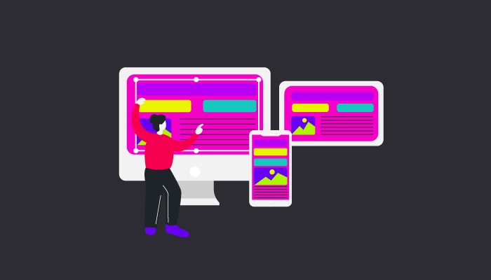
Responsive Design
Another thing that cannot be overlooked is responsive design. Keeping responsiveness in mind while designing is of the utmost importance.
By employing CSS to cater to diverse resolutions and orientations, designers can create an amazing responsive UI, ultimately enhancing user experience.
Using CSS media queries will help you design styles that are responsive to different devices and screen sizes ensuring user satisfaction and loyalty.
Using CSS Frameworks
Let’s delve into another tool that can revolutionize the way we handle styles on the web – CSS Frameworks.
CSS Frameworks are like toolkits that come pre-loaded with styles, layouts, and components, saving developers from reinventing the wheel.
They offer a consistent design language and responsive grids, allowing for quicker development and maintaining a cohesive look across the site.
Popular frameworks like Bootstrap provide a solid foundation for styling, allowing developers to focus more on customization rather than starting from scratch.
By integrating CSS frameworks, we further enhance our ability to build scalable and maintainable CSS, ensuring efficiency and an enhanced UI/UX.
Conclusion
CSS is the key to unlocking the pathway to a stellar user experience with pleasing aesthetics.
However, anything when overused is not fruitful and the same goes with CSS. Excessive use of CSS may spoil user experience as it might increase load time and cause other issues like that.
With that said, we cannot take away the fact that the right use of CSS not only makes a website look good but also plays a chief role in crafting an immersive digital experience that users enjoy.
Incorporating CSS into UI development not only enhances the visual charm but also adds to a smooth and delightful user experience.
So, if you are building your blog, website, or web app, a deep understanding of CSS will set you on the path to success in the ever-evolving world of the internet.
For more insights on design, users, and user experience, check out The Blue Book– f1Studioz’s bible for crafting exceptional digital experiences that users love.
Visit us at f1Studioz


