
A deep dive into Data, UX, and Data Design — Pt.2
In this series of blogs, I’ll be talking about the basics of cognitive biases and data lifecycle and certain things that one should keep in mind while designing effective data visualizations that convey the right information in the right format. These articles will hopefully be a stepping stone in your journey into Data Design.
This is the second part in the series, if you want to take a look at part 1, click here.
The human mind takes in numbers more effectively when they are presented in the form of graphs, charts, maps, or any other kind of data visualization. But the human brain has its flaws and disabilities which are seldom accounted for when these graphics are designed. Either intentionally or unintentionally, visual graphics that accompany articles can often be misleading.
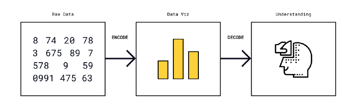
“A graphical method is successful only if the decoding is effective. No matter how clever and how technologically impressive the encoding, it fails if the decoding process fails.” (read more here)
As designers, we are responsible for reproducing numbers and statistics and realizing them into objects or systems that play a role in our daily life.
So for us to be able to effectively design data into forms that can be comprehended by users easily, we need to understand the data lifecycle. How is data collected, analyzed, and published? To what degree can any of the steps in this process go wrong?
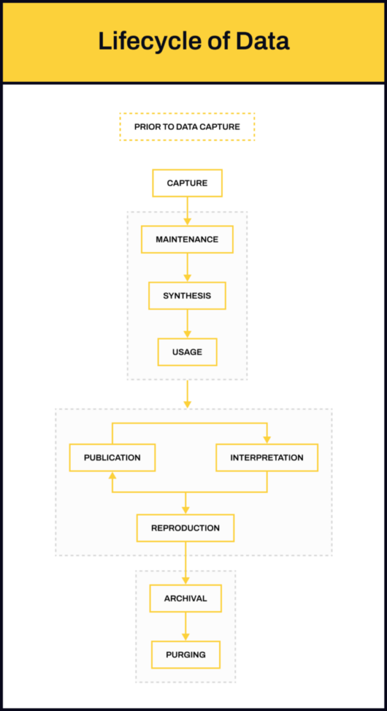
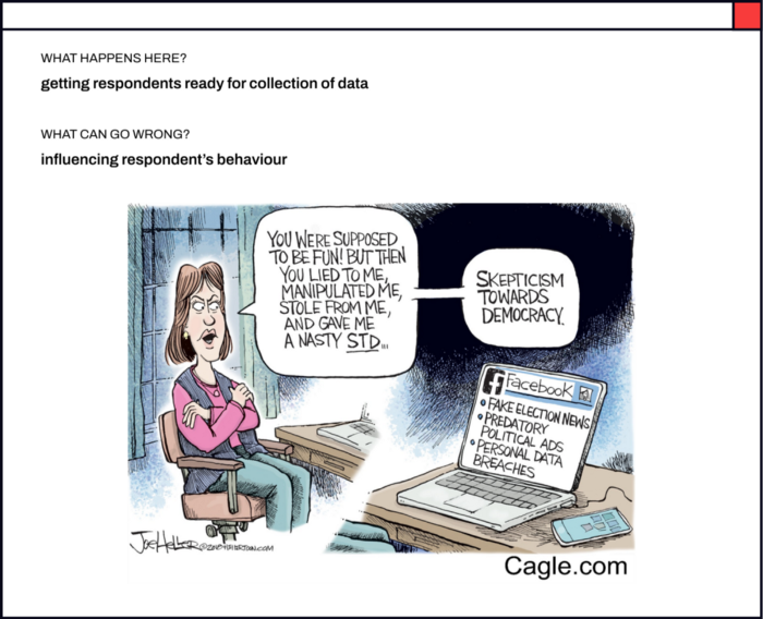
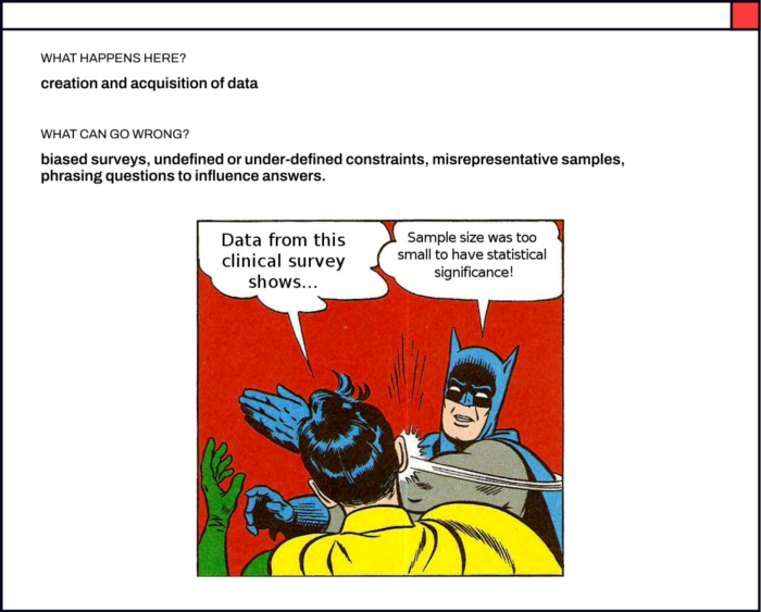
Before Data Capture
In this step, respondents are prepared for the collection of data — introducing them to the survey topic, giving them some context about why a particular survey is being taken, etc. It is very easy to influence a respondent’s behavior if this step is not carried out appropriately.
We all have heard about the 2016 US Election story. Pre-poll surveys in India are considered notorious for a similar reason. The Lokniti National Election Study shows that in the 2019 elections only 35 out of every 100 voters were committed voters. “a significant 43 percent of these non-committed voters make their choice based on hawa — on who they think is likely to win.” Praveen Chakravarty further reports, “A rigged pre-poll survey disguised as an independent, scientific study by a professional survey agency and spread widely by a compliant and compromised media can play a powerful role in creating the Hawa or a “wind of victory” for a particular party and influence the 30 percent of floating voters to vote for that party. Since these polls carry a veneer of objectivity, voters are more easily misled. Thus, fake opinion polls can be extremely potent weapons in Indian elections.” You can read more here.
Data Capture
This is where actual data collection occurs — through surveys, interviews, experiments, observational studies, etc. The method of collecting data can greatly impact the quality of the data you get — whether the question was framed neutrally, whether the respondents were probed, how the respondents were selected for the study, who was asked what kind of questions, etc.
Designing surveys is particularly tricky. We — especially as d.school students or amateurs in the industry — often rely on surveys to get more data in less time for our projects. Tools like Google Forms, Typeform, Mailchimp, and many more, make it easy to design surveys that can be sent out or published on social media to be consumed in mere minutes. But it is important to be conscious of the choice of words and the structure of the question as well as the type of input of the answer.
Here is a simple guide for survey design for beginners. And here are examples of badly designed survey questions.
Rukmini S is an independent Data Journalist in India who recently published her book Whole Numbers and Half Truths’. The book is replete with examples of discrepancies — in every stage of the data lifecycle — in Indian statistics and statistical news and reports. One such example from the book which is relevant to this particular stage is that of the Crime Statistics in India — the National Crime Records Bureau (NCRB) in India publishes the ‘Crime in India’ report every year. “All FIRs filed in police stations all across the country are collected at the state level and then put together at the national level to produce these all-India statistics”, the author reports. However, the NCRB follows a system known as the ‘Principal Offense Rule” — which essentially means that if multiple offenses are registered in a single FIR, only the most heinous crime i.e. the one that attracts maximum punishment would be considered for counting. So, the 2012 Nirbhaya case that triggered a nationwide movement against sexual violence, would be recorded in the NCRB statistics as a murder (punishment is death or imprisonment for life) and not as a sexual assault (imprisonment for a term which shall not be less than twenty years, but which may extend to life which shall mean imprisonment for the remainder of that person’s natural life, and with fine). You can read more on this from the author here.
Does the captured data convey the entire story?
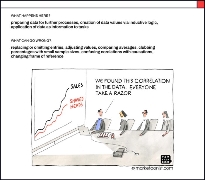
Maintenance, Synthesis, and Usage
In this step, all the raw data that has been collected gets cleaned, organized, synthesized, and further analyzed to generate insights. In simple words, this is the step where percentages, averages, interpolation, or any data points generated via inductive logic are calculated based on collected data.
Some of the things that can go wrong during analysis are — using incorrect data points for comparison, accidentally omitting data entries, selectively picking data entries to manipulate the result to reach the desired conclusion, etc.
You can read more about it here.
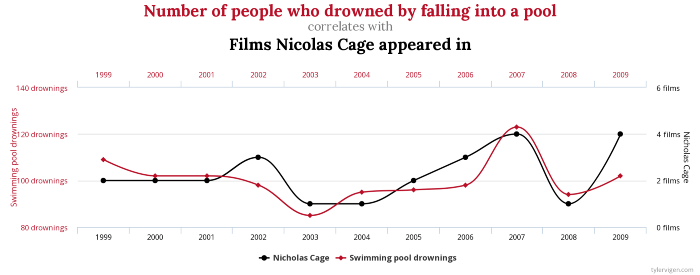
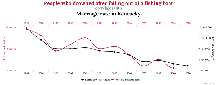
Here’s a fun TED talk that discusses bogus but catchy claims. Tyler Vigen put together a fun project to make people think about spurious correlations. Here are some of my favorite ones:
Publication, Interpretation, and Reproduction
Once the data is analyzed and insights are generated, they are published for readers to consume — it could be in any form — as articles, infographics, news, etc.
If executed incorrectly or unethically, this step may lead to misleading headlines, stories, or visualizations.
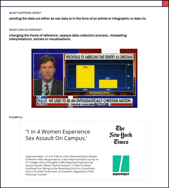
Here are some examples of bad data visualization and this is an article that discusses misleading data visualizations in detail.
Can you tell what’s wrong with these visualizations?
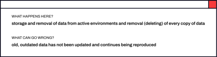
Archival and Purging
In this step, old data that is no longer relevant is archived or erased. However, it often happens that old data keeps getting reproduced in new forms.
The book ‘Factfulness’ co-authored by Hans Rosling, Anna Rosling Rönnlund, and Ola Rosling discusses how we as humans tend to hold onto old beliefs and are ignorant about the slow changes in the world.
Gapminder is an independent educational non-profit whose goal is to fight global misconceptions. Their surveys show that people are often wrong about the state of the societal challenges that the world is facing. The facts that the respondents are functioning on are simply outdated. Is your worldview upgraded? How well do you think you’ll score? — try their quiz!

To read more about the data lifecycle, you can go here.
Now that we know the journey of data right from its creation to purging, let’s look at each of the steps in detail. We’ll begin with Publication, Interpretation, and Reproduction since that’s usually where designers are most likely to get involved when it comes to client-initiated projects.
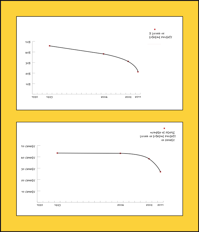
What kind of chart do we pick to represent what kind of data is extremely important. Same data can tell contrasting stories if the visuals are not designed well.
Here’s an example from the extreme poverty statistics in India:
What should we consider while designing a data viz? What should we avoid? I’d be discussing this example and more in the next blog. See you soon! 🙂
“free access to data does not turn into knowledge without effort.”
— Hans Rosling