
A deep dive into Data, UX, and Data Design — Pt.1
In this series of blogs, I’ll be talking about the basics of cognitive biases and data lifecycle and certain things that one should keep in mind while designing effective data visualizations that convey the right information in the right format. These articles will hopefully be a stepping stone in your journey into Data Design.
Hi, I am Anushka. I am a Product/UX Designer. Although my major in college was Industrial Design, our faculty and curriculum encouraged exploratory and interdisciplinary learning. The focus was always on identifying the right problems and solving them efficiently — even if it meant getting out of your comfort zone and learning new skills to craft the right solution.
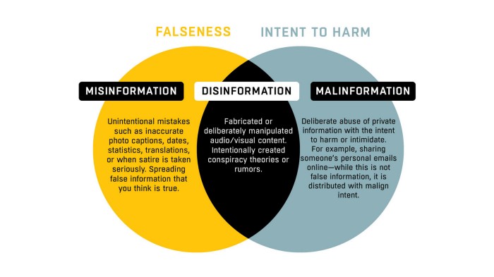
My thesis project presented one such opportunity for me. The larger umbrella was ‘Decolonizing Design’ and owing to my interest in Statistics and Data Viz, the brief I chose was in the smaller area of ‘Colonization in the Age of Misinformation’. The entire thesis journey allowed me to take a deep dive into all things about statistics, data viz, cognitive biases, etc. The journey is still ongoing and I’d be sharing my experiences here.
Have you ever come across misleading headlines?
I’m sure you have. Oftentimes, media houses craft catchy headlines or what you’d call ‘clickbait’ material in order to dramatize the content and catch the audience’s attention. The article usually paints a more realistic, less dramatic picture.
For example:

Here’s another example that concerns data and data viz:

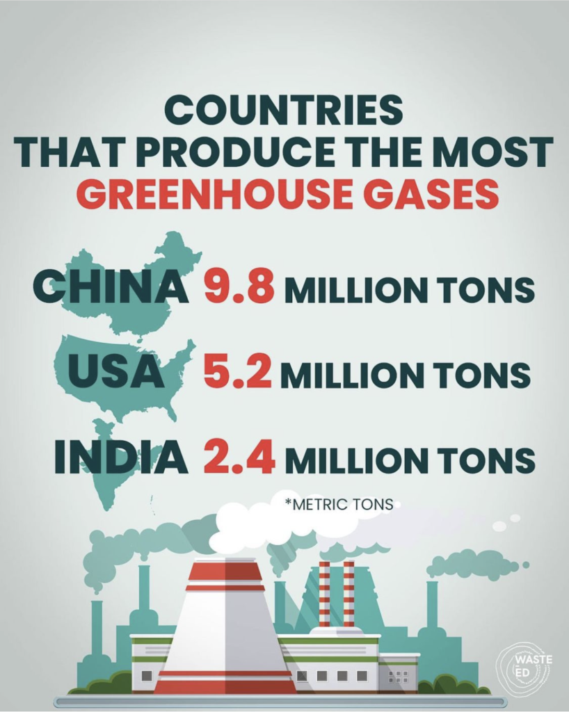
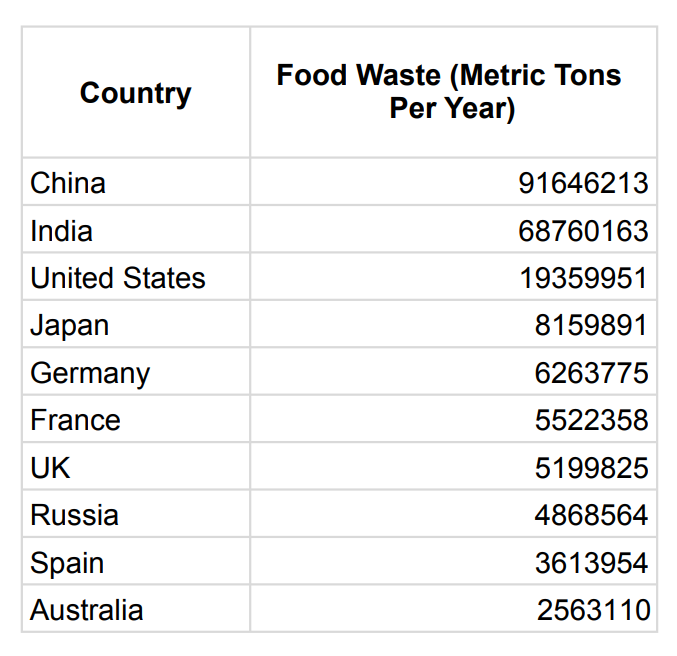
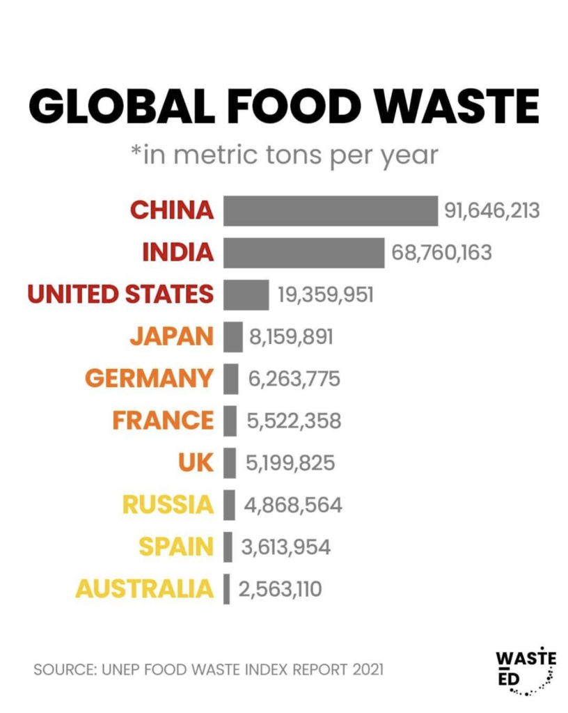
These infographics give the idea to the viewer that China, India, and the USA are the top polluters and waste generators in the world and may create a view among the audience that it is the citizens and governments of these nations that are most at fault for accelerating climate change.
There are several factors (qualitative and quantitative) that could essentially debunk this view and prove it wrong but let’s consider purely the data for now. A better perspective for looking at this data would be in comparison with each country’s population. “Metric Tons Per Capita” (per capita means per person) would be a better unit for consuming this data as a comparison between different countries.
When we come across dramatic headlines, it is important to question the source and the story that the content is trying to convey to get a holistic view.
The Human Factor
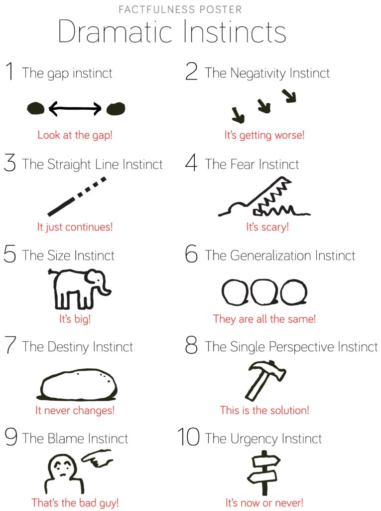
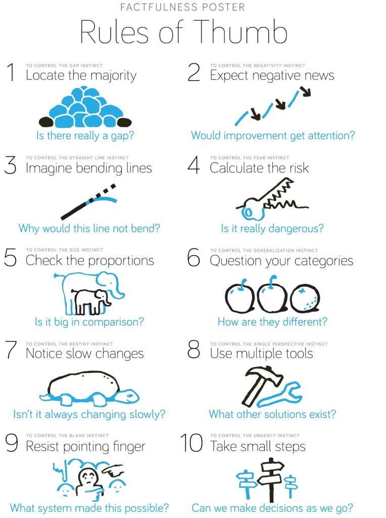
As humans, we have witnessed a drastic technological evolution in the past few centuries. But biologically, our brains aren’t much different than the brains of the early homo sapiens. Human brains are wired to take certain shortcuts when they consume information to make certain decisions quickly. Hans Rosling calls these the dramatic instincts. In their book ‘Factfulness’, Hans Rosling, Ola Rosling, and Anna Rosling Ronnlund discuss these instincts in detail and how we can tackle them with simple rules of thumb.
Need for Media Literacy and Statistical Literacy
Consumption of short-form content has been on an increase and human attention spans have been decreasing. At the same time, information consumers have started relying more on social media as a source of news. These changes together cause a major concern of misinformation through badly designed infographics.
Let’s go back to the example of the ‘Global Food Waste’ Infographic:
This is the data that the infographic represents:
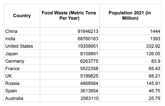
Since these figures are from 2021, let’s add another column here for the population of these countries in 2021.
Now let’s calculate the food waste that these countries generate per person and then arrange them in descending order of those figures.
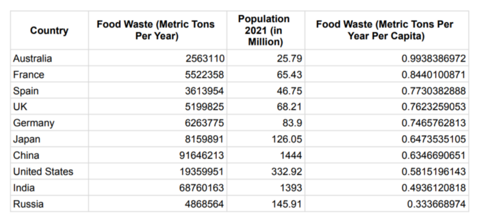
The pressure isn’t so much on India, China, and the USA anymore, is it? So if we were to redesign the earlier infographic in a better way, it’d look something like this:
There are several other factors that could change this story — how was the data collected? How effective was the data collection process? Did any events occur in any of these countries that might have skewed this data? One dataset can tell contrasting stories depending on how the data is sourced, who interprets it and how it gets analyzed and represented.
As information consumers, and especially as designers, we should be educated about which numbers are reliable and which ones aren’t. As designers, we are responsible for reproducing these numbers and statistics and realizing them into objects or systems that play a role in our daily life.
What kind of numbers can be trusted and from which sources? How shall we analyze numbers effectively and then present them in a way that they convey the right story to the audience?
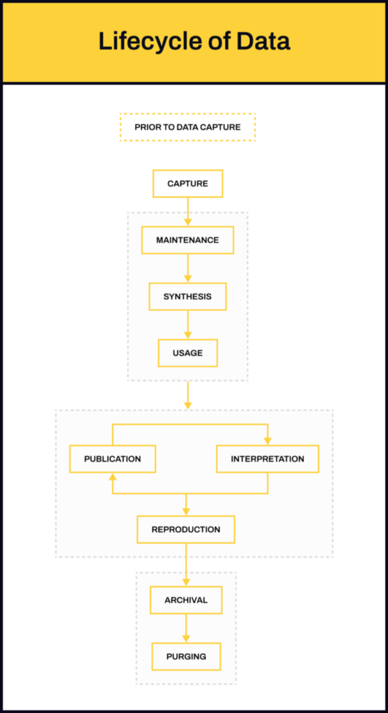
This brings us to the ‘lifecycle of data’ — which is actually not a cycle if you look at it. I’d be discussing this in detail in an upcoming blog, so stay tuned!
“free access to data does not turn into knowledge without effort”
— Hans Rosling, Factfulness