
Smooth and mobile-friendly interfaces have transitioned from being an option to a necessity for businesses as the world is becoming increasingly mobile-centric. Today’s users demand efficient, responsive, and intuitive designs that accommodate their fast-paced lifestyles. A well-designed mobile interface can improve user retention, increase conversions, and ultimately enhance customer satisfaction.
Below, we explore key strategies and actionable insights to help you design highly effective mobile interfaces that deliver optimal user experiences.
Key Strategies for Designing Effective Mobile Interfaces
1. Embrace Responsive Design
Responsive design is the foundation of mobile-friendly interfaces. It allows your website or app to automatically adjust and adapt to different screen sizes and orientations, providing a consistent experience across devices. Responsive design typically uses fluid grids, flexible images, and media queries to ensure content looks great, whether on a 5-inch smartphone or a 10-inch tablet.

Tip: Prioritize “adaptive breakpoints” to ensure that elements reflow gracefully at different screen widths. Consider important breakpoints at 360px, 768px, and 1024px for optimal display on smartphones, tablets, and desktops.
Research shows that 53% of users abandon a website if it takes longer than three seconds to load. Responsive design can improve load times, reduce bounce rates, and ensure smoother navigation.
2. Prioritise Touch-Friendly Navigation
Mobile users interact with their screens primarily through touch, which means buttons, links, and menus need to be designed for touch accuracy. One common pain point for mobile users is tapping on small, closely placed elements, leading to frustrating errors.

Tip: Design larger, touch-friendly buttons with a minimum size of 44×44 pixels to accommodate the average fingertip size. Make sure there is enough spacing between interactive elements to prevent misclicks.
A touch-friendly design improves user satisfaction, especially on smaller screens where precise taps are more challenging. With mobile devices now accounting for over 58% of global web traffic, ensuring touch-friendly navigation is crucial for a positive user experience.
3. Optimise Typography for Legibility
Text readability is crucial, especially on small mobile screens. Poorly chosen fonts, inadequate font sizes, or insufficient contrast can make reading difficult, driving users away from your content.
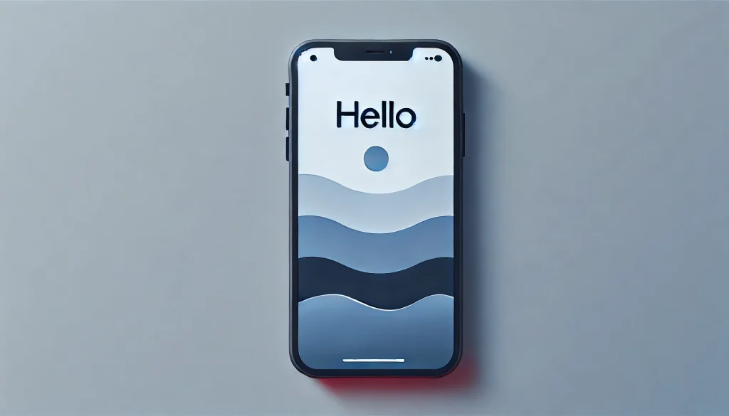
Tip: Use a base font size of at least 16px for body text and ensure sufficient line spacing (1.5x font size) for readability. Opt for simple, sans-serif fonts like Arial or Roboto, which are easier to read on mobile devices.
Bonus: Ensure high contrast between text and background to maintain legibility, particularly in outdoor settings where glare may interfere with visibility. Optimizing typography can enhance content comprehension and ensure users stay on your page longer.
4. Keep Content Concise and Focused
Mobile users often engage with content in shorter, more frequent bursts. Your interface should focus on presenting the most crucial information quickly and clearly. Content-heavy pages with excessive scrolling or complex layouts will likely frustrate users.

Tip: Structure content in bite-sized chunks. Use short paragraphs, bullet points, and headings to break down text and guide users to key information.
Bonus: Incorporate a “content hierarchy” where the most crucial information is placed at the top of the page (also known as the inverted pyramid model). Users should immediately understand the purpose of the page without having to scroll.
Mobile users typically spend less time on websites, averaging between 704 and 775 seconds per visit. In contrast, desktop users have a longer session duration, ranging from 996 to 1,918 seconds. This data indicates that mobile users tend to engage with content for shorter periods.
5. Optimise Images and Media for Mobile
While visual content enhances engagement, heavy media files can drastically slow down page load times, leading to poor user experiences. Optimizing images and media for mobile devices ensures a faster, smoother experience without sacrificing quality.

Tip: Compress images using modern formats like WebP or JPEG 2000 to reduce file size without compromising image clarity. Limit auto-playing videos or enable users to choose when to play media to save bandwidth.
Bonus: Use lazy loading techniques, where images and videos load only when they come into the user’s viewport. This can significantly improve load times for pages with a lot of media.
A study shows that a one-second delay in mobile page load can reduce conversions by 7%. Optimized media can improve both user engagement and conversion rates.
6. Minimise Form Inputs
Forms are often a necessary part of mobile interfaces, especially for e-commerce, sign-ups, or surveys. However, filling out forms on mobile can be tedious, especially if they’re long or complicated.

Tip: Reduce the number of fields and eliminate unnecessary inputs. Use auto-fill features and pre-populate fields when possible, and provide options like drop-down menus or clickable buttons to minimize typing.
Bonus: Implement smart keyboard adjustments based on input types. For instance, show the numeric keypad automatically when the user taps a phone number field.
Form abandonment is common on mobile due to complicated processes. Simplifying forms can reduce friction and increase completion rates, increasing conversions.
7. Test Across Devices, Browsers, and Networks
Testing is one of the most critical stages of mobile design. Different devices, operating systems, and browsers may interpret your interface in unique ways. Conduct thorough testing to ensure consistent functionality and performance.

Tip: Test your interface on various devices (both Android and iOS), screen sizes, and resolutions. Don’t forget to check how it performs under varying network conditions, including 3G or low-speed networks.
Bonus: Use tools like Google’s Mobile-Friendly Test or BrowserStack to simulate mobile environments and identify performance bottlenecks.
The global mobile ecosystem is highly fragmented. Cross-device testing ensures your interface reaches the widest possible audience.
8. Implement Mobile-First Design
Mobile-first design flips the traditional design process by starting with mobile users in mind and scaling up for larger screens. This approach forces designers to prioritise essential features and functionality from the outset.

Tip: Focus on core content and primary actions when designing for mobile first, ensuring simplicity and ease of use. Once the mobile design is solid, additional features can be added for tablets and desktops.
85% of users expect a company’s mobile website to be as good as or better than its desktop counterpart. By adopting a mobile-first mindset, you ensure the most critical user needs are met on all devices.
Conclusion
Designing for mobile isn’t just about shrinking a desktop site—it requires rethinking the user experience from the ground up. A successful mobile-friendly interface should be responsive, intuitive, and optimised for quick interactions, keeping users engaged and satisfied. By following these best practices—embracing responsive design, simplifying navigation, optimising media, designing for touch, and testing across devices—you can create mobile interfaces that meet the demands of today’s mobile-first world.
Also Read: Improving mobile UX by right UI choices


