If you’ve ever stared at a beautiful website that somehow couldn’t sell a thing, you already understand the gap between “looks good” and “works well.” Great UI/UX design in 2026 isn’t about winning Dribbble likes -it’s about building digital experiences that retain users, reduce friction, and grow revenue.
Let’s explore the advanced strategies that top tech companies are using right now.
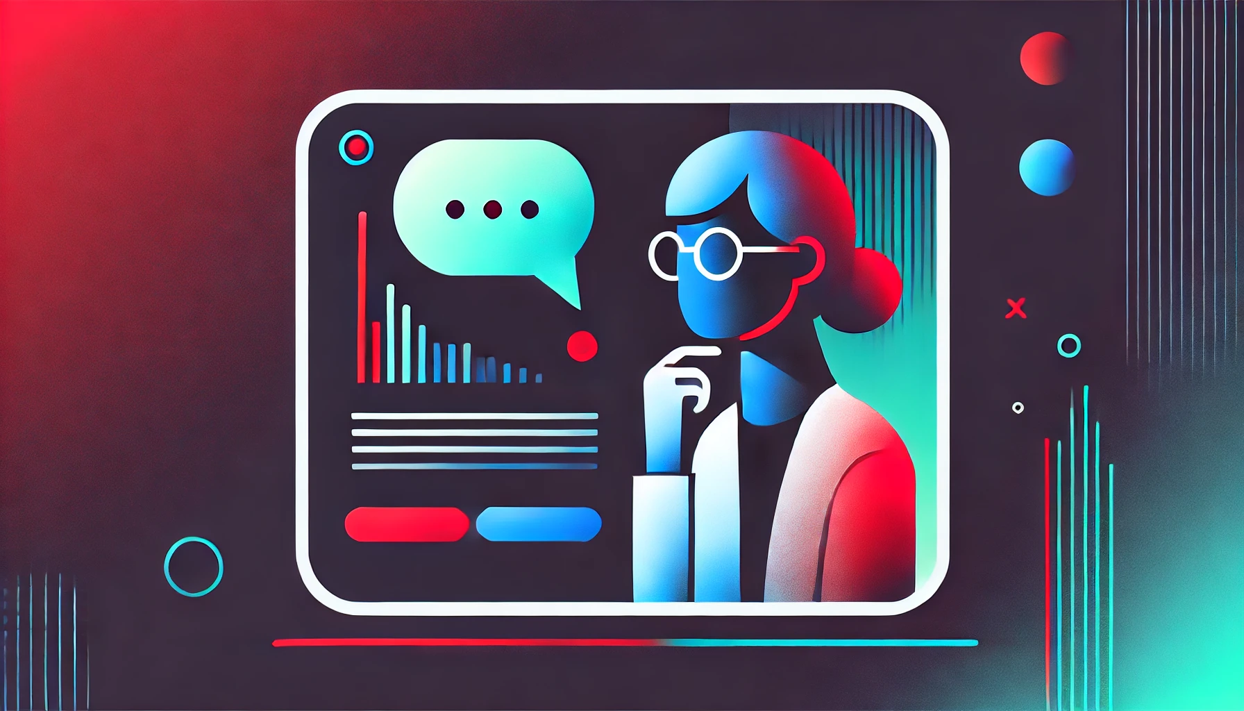
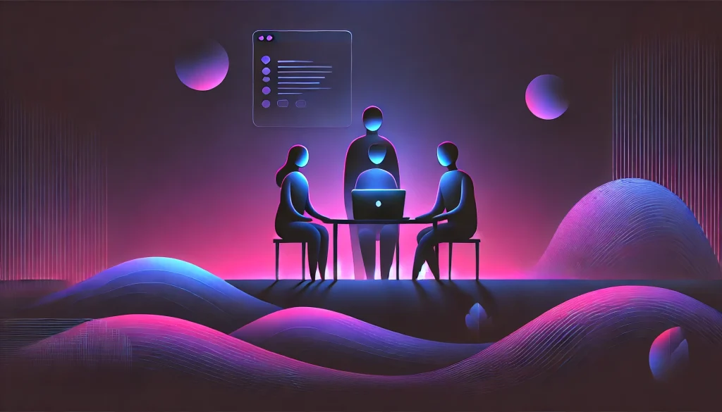
1. Stop Guessing: Design with Data
Every design decision is a hypothesis. The question is whether you’re testing it.
Data-driven design replaces intuition with evidence. Before touching a single wireframe, smart teams are leveraging:
- Heatmaps to see where users are actually clicking versus where you want them to click.
- Scroll maps to identify the “False Bottom” -the point where users stop scrolling because the page looks like it ends when it doesn’t.
- A/B testing to pit two design versions against real users and let the data pick the winner.
Tools like Hotjar, Mixpanel, and Google Analytics are no longer optional extras -they’re the foundation of any serious design process.
2. Leverage the Psychology of Conversion
Users don’t always behave rationally, but they do behave predictably. Understanding a few core cognitive biases can dramatically improve your conversion rates.
Hick’s Law tells us that the more choices you give someone, the longer they take to decide -and the more likely they are to decide nothing at all. Simplify your menus, reduce your options, and watch your click-through rates climb.
Scarcity and Urgency are powerful motivators. A well-placed “Only 2 left in stock” or a countdown timer doesn’t manipulate users -it gives them the nudge they need to act on a decision they’ve already made.
The Peak-End Rule may be the most underused insight in UX. Research shows that people don’t judge an experience by its average -they judge it by its most intense moment and how it ended. This is why your “Order Confirmed” page matters far more than most designers realize. Make your success states memorable, celebratory, even delightful.
3. Micro-Interactions: The Details That Build Trust

You’ve felt them without noticing them. The gentle pop of a heart when you like a post. The satisfying fill of a password strength meter. The pull-to-refresh animation that makes waiting feel dynamic.
Micro-interactions are small, subtle animations that provide immediate feedback. They signal to users that the interface is alive and responding -and that quiet reassurance reduces uncertainty and builds trust more effectively than any copy could.
Done right, they feel invisible. Done wrong, they feel annoying. The goal is to make the interface feel responsive and intuitive without ever drawing attention to itself.
4. Gamification Done Right
Borrowed from the world of gaming, these mechanics tap into our hardwired desire for progress, achievement, and reward.
A progress bar on a signup form isn’t just decoration -it’s a commitment device that makes users 30–40% more likely to complete it. Streaks and badges in a fitness or learning app create daily habits, turning casual users into loyal ones.
The key caveat: don’t gamify for its own sake. Slapping a leaderboard onto a B2B SaaS tool is at best irrelevant and at worst, condescending. Keep gamification tightly tied to behavior you actually want to reinforce.
5. Emotional Design -The Loyalty Engine

Don Norman’s classic framework breaks emotional design into three levels: Visceral (how it looks), Behavioral (how it works), and Reflective (how it makes you feel over time).
Most design teams nail the first two. The third -the emotional residue a product leaves behind -is where brand loyalty lives.
Adding a witty illustration to a 404 error page won’t directly increase sales. But it signals personality, humanizes the brand, and turns a moment of friction into a moment of delight. Users stick with products that make them feel good. It really is that simple.
6. Omnichannel UX: Designing Across Every Device
Your users don’t live on one device. They browse on mobile during their commute, research on a tablet at home, and purchase on desktop at the office. A seamless omnichannel experience means the shopping cart they built on their phone is still waiting when they open a laptop.
This requires more than responsive design. It demands synchronized state -login sessions, browsing history, cart contents, and preferences that persist across platforms. The UI should feel like a single coherent product, not a patchwork of separate apps.
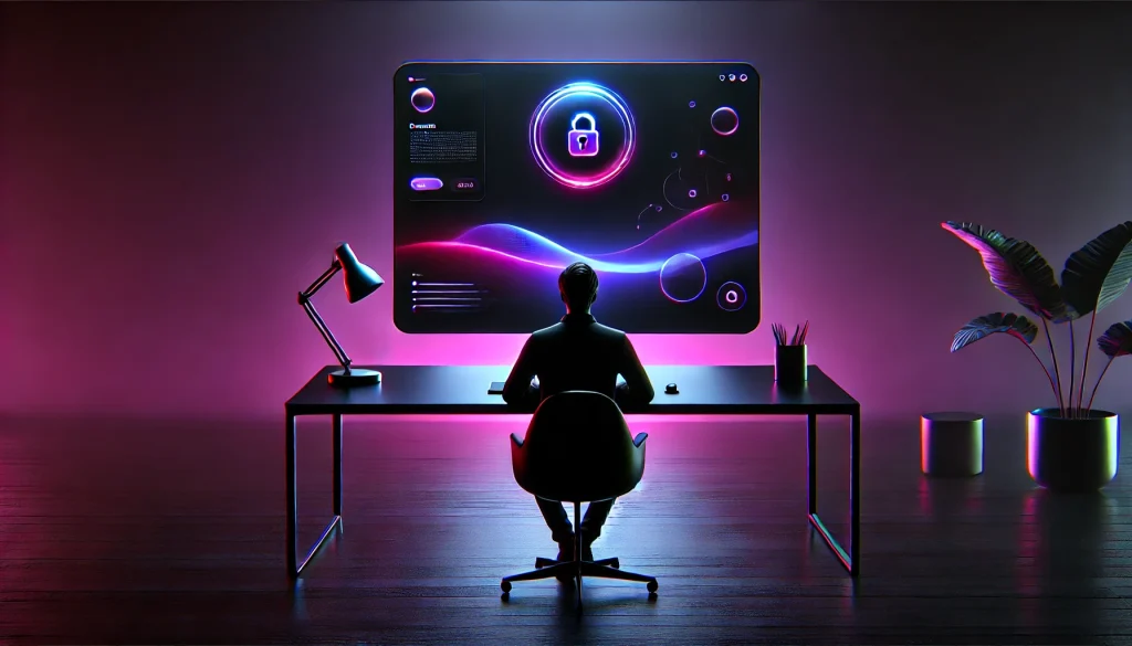
7. Inclusive Design: Accessibility as a Growth Strategy
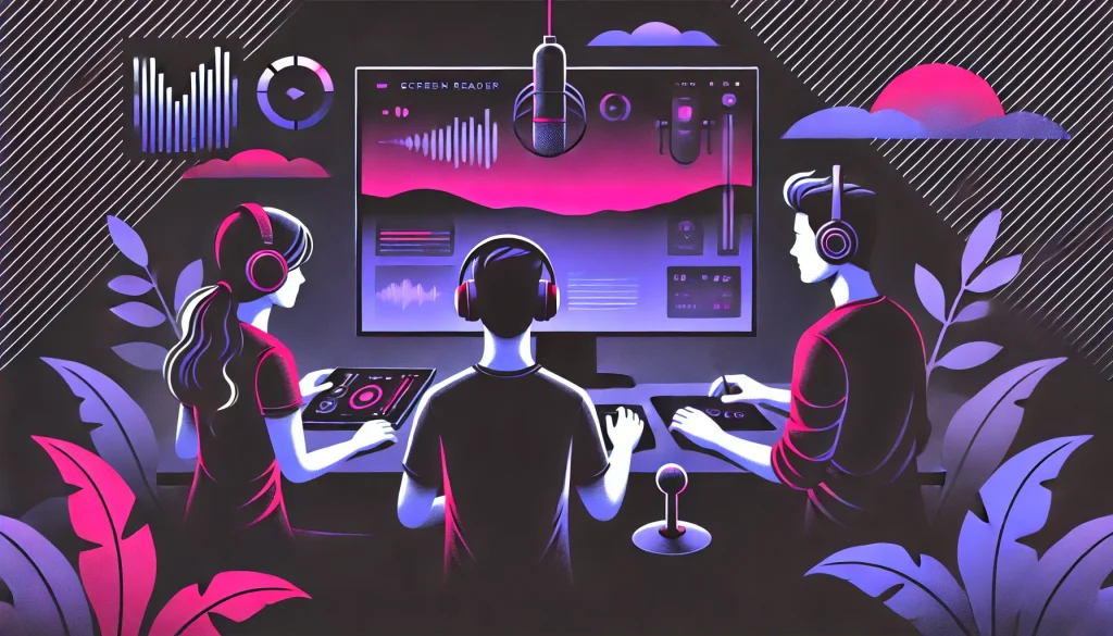
15% of the global population lives with some form of disability. That’s over a billion people who are often left behind by interfaces designed without them in mind.
Advanced accessibility goes beyond adding alt text. It means designing for keyboard navigation, supporting screen readers, enabling voice commands, and ensuring sufficient color contrast.
Beyond the ethical imperative, there’s a clear business case: designing for accessibility expands your addressable market and often improves the experience for all users, not just those with disabilities.
8. Eliminate Friction in the Conversion Funnel
Friction is the silent killer of conversion rates. Here’s where to start cutting it:
- Forms: Audit every field. If it’s optional and you’re not actively using the data, remove it. A form with 4 fields converts meaningfully better than one with 8.
- Guest Checkout: Forcing account creation before purchase is one of the single biggest drivers of cart abandonment. Let users buy first, create an account later -or never.
- Loading States: Replace blank spinners with skeleton screens. Showing the structure of the content before the content loads makes pages feel significantly faster, even when the actual load time is identical. Perception matters.
The Bottom Line
Advanced UI/UX design in 2026 is really the intersection of two things: empathy and economics. You have to deeply understand how users think, feel, and behave -and then apply that understanding in service of outcomes that matter to the business.
Data tells you what’s happening. Psychology explains why. And thoughtful design gives you the leverage to change it.
The best designers aren’t the ones with the most beautiful portfolios. They’re the ones who can point to a metric and say, “I moved that.”
Frequently Asked Questions
What is data-driven design?
It’s the practice of making design decisions based on real user analytics -heatmaps, session recordings, A/B tests -rather than gut feel. It ensures your design actually performs in the wild.
How does gamification improve UX?
By tapping into our natural drive for progress and reward, gamification mechanics like progress bars, streaks, and badges increase user engagement and encourage return visits.
What is the Peak-End Rule?
A psychological principle stating that people judge an experience primarily by its most intense moment and its final impression -not the average of all moments. Design your success states accordingly.
What are micro-interactions?
Small, purposeful animations that provide real-time feedback -a button confirming a click, a form flagging an error. They make interfaces feel alive and trustworthy.
How do I reduce cart abandonment?
Offer guest checkout, simplify forms, ensure fast load times, and use clear and visible CTA buttons. Removing unnecessary barriers at checkout is the most direct lever you have.
What is Omnichannel UX?
A design approach that ensures a seamless, consistent experience across all devices -so users can start a task on mobile and finish it on desktop without losing any progress.
Is A/B testing really necessary?
Yes. It’s the only way to know with confidence whether a design change actually improved performance, rather than just looking better to you and your team.