The secret to any intuitive digital experience is that how the closely the concept model represents the mental model of the problem. And Information architecture is basically the detailed concept model. And a great user experience is simply about recognising the user’s mental model and replicating it as close as possible.

Following is a story snippet from an epic enterprise project in the marketing domain. The story focuses on one particular UX problem and how solving at IA level fixed the problem
The UX Problem
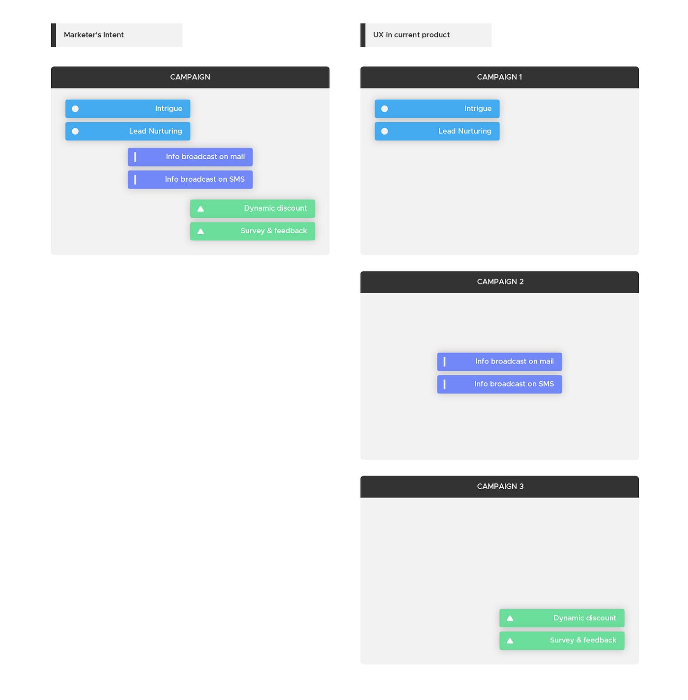
Imagine a scenario where a marketer had to design a campaign for Diwali where he has to plan different messages at difference phases of the campaign. One for sending information about the offers that goes as part of the Diwali campaign and second is a series of real time messages that sends the messages to the user while they are at the shopping counter. The third is a set of automated messages depending on the response from the user. The marketer ends up creating four different campaigns when all he needs is one campaign.
The problem can be best represented visually as follows

The impact on the User Experience is that marketer’s focus now shifts from marketing strategy and planning to coordinating between four different campaigns which essentially are part of same campaign.
Investigation of the Problem
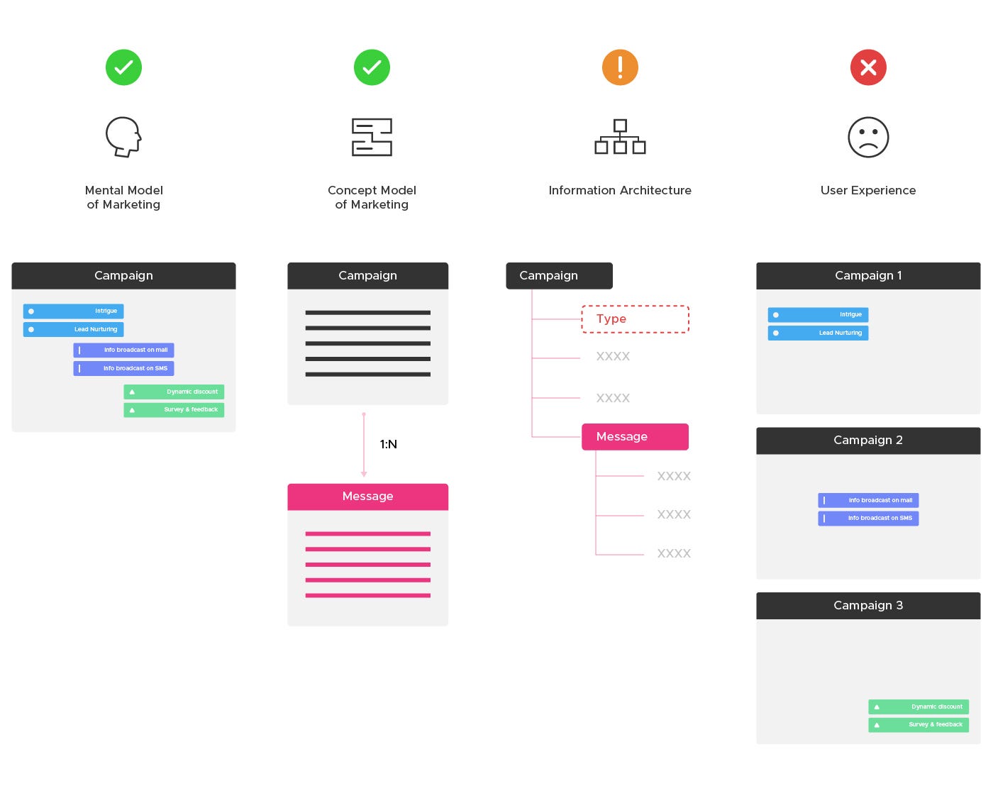
This was clearly a problem somewhere in the Information architecture which needed a fixing. So we mapped the current Information Architecture, using a mindmapping tool called coggle, from the existing screens from the product’s main flow of creating campaign and message.

PROBLEM: Incorrect Attributing
The Good news was that the Mental model and Concept model of the current product matched but the detailing of the concept model (i.e. IA) where things have gone wrong

SOLUTION: Tweaking the IA
It was a simple case of incorrect attributing. The attribute “type” which should have been part of Campaign should have been part of Message

CHALLENGE: Stakeholder Buy-In
Though it was a seemingly small problem and required just tweaking at IA level, it had huge impact on the tech because it would mean redefining the foundation of the tech at various levels. Hence, we have to conduct card- sorting along with all the stakeholders including the Technology team to arrive at a consensus.

Following was the result of the series of workshops we conducted with the client stakeholders which we interestingly named as “Anatomy of Marketing” discussions.
IMPACT: Foundation for a simple UX
Below you can see the Existing IA was super-simplified into a crisp and much less denser IA. This sparked off a synergetic co-creation phase in the project where all the stakeholders from Product, Engineering, Business worked together with Design to simplify the product without any biases.

In the next story, we shall discuss how we applied the concept of MECE (Mutually exclusive;Collectively Exhaustive) to the redefinition of the Information Architecture that eventually simplified the complex workflows.
Special thanks to Jayanta Borah, Neel Sangani and Akash Kale who were also part of the discovery process. Special thanks to Mejo Mohan for the illustrations for the blogpost!


