Design thinking, as we all know, is a problem-solving approach that those in the human-centered design field are all too familiar with.

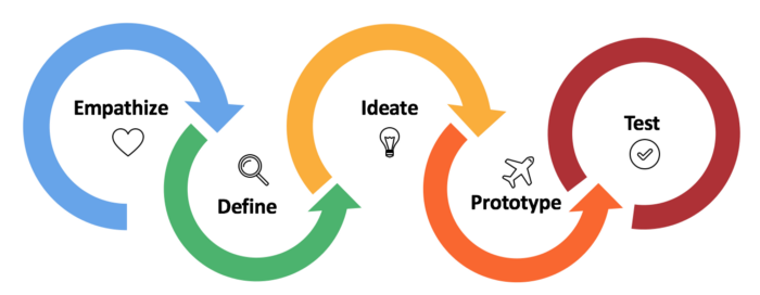
To summarise, design thinking is a non-linear process that includes — empathizing to help define the problem, ideating and creating low fidelity prototypes and testing them out with the target audience, circling back to revising the ideations and prototypes, and most times, even redefining the problem area to identify more specifically what the users are facing.

As someone who has graduated with a degree in human-centered Design, from a formal design education in India, what we were taught in college versus what I have experienced in my work life, are quite different in certain aspects.
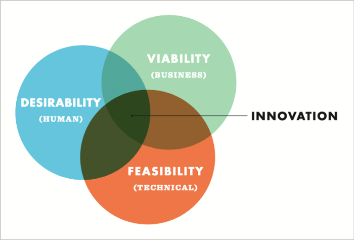
Design thinking is a human-centered approach to innovation that draws from the designer’s toolkit to integrate the needs of people, the possibilities of technology, and the requirements for business success. — Tim Brown
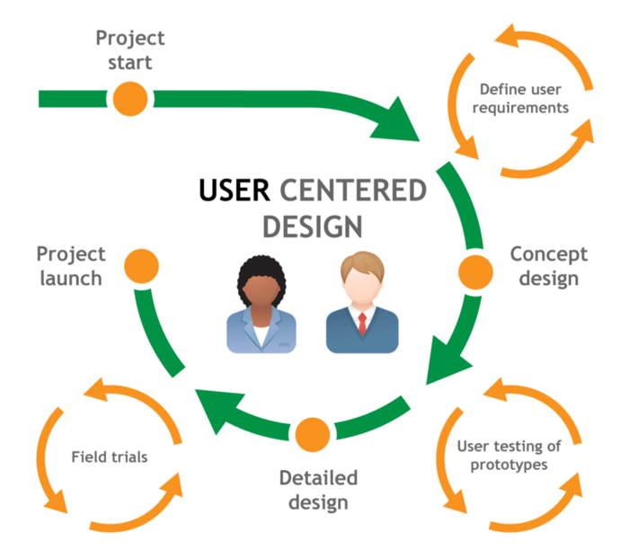
In colleges, the UX design or user-centric design process is mainly focused on “doing what’s best for the user”. While this is the correct approach and is key throughout the UX process, it isn’t always practical in the real world.
Throughout college projects, we were taught to be as imaginative as possible and had close to no restrictions at all when it came to feasibility or funding as these were purely for the courses. While this helped in giving us creative freedom of expression, looking back, I believe it didn’t teach us the value of many aspects, for example — the stakeholders, the materials, and the process as well. We always tried to make our designs both functional as well as aesthetic, which is an ideal scenario. In the real world though, money is a huge driving factor that has to be considered before moving into the implementation phase. During the design degree, there was also scope to slack during work, which is very different from the deadline-bound timelines that the design process in the real world is heavily backed by. Another major thing that one tends to overlook in design college is the long-term effects of creating or implementing a certain design or system. This too is crucial when it comes to solving design problems in the real world because this is what determines the sustainability of the solution.
Working as a UX designer in a company, when a client approaches my team with a potential problem, we kickstart by not only empathizing with the user of the end product but also empathizing with the client. In the real world, most companies are revenue-driven, and thus, as designers, it is our goal to keep in mind the success of the client, while at the same time giving the user of the end product an easy and seamless experience.

Many a time, we need to take a step back and re-evaluate our design decisions to see if what we are creating, is beneficial to all stakeholders involved in the project. This can be done through multiple ways, such as having meetings one-on-one with stakeholders, focus group discussions, prototyping and testing, fly on the wall observation, think-aloud feedback, to name a few.
From these activities, we might end up with a lot of feedback and takeaways, but as UX designers, it is our responsibility to understand how to set limitations while also meeting requirements. This can be done by making a list of all the feedback and queries from the stakeholders and finding a way to broadly classify them under common goals and issues, and then tackling those larger goals and issues, instead of working with pin-pointed feedback. This way, we are staying true to the design-thinking process, while also setting realistic goals and working towards them.
Good Design is Good Business. — Thomas Watson Jr.
While designing interfaces, one thing that we as designers must do our best to avoid, are dark patterns. Dark patterns can be described as tricks used in websites and apps that make the user do things that they didn’t mean to. These tricks are found mainly in sign-up pages or payment screens, where they either guilt-trip the user into joining a service or platform they didn’t intend on doing or, they make it incredibly tough for the user to unsubscribe or leave a certain platform. While working with Dark patterns, we must also note that there are multiple types of dark patterns that are in use.
It is easy to avoid these dark patterns when designing for a consumer, but, when you are designing for a client company, the client might suggest including a certain dark pattern to help keep their users trapped, without the users knowing. It is at this point where we as designers have to take an ethical stand, whether we are comfortable doing this for the client or not, because, by choosing not to do it, it could cost the company a great deal as the client might take their project to another firm. This situation has been a grey area for many design firms and at the end of the day, it is up to us, as designers to do our best and explain why these dark patterns aren’t good and help the client company find alternatives.
While working for a design studio has assured job security and provides great exposure, we must always consider what the client wants and work towards that requirement. There’s a saying “Client is King” and that is something that would be the case when one works in a revenue-driven design setting.
If you as a designer are in an ethical and moral dilemma regarding following what the client wants to the T, but still want to practice UI/UX, then a good option would be to work in companies or organizations whose revenue is not dependent on a particular client company and the products are completely consumer-facing and for the wellness of the consumer.


