

Users interact with products across multiple platforms – mobile apps, websites, smartwatches, voice interfaces, augmented and virtual reality (AR/VR), and more. Each platform has its own technical and experiential constraints, yet users expect a familiar, cohesive experience no matter where they are. This is where design systems come in – not just as style guides, but as the backbone of consistent, scalable, and accessible user experiences.
Why Cross-Platform Consistency Matters

When users move from a mobile app to a desktop site, or from a 2D interface to a VR environment, they shouldn’t feel like they’re learning a new language every time. Cross-platform consistency helps reduce friction, builds brand trust, and improves usability.
A 2023 report by Adobe found that 73% of users are more likely to remain loyal to brands that offer a seamless experience across platforms. Inconsistencies, on the other hand, lead to confusion, abandonment, and a fractured product identity.
But consistency doesn’t mean uniformity. It’s not about making every button or interaction identical across devices. It’s about creating predictable, flexible systems that adapt to the context while staying true to the brand.
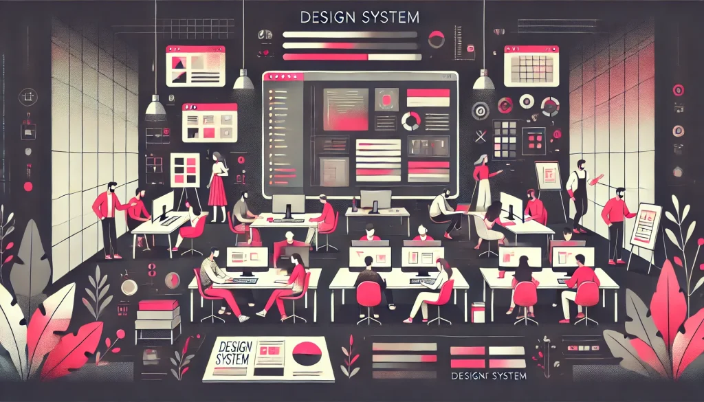
What Is a Design System?
A design system is a collection of reusable components, patterns, principles, and documentation that guide product design and development. It typically includes:
- Design tokens (color, spacing, typography)
- Components (buttons, forms, modals)
- Guidelines (tone of voice, accessibility, animation usage)
- Code implementations (React components, Flutter widgets, etc.)
Some well-known examples include Google’s Material Design, Apple’s Human Interface Guidelines, Microsoft’s Fluent Design, and Shopify’s Polaris.
Designing for Mobile, Web, and VR: What’s Different?

Each platform has different interaction models and expectations. Here’s how design systems adapt:
- Mobile: Small screen sizes, gesture-based interactions, and limited attention spans require components that are touch-friendly, responsive, and fast-loading. Design systems for mobile must account for native behaviors (like Android’s back button or iOS’s swipe gestures) while maintaining brand consistency.
- Web: Web interfaces have more space and interaction methods (mouse, keyboard, screen readers). Design systems here must include responsive layouts, keyboard navigability, and accessibility standards like WCAG.
- VR and AR: Designing for immersive environments adds another layer of complexity. Interfaces must be spatial, intuitive, and minimize motion sickness. Components might be 3D instead of flat, and actions are often controlled by gaze, hand-tracking, or controllers.
The challenge is to create a system that scales across these platforms without fragmenting the user experience.
How Design Systems Enable Consistency
1. Shared Design Tokens
Using a central set of design tokens (e.g., color palettes, spacing scales) ensures visual consistency. Tools like Style Dictionary or Figma Tokens allow teams to sync these values across platforms.
2. Component Libraries Across Codebases
A single design can be implemented in multiple codebases using platform-specific components. For example, a button defined in a design system can have a React version for the web, a Swift version for iOS, and a Unity version for VR.
3. Platform-Specific Guidelines Under One Roof
The best design systems don’t force one-size-fits-all solutions. Instead, they provide adaptive components and clear guidance for different contexts. For instance, Material Design now includes support for foldables and wearables, while Fluent Design supports Windows, Xbox, and HoloLens.
4. Documentation and Governance
A design system is only useful if teams can follow it. Good documentation explains not just the “what” but also the “why” – helping designers and developers make platform-appropriate decisions without losing cohesion. Governance models (like a central design ops team or community contributors) help maintain the system over time.
Real-World Example: Spotify
Spotify is a great case of cross-platform consistency. Whether you’re using the mobile app, web player, desktop app, or smart speaker, the experience feels familiar. Spotify’s design system, Encore, provides shared components, color tokens, typography rules, and platform-specific implementations that keep its look and feel unified – while still respecting each platform’s interaction model.
Benefits Beyond Consistency
While consistency is the main goal, design systems also bring other advantages:
- Faster development: Teams don’t have to build UI elements from scratch.
- Better collaboration: Designers and developers work from the same source of truth.
- Accessibility at scale: Built-in accessibility guidelines and components help products meet compliance requirements by default.
- Easier onboarding: New team members ramp up faster when there’s a documented system.
According to a 2022 UXPin survey, companies with mature design systems reduced design-developer handoff time by up to 34%, and shipped new features 23% faster on average.
Challenges to Watch For

Of course, building a cross-platform design system isn’t easy. Some common challenges include:
- Over-engineering: Trying to cover every edge case can make the system bloated and hard to use.
- Lack of adoption: Without buy-in from teams, even the best system can fall apart.
- Platform drift: Over time, different teams may interpret the system differently, leading to fragmentation.
- Maintaining parity: Keeping design and code implementations in sync across platforms requires regular updates and communication.
Future Outlook

As technology evolves, we’re moving from device-specific design to ecosystem thinking. A user might start a task on a smartwatch, continue on a phone, finish on a desktop, and view the results in VR. In this context, design systems must evolve too – supporting not just interface consistency, but journey continuity.
Tools like Design Tokens W3C Working Group and cross-platform frameworks like Flutter and React Native are working toward making this easier. Meanwhile, AI-driven systems may soon generate adaptive components that tweak themselves based on context – further reducing manual overhead while maintaining consistency.
Conclusion
Cross-platform consistency is no longer a nice-to-have – it’s essential to delivering a unified brand experience. Design systems are the key to making this possible. By creating scalable, adaptable systems rooted in shared principles, companies can ensure their products look, feel, and behave cohesively across mobile, web, VR, and whatever comes next.
Building such systems takes effort, coordination, and long-term thinking – but the payoff is worth it: faster teams, happier users, and products that don’t just work everywhere – they belong everywhere.
Also Read: AI-Assisted Design Systems: The Next Evolution in Scalable UX


