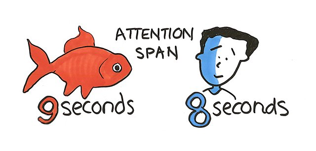
How long can a Human being focus on something? On average, it is said that the human attention span is around 8 seconds only. We can’t focus on the same task without taking any minuscule interruption for more than 8 seconds. However, as a coping strategy, we have improvised multitasking skills.
The 8-second rule in UX
As discussed earlier, humans’ attention span has been reduced to 8 seconds from the original12 seconds. Our phones and laptops have this option of running the apps behind so that we can jump into different apps and multi-task while making the most of our time. If not for multi-tasking we try to repeatedly focus on the same thing again and again.

And the same attention span rule applies to websites as well. No visitor would be willing to spend more time searching for the content they want. With the advent of technology, social media, and numerous other distractions it is only fair for visitors that designers design the websites or for that matter any interface in the most trouble-free manner. Keep it simpler and optimal for the user to find what they are looking for in the fastest way possible.
There is a lot of fish in the sea. So the question is how would you let your users know your website is the best option out there?
Simple. Just grab your user’s attention in 2 seconds. Or else you might lose them to your competition. Impressing and Attracting are two sides of the same coin. You first attract users so that you can buy a chance to impress them. Any website today that tries to seize users’ attention follows the 8-second rule. And how to do that? We’ll tell you that.
Page Layout and Design
Without any empty space, you can’t like your own room. The same applies to your website. Without the required amount of white space, users find it difficult to use the website. It helps the users to navigate through the website with ease. White space also helps in breaking large sections of content as required which is nothing but creating layouts. Simply speaking, users can find the required content and elements when the website is clean and tidy.
Loading Indicators
In other words, these are the elements that distract the user from what is happening or take their mind off from the fact that your website is taking time to load. Firstly it’s always better to keep up to the speed, but if your website lacks that it’s better to have loading indicators.
This is where gamification comes into play. When waiting is ultimate, why not add more joy to it? Adding gaming elements to non-gaming contexts records more loyalty, engagement, and association from the visitors.
Content
When the content and context go hand in hand users tend to get attracted to what is in front of them. Users are always in a hurry. They want to get what they are looking for in the nick of the moment. It is very hard to find users reading beyond the first sentence unless it is attractive. And that’s when a crisp and precise copy comes into play. Organizing the content in a way such that it clearly describes the needful points is a way to grab users’ attention.
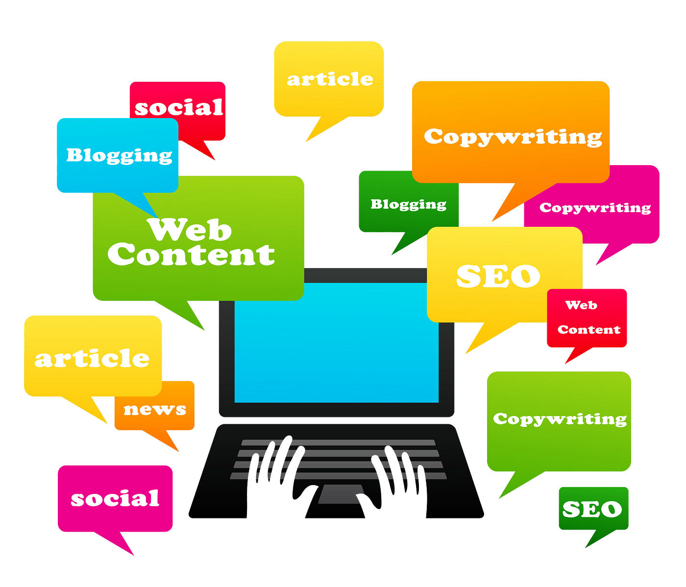
Using subheadings, bullet points, and highlighting important words helps the user get attracted to the content that they are looking at.
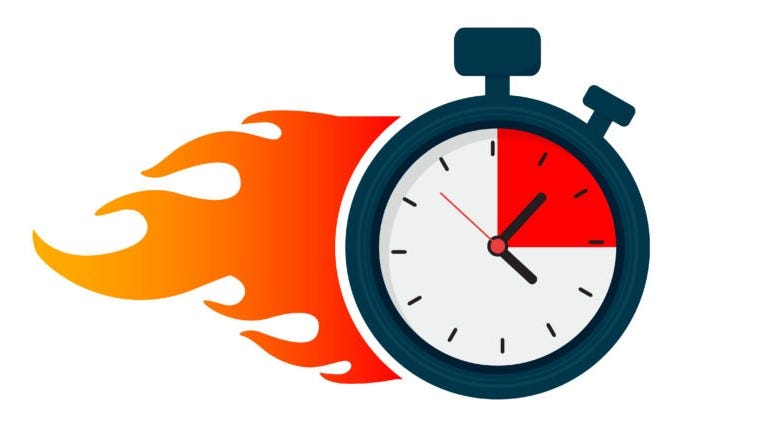
Page Loading Speed
Make sure your website has all the properties to be loaded at a good speed. However great your website is designed, it needs to be loaded at an equally great speed. Users tend to abandon the site if the page doesn’t load within 2 seconds. So there’s yet another trick to attract and retain your customers.
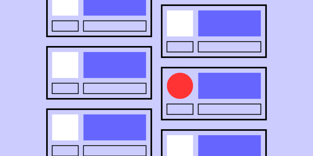
Design Consistency
This is a must-have element to grab users’ attention within less than 8 seconds. It is always better to be unique and smart when it comes to designing your landing pages. But never let your core branding change. Use the same placement, fonts, hex codes. Users should never feel entirely different as they land on a new page. Reduce complexity and maintain consistency to let users stay on the site for longer.
Jaw-dropping Visuals
The visually appealing design adds more weight to the text. Adding images, graphics, and videos is a way to bring more context. Visual content takes the pressure off the viewer’s eyes. It is said that visitors spend twice as much time as they normally do with a video embedded in it. So get your hands on making a well-documented video that could do nothing but grab more attention on the page.

Incorporating these things into your design does not just grab the users’ attention but multiplies the conversion rate and scales up the engagement. What all things have you put into use in order to design for short attention spans?