

Color plays a significant role in user interface (UI) design, influencing aesthetics, usability, and accessibility. However, for the millions of people with color blindness – approximately 8% of men and 0.5% of women worldwide – certain design choices can create barriers to interaction. Designers must consider color accessibility to ensure an inclusive user experience (UX). This article explores how to create interfaces that work for everyone, regardless of their ability to perceive color.
Understanding Color Blindness
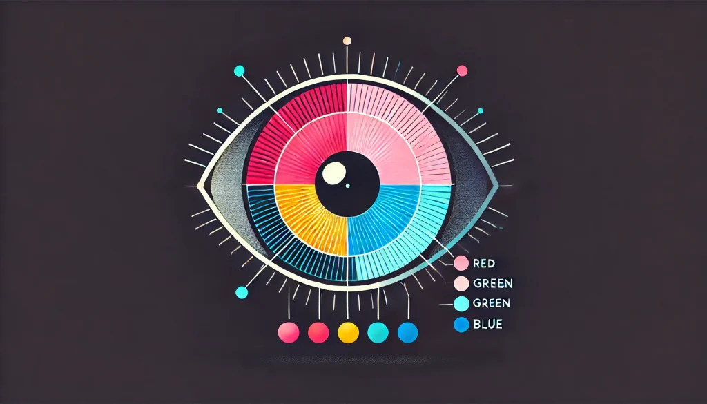
Color blindness, or color vision deficiency (CVD), is a condition where individuals have difficulty distinguishing certain colors. The three main types of color blindness are:
1. Red-Green Color Blindness (Most Common)
This type affects how individuals perceive red and green hues and is the most prevalent form of color blindness. It includes:
- Protanopia: Reduced sensitivity to red light, making reds appear dull or brownish.
- Deuteranopia: Reduced sensitivity to green light, causing greens to appear beige or indistinguishable from reds.
- Deuteranomaly: A milder form of red-green color blindness where the green cones are present but do not function correctly, causing greens to look more like reds. This is the most common type of color blindness, affecting about 6% of men.
2. Blue-Yellow Color Blindness
This rarer form affects blue and yellow hues, making it difficult to differentiate between certain shades. It includes:
- Tritanopia: The inability to distinguish between blue and yellow tones, often resulting in a perception of muted blues and difficulty distinguishing between greens and blues. Blue–yellow color deficiency occurs at equal rates among men and women. However, tritanopia and tritanomaly are exceptionally rare, affecting only 1 in 10,000 individuals.
3. Total Color Blindness (Achromatopsia)
In the rarest cases, individuals with achromatopsia see no color at all and experience the world in grayscale. This condition is often accompanied by light sensitivity and reduced visual acuity. Only 1 in 30,000–50,000 people worldwide experience it.
Why Color Accessibility Matters

Many UI elements rely heavily on color to communicate information. For color-blind users, this can result in confusion, difficulty in navigation, and frustration. Some common issues include:
- Unreadable text due to low contrast: Light gray text on a white background or red text on a black background can be challenging to read.
- Confusing color-coded indicators: Traffic lights, stock market graphs, and status alerts that rely solely on color can be indecipherable.
- Inaccessible form validation errors: If a form only highlights errors using red, color-blind users may not recognize the issue.
- Uninterpretable charts and graphs: Data visualization that relies on red/green or blue/yellow distinctions can be difficult to comprehend.
Real-World Scenarios
Consider the experience of a color-blind user trying to use a travel booking website. If flight availability is indicated only by red (unavailable) and green (available), they may struggle to differentiate between the two. A simple addition of symbols (✓ for available, ✗ for unavailable) would solve this issue.
Best Practices for Designing Color-Blind-Friendly Interfaces

1. Use High Contrast
Contrast is crucial for readability and visibility. The Web Content Accessibility Guidelines (WCAG) recommend:
- A contrast ratio of at least 4.5:1 for normal text.
- A contrast ratio of 3:1 for larger text.
- A contrast ratio of 3:1 for UI components like buttons and input fields.
To check contrast, use tools like:
- WebAIM’s Contrast Checker
- Adobe Color Contrast Analyzer
- Google Chrome’s DevTools color contrast checker
2. Avoid Reliance on Color Alone
Since color-blind users may not distinguish certain hues, it’s important to reinforce meaning with additional cues such as:
- Text labels alongside color-coded indicators.
- Icons or shapes to supplement colors (e.g., using different shapes for traffic signals in apps).
- Patterns in graphs and charts instead of using solid colors alone.
3. Use Color-Blind-Friendly Palettes
Certain color combinations are more accessible for color-blind individuals:
- Use blue and orange instead of red and green.
- Avoid red/green, blue/purple, and light green/yellow combinations.
- Choose colors that are distinct even in grayscale.
Online tools like Coblis (Color Blindness Simulator) and Sim Daltonism can help designers simulate how colors appear to users with different types of color blindness.
4. Provide Alternative Cues
Enhance usability by combining visual and textual elements:
- Buttons should include both color and text.
- Error messages should include text descriptions instead of relying on red highlights.
- Dotted, dashed, or solid lines should be used in charts to differentiate data trends.
- Progress bars should have labels or numbers alongside colors.
5. Implement Color Accessibility Testing
Before finalizing a design, test it with real users and tools such as:
- Stark (Figma, Sketch, Adobe XD plugin)
- Toptal’s Color Blind Filter
- Google’s Accessibility Scanner for Android apps
- Mac’s Color Filters in Display Settings
6. Follow WCAG Guidelines
The Web Content Accessibility Guidelines (WCAG) offer industry standards for designing accessible digital experiences. Key recommendations include:
- Ensure sufficient contrast between text and background.
- Provide additional indicators beyond color (e.g., text, shapes, icons).
- Support keyboard navigation and screen readers for additional accessibility needs.
Examples of Color-Blind-Friendly UI Designs

1. Google Maps
Google Maps uses different shades and patterns to distinguish traffic routes instead of relying solely on red and green indicators.
2. Trello
Trello’s color-coded labels include text descriptions, ensuring users can differentiate categories even if they can’t perceive color variations.
3. Microsoft Office Suite
Microsoft Office applications offer multiple high-contrast and color-accessible themes to accommodate users with visual impairments.
4. Instagram’s Color-Blind Mode
Instagram introduced a setting to make posts more distinguishable for color-blind users, improving accessibility for engagement features.
Additional Tips for Developers and Designers

- Use ARIA attributes to help screen readers describe UI components effectively.
- Offer customization options, allowing users to select alternative color themes.
- Educate teams on accessibility to ensure inclusive design thinking from the start.
- Prioritize accessibility in UX research, including color-blind users in usability testing.
Conclusion
By prioritizing contrast, alternative cues, and user testing, designers can build interfaces that work seamlessly for everyone, regardless of their ability to perceive color.
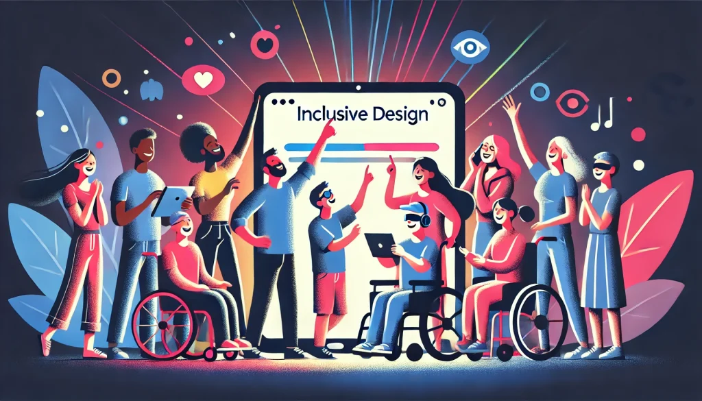
Accessible design isn’t a limitation; it’s an opportunity to innovate and enhance UX for a broader audience. Start implementing these best practices today to ensure your digital products are truly inclusive!
Also Read: Designing for the Elderly: The Overlooked Demographic in Digital Accessibility


