
First of all, before we dig deep into this guide and all the bits and nuts about designing meaningful icons, let’s start by understanding why we should care about iconography and its importance of usage in the real world.
If you search for the word ‘icon’ on the internet, you will come across a lot of different meanings from ‘an idolized person’ to ‘a computer symbol commonly used to represent a command’ to ‘small graphical representation of a program’ and many more. But, the simple definition is that an icon is a sign or a simplified representation of an object (or) an idea that we want to communicate. It uses a common/universal language that is understood by anyone independent of nationality, age, race or gender.
Why Icons matter?
As the world is getting busier and noisy with information, icons are the lifesavers where they help convey the concept quickly using a universal language with less than an average attention span of a normal human being i.e., (8sec; and research show this time is falling gradually in recent years due to increased cognitive load of a human brain). Moreover, they also can be presented at much smaller real estate. So, you only need a quick look at an icon to get the complex message it carries.
This article intends to guide you through some of the key guidelines and principles of designing icons for the current digital environment. But, if you are interested to know more about the history of digital iconography please refer to this link by FUTURAMO. (An excellent walkthrough of Icon history designed over early GUI’s to modern displays).
Types of Icons
There are two types of icons: a pictogram that uses the resemblance or reference to a physical object to convey its meaning and an Ideogram which is an illustrative representation of a whole idea or a concept we want to communicate.

knowing these differences is just a beginning. But like for designing anything, there are some other considerations need to be are taken care of in which they help us to build a meaningful and consistent icon set. And it all starts with defining the style that aligns with your brand message.
Icon style should match the brand language.
As with the different types of icons, that we just discussed there are also a couple of primary styles of icons to start with like outlined(flexible for adding details), filled(ensures more recognizability), Skeuomorphic(inspired by real-world) and organic(hand-drown) before we define and customize the icons with our unique brand style like whether they should be rounded/sharp, flat/angled, hard/soft, bold/light, fun/serious, casual/formal, luxurious/economical, literal/abstract and the list goes on.
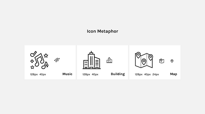
Icon Metaphor is important
A metaphor is a figure of speech that describes an object or action in a way that isn’t true but helps explain an idea or make a comparison. They act more like an ideogram in communicating the icon message. The simple example could be, a homepage of a website that can be represented with a simple home icon, a search can be represented as magnifier glass and similarly more complex like a cut and paste actions are represented with scissors and clipboard respectively.
And when dealing with different sizes of a particular icon, instead of simply scaling it down for smaller sizes we can remove or adjust the unnecessary details/elements within the icon keeping the icon metaphor in mind so that we don’t break the message it communicates.
Defining Grids & Keylines
Grid is the foundation of any good design which in this case it helps icons keep aligned to the pixels and space the elements properly thereby the whole icon set feels more consistent and uniform. But forcing all the elements to the pixel grid doesn’t work all the time because aligning something to a grid might not feel balanced until you balance it optically, considering the space of the element that each icon is occupied by and object center of mass. For example, a square with a similar size of a circle looks bigger when compared with each other. In a way, we need to develop a bit smaller version of the same circle that is optically corrected and balanced using the keylines within a pixel grid to make both look identical.
Now, depending on the use-case there are two types of grid keylines to follow, the grid with tabular keylines and the other one where it’s keylines are formed using the golden ratio circles (We will talk about the golden ratio in detail in the part-2 of this guide but for now let’s stick to the tabular grid). Most of the time we tend to use a tabular grid which is more powerful when working not just with symmetrical icons but also with asymmetrical where the particular icon having more horizontal/vertical size compared to its other side. For example, an email icon has more width than its height and similarly, a clipboard has more height than its width and these both can be aligned center using a tabular grid.
Which icon size should you consider?
Size is another common attribute for designing a consistent set of icons. If you are making a web thing and you are new to designing icons, I recommend starting with larger size i.e., at least from 80px to a minimum size of 16px followed by multiples of 8 for consistent scaling. So that, as the size reduces you can remove some unnecessary elements/details keeping the icon metaphor as we discussed earlier in the article. But if your designing for the mobile application the sizes vary from 96px to 512px of maximum. Independent of the size you choose your icons should be aligned in a fixed frame size let’s say at (24px X 24px) so that all your icons look uniform in structure.
Here comes fills & strokes
Especially, when working with outlined icons make sure your strokes are aligned to a pixel grid so they won’t get pixelated when a default vector is exported as PNG for Android (or) IOS mobile applications use-case. But if you’re making a web thing again SVG’s itself works better and developers can export one version of the icon and customize the code further in terms of size, stroke, and color depending on the use-case. One thing to note here is that the space between the strokes shouldn’t be less than a stroke width so that it adds enough breathing space for an icon even at smaller sizes.
Storke properties like cap and join should also be taken into consideration whether you need a rounded or sharp version of icons depending on the brand language. But whatever you choose, stick with one option for consistency over a complete icon set.

What’s next in the guide?
Now that we know the basic considerations of designing icons (or) iconography in general with part-2 of this guide we will continue to focus on other important icon metrics like corner-radii, element spacing, stroke terminal and pixel snapping for designing a more complex structure of an icon. Along with this, we will also look into defining proper naming conventions, localization constraints, use of color and other unique and practical ways to create icons, using the tool of your choice. Stay tuned. Any feedback is most appreciated in improving this guide. Thanks for reading.


