Your morning has started with your phone awakening you. And you switch on the data, to see all notifications popping into the smartphone. Then you click on a notification to open the Instagram application to like a post of your favorite person. And continue scrolling through the phone.
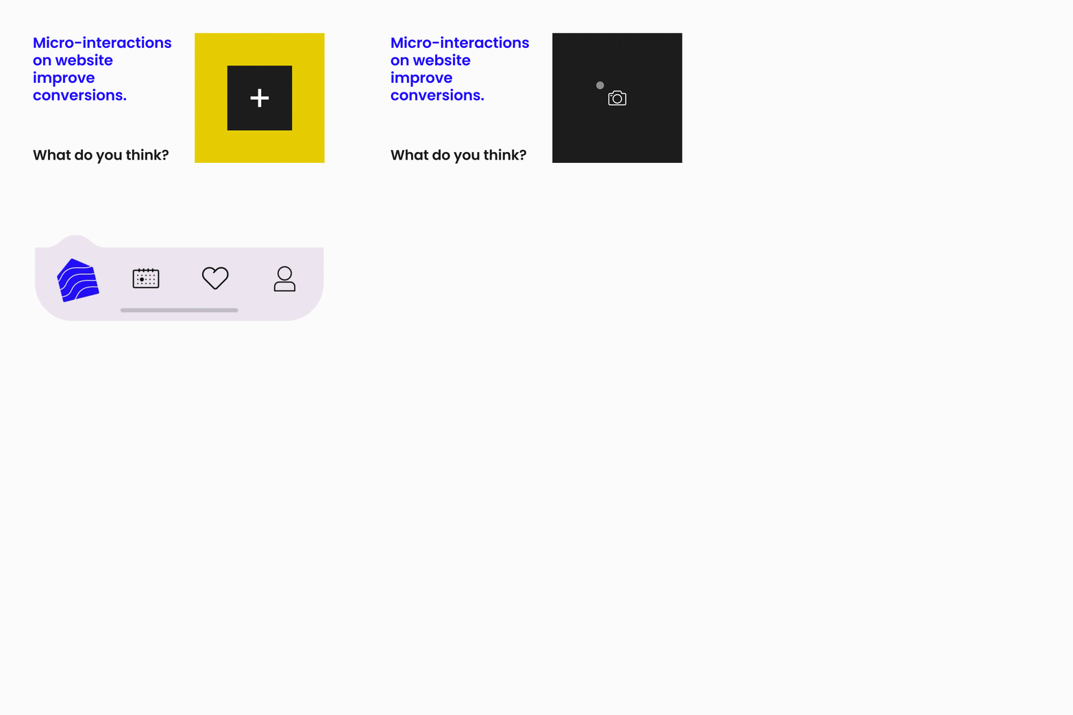
Each of these actions that you run into is micro-interactions. These small actions that push the user to interact with the application bring real beauty while using it. Micro-interactions sophisticate and improve user experience.
Micro-interactions initially came into existence in the 1980s. Since then these little things add huge value to the user experience design. Nowadays there is no website working without minuscule animations. They play a huge role in nudging the user into taking actions and thus makes them own a sense of accomplishment.
As time evolves more and more micro-interactions are designed to wow the visitors. Nowadays every aspect of the website is filled with these little things. Generating leads through pop up notifications has been considered spammy. Whereas now popups are designed to be intuitive and thus are thought-provoking to reconsider the way leads are generated.
Let’s have a look at the impact Micro interactions over some industries:
Payments Industry
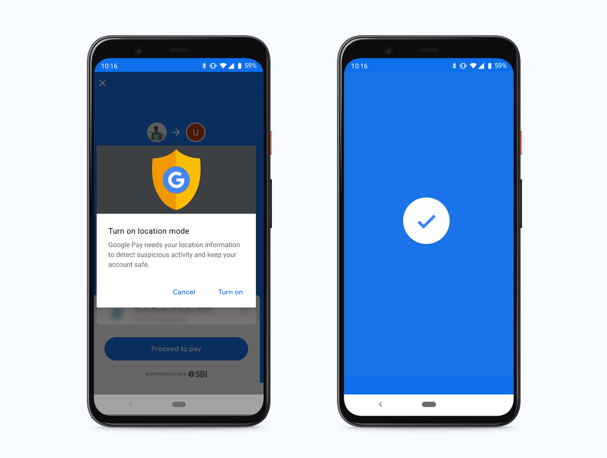
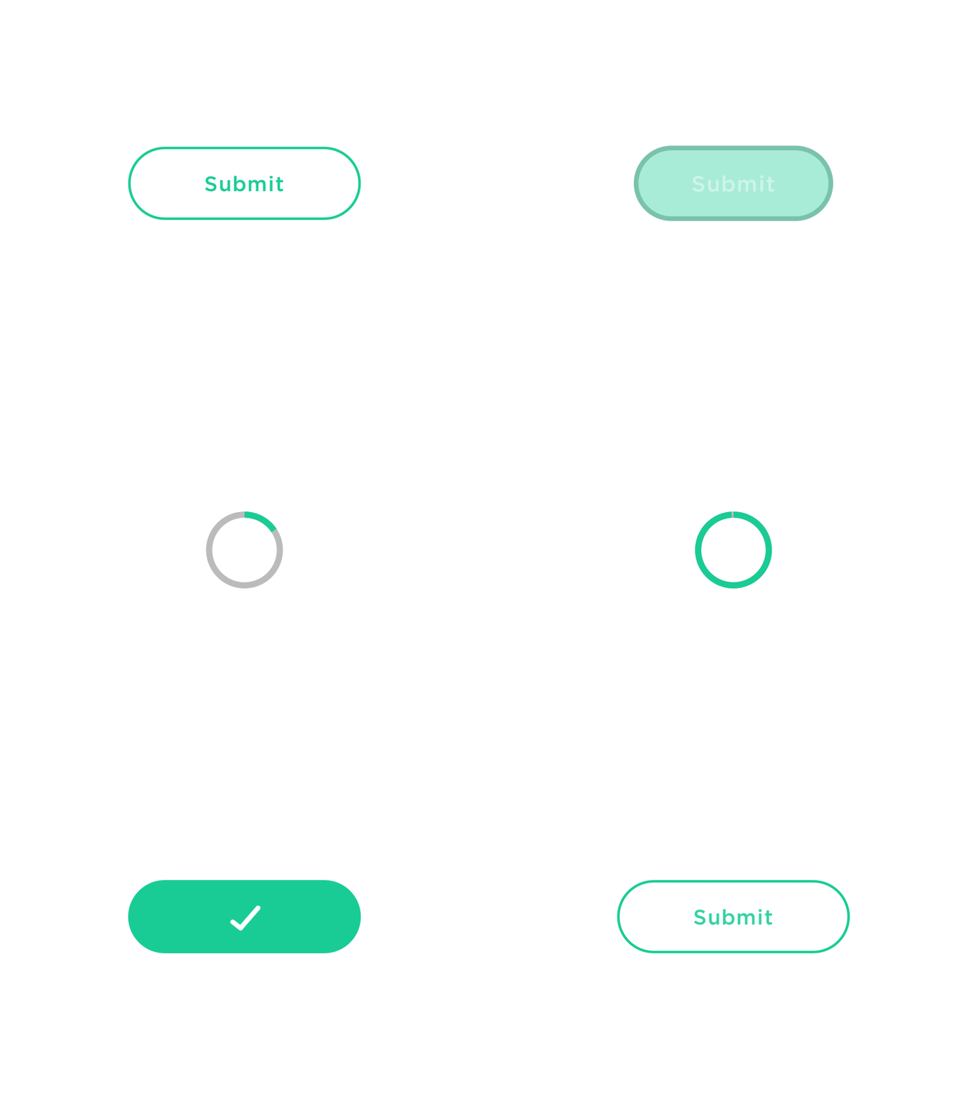
These minuscule interactions have taken a high road when it comes to payment applications or websites. In the millennials and gen Z era, it has become so common to digitalize payments. It is very important to consider the whole user journey while designing a micro-interaction on a payments platform. Imagine how unpleasant it might become if there is no payment success page on Gpay or Paytm.
Gaming industry
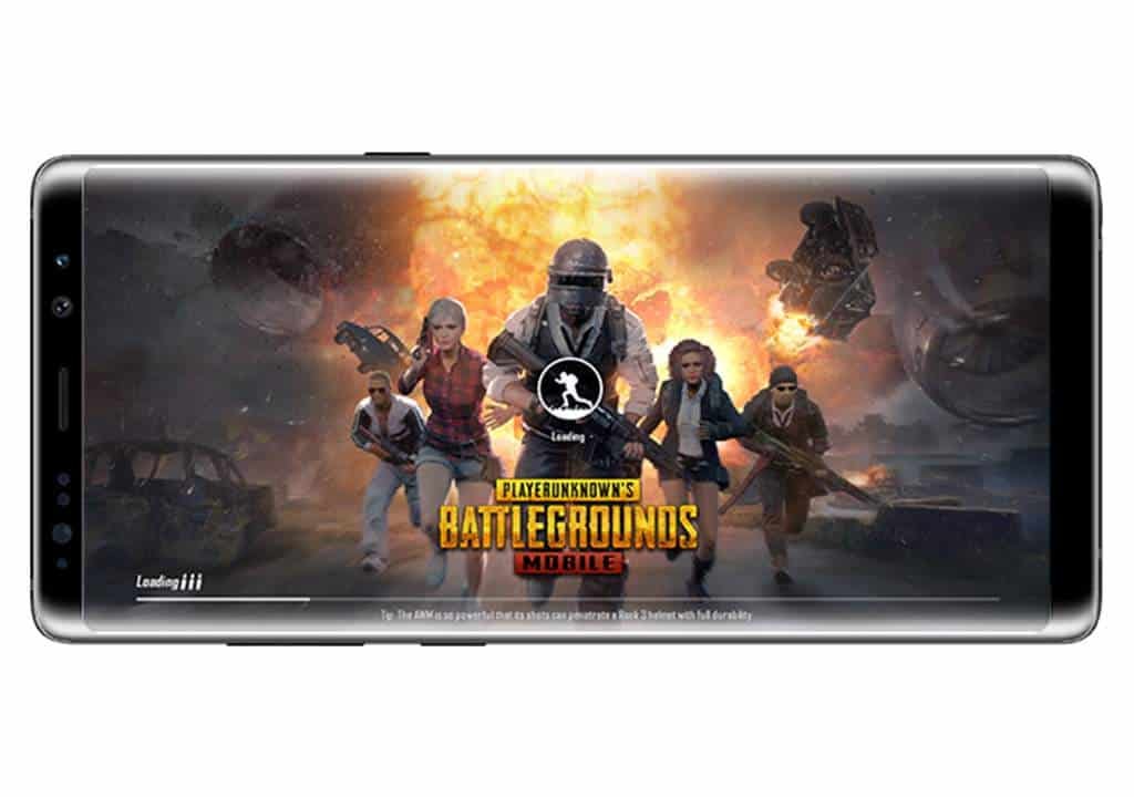
We all have heard of gamification in UX at some moment. Gaming itself is interesting but there is always lagging at some point or the other. And there is room for improvement in such things. Take PUBG for instance, whenever there is a bandwidth issue screen displays an interesting interaction. This retains the user to the game by making an effort to compensate for their boredom.
Ed-tech industry:
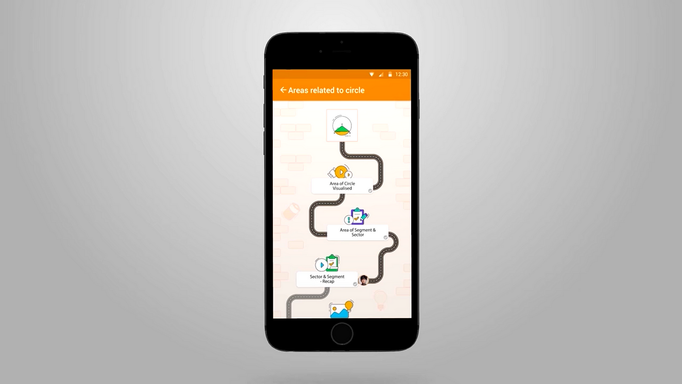
The education industry has gone through many changes. With the advent of digitalization, it has become quite easy to access immense material without any difficulty. It is easy to learn when what you want to learn is interactive and engaging. Have you seen the Journey feature that Byjus had introduced? So basically your avatar progresses the journey as you keep learning. This journey gives the user a sense of accomplishment and creates the urge to finish more.
The micro-interactions model:
In 2014, Dan Saffer, a product designer, published the book Microinteractions. In this book, Dan coined the term micro-interactions and outlined a model for designing them. This model has the following parts:
- A micro-interaction starts with a trigger. A user or the system can initiate triggers. User-initiated triggers include something like selecting the share button on a Facebook post. All the emoticons shown on a Facebook post are created for a user to take the action. On the other hand, System-initiated triggers occur when certain conditions are met such as an incoming message or an alarm ringing. In general, you want to create a system-initiated trigger like a pop-up notification on the website where the user tends to mostly perform the action. This should not cause annoyance to the user though. A micro-interaction should be as subtle as possible.
- Rules are the set of regulations that determine what happens when a particular trigger takes place. These actions are invisible and are not displayed unless the determined actions are not taken place. This is to create a flow for the actions. If a form is filled with an unexisting email id, then a notification pops up asking to fill the right email id.
- Feedback verifies the micro-interaction by double-checking the action the user has performed. As in when sending an email without any subject, Gmail pops up a confirmation message asking whether the user is absolutely fine to send the email without any subject line. Or more likely when filling a form, an error message asking to fill all the fields is a feedback interaction. Make sure that this message and design have a human touch rather than just an alert message.
- Loops and Modes are the sequence actions for the micro-interaction. What happens when you see the same visitor visiting your blog for the third time or fourth? If you are serious about the visitor subscribing to the newsletter display a different yet subtle set of micro-interactions.
Micro Interactions are used in various situations like
- Helping users understand: Micro interactions help users in understanding about the function. What it does and when to use it.

2. Calls to actions: The best way to make the user feel the sense of accomplishment is the calls to action button. When you want the user to take up a particular CTA your product should instill interest in them. This aids in better conversions.
3. Keep context: Unless all the elements keep up with the context reflecting the function it is going to perform, the UX is considered not great. At times it is also about maintaining the space between the elements. If four are grouped together it declutters the interface.

4. Highlight changes: Users might overlook the change sometimes, and we should make sure that does not happen by highlighting changes. Animations grab the attention of the users.
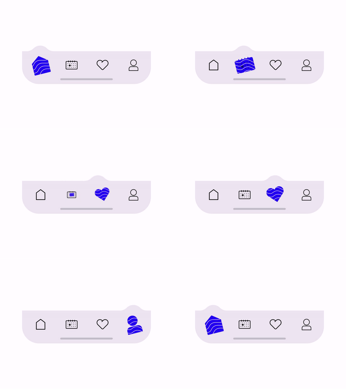
5. Showing system status: It is suggested that users should be informed about the system changes. Mostly it is the progress bar when an action is taking place. Else, there are more chances of the user getting annoyed with the site and thus add up to the bounce rate.
Experience more conversions:
Micro-interactions have the potential to create more engagement. Carrying out strategic website interactions could help in gaining more leads, conversions.
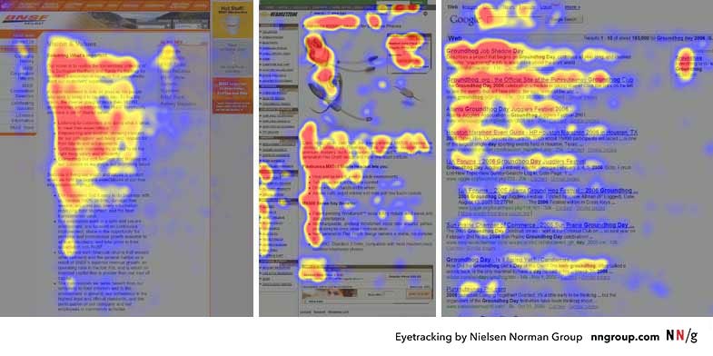
You might be focussing on F pattern layout or comprehending the power of UX writing in the opt-out buttons, but the only thing that works for your website is by testing which kind of works the most for us.

