
A Strategic Approach to Navigating Responsive Design Challenges in B2B SaaS Interfaces
It is no secret that a strong UX design is one of the most crucial factors that determines whether a user will engage or abandon your platform after the first visit.
Reports show that 88% of users do not return to a site with poor UX design.
So, a robust UX design is necessary for every online business, but it becomes especially crucial for SaaS businesses because of subscription-based models.
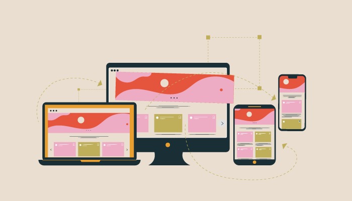
Delivering an excellent experience to users regardless of the device they are using, and their screen sizes is something that should not be discounted at any cost.
This is where responsive design comes into the picture. Responsive design customizes a website’s layout for different devices, ensuring a user-friendly experience across various screens. It prioritizes adaptability and user satisfaction.
Just like one size doesn’t fit all, the same UX design does not work for all screen sizes and devices when we talk about SaaS applications.
Mere re-sizing the layout to fit the screen for different devices is not the best approach to creating an exceptional user experience.
“Responsive design isn’t just about adapting to screen sizes; it’s about adapting to user needs and behaviors.”
Ethan Marcotte
However, crafting seamless and outstanding experiences across various screen sizes and devices comes with its challenges.
In this blog, we will dive deeper into the challenges and considerations of Responsive design in SaaS Interfaces. Read on to discover how to tackle the intricate task of balancing flexibility and consistency across diverse devices.
Why Responsive Design is Essential for SaaS Interfaces
In today’s digital era, users no longer confine themselves to a single device or screen size. They keep switching between devices. One moment they are on their desktops, the other moment they are on their mobile screens.
Responsive SaaS interfaces are crucial to cater to this user behavior and ensure optimal and consistent user experiences across devices.
Responsive design addresses this complexity by dynamically adjusting the layout, content, and functionality of a SaaS interface according to the characteristics of each device.
The intuitive user experience because of responsive design helps boost user engagement and satisfaction, strengthens brand image, and increases customer loyalty as well as conversion rates.
That’s why responsive design is essential for SaaS interfaces. It not only adapts to the diverse technological landscape but also establishes a harmonious connection between users and applications.
Common Responsive Design Hurdles in SaaS Interfaces
Cross-Device Display
While designing a responsive web page, it is often seen that a page that appears perfectly fine on larger screens appears disorganized and jumbled when viewed on smaller screens.
Dynamically adjusting the layout so that the content remains accessible and visually appealing across different screen sizes is one of the major challenges that designers face.
Developers must rigorously test and refine a website’s mobile and tablet view to eliminate issues like distorted layouts or misplaced elements.
Compatibility Across Various Browsers
Another challenge is to make the interface compatible with different web browsers. It is crucial to ensure that content is consistent regardless of the web browser on which it is being viewed.
According to reports, 34.6% of visitors leave a website because of poor content structure.
Each web browser is diverse with its unique rendering engine and interpretation of web standards. This adds another layer of complexity for designers creating responsive interfaces.
Legacy browsers add to the complexity as many users still use outdated web browsers that do not support advanced features, making backward compatibility a difficult task.
Developers must also keep in mind that not all functionalities, scripts, and elements work consistently on each browser. All these factors need careful consideration while designing a responsive SaaS interface to ensure a consistent user experience.
Touch and Mouse Interactions
Another challenge is to make the platform responsive to not just mouse and keyboard commands but also touch inputs.
Oftentimes, the mobile experience is compromised because of poor sensitivity to touch and scroll.
Optimizing button sizes, touch targets, and spacing is crucial to ensure that your platform is uniformly responsive to mouse interactions, keyboard commands, swiping, pinching, and tapping.
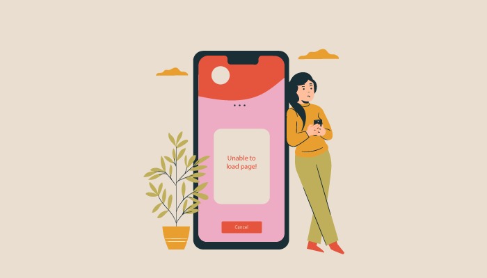
Loading Speed
Responsive interfaces are known for slow loading speeds, and this is one of the biggest challenges that UX designers face when designing responsive SaaS interfaces.
Designers must create responsive interfaces that do not take too much time to load as this will increase the bounce rate and affect revenue.
“The probability of bounce increases 32% as page load time goes from 1 second to 3 seconds.”
Google
Optimizing large image files, excessive HTTP requests, unoptimized code, and complex design elements are some of the issues that need to be overcome to enhance speed and user experience.
Inaccessibility
Sometimes scaling down web components for smaller screens makes certain pages and elements inaccessible to the users.
This poses a significant challenge for the designers to strike a balance between responsive design and maintaining accessibility.
Consistency is key in user experience. If web components are not scaled down effectively, users may encounter inconsistencies in the presentation of content, leading to confusion and frustration.
Designers strive for a consistent and intuitive user experience across all screen sizes, making scalability a crucial aspect of their design considerations.
Performance Optimization
Optimizing the performance of your interface for every device is of the utmost importance to ensure a seamless, consistent, and delightful experience.
Offering a consistent performance on different devices with different screen sizes, usability, functionalities, resolution, and specifications is not a cakewalk.
To overcome performance challenges, designers need to prioritize efficient use of resources, implement lazy loading for assets, and optimize graphics for different resolutions.
Leveraging technologies like progressive web apps (PWAs) can also enhance the overall performance and accessibility of SaaS applications on a wide range of devices.
These were some of the challenges of responsive design in SaaS interfaces. Let us now have a look at some ways to balance flexibility and consistency across devices.
How to Achieve Seamless Responsive SaaS Interfaces Through Good UX

Achieving Consistency and Flexibility on Every Device
Here are some tips to strike a balance between flexibility and consistency across devices and delivering an outstanding user experience.
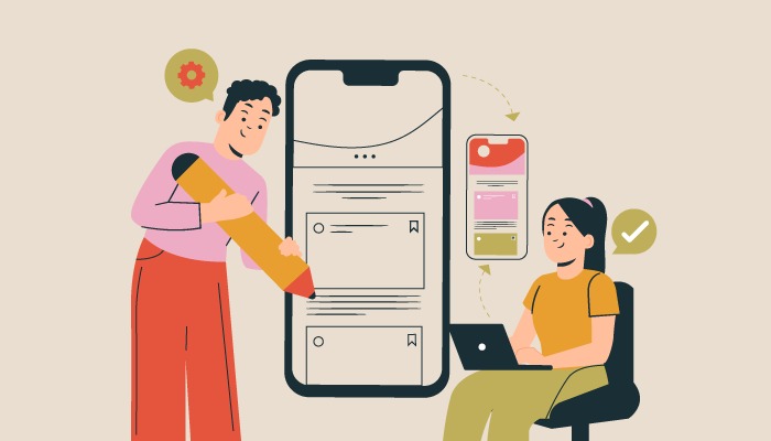
Comprehensive User Research
Understanding user behaviors and preferences and tailoring designs based on insights into user expectations is essential for crafting uniform and seamless experiences across devices.
Responsive Design Frameworks
Leverage responsive design frameworks to streamline the development process. These frameworks offer pre-built components and grids that automatically adjust based on the device’s screen size. This not only enhances flexibility but also maintains a consistent design structure across devices.
Fluid Layouts and Adaptive Images
Implementing fluid layouts that can adapt to varying screen sizes and combining this with adaptive images that dynamically adjust based on the device’s resolution will ensure that visual elements remain crisp and impactful regardless of the viewing context.
Test Across Devices
It is very important to rigorously test various devices and browsers and gather user feedback to identify and address inconsistencies. This will be beneficial in designing consistent and flawless interfaces.
Mobile-First Approach
Designing with a focus on a seamless mobile experience will be very beneficial for consistent interfaces across devices. Designing for smaller screens first allows for the optimization of core functionalities and content creating a strong foundation that can be expanded upon for larger screens.
Craft Flawless and Seamless Responsive SaaS Interfaces with f1Studioz
f1Studioz understands the importance of consistency in responsive SaaS interfaces. We specialize in crafting unforgettable, user-friendly, and delightful experiences.
Keeping user-centric design as our priority, we have successfully delivered exclusive design solutions to leading SaaS companies for over a decade.
The list of our happy customers includes Darwinbox, Capillary, Aviso, Setsail, Optmyzr, and a myriad of distinguished companies.
If you are looking to elevate your platform’s user experience with flawless responsive interfaces, look no further than f1Studioz.
Connect with us to experience a complete digital transformation. Learn more about our expertise at f1Studioz.
Conclusion
Navigating the challenges of responsive design in SaaS interfaces demands that designers approach the intricate terrain with ingenuity and a user-centric mindset.
Fundamentally, understanding users’ preferences, behaviors, and needs is key to overcoming these challenges.
It goes beyond mere adaptation to diverse devices; it’s about crafting experiences that enhance the lives of individuals interacting with the interfaces.
As technology evolves, the vital factor for creating exceptional, inclusive, and delightful digital experiences remains the harmonious fusion of flexibility and consistency.
This delicate balance not only meets the demands of a dynamic digital landscape but elevates the overall user experience to new heights.


