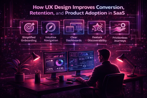
The first experience is the best experience. This plays a crucial role in the success of your business. Of Course, you only get one chance to impress your customers. Ease of first use is a very important factor when it comes to customer satisfaction and conversion rate.
Experiencing what your users are going to experience before they use your product. This will help you to understand if your product is worth using or needs any modifications. Focusing on how the user feels when they use your product for the first time is important. Often it is called “First Time User Experience (FTUE)”, “Out of Box Experience (OOBE)” or “Unboxing”.

A few of the key strategies to maintain the ease of first use include:
Onboarding strategy: Onboarding refers to the initial steps that a user goes through when they initially open an application. In simple words, the user will judge your application and decide if it’s worth using or not. Of course, first impressions are rough. But what to do, we live in a judgemental society and need to play along.
So, we try to create a nice first impression so that the user will not abandon your application after using it just once. Oh, did I forget to mention that nearly one-fourth of the users will stop using the application when they don’t get a good experience on first use? So cut the blare and give a great onboarding experience to your users.
Coach marks: Guiding your users is never old. Go back to the time when you were new to using Instagram. How would you know where the explore button is if there are no coach marks to guide you? These marks appear automatically or in response to an action.
Generally, when the application is being used for the first time the coach marks appear automatically and disappear when you tap on the ‘X’ button. Sometimes when the users want to go through instructions again, they can simply activate the info icon. Then the coach marks appear again. Don’t forget to include the ‘X’ mark since it helps the user to exit the guidance whenever they want to.
Empty states: Empty states or empty screens are the times in the user experience where there is nothing to display or show to the user. Even this can be attractive FYI. Trust me, you don’t want to bore your user by showing “Error 404 Not Found”.
You can fill that in with some illustrations or some cool lines. For example, we have Google classroom’s “Woohoo, no work due soon!” to showcase empty events box. And don’t forget to help the user navigate to some other page or do something else on the page. Provide other task links or something. Whatever it takes to keep your user busy.
Ikea effect: When you create something, you obviously love it more than anything. You tend to value it more than its ready-made counterpart. This love towards the product by its creator and bias towards its value is called “The Ikea Effect”.
So, what does design have to do with this Ikea effect? Well, if you want to make your users value your application more, make them the creators. Not totally, but digital products should be designed in such a way that users also need to contribute some effort or a small amount of customization done by them. This automatically increases the value of your application from the users’ perspective.
Let me be honest. There is no ‘Do this and be successful’ mantra available in the market to make a good first impression. So doing everything you can and implementing every reasonable strategy will definitely keep you one step ahead. Share your first impression experiences with us in the comments below.


