

You spend $100 acquiring a customer, nurture them through a three-week sales cycle, celebrate when they sign up… only to lose them three months later because they can’t find the “Export” button. That’s not just bad UX – it’s revenue arson.
Here’s the painful truth: 88% of online users won’t return after a bad experience. While your marketing team obsesses over lowering Customer Acquisition Cost, your product might be quietly hemorrhaging users through preventable design friction. The irony? Retaining an existing customer costs five times less than acquiring a new one, yet most SaaS companies don’t systematically audit the experience that keeps users around.
A SaaS UX Audit isn’t a design critique or aesthetic makeover. It’s a systematic health check that identifies profit-killing friction points before they become churn statistics. Think of it as preventative medicine for your revenue stream. Retention is the third critical pillar of SaaS UI/UX strategy, and it starts with understanding exactly where and why your users are hitting walls.
The 3 Types of Churn (And How Design Stops the Bleeding)
Not all churn is created equal. To fix it, you need to understand what’s actually driving users away.
Voluntary Churn: The “Value” Gap
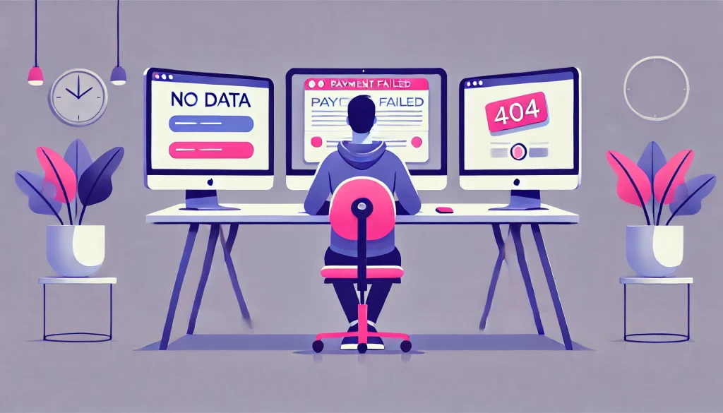
These users leave because they don’t see your product’s value, but here’s the twist: the value is often there, just buried. Your power features are hidden three menus deep. Your dashboards show vanity metrics instead of actionable insights. Your empty states say “No data yet” instead of teaching users how to get started. When users can’t discover what makes your product worth paying for, they leave. Better feature discovery, progressive disclosure, and intelligent onboarding can close this gap before it becomes a cancellation.
Related Reading:- How Do You Fix Onboarding Drop-Off? The Guide to Activating SaaS Users Fast
Involuntary Churn: The “Payment” Fail
Credit cards expire. Payment methods change. Banks flag transactions. But here’s what kills you: users don’t check their email religiously, so your dunning emails go unread. By the time they realize their account was suspended, they’ve already moved to a competitor. The fix? Pre-dunning alerts built directly into your dashboard, in-app payment update flows, and graceful degradation instead of hard account locks. Design can turn payment failures from silent killers into recovered revenue.
“Rage Quit” Churn: The Friction Killer
This is the most devastating type because these users wanted to stay. They were engaged enough to keep using your product, but something broke their patience. Picture this: a user needs to export their data for a client presentation in 30 minutes. They click the Export button. Nothing happens. They click again. And again. And again. This is what we call rage clicks, the digital equivalent of repeatedly slamming an elevator button that won’t respond. After the fifth click, they don’t file a support ticket. They open a new browser tab and Google your competitors.
Rage clicks are symptoms of broken flows, unclear system status, dead-end errors, and navigation that doesn’t match users’ mental models. These friction points are measurable, fixable, and cost you more than you think.
How to Conduct a Revenue-Saving UX Audit

A proper SaaS UX Audit combines expert review with hard data. Here’s how to do both.
Start with Heuristic Evaluation
Jakob Nielsen’s 10 Usability Heuristics provide a proven framework for expert review. Score your application on a 1-5 scale across dimensions like error prevention, visibility of system status, and consistency. Does your app tell users what’s happening during long processes? When users make mistakes, does your interface prevent errors or help them recover gracefully? This systematic review reveals patterns that analytics alone might miss. You’re not looking for opinions; you’re applying decades of UX research to identify violations of fundamental usability principles.
Layer in Behavioral Analytics
Expert opinion gets you halfway. Real user behavior takes you home. Tools like Hotjar or FullStory reveal what users actually do, not what they say they do. Look for dead zones where users frantically click non-interactive elements, assuming they’re buttons. Find your drop-off cliffs where 50% of users abandon a critical flow. Map rage click patterns to understand which interface elements are frustrating users most. Heat maps show you what users ignore, session recordings show you where they struggle, and funnel analysis shows you exactly where you’re losing money.
Focus on “Red Routes” First
You can’t audit everything at once, and you shouldn’t try. Identify your three to five red routes, the critical paths that directly generate revenue. For most SaaS products, these include upgrading plans, adding team members, integrating with other tools, exporting data, or configuring key features. Audit these flows first. If your primary monetization path requires more than three clicks or involves any moment where users commonly get confused, you’ve found your highest-impact fix.
Here’s a quick friction test you can run right now: Open your app and try to upgrade your plan. If it takes more than three clicks or requires you to leave the app entirely, you’re losing money. Every extra step, every moment of confusion, every unclear button label is a conversion rate tax you’re paying unnecessarily.
Top Churn Triggers & How to Fix Them

- Slow Load Times: 53% of users abandon experiences that take longer than three seconds to load. If you can’t make it faster, make it feel faster. Skeleton screens, progressive loading, and optimistic UI updates can transform perceived performance even when actual load times stay constant.
- Dead-End Errors: Nothing frustrates users faster than cryptic error messages. “Error 404” tells users they failed but not how to recover. Instead, guide them: “We couldn’t find that page. Here’s your dashboard, or you can search for what you need.” Turn every error into a supported recovery moment rather than an abandonment trigger.
- Navigation Bloat: When your menu has 15+ items, you’ve created decision paralysis. Users don’t want infinite options; they want the right option, fast. Group related features, use progressive disclosure for advanced functionality, and ruthlessly prioritize based on actual usage data. This problem usually compounds when you lack a consistent design system, leading to feature sprawl that confuses rather than empowers.
Related Reading:- When Should You Build a Design System? How to Scale SaaS UI Without Chaos
- Hidden Value: Your most powerful features might be invisible to 80% of users. Contextual tooltips, in-app announcements for power features, and usage-based prompts can surface value at exactly the right moment. If users don’t know a feature exists, they can’t get value from it, and they can’t justify their subscription cost.
Related Reading:- What Makes a Dashboard ‘Smart’? How to Visualize Complex SaaS Data
The Million-Dollar Cancel Flow
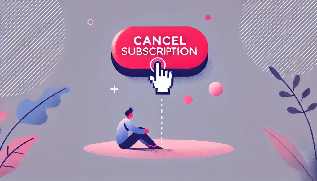
Here’s a real scenario: A SaaS company was bleeding users who cited “too expensive” as their primary cancellation reason. Their UX audit revealed something surprising. The cancel button wasn’t the problem; it was what happened after users clicked it. There was no conversation, no attempt to understand, no offer to help. Users who wanted to cancel could only cancel.
The fix? A thoughtful offboarding flow that actually engaged with users. When someone clicked cancel, the system asked why they were leaving. If they selected “Price,” it offered a 20% discount for the next three months. If they selected “Confused about features,” it offered a free one-on-one demo with a customer success manager. If they selected “Not using it enough,” it suggested a plan downgrade instead of full cancellation.
The result? Churn dropped from 14% to 9% in the first quarter after implementation. The revenue saved? $1.2 million annually. This wasn’t manipulation; it was conversation. Many users weren’t trying to leave permanently. They were stuck, frustrated, or needed a temporary adjustment. The new cancel flow gave them options they didn’t know existed.
Start Fixing Churn Today

Stop treating churn as an inevitable cost of doing business. Stop throwing discounts at retention problems that stem from design friction. A systematic SaaS UX Audit identifies exactly where users struggle, why they leave, and how to fix it before you lose another customer.
The math is simple: if your average customer lifetime value is $5,000 and you’re churning 12% annually, every percentage point you reduce churn adds significant recurring revenue. Fix the rage clicks. Eliminate the dead-end errors. Surface your hidden value. Make your critical paths frictionless.
A UX audit isn’t a cost center. It’s an investment with a 10x return, because keeping customers you’ve already won is always cheaper than finding new ones.
Is your product leaking revenue? Book a free 30-minute UX audit with our team and discover the friction points costing you customers.
Frequently Asked Questions
1. What exactly is a SaaS UX Audit?
A SaaS UX Audit is a systematic evaluation of your product’s user experience, combining expert heuristic evaluation with behavioral data analysis to identify friction points that cause churn, reduce engagement, or block users from discovering value.
2. How much does a UX audit cost?
Professional UX audits typically range from $5,000 to $25,000 depending on application complexity and scope. However, the cost of not fixing churn-causing friction is exponentially higher. A single percentage point reduction in churn can generate six to seven figures in retained annual revenue.
3. How does bad UX increase churn?
Bad UX creates friction that prevents users from accomplishing their goals, discovering your product’s value, or completing revenue-generating actions. When users consistently struggle, they assume the problem is your product’s capability rather than its interface, leading them to seek alternatives.
4. What are rage clicks and how do I find them?
Rage clicks occur when users frantically click the same element multiple times, usually because it’s unresponsive, unclear, or broken. Session recording tools like Hotjar, FullStory, or LogRocket automatically detect and flag rage click patterns, showing you exactly which interface elements are frustrating users most.
5. What are Nielsen’s 10 Heuristics?
Jakob Nielsen’s 10 Usability Heuristics are foundational principles for interface design, including visibility of system status, match between system and real world, user control and freedom, consistency, error prevention, recognition over recall, flexibility, aesthetic minimalism, error recovery, and help documentation. They provide a research-backed framework for evaluating interface quality.