The fintech revolution is reshaping how we manage money, but are users truly benefiting?
Only 57% of Americans are financially literate, rest struggling with basic concepts like budgeting and investing. This gap presents a golden opportunity for fintech apps to step up and make a difference through intuitive UX design.
The Financial Literacy Crisis
The numbers paint a concerning picture:
- Only 24% of millennials demonstrate basic financial literacy.
- 53% of adults feel anxious discussing their finances.
- 78% of American workers live pay check to pay check.
These statistics highlight the urgent need for accessible financial education. Fintech apps, with their widespread adoption, are uniquely positioned to tackle this challenge head-on.
UX for Financial Empowerment

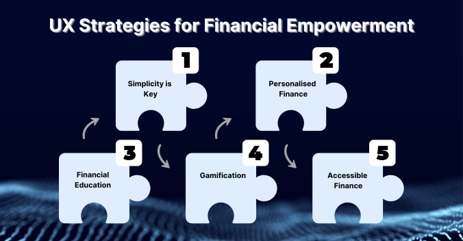
1. Simplicity is Key: Prioritising User-Friendly Interfaces
Financial information can be dense and complex. A well-designed Fintech app should prioritise clarity and ease of navigation.
- Clear Labelling and Terminology: Avoid jargon and financial acronyms. Use clear, concise language that everyone can understand.
- Intuitive Interface: Organise information logically, with easy-to-find features and functionalities. Leverage familiar design patterns to create a seamless user experience.
- Data Visualisation: Data Visualisation helps present financial data in an easily digestible format. Charts, graphs, and progress bars help users understand their spending patterns and financial goals.
Example: Mint’s spending wheel provides an intuitive snapshot of budget allocation, making it easy for users to identify areas for improvement.
2. Financial Education on the Go: Building Learning into the App
Fintech apps can be powerful educational tools. Integrate features that go beyond basic transactions:
- Interactive Tutorials and Explainers: Offer short, engaging tutorials that explain financial concepts in a clear and relatable way.
- Contextual Tips and Information: Provide bite-sized educational pop-ups or tooltips that explain specific features or financial terms when users hover or click.
- Glossary and Resource Center: Include a built-in glossary defining financial terms and a curated list of financial literacy resources for further learning.
3. Personalised Finance: Tailoring the Experience to Individual Needs

A one-size-fits-all approach doesn’t work in finance. UX design can personalise the app experience to each user’s financial goals and literacy level.
- Onboarding with Financial Assessments: During signup, assess user’s financial knowledge and goals to tailor the app experience and educational resources.
- Goal Setting and Tracking: Provide tools to set personalised financial goals like saving for a down payment or building an emergency fund. Track progress visually and offer guidance along the way.
- Actionable Insights and Recommendations: Analyse spending data and offer personalised recommendations based on the user’s financial situation. This could include budgeting tips, saving strategies, or investment suggestions tailored to their risk tolerance.
Example: Betterment, a robo-advisor platform, personalises the investment experience through UX design.
4. Gamification: Making Learning Fun and Engaging
Let’s face it, financial literacy isn’t always the most exciting topic. Gamification elements can make learning more engaging and interactive.
- Points and Badges: Reward users for completing financial tasks like creating a budget or tracking expenses. This provides a sense of accomplishment and motivates them to continue using the app’s educational features.
- Challenges and Quizzes: Offer interactive challenges and quizzes related to financial concepts. This reinforces understanding in a fun and rewarding way.
Example: Acorns’ “Money Basics” course uses interactive quizzes and micro-learning to make investing concepts stick.
5. Accessible Finance: Making Fintech Apps Accessible for All

Financial literacy shouldn’t be a privilege. Here’s how UX design can ensure inclusivity:
- Accessibility Features: Implement features like screen reader compatibility, high-contrast themes, and larger fonts to cater to users with disabilities.
- Multilingual Support: Make your app accessible to a wider audience by offering support in multiple languages.
Measuring Success

To gauge the effectiveness of these UX strategies, consider tracking metrics like:
- Time spent on educational content
- Quiz completion rates and scores
- User confidence levels (through surveys)
- Positive financial behaviours (e.g., increased savings rate)
Fintech Frontrunners
1. Mint: Mastering Financial Management Through Gamification
Mint, a budgeting and money management app, understands the power of making finance engaging. They incorporate gamification elements to keep users motivated.
- Progress Bars & Badges: Users see visually appealing progress bars track their budgeting goals, accompanied by badges for milestones achieved.
- Goals & Challenges: Mint allows users to set custom goals and participate in fun challenges, fostering a sense of accomplishment and healthy competition.
2. Acorns: Making Saving Effortless with Micro-Investing
Acorns, a micro-investing app, uses UX design to make saving seamless and educational.
- “Round-Ups” Feature: Acorns automatically rounds up spare change from everyday purchases and invests it, making saving effortless.
- Investment Education: The app provides bite-sized educational content within the interface, explaining investment concepts in a clear and concise manner.
3. Betterment: Simplifying Investing Through Personalized Portfolios
Betterment, a robo-advisor platform, uses UX design to make investing accessible for everyone.
- Risk Assessment & Portfolio Building: They guide users through a simple risk assessment and automatically build personalized portfolios based on individual goals and risk tolerance.
- Investment Performance Tracking: Betterment offers clear and easy-to-understand dashboards that track investment performance, empowering users to monitor their progress.
Building a Financially Literate Future

As fintech continues to evolve, the opportunity to positively impact financial literacy grows. By prioritising education through thoughtful UX design, fintech apps can empower users to make smarter financial decisions.
At f1Studioz, we believe in the power of UX design to make Fintech apps not just functional, but truly educational and create user experiences that foster financial literacy, build trust, and empower users to achieve their financial goals.
Remember, the goal isn’t just to create flashy interfaces – it’s to genuinely improve users’ financial lives.
Also Read: Elevating Online Banking Security & Loyalty Through Intuitive UX Design


