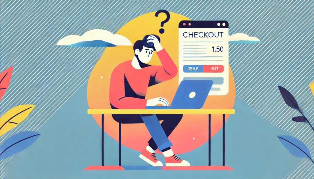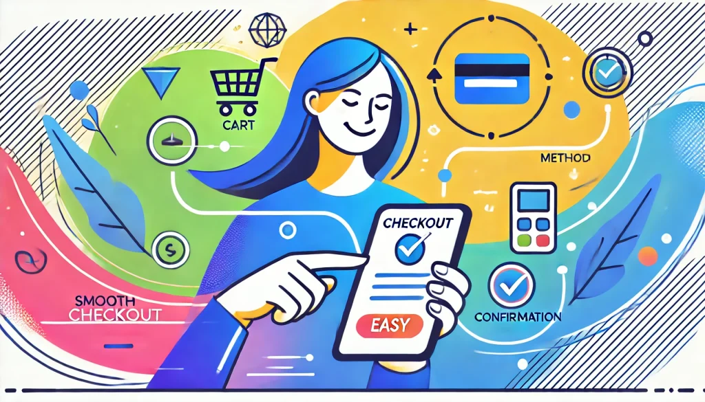
Abandoned shopping carts are a common frustration in e-commerce, impacting sales and revenue across industries. Users add items to their cart but, for various reasons, leave before completing the purchase. Around 70% of online shopping carts are abandoned before checkout, representing a significant missed revenue opportunity for e-commerce businesses. Tackling this issue through strategic design and retention-focused user experience (UX) enhancements can help turn casual browsers into loyal customers.
Understanding Why Users Abandon Carts

Understanding why users abandon carts is the first step in addressing the problem. Common reasons include:
- Complex or Lengthy Checkout Process: If the checkout process involves multiple pages or requires users to fill in excessive details, they’re more likely to abandon it. Simplifying this flow is crucial.
- Unexpected Costs: Users dislike surprises, especially additional costs like shipping fees or taxes appearing late in the process. Displaying these costs upfront is essential.
- Mandatory Account Creation: Many users prefer a fast, one-time purchase experience and may abandon their carts if forced to create an account.
- Security Concerns: Without trust signals (like SSL certifications or recognizable payment options), users may hesitate, fearing their information could be at risk.
- Exploring Options: Sometimes, users aren’t yet ready to purchase and may abandon their carts to compare prices or assess their options.
The Role of User Experience (UX): Abandonment often boils down to friction points in the user journey. By optimising UX, e-commerce sites can simplify the checkout process and minimise hesitation, leading to higher conversions. This is where thoughtful design, clear communication, and streamlined navigation come in.
The Power of Design in Retaining Users

- Streamlined Checkout: A clear and straightforward checkout process is critical. Research shows that 17% of shoppers abandon their carts due to a complicated checkout experience. Reduce unnecessary steps, such as separate pages for billing and shipping information, and combine them when possible. Aim to limit the checkout process to no more than 2-3 pages, and include a progress indicator to show users how close they are to completion.
- Transparency in Pricing: A study shows that unexpected or high additional costs are a leading cause of cart abandonment, impacting 48% of users. Displaying taxes and shipping fees upfront can reduce abandonment rates by nearly half, significantly increasing checkout completion rates.
- Guest Checkout Options: Offering guest checkout is key to reducing friction. Once the purchase is complete, provide a one-click option to create an account, saving the user’s information for future transactions. This allows users the flexibility of a quick purchase without unnecessary delays.
- Secured Payment Experience: To instill confidence, display security symbols, payment partner logos, and encryption indicators, like SSL badges. Highlight security practices, such as two-factor authentication or verification steps, to reassure users that their data is safe.
Utilising Data to Understand User Behaviour

- Heat-maps and Session Recordings: Using tools like heatmaps and session recordings can reveal areas of user hesitation or frequent exits. For example, if users often hover over the shipping information section, they may have concerns about fees. Use these insights to optimize problematic areas and ease user concerns.
- A/B Testing: A/B testing can provide data-backed insights on what design elements, such as button colours, CTAs, or form layouts, drive the highest conversions. Test options like different CTA language (“Complete Purchase” vs. “Buy Now”), the placement of trust signals, and page structure to continually refine the user journey.
- Personalisation and Targeted Offers: Data-driven personalisation can make users feel valued. Use browsing history, past purchases, or abandoned items to create tailored offers, like discounts on items users have abandoned or free shipping on their next purchase.
Effective Use of Visual Cues and CTAs

- Clear Call-to-Actions (CTAs): Direct, concise language in CTAs can make a difference. Buttons with phrases like “Complete Purchase” or “Order Now” are more effective than generic “Continue” buttons. Additionally, using contrasting colours for these buttons helps them stand out.
- Progress Indicators: Showing a visual progress bar in multi-step checkouts reassures users, giving them clarity on how many steps remain. It can prevent abandonment by reducing frustration with complex or lengthy processes.
- Sense of Urgency: Using visual cues that create urgency, such as limited stock indicators (“Only 2 left in stock”) or countdown timers on offers, encourages users to complete their purchase. These visual signals add a subtle psychological nudge without being pushy.
Cart Reminders and Retargeting Strategies

- Email Reminders: Cart abandonment emails are a powerful tool for re-engagement. According to SellersCommerce, businesses have the opportunity to recover around 10% of lost revenue simply by sending abandoned cart emails. Statistics reveal that 45% of cart abandonment emails are opened, with 21% of those emails leading to a click-through, and half of those clicks resulting in a completed purchase.
Personalise these reminders to include product images and descriptions, and consider offering incentives such as a limited-time discount or free shipping. Include a prominent CTA button to make returning to the cart easy.
- Retargeting Ads: Utilising retargeting ads through Google or social media can serve as gentle reminders to users about their abandoned items. For example, displaying the item left in the cart alongside similar product recommendations or highlighting a discount offer can increase the likelihood of conversion. On average, 26% of users return to complete their purchases after seeing a retargeting ad.
- Incentives for Returning: Sometimes, a small nudge is all that’s needed. Offering incentives, like 10% off the total purchase or complimentary shipping for orders over a certain amount, can persuade users to return and complete their purchase.
Mobile Optimisation

- Responsive Design: Nearly 79% of smartphone users have made an online purchase using their mobile device in the last six months. Ensuring a smooth mobile experience is essential to capitalising on mobile traffic. Make sure that text, images, and buttons are appropriately sized and responsive. Use auto-fill fields and simplified navigation to make the experience as smooth as possible.
- Easy Payment Methods: Integrating mobile-friendly payment methods such as Apple Pay, Google Pay, or Amazon Pay can significantly enhance the checkout experience. One-click payment methods can reduce friction, allowing users to complete purchases faster and with fewer steps.
Conclusion

Abandoned carts present a challenge for e-commerce businesses but also highlight valuable opportunities for enhancing the customer experience. By understanding common reasons for abandonment and applying design principles that prioritise ease of use, security, and personalisation, businesses can reduce abandonment rates, retain more users, and increase conversions.
The key lies in building a checkout experience that is intuitive, user-friendly, and optimised for both desktop and mobile. Regular testing, user data analysis, and responsive adaptation will ensure that your e-commerce platform evolves with changing user expectations, helping you stay ahead in a competitive marketplace.
Also Read: How UI/UX Design Can Boost Your Website’s Conversion Rate


