

Picture a mid-level operations manager staring at a dashboard: 14 data panels, 6 navigation tabs, and a modal window they’ve never seen before. They have ten minutes to make a decision that affects three departments. Now compare that to the average consumer app, where the goal is to get a user from install to “aha moment” in under sixty seconds.
These are not the same design problem. Enterprise software carries a different weight – more stakeholders, more consequences, more complexity baked into every screen – and it needs to be designed accordingly.
Why Consumer UX Principles Fail at Enterprise Scale
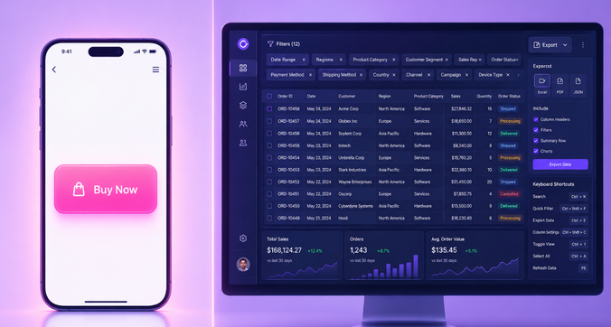
Most UX training starts with a simple mantra: reduce friction, minimize clicks, make it obvious. That thinking works well for a shopping app or a social feed, where users are casual, un-trained, and free to leave the moment something feels hard.
Enterprise users are the opposite. They’re trained professionals who use the same product eight hours a day, often for years. They don’t need a simplified experience – they need power, precision, and access to depth. A sales operations lead doesn’t want three onboarding tooltips explaining what a pipeline is; they want to filter twelve fields at once and export the results before their next meeting.
This is where a common myth breaks down: the idea that fewer clicks always equals better UX. In high-complexity environments, an extra click that surfaces the right information can be far more valuable than a “simplified” view that hides what an expert user actually needs.
The Cost of Getting Enterprise UX Wrong

When enterprise UX fails, the damage isn’t just an annoyed user – it shows up on a P&L statement. Common symptoms include:
- Productivity loss as employees fight the tool instead of doing their jobs
- Workarounds and shadow IT, where teams quietly adopt spreadsheets or unauthorized apps because the sanctioned system is unusable
- Low adoption rates for expensive platforms that were supposed to transform how the business operates
- Failed digital transformation initiatives, where millions in software investment never translate into the promised efficiency gains
Poor enterprise UX isn’t a cosmetic problem. It’s an operational and financial one.
Enterprise UX as a Discipline of Its Own
Given all this, enterprise UX design has emerged as a specialized practice – one that balances complexity with usability rather than eliminating complexity altogether. It requires designing simultaneously for multiple user roles, organizational hierarchies, data-heavy environments, and strict permission structures.
This article is a practical guide to that discipline. We’ll cover what enterprise UX actually is, how to design for multiple roles at once, how permissions shape the user experience, how to handle dense and complex data, the design patterns that show up again and again in enterprise products, and the key challenges designers face along the way.
What Is Enterprise UX Design?

Enterprise UX design is the practice of creating digital experiences for business software used by professional users inside large organizations – think CRM platforms, ERP systems, internal admin tools, and workflow software used by hundreds or thousands of employees.
It differs from consumer (B2C) UX in a few important ways:
- A captive user base. Employees don’t “choose” to use the internal HR platform the way they choose a weekend delivery app – they’re required to, regardless of how they feel about it.
- Domain expertise. Users often have deep, specialized knowledge of their field, and the interface needs to speak their language.
- Organizational scale. A single product might serve dozens of departments with different goals.
- Multi-system integration. Enterprise tools rarely operate alone; they connect to a web of other systems.
- Governance requirements. Compliance, audit trails, and data governance are built into the product, not bolted on afterward.
Core Characteristics That Make Enterprise UX Unique
Five characteristics tend to define enterprise environments:
- Multiple user roles with different needs, goals, and access levels using the same product
- Dense, high-volume data that must be surfaced meaningfully rather than dumped onto a screen
- Complex workflows that span departments, teams, and systems
- Strict compliance, audit, and governance requirements that shape what can and can’t be shown
- Long onboarding cycles, with users developing deep product expertise over months or years
Enterprise UX vs. Consumer UX: A Side-by-Side Comparison
| Dimension | Enterprise UX | Consumer UX |
| User intent | Task completion, efficiency | Engagement, delight |
| Design goals | Depth, control, accuracy | Simplicity, speed to value |
| User base size | Smaller, defined, often internal | Large, broad, self-selected |
| Learning curve | Acceptable, even expected | Should be near-zero |
| Success metrics | Task completion time, error rate, adoption | Retention, engagement, conversion |
One of the most common mistakes in enterprise product organizations is applying consumer benchmarks – like time-to-first-action or daily active users – to products where a longer learning curve is actually appropriate, even desirable.
Designing for Multi-Role Workflows

Understanding Role-Based Mental Models
Different roles within the same enterprise product don’t just have different permissions – they have fundamentally different mental models. A financial analyst thinks in terms of line items and variances. A department head thinks in terms of team performance and budget ownership. A system administrator thinks in terms of configuration, access, and system health.
Put all three in front of a single unified interface designed for “the average user,” and it will underserve all three. Each role needs the product to reflect how they actually think about their work, not a generic compromise.
How to Map Cross-Role Workflows
To design well for multiple roles, enterprise designers rely on cross-functional journey maps and service blueprints that reveal where handoffs, dependencies, and friction occur between roles. A practical process looks like this:
- Identify every user role that interacts with the workflow
- Document each role’s entry point, tasks, and exit point
- Map the handoffs and data dependencies between roles
- Identify where the workflow breaks down or causes delays
- Design interface states and notifications that support each role at each stage
This mapping exercise often reveals invisible friction – a step where an approval silently stalls, or a handoff where one role has no visibility into what the previous role just did.
Designing Adaptive Interfaces for Multiple Roles
Rather than building entirely separate products for each role (expensive to maintain, hard to keep consistent), most enterprise platforms design interfaces that adapt based on who’s using them. Common techniques include:
- Role-based dashboard configurations that surface different widgets by default
- Contextual navigation menus that show only relevant modules per role
- Personalized data views that filter the same underlying dataset differently
Platforms like Salesforce, SAP, and ServiceNow are built around this kind of role-adapted experience. The tradeoff designers constantly weigh is between full customization (flexible, but harder to maintain a consistent product experience) and a more unified experience (easier to support, but less tailored to each role’s needs).
Permissions and Role-Based Access Design
What Is Role-Based Access Control (RBAC) and Why It Matters for UX
Role-based access control structures permissions around roles – like “editor,” “approver,” or “viewer” – rather than granting access to individual users one by one. This makes systems easier to secure and manage at scale.
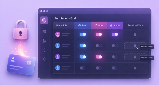
But RBAC isn’t just a backend security concern. Every permission decision directly shapes what a user sees, what they can do, and how confident they feel using the product. Get it wrong, and users hit walls they don’t understand.
The UX Design Challenge of Invisible Restrictions
Hidden buttons, greyed-out fields, and blunt “access denied” errors are some of the most common sources of user frustration in enterprise software. When users can’t tell whether something is broken, missing, or simply restricted, trust in the entire product erodes.
The guiding principle here is graceful degradation: show users what they cannot access, but clearly communicate why it’s restricted and how access can be obtained – rather than pretending the feature doesn’t exist or throwing an unexplained error.
Best Practices for Designing Permission-Aware Interfaces
- Design for the lowest-permission role first, then layer additional capability upward
- Use contextual messaging instead of hard errors when access is restricted
- Make permission boundaries visible in admin views without exposing sensitive underlying data
- Test every interface state across all permission levels before release
- Collaborate with engineering and security teams early in the design process, not as an afterthought
Handling Complex Data in Enterprise Interfaces

Why Enterprise Data Is Different
Enterprise data tends to be high-volume, pulled from multiple sources, updated in real time, made up of mixed data types, relationally complex, and subject to audit requirements. Compare a simple consumer product card – a photo, a price, a button – to a multi-entity ERP transaction record linking vendors, cost centers, approvals, and line items. These are fundamentally different design problems.
Data Density vs. Clarity: Finding the Right Balance
The central tension in enterprise data design is showing enough for expert users to make informed decisions without overwhelming them. Progressive disclosure is the standard solution: surface summary-level data first, with clear paths to drill into detail when needed.
It’s also worth remembering that different roles often need different data densities on the exact same record – an executive might want a single rolled-up number where an analyst wants the full transaction history behind it.
Data Visualization Patterns for Enterprise Dashboards
A few visualization patterns show up repeatedly in enterprise UX, each suited to a different kind of decision:
- Data tables with inline actions for managing high-volume lists efficiently
- KPI cards for executive and operations-level dashboards
- Timeline and Gantt views for tracking projects and workflows over time
- Network and relationship graphs for mapping connections between entities
- Configurable chart modules that let users define their own metrics and views
Common Enterprise UX Design Patterns
Navigation Patterns for Complex Product Architectures
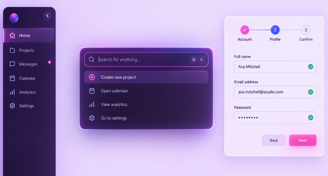
Enterprise products often have hundreds of features, modules, and settings, which makes navigation a design challenge in its own right. Three structures come up most often:
- Mega-menus with modules grouped by function
- Sidebar navigation with collapsible sections for deep hierarchies
- Command palettes that let power users jump anywhere without menu-diving
Which one fits best depends on the product’s breadth, the user’s expertise level, and how often they need to move between unrelated modules.
Form Design for High-Stakes Data Entry
Enterprise forms are frequent, high-volume, and often consequential – a mistyped field can mean a compliance issue or a financial error. Good form design here relies on inline validation, conditional logic that adapts the form to context, multi-step flows for complex records, and clear field-level help text. Bulk operations like import and batch edit also meaningfully reduce the manual entry burden on users.
Notification and Alert Design in Multi-System Environments
Enterprise users are frequently pulled in by notifications from several integrated systems at once. Good notification design relies on a clear hierarchy, defined severity levels, and alerts that are genuinely actionable – not just informational noise. It also helps to clearly distinguish system-level alerts, task-based reminders, and approval-request notifications, since treating them all the same way is one of the fastest routes to notification fatigue and disengagement.
Empty States, Error States, and Loading Patterns
In enterprise tools, empty states, errors, and loading behavior carry more weight than they do in consumer products – because an ambiguous empty state on a data dashboard can make a user question whether the underlying data itself is broken or missing. The best practice is straightforward: always explain why a state is occurring, what the user can do about it, and when they can expect resolution.
Key Challenges in Enterprise UX Design

Legacy Systems and Technical Debt
Enterprise designers frequently inherit legacy systems with deeply embedded workflows, dated interaction patterns, and constrained technical architecture. The challenge is improving the experience without breaking workflows that thousands of users already depend on. This is where progressive modernization – improving the product in incremental, low-risk stages – becomes a practical path forward.
Stakeholder Misalignment and Conflicting Requirements
Enterprise UX designers answer to a wide stakeholder landscape: procurement teams, IT departments, department heads, compliance officers, and the end users themselves – all of whom often want different things. Navigating internal politics and competing priorities is part of the job, especially when the “buyer” of the software isn’t the person who actually uses it every day.
Accessibility and Inclusive Design at Enterprise Scale
Accessibility isn’t optional in enterprise software – it’s frequently a legal requirement, whether through WCAG 2.1 AA compliance, Section 508 for government procurement, or EN 301 549 in the EU. And accessibility improvements tend to benefit every user, not just those with disabilities, especially in environments where cognitive load is already high.
Conducting User Research in Closed Enterprise Environments
Traditional research methods often break down in enterprise contexts, where end users can be hard to reach, bound by confidentiality agreements, or shielded by gatekeepers. Designers get creative: working through internal champions, analyzing support tickets and usage analytics, running guerrilla research during onboarding sessions, and building proxy personas when direct access isn’t possible. Even with these workarounds, validating assumptions with real users – whenever access becomes available – remains essential.
FAQs
What is the difference between enterprise UX and consumer UX?
Enterprise UX prioritizes efficiency, role-based workflows, data density, and compliance for trained professional users. Consumer UX prioritizes ease of adoption, delight, and broad accessibility for casual users.
How do you design for multiple user roles in a single enterprise product?
By understanding each role’s mental model, mapping cross-role workflows to find handoffs and friction points, and using adaptive interfaces or configurable dashboards so each role sees only what’s relevant to their tasks.
How do you handle complex data in enterprise dashboards without overwhelming users?
Through progressive disclosure, sensible defaults, filtering and grouping, and choosing visualization patterns that balance data density with clarity.
What is role-based access control (RBAC) and how does it affect UX?
RBAC defines what each user can see and do based on their role. Good UX communicates those permissions clearly, avoids confusing dead ends, and handles restricted actions gracefully instead of throwing unexplained errors.
How do you conduct user research when you cannot access end users directly?
By working through internal champions, analyzing support tickets and product analytics, observing onboarding sessions, and building proxy personas – while still validating assumptions with real users whenever access becomes possible.
Conclusion

Enterprise UX is a distinct discipline, not a scaled-down version of consumer design. It requires deliberate, careful handling of multi-role workflows, role-based permissions, and genuinely complex data – often all at once, on the same screen.
Investing in enterprise UX isn’t a cosmetic upgrade. It’s a strategic advantage that reduces errors, lowers training costs, and cuts down on user frustration at scale – the kind of advantage that shows up in adoption rates, support tickets, and ultimately, the bottom line.
If your organization is evaluating how well your internal tools serve the people who use them every day, it may be worth exploring an enterprise UX audit or diving deeper into the broader guide on enterprise product design.