A deep dive into the whys, what’s, and hows of prototypes.
Every line has a weight
An idea becomes a reality when one puts thought to paper. Otherwise, it remains a thought. A prototype is a productive way of churning an idea into a format that communicates the idea to people with the intention to improve that idea over time. I like to think it is also a beautiful way to fail, to ponder, and try again.
Prototyping is the conversation you have with your ideas. — Tom Wujec
A line is a dot that went for a walk
A professor in college would repeatedly joke, “Don’t build it, fake it first.” I did not give it much thought until I designed my first website. Anyone I showed the “final” design had something to say or questioned why a component was there. Needless to say, that was not the final design. I realized then that I cannot predict accurately what people would say. A component placed in one region on the screen seems logical to me but may not be for another designer.

Hold on, why should we make prototypes?
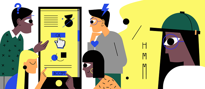
Eye know now: A prototype is a tangible way for the designer to understand the user or the problem that needs to be solved and if the solution pursued is the correct one for the user
Broadcast text: It communicates the design ideas to stakeholders, teammates, or clients and receives feedback. Also, a prototype helps to specify the details and interactions to developers, engineers, or manufacturers.
Testing 1,2,3: Receiving feedback on prototypes reveals what we don’t know about the design.
A Booster dose: Prototypes can advocate for the required design directions to the stakeholders.
And that’s why prototypes are a path to understanding how people think. Prototypes are not meant to be perfect; they get better with every feedback.
Walking into the design like —
The fidelity of a prototype refers to how closely the prototype acts like the finished product.
The first steps
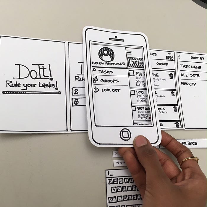
Low fidelity (lo-fi) prototypes can be used while testing core concepts, getting over initial fears, thinking through many ideas, and identifying potential issues that are too big to fix. It is the easiest prototype to make and does not require as much time or skill. The goal is to test basic ideas. Examples of low fidelity prototypes include paper prototypes, storyboards, sketches, etc.
Marching forward
Medium fidelity (mid-fi) prototypes have a more refined assumption to test. This prototype provides more context, which can result in feedback on specific parts. They can be considered as an extension of lo-fi prototypes where interactions, functionality, and the possible mediums (phone, tablet, wearables, etc.) began to take shape.
Adding some swagger
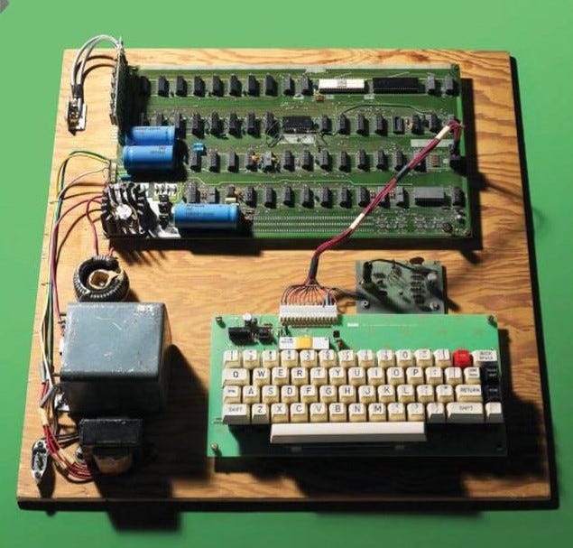
High fidelity (hi-fi) prototypes are the final lap, they include visual design (color, typography, etc.) and are closest to the final product. It’s best used to test overall reactions to the design, animations, legibility of the text, etc. These prototypes also involve the maximum cups of coffee consumed as it takes a longer period of time 🙂
Another perspective
The prototypes used during the design process will take a slightly different form depending on the purpose. There are three major touchpoints where prototypes can play a significant role.
Exploration-centric
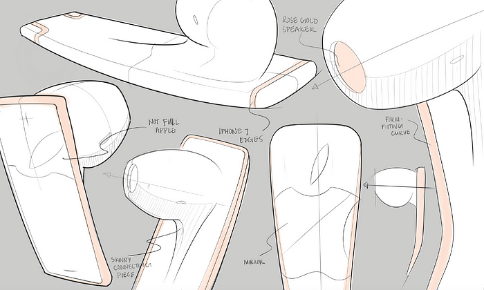
This process is at the beginning of a project when a lot of decisions haven’t been made. The goal is to explore — find the right problem to solve and, to make an educated decision on the ways to solve and decide on a direction forward based on the team’s prioritization.
Audience-centric
The goal of this process is to gain approval get feedback or obtain alignment for decision-making or implementation. This can be used throughout the design process to communicate at different touchpoints to different groups of people. The fidelity level depends on the stage of the design process and the audience (stakeholders, clients, developers, designers)
It can also be specific to test a hypothesis, a question, or an assumption. This can consist of testing high-level concepts, user flows, or specific parts such as iconography, a call-to-action text, etc.
Lastly, let’s look at prototypes in enterprise UX
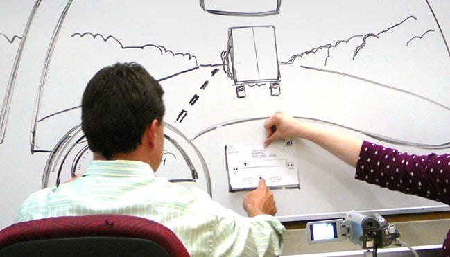
Tasks in enterprise products can be complex, but they don’t have to be confusing. Prototypes add structure and a narrative to the complexity helping to provide clarity in the design. As someone who switched to UX barely two months ago, wireframes and sketches took up a large portion of my day.
I have learned that a prototype in the silo isn’t useful, it needs to be out in the wild in order to be effective — through testing, feedback, and iterations.
Prototypes are a fundamental part of the design process ( emphasis on the fun 😛 ).


