
A good SaaS dashboard does more than display metrics.
It should help a specific user understand what is happening, why it matters, and what they should do next.
That becomes harder as SaaS products grow. Modern platforms may need to bring together analytics, workflows, alerts, permissions, AI-generated insights, financial information, operational data, and user actions in one interface.
The wrong approach is to show everything simply because the data exists.
The better approach is to design the dashboard around user roles, decisions, information priority, and actions.
In this guide, we break down the most important SaaS dashboard UX patterns for 2026, including real product examples, dashboard layout, data visualization, filters, tables, mobile UX, enterprise dashboards, AI-powered experiences, accessibility, design systems, and common mistakes.
Quick answer: A strong SaaS dashboard prioritizes role-specific information, uses clear visual hierarchy, reveals detail progressively, supports filtering and drill-down, and connects insights directly to meaningful actions.
SaaS Dashboard Design at a Glance
| UX Area | Recommended Approach |
|---|---|
| Information hierarchy | Prioritize metrics according to user goals and decisions |
| Dashboard layout | Show critical information early in the scanning path |
| Data density | Show summaries first and deeper information on demand |
| Visualization | Choose chart types based on the question users need answered |
| Filters | Keep common filters visible and advanced controls secondary |
| Tables | Support sorting, filtering, scanning, comparison, and actions |
| User roles | Show information based on responsibility, not database access |
| Alerts | Prioritize by severity and required action |
| Empty states | Explain what is missing and what the user should do next |
| Mobile | Reprioritize content instead of shrinking desktop layouts |
| AI insights | Explain conclusions and keep supporting evidence accessible |
| Accessibility | Use readable contrast, labels, and non-color status cues |
| Design systems | Standardize charts, tables, states, and interaction patterns |
| Performance | Design loading, pagination, and large datasets deliberately |
What Is a SaaS Dashboard?
A SaaS dashboard is an interface within a Software-as-a-Service product that brings together the most important metrics, activity, alerts, trends, and actions relevant to a particular user.
Depending on the product, the dashboard may help users:
- monitor business performance
- track customers
- analyze product usage
- review financial activity
- manage projects
- monitor infrastructure
- investigate incidents
- manage inventory
- evaluate campaigns
- track operational workflows
- review AI-generated insights
- take action on exceptions
The important distinction is that a dashboard is not simply a collection of charts.
It is an information and decision-making layer within the product.
A useful dashboard should answer three questions quickly:
- What is happening?
- Why does it matter?
- What should I investigate or do next?
If users must interpret a dozen unrelated widgets before answering those questions, the dashboard architecture needs work.
10 SaaS Dashboard Examples and What Product Teams Can Learn From Them
Real products are useful because they show how different dashboard patterns work under different business requirements.
The goal is not to copy their visual style. It is to understand why the information is organized the way it is.
1. Stripe: Transaction-First Financial UX
What to study: Tables, status clarity, financial detail, filtering
Stripe demonstrates an important principle: not every dashboard needs to be dominated by charts.
Financial products often require exact values, individual records, statuses, timestamps, and transaction-level investigation.
A table can be more useful than a visual summary when users need to:
- identify a payment
- investigate a failed transaction
- compare records
- filter by status
- trace an event
- take action on a specific item
UX lesson
Use visualizations for trends and summaries, but use structured tables when exact records matter.
2. Linear: Focused Operational UX
What to study: Minimal hierarchy, action orientation, task clarity
Linear is a useful example of a product that does not treat the dashboard as a place to display every possible metric.
The interface keeps the user close to actual work.
The lesson is simple:
If the primary job of the product is execution, the dashboard should support execution.
Avoid filling the first screen with metrics that do not help users complete their next task.
![Linear interface showing issue/task hierarchy]](https://f1studioz.com/blog/wp-content/uploads/2026/01/Linear-interface-showing-issue-task-hierarchy-1024x576.png)
UX lesson
For operational SaaS products, task clarity may matter more than analytical density.
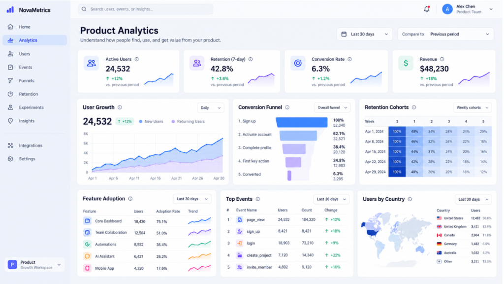
3. Amplitude: Analytical Exploration
What to study: Multiple charts, KPI monitoring, analysis workflows
Amplitude dashboards allow teams to group multiple saved charts into a shared view so related metrics can be monitored together. Its product documentation also distinguishes dashboards from deeper narrative analysis, which is a useful architectural decision. Amplitude
This is a strong model for analytics products because the dashboard acts as the entry point, while deeper exploration remains available when needed.
UX lesson
Do not force every analytical question onto the primary dashboard.
Use the dashboard for recurring monitoring and provide deeper investigative views separately.
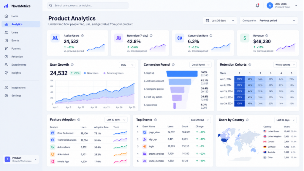
4. Datadog: Designing for High Information Density
What to study: Operational monitoring, status visibility, dense information
Monitoring products often need to display far more information than a consumer dashboard.
That does not automatically make the interface cluttered.
A dense dashboard can still be usable when it has:
- consistent grouping
- clear status hierarchy
- predictable component behavior
- restrained semantic color
- strong labels
- meaningful alert priority
UX lesson
The goal is not always to reduce information.
Sometimes the real UX challenge is to organize complexity intelligently.
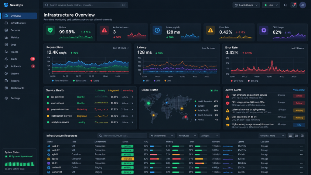
5. HubSpot: Role-Oriented Sales Information
What to study: CRM workflows, funnel context, actions
Sales dashboards are useful when they connect numbers to actual workflows.
For example, a sales manager may care about:
- pipeline health
- forecast
- conversion
- team performance
- stalled opportunities
A sales representative may care more about:
- today’s tasks
- follow-ups
- assigned opportunities
- individual target progress
UX lesson
Two users can work from the same underlying data while needing very different dashboard priorities.
6. Mercury: Financial Hierarchy
What to study: Account state, balance hierarchy, transaction context
Fintech dashboards need to make high-value information understandable without ambiguity.
Important information such as balance, transaction status, cash movement, and account conditions should be immediately understandable.
UX lesson
Financial dashboards should prioritize:
accuracy → context → interpretation → action
before visual decoration.
7. PostHog: Product Analytics Around Questions
What to study: Product metrics, investigation, behavioral analysis
Product analytics becomes far easier to use when metrics are organized around questions.
Instead of simply displaying:
- traffic
- signups
- activation
- retention
- churn
organize the experience around questions such as:
Are users activating?
Are users staying?
Which features are driving value?
UX lesson
Dashboards become more useful when they reflect decisions, not database structure.
8. Vercel: Status and Technical Clarity
What to study: Developer UX, system state, project hierarchy
Technical dashboards often serve users who understand complex systems.
Oversimplifying these interfaces can actually make them less useful.
Experienced users may need:
- deployment status
- logs
- performance
- project state
- error information
- configuration
UX lesson
Good SaaS UX does not always mean “less information.”
For expert users, it often means faster access to the right depth.
9. Attio: Workflow and AI Context
What to study: CRM context, flexible records, modern workflow design
Modern SaaS products increasingly introduce AI into existing workflows.
The strongest implementations do not simply add a chatbot in the corner.
AI becomes useful when it can:
- summarize information
- identify patterns
- prepare actions
- surface relevant context
- help users investigate data
UX lesson
AI should reduce interpretation effort while keeping the underlying evidence and workflow visible.
For a deeper look at autonomous product experiences, read Designing UX for Agentic AI. f1Studioz
10. Supabase: Developer-Focused Dashboard UX
What to study: Technical navigation, database context, developer workflows
Developer-facing products often contain:
- multiple technical modules
- logs
- data records
- configuration
- authentication
- database controls
- project settings
The dashboard must make these areas easy to locate without hiding the depth technical users expect.
UX lesson
For expert products, clarity comes from organization and predictability, not aggressive simplification.
SaaS Dashboard vs Analytics Dashboard
These terms are often used interchangeably, but they are not always the same thing.
| SaaS Dashboard | Analytics Dashboard |
|---|---|
| Summarizes current status | Supports deeper investigation |
| Often acts as a product home | Usually acts as an analysis surface |
| Prioritizes quick understanding | Prioritizes exploration |
| Highlights selected KPIs | Supports segmentation and comparison |
| Connects insights to actions | Connects data to explanations |
| May serve multiple workflows | Usually focuses on analytical questions |
Direct answer
A SaaS dashboard helps users understand current state and decide what to do next, while an analytics dashboard is primarily designed to investigate why metrics changed and explore patterns in greater depth.
A product may contain both.
Anatomy of a SaaS Dashboard
There is no universal layout that works for every SaaS product.
However, many effective dashboards contain similar structural layers.
1. Primary Navigation
This helps users move between major product areas.
Examples include:
- dashboard
- customers
- analytics
- projects
- transactions
- settings
- reports
Keep navigation aligned with the user’s mental model rather than internal company departments.
2. Context Controls
This area can include:
- account or workspace selector
- global search
- date range
- notifications
- profile
- environment selector
These controls affect how users interpret the rest of the dashboard.
3. Primary Status or KPI Layer
This should contain the information users need immediately.
Examples:
- revenue
- active customers
- incidents
- tasks requiring attention
- conversion
- balance
- system health
Not every metric deserves this level of prominence.
4. Trend and Context Layer
This area explains how the current state is changing.
Examples:
- time-series trends
- comparisons
- anomalies
- segmentation
- forecasts
- benchmarks
5. Detailed Work Surface
This is where users investigate or act.
Examples:
- tables
- records
- customer lists
- transactions
- activity logs
- alerts
- support tickets
6. Contextual Actions
Good dashboards do not stop at displaying information.
They allow users to:
- investigate
- approve
- assign
- export
- create
- edit
- contact
- resolve
The action should logically follow the information.
7. System States
Every dashboard also needs UX for:
- empty data
- loading
- errors
- unavailable services
- access restrictions
- partial data
- stale data
These states are part of the product experience, not edge cases.
[IMAGE PLACEHOLDER: Annotated SaaS dashboard anatomy diagram showing navigation, KPI layer, charts, tables, and actions]
1. Start With the Dashboard’s Job
Before choosing cards, charts, colors, or layout, define exactly what the dashboard is supposed to help users accomplish.
One of the most common problems is combining too many different purposes into one screen.
A dashboard trying simultaneously to be:
- an executive report
- an operational workspace
- an analytics tool
- a task manager
- an alert center
usually becomes overloaded.
Most dashboards can be grouped into three broad categories.
Operational Dashboards
Primary purpose: Monitor what is happening now and enable action.
Typical users:
- operations teams
- customer support
- cybersecurity teams
- infrastructure teams
- logistics teams
Typical information:
- incidents
- status
- transactions
- open tickets
- thresholds
- alerts
- real-time activity
Operational dashboards should prioritize scanability, severity, and action.
Analytical Dashboards
Primary purpose: Understand patterns and investigate why something happened.
Typical users:
- analysts
- product managers
- marketing teams
- growth teams
- finance teams
Common functionality:
- filters
- segmentation
- drill-downs
- date ranges
- trends
- cohorts
- comparisons
- exports
Analytical dashboards usually require more interaction depth.
Executive Dashboards
Primary purpose: Summarize business health for decision-makers.
Typical information:
- key KPIs
- changes against targets
- period comparisons
- business risks
- forecasts
- major exceptions
An executive should not need to interpret every underlying operational metric to understand the situation.
2. Design Around User Roles, Not Available Data
This becomes especially important in B2B SaaS and enterprise software.
A product may serve:
- administrators
- analysts
- sales teams
- managers
- finance teams
- operators
- customers
- executives
They may all technically have access to similar data.
That does not mean they should see the same dashboard.
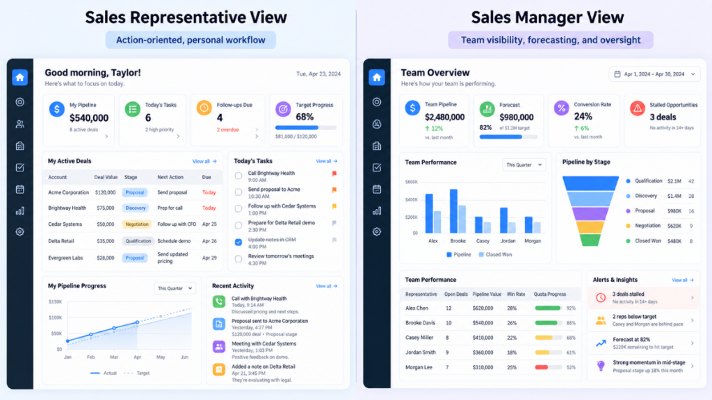
Example: Sales platform
Sales representative
Needs:
- today’s tasks
- follow-ups
- pipeline
- target progress
Sales manager
Needs:
- team performance
- pipeline health
- forecast
- conversion
- stalled opportunities
Executive
Needs:
- total pipeline
- revenue trend
- forecast accuracy
- strategic risks
The data overlaps.
The priorities do not.
This is why role-based information architecture is critical in enterprise products.
For a deeper explanation of multi-role workflows and permissions, see What Is Enterprise UX Design?. f1Studioz
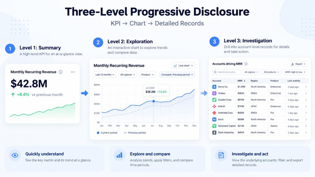
3. Use Progressive Disclosure for Complex Dashboards
Progressive disclosure means showing the most important information first and revealing advanced detail when users request it.
Nielsen Norman Group describes progressive disclosure as showing essential options initially and making specialized options available when needed. Nielsen Norman Group
A simple dashboard structure could be:
Level 1: Summary
Show:
- current value
- previous-period change
- target
- short status
Example:
Monthly Recurring Revenue
₹42.8M
↑ 8.4% vs previous month
Level 2: Exploration
On interaction, show:
- historical trend
- comparison period
- filters
- segmentation
- annotations
Level 3: Investigation
Provide:
- raw records
- advanced filters
- account-level detail
- related events
- export
This helps sophisticated products remain powerful without showing every detail immediately.
4. Build a Clear Dashboard Layout
A practical dashboard hierarchy often looks like this:
Top: Current State
Use for:
- critical KPIs
- system health
- urgent alerts
- important actions
Middle: Trends and Explanations
Use for:
- charts
- comparisons
- anomalies
- segmentation
- forecasts
Bottom: Investigation
Use for:
- tables
- logs
- records
- detailed lists
- historical activity
A useful mental model is:
Status → Context → Investigation → Action
rather than:
Card → Card → Card → Card
5. Treat Data Density as a UX Decision
Dense dashboards are not automatically bad.
Enterprise products often serve users who need substantial information available at once.
The real problem is unstructured density.
A dense dashboard can remain usable when it has:
- consistent alignment
- meaningful grouping
- strong typography
- predictable components
- restrained color
- clear labels
- sensible spacing
- obvious information priority
This is particularly relevant for:
- finance
- cybersecurity
- healthcare operations
- ERP
- logistics
- trading
- developer tools
The goal is not always to remove data.
The goal is to make complexity understandable.
6. Choose Visualizations Based on the User’s Question
Do not start by asking:
Which chart looks good?
Start by asking:
What does the user need to understand?
Line charts
Useful for:
- change over time
- growth
- usage
- revenue
- retention
Bar charts
Useful for:
- category comparison
- ranking
- region comparison
- team comparison
Stacked bars
Useful when users need to understand:
- total value
- composition
Scatter plots
Useful for relationships between two variables.
Heatmaps
Useful for patterns involving:
- time
- activity
- frequency
- geography
Tables
Better when users need:
- exact numbers
- record-level detail
- comparison
- sorting
- actions
One common mistake is assuming every dataset should become a chart.
Sometimes the table is the better UX.
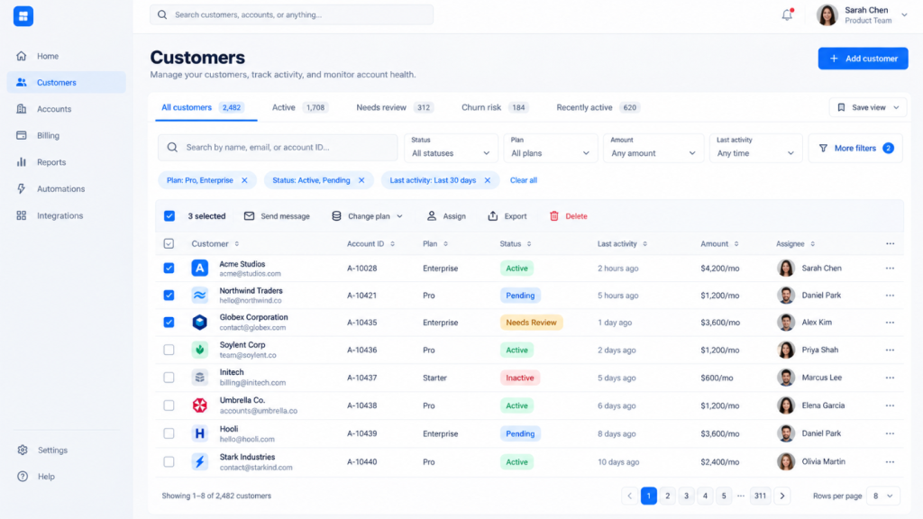
7. Design Data Tables for Real Work
Data tables are not secondary components in complex SaaS products.
In many enterprise systems, they are where users do most of their work.
Useful table capabilities include:
- sticky headers
- sorting
- search
- filters
- column visibility
- column resizing
- pagination
- virtualization
- saved views
- row selection
- bulk actions
- contextual actions
- status labels
- export
For large datasets, saved views can dramatically reduce repeated filtering.
8. Design Filters Without Creating Filter Overload
Filters are essential for analytics, but too many visible controls create another form of complexity.
Use a hierarchy.
Global Filters
Apply to the entire page.
Examples:
- date range
- account
- geography
- business unit
Section Filters
Apply to a group of components.
Local Filters
Apply only to one chart or table.
Keep common controls visible.
Place less frequently used options inside an advanced filter area.
Most importantly, make the current state obvious.
Users should always be able to answer:
What data am I looking at right now?
9. Use Color to Communicate Meaning
Color should carry information.
Avoid assigning every card a different bright color simply to make the interface look dynamic.
Create semantic meanings for:
- critical
- warning
- normal
- positive
- neutral
But never rely on color alone.
WCAG guidance requires information not to depend solely on color perception, which is especially important for status-heavy dashboard interfaces. Microsoft Learn
Use additional cues such as:
- text labels
- icons
- symbols
- patterns
- shapes
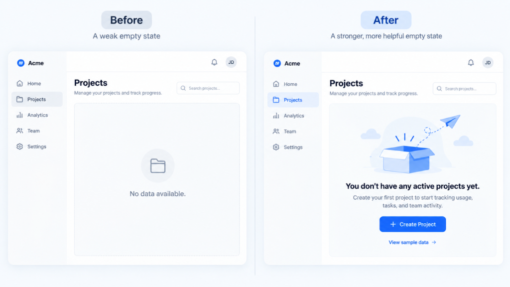
10. Design Empty States as Part of SaaS Onboarding
An empty dashboard may be the first dashboard a new user ever sees.
Treating it as an afterthought wastes a valuable onboarding moment.
Weak empty state
No data available.
Better empty state
You don’t have any active projects yet. Create your first project to start tracking usage, tasks, and team activity.
A strong empty state should explain:
- what will eventually appear
- why the information matters
- what creates the first data
- what the user should do next
- whether sample data is available
Why this matters
The dashboard can become part of activation.
It helps the user understand what successful product usage will eventually look like.
11. Dark Mode SaaS Dashboard Design
Dark mode can work well for products involving:
- developer tools
- cybersecurity
- monitoring
- analytics
- trading
- AI systems
But it is not automatically better UX.
Consider dark mode when users:
- spend long sessions in the product
- work in low-light environments
- continuously monitor systems
- expect dark interfaces in that product category
Watch for:
- poor text contrast
- oversaturated status colors
- invisible borders
- difficult-to-read charts
- excessive glow effects
Dark mode should remain functional before it becomes visually impressive.
12. Design Enterprise SaaS Dashboards Differently
Enterprise dashboards often support complexity that consumer products do not.
They may involve:
- multiple roles
- permissions
- large datasets
- audit histories
- integrations
- compliance
- regional differences
- legacy workflows
- accessibility requirements
Enterprise dashboard UX should prioritize:
clarity + depth + efficiency + control
A visually minimal dashboard that hides frequently needed functions may actually reduce productivity.
F1 Studioz explores these issues in greater depth in What Is Enterprise UX Design? and Why Enterprise Products Need a Design System. f1Studioz
13. Fintech Dashboard Design Patterns
Financial dashboards require careful hierarchy because users may make consequential decisions from the information shown.
Common elements include:
- account balance
- cash flow
- portfolio performance
- transaction activity
- payment status
- risk indicators
- forecasts
- reconciliation
Useful principles include:
- separate current value from historical change
- show currency clearly
- provide date context
- make positive and negative movement unambiguous
- make underlying records accessible
- support audit and reconciliation
Accuracy and traceability matter more than decoration.
14. Design Analytics Dashboards Around Questions
A weak analytics dashboard starts with:
What metrics do we have?
A better dashboard starts with:
What decision does the user need to make?
Are we acquiring enough users?
Show:
- acquisition
- channel performance
- cost
- conversion
Are users experiencing value?
Show:
- activation
- onboarding completion
- time to value
- feature adoption
Are users staying?
Show:
- retention
- engagement
- churn
- repeat usage
Now the dashboard becomes a decision framework, not a metric warehouse.
15. Responsive and Mobile SaaS Dashboard Design
A desktop dashboard should not simply shrink onto a smaller screen.
Mobile users often have different goals.
Desktop
I want to investigate the business.
Mobile
Is everything okay?
Mobile dashboards may prioritize:
- critical KPIs
- alerts
- approvals
- recent activity
- urgent actions
Detailed tables and complex exploration may remain better suited to desktop.
Responsive UX should therefore consider task priority by device, not only breakpoints.
16. Build Dashboard Components Through a Design System
As SaaS products grow, dashboards accumulate repeated components:
- KPI cards
- charts
- filters
- tables
- status badges
- alerts
- tooltips
- empty states
- loading states
- error states
- drill-down panels
Without shared standards, every team starts creating slightly different versions.
A dashboard design system should define:
- visual structure
- component behavior
- chart conventions
- semantic colors
- spacing
- typography
- accessibility
- responsive rules
- loading states
- empty states
- error states
For large SaaS products, a design system becomes infrastructure.
Read Why Enterprise Products Need a Design System for a deeper explanation of governance, reusable components, and scale. f1Studioz
17. Dashboard Performance Is Part of UX
A dashboard can be visually excellent and still feel broken if the user waits too long for data.
Performance decisions should be considered during UX design.
Useful patterns include:
- skeleton loading states
- progressive data loading
- pagination
- table virtualization
- lazy-loading secondary widgets
- cached filter states
- loading indicators for individual components
- error recovery
- preserved filter state
- reduced layout shifts
For large datasets, avoid blocking the entire dashboard while every secondary component loads.
Let users start understanding the most important information first.
18. AI-Powered SaaS Dashboards: From Reporting to Interpretation
Traditional dashboards answer:
What happened?
AI-enabled dashboards can increasingly help answer:
Why might it have happened?
and:
What should I investigate next?
For example:
Instead of only showing:
Churn increased from 3.8% to 4.6%.
an AI layer might identify that the increase is concentrated among a particular account segment or behavior pattern.
The UX challenge is trust.
Users should be able to:
- inspect supporting data
- understand the source of the insight
- identify uncertainty
- reject an incorrect interpretation
- investigate further
AI should reduce analysis effort without hiding the evidence.
19. AI Copilots and Dashboard Actions
The next stage goes beyond explanation.
Dashboards may increasingly allow users to ask:
Show enterprise accounts whose engagement dropped more than 20% this month.
The product could then:
- filter the dataset
- identify the accounts
- summarize patterns
- create a segment
- prepare a workflow
The important design question is how much control the AI should have.
For high-impact or irreversible actions, human review becomes more important.
F1 Studioz covers this directly in AI Copilot vs Autopilot: When Your Product Should Ask Before It Acts. f1Studioz
A good AI dashboard should make it clear:
- what the AI did
- why it did it
- what happens next
- whether approval is required
- how the user can stop or undo an action
Weak vs Strong SaaS Dashboard UX
| Weak Approach | Stronger Approach |
|---|---|
| Show every available KPI | Prioritize metrics around decisions |
| Give every user the same dashboard | Use role-based information hierarchy |
| Turn every dataset into a chart | Use tables when exact values matter |
| Hide filters behind several clicks | Keep common filters visible |
| Use color only for status | Add labels, icons, or symbols |
| Show “No data” | Explain how users can create value |
| Shrink desktop UI onto mobile | Reprioritize mobile information |
| Show AI conclusions without evidence | Provide supporting data and user control |
| Load everything before rendering | Prioritize essential content first |
| Use visually different components everywhere | Standardize through a design system |
Common SaaS Dashboard Design Mistakes
Showing Every Metric on the Homepage
More data does not automatically create more value.
Prioritize information around user intent.
Designing One Dashboard for Every Role
Different responsibilities require different priorities.
Use role-based defaults where appropriate.
Overusing Charts
Charts are not automatically more informative than tables.
Use the format that best answers the user’s question.
Hiding Important Filters
Frequently used controls should be easy to find.
Using Color Without Meaning
Color should communicate status or hierarchy rather than decoration.
Ignoring Empty States
New users may have no data.
Help them understand what to do next.
Ignoring Loading and Error States
Data-heavy products rely on asynchronous services and APIs.
Design what happens when data is delayed, unavailable, or incomplete.
Building Desktop First and Shrinking Later
Mobile dashboard UX may require entirely different prioritization.
Treating the Dashboard as a Reporting Screen Only
Modern SaaS dashboards increasingly connect insight directly to action.
How to Improve an Existing SaaS Dashboard Without Redesigning Everything
You do not always need a full product redesign.
Start by auditing high-impact friction.
Review:
- Which widgets are actually used?
- Which KPIs create decisions?
- Are important actions buried?
- Are filters difficult to understand?
- Are different roles receiving the same information?
- Are users repeatedly exporting data to complete tasks elsewhere?
- Are tables difficult to scan?
- Are empty states useful?
- Are loading states clear?
- Are dashboards slow with real production data?
Then improve the highest-impact areas incrementally.
For a more structured approach, read the SaaS UX Audit Guide. f1Studioz
SaaS Dashboard UX Checklist
Before shipping a dashboard, ask:
Purpose
- What is the primary job of this dashboard?
- What decisions should it support?
Users
- Who uses the dashboard?
- Are different roles seeing the right information?
Hierarchy
- What should users notice first?
- Is secondary information visually secondary?
Data
- Are units clear?
- Are date ranges obvious?
- Can users understand where the numbers came from?
Interaction
- Can users filter and drill into information?
- Are frequently used actions accessible?
Visualization
- Does each chart answer a useful question?
- Would a table communicate the information more accurately?
Accessibility
- Is status understandable without color alone?
- Is text readable?
- Can required interactions support keyboard use?
Performance
- Do large datasets load efficiently?
- Are loading and error states designed properly?
Responsive UX
- Does mobile show the most important information first?
AI and Trust
- Can users understand AI-generated insights?
- Can they inspect supporting data?
- Can they correct or stop high-impact actions?
How We Developed These SaaS Dashboard Recommendations
The recommendations in this guide are based on the factors that most directly affect complex SaaS and enterprise product experiences.
We evaluated dashboard patterns around:
- information hierarchy
- role-based relevance
- task efficiency
- data density
- filtering and drill-down
- tables and record-level workflows
- accessibility
- responsive behavior
- design-system consistency
- developer implementation constraints
- loading, empty, and error states
- AI transparency
- user control
Our approach is also informed by F1 Studioz’s experience working with product and engineering teams on complex digital products since 2012.
The goal is not to promote one visual style.
It is to identify patterns that help users understand information, complete tasks, and make decisions efficiently.
How F1 Studioz Approaches Complex SaaS Dashboard UX
F1 Studioz was founded in 2012 and brings more than 13 years of experience across enterprise software, SaaS products, financial services, telecommunications, energy, AI-powered applications, and data-heavy digital platforms.
F1 Studioz has worked with product and engineering teams across organizations including:
- Siemens Energy
- Deutsche Telekom
- The Home Depot
- NASDAQ
- Tata Tele Business Services
- Emirates NBD
The challenge in complex dashboard UX is rarely just making the screen look cleaner.
The work usually starts with understanding how users actually use the product.
User and Workflow Research
Identify:
- key user roles
- frequent tasks
- decisions
- pain points
- workarounds
Information Architecture
Determine:
- what belongs on the main dashboard
- what belongs in deeper views
- what information is role-specific
- how users move from summary to investigation
Interaction Design
Define:
- filters
- tables
- drill-downs
- alerts
- actions
- states
- permissions
Data Visualization
Choose visualizations based on the questions users need to answer rather than aesthetics.
Design System Thinking
Create reusable patterns for:
- charts
- tables
- cards
- filters
- alerts
- statuses
- responsive behavior
Front-End Alignment
The dashboard also has to work with real data and real implementation constraints.
That means thinking early about:
- performance
- responsiveness
- component behavior
- data states
- technical limitations
A dashboard that looks polished in Figma but breaks down once production data arrives is not successful product design.
For related reading, explore The Role of UX Design in Simplifying Complex Digital Workflows. f1Studioz
Experience Behind the Recommendations
F1 Studioz’s product-design work has involved collaboration with founders, product leaders, engineering teams, and enterprise stakeholders working on complex digital systems.
That experience shapes how we evaluate dashboards.
We do not look only at whether a dashboard appears visually clean.
We look at whether it supports:
- real user roles
- real workflows
- real data complexity
- investigation
- decision-making
- accessibility
- scale
- implementation

What Product Leaders Say About Working With F1 Studioz
F1 Studioz has worked with teams building complex enterprise and SaaS products across multiple industries.
Client feedback frequently highlights the team’s ability to understand product complexity, collaborate closely with stakeholders, and translate business and technical requirements into usable digital experiences.
Frequently Asked Questions About SaaS Dashboard Design
What makes a good SaaS dashboard?
A good SaaS dashboard helps a specific user understand current status, identify important changes, investigate relevant details, and take the next appropriate action without interpreting unnecessary information.
What should a SaaS dashboard include?
A SaaS dashboard may include role-specific KPIs, alerts, trends, filters, tables, recent activity, contextual actions, and drill-down paths. The exact components should be based on user tasks rather than a fixed template.
What is the best SaaS dashboard layout?
A useful layout generally places critical status and KPIs first, trends and context next, and detailed tables or investigative information lower in the hierarchy.
What is the difference between a SaaS dashboard and an analytics dashboard?
A SaaS dashboard primarily helps users understand current status and take action, while an analytics dashboard is designed for deeper exploration, segmentation, comparison, and investigation.
How many KPIs should a SaaS dashboard show?
There is no universal number. Show only the KPIs required for the dashboard’s primary user and purpose. Secondary metrics should remain available through deeper views rather than competing equally for attention.
How do you design a data-heavy SaaS dashboard?
Use clear grouping, consistent component behavior, progressive disclosure, strong labels, contextual filters, well-designed tables, and role-based information hierarchy. The goal is to organize complexity rather than simply remove information.
What is progressive disclosure in dashboard UX?
Progressive disclosure means presenting important summary information first and making deeper detail available when the user requests it. For example, a KPI may lead to a trend chart and then to record-level analysis.
What are the best SaaS dashboard examples to study?
Useful products to study include Stripe for transaction workflows, Amplitude for analytics, Linear for operational clarity, Datadog for high-density monitoring, and developer platforms such as Vercel or Supabase for technical dashboard organization.
How should a SaaS dashboard handle new users with no data?
Use an instructional empty state. Explain what will appear, why it matters, and what action the user should take to create their first meaningful data.
Should dashboards use dark mode or light mode?
Choose based on context. Dark interfaces can work well for technical, monitoring, analytics, cybersecurity, and trading products, but readability, contrast, and information hierarchy should remain more important than visual preference.
How should dashboards support multiple roles?
Use role-based information architecture. Executives, operators, analysts, and managers should see information aligned with their responsibilities rather than identical dashboard configurations.
How should SaaS dashboards use AI?
AI should help users interpret data, identify patterns, or prepare actions while keeping supporting evidence, uncertainty, permissions, and user control visible.
How can I improve an existing dashboard without redesigning the entire product?
Start with a focused UX audit. Identify underused widgets, weak information hierarchy, difficult filters, role mismatches, confusing tables, slow workflows, and missing states. Fix the highest-impact problems incrementally.
Final Thoughts
The strongest SaaS dashboards in 2026 will not be the ones with the most charts, widgets, AI features, or animations.
They will be the ones that make complex information easier to understand and act on.
That requires:
- knowing who the user is
- understanding their decisions
- prioritizing information accordingly
- revealing detail progressively
- selecting appropriate visualizations
- supporting real workflows
- designing for different roles
- handling empty and loading states
- maintaining consistency through design systems
- keeping AI transparent and controllable
A dashboard should not make users work harder to understand their own data.
It should create a clear path:
Information → Understanding → Decision → Action
Designing a Complex SaaS, Enterprise or AI Product?
F1 Studioz helps product and engineering teams simplify complex workflows, structure data-heavy interfaces, and design scalable SaaS and enterprise experiences.
Whether you are improving an existing dashboard or designing a new product from the ground up, the goal should be the same:
make complexity easier to use without removing the depth professional users need.


Suggested destination: your relevant F1 Studioz contact/service page.