Your Series B just closed. Revenue targets doubled. Your product roadmap is stacked with game-changing features. But your engineering team? They’re spending 15 hours every week debating whether buttons should be 8px or 12px rounded, arguing over which shade of blue is “brand correct,” and rebuilding the same dropdown component for the fourth time this quarter.
That’s not growth. That’s design debt strangling your UI scalability.
Design inconsistency costs mid-market SaaS companies an average of $1.5M per year in rework, according to Forrester research. Every duplicated component, every styling argument, every “just make it look like the other page” conversation is burning cash that should be funding features your customers actually want.
The solution? A SaaS design system – a governed kit of reusable components and standards that eliminates UI chaos before it metastasizes into a million-dollar problem.
This completes the ‘Scalability’ pillar of comprehensive SaaS UI/UX strategy, where design transforms from a bottleneck into your growth engine. But timing matters. Build too early, and you’re cementing decisions before product-market fit. Build too late, and you’re drowning in technical debt. Let’s explore when and how to get it right.
Related Reading:- The Complete Guide to SaaS UI/UX Design
Beyond Style Guides: What a SaaS Design System Really Is

Let’s clear up a critical misconception: your brand style guide is not a design system. That PDF with your logo variations and color palette? That’s marketing collateral. A SaaS design system governs behavior in code.
Think of it as the difference between a paint swatch collection and an entire construction blueprint with engineering specifications. One tells you colors exist; the other ensures buildings don’t collapse.
The Three Pillars of a Design System
Component Library: Buttons, modals, cards, form inputs
Impact: 40% faster developer handoff. Every element comes pre-built, tested, and documented. No more “can you send me that button design?” Slack messages at 4 PM.
Design Tokens: Variables like color-primary-500 or spacing-md
Impact: Consistency across 10+ products. These platform-agnostic variables bridge Figma and code, ensuring that “brand blue” means the exact same hex value whether it’s in your marketing site, dashboard, or mobile app.
Documentation: Usage rules, code snippets, accessibility guidelines
Impact: Cut new developer onboarding time by 60%. When every component comes with clear rules about when to use it (and when not to), you eliminate the guesswork that leads to Frankenstein UIs.
The ROI That Makes CFOs Pay Attention
Adobe’s research found that teams with design systems ship features 3 times faster than teams without them. Let that sink in. Your competitors with mature design systems are iterating at triple speed while your developers debate border radiuses.
When Figma components become React design system assets, you’re not just organizing pixels – you’re converting design debt into development velocity. Every hour saved on UI consistency is an hour spent on the analytics dashboard your enterprise customers are demanding.
Atomic Design: Building Blocks for UI Scalability

The most successful SaaS design systems follow Atomic Design methodology, a mental model that treats interfaces like chemistry: starting with atoms and combining them into increasingly complex molecules.
Atoms: The DNA of Your UI
Atoms are the irreducible elements that can’t be broken down further. Think icons (icon-chevron-right), colors (brand-blue-500), typography tokens (font-heading-xl), and spacing units (spacing-md).
The golden rule: If it can’t be reused across multiple contexts, it’s not an atom. That custom illustration your designer made for one landing page? Not an atom. The icon set used throughout your navigation? Definitely atoms.
Molecules: Simple Combinations
Molecules form when you combine atoms into simple, functional groups. A search bar is the perfect example: an input field atom plus a button atom plus a search icon atom equals a search molecule that appears consistently across your product.
Tactic for designers: Use Auto Layout in Figma for responsive molecules. When your search bar automatically adapts from 320px mobile screens to 1440px desktop monitors, you’ve built a molecule that scales.
Organisms: Complex UI Sections
Organisms are where things get interesting. These are substantial interface sections built from molecules and atoms. Your navigation header is an organism: logo atom + navigation link molecules + search molecule + user profile molecule.
Tactic for developers: Export organisms as Storybook stories. This creates an interactive catalog where product managers can see every possible state (logged in/out, mobile/desktop, empty/populated) without touching code.
Templates and Pages: The Final Assembly
Templates define page-level layouts using organisms as placeholders. Pages are templates filled with real content. This hierarchy means you can maintain 100+ unique pages while only managing 12 foundational templates.
The scalability win: Change one atom (say, updating your primary button color), and that change cascades through every molecule, organism, template, and page that uses it. Update 100+ pages by changing a single line of code.
Related Reading:- What Makes a Dashboard ‘Smart’? How to Visualize Complex SaaS Data
Building Your System: Tools, Tokens and Governance

Theory is elegant. Execution is messy. Here’s the practical stack that separates functional design systems from expensive documentation graveyards.
The Tool Stack: Where Design Meets Code
For Designers: Figma – Specifically, use Dev Mode and Variants. Variants let you define every button state (default, hover, pressed, disabled) in one component rather than creating 47 different button files. Dev Mode automatically generates specs that developers can reference without endless annotation meetings.
For Developers: Storybook – This interactive component testing environment becomes your living documentation. Every component renders in isolation, showing all variants, states, and usage examples. It’s the single source of truth that eliminates “but it looked different in Figma” arguments.
For Documentation: Zeroheight – Connect your Figma files and code repos to create documentation that updates automatically. When your button component changes in code, the documentation reflects it immediately. No stale docs lying to new team members.
Design Tokens: The Secret Sauce
Design tokens are the closest thing to magic in modern UI development. These platform-agnostic variables (spacing-md: 16px, color-error: #D32F2F) exist as a single source of truth that transforms into whatever format you need: CSS variables, iOS Swift constants, Android XML resources.
The benefit: Your brand colors need updating? Change one token definition, run your build process, and watch 50+ components update instantly across web, iOS, and Android. No manually hunting through stylesheets. No missed instances causing color inconsistencies.
Tools like Style Dictionary or Theo transform your tokens from JSON into any format: SCSS, JavaScript, Swift, Kotlin. This is how enterprise SaaS products maintain consistency across 10+ platforms without 10+ design teams.
Governance: Keeping Chaos at Bay
Without governance, your beautiful design system becomes a cluttered junk drawer within six months. Three rules keep it healthy:
Rule 1: Document Everything – Undocumented components don’t exist. If there’s no usage guideline, accessibility note, or code snippet, it’s not part of the system. Period.
Rule 2: Version Control – Treat design like code. Use Semantic Versioning (SemVer: v1.0.0 → v1.1.0) so teams know when updates are safe (patch), require attention (minor), or will break things (major).
Rule 3: Contribution Model – Anyone can request components; a core team approves. This democratizes innovation while preventing 15 different “custom” modals from sneaking into production. Think of it as pull requests for design.
When to Invest: The SaaS Growth Timeline
Timing is everything. Build too early and you’re solving problems you don’t have. Build too late and you’re drowning in technical debt.
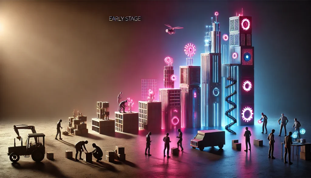
Early Stage (Pre-Seed to Seed)
Verdict: SKIP
Alternative: Use a pre-made UI kit like Material UI, Ant Design, or Chakra UI.
Why: Your product will pivot 5 times in the next 18 months. Locking in custom components now creates technical debt, not efficiency. You’re still figuring out what your product is – premature systematization is just expensive constraint.
Focus on learning what your users need. The buttons can be messy for now.
Related Reading:- How Do You Fix Onboarding Drop-Off? The Guide to Activating SaaS Users Fast
Growth Stage (Series A to Series B)
Verdict: CRITICAL
Timing triggers:
- You’re managing 3+ products in your suite
- Your dev team exceeds 15 people
- Support tickets mention “inconsistent UI”
- Multiple teams complain about conflicting design decisions
This is your window. You’ve achieved product-market fit. You’re scaling the team. You’re expanding the product. Design debt compounds exponentially from here. Build the system now while you still can.
The investment: Allocate one designer and one frontend developer full-time for 3-4 months. Part-time efforts fail because context-switching kills the deep thinking design systems require.
Enterprise Stage (Series C+)
Verdict: MANDATORY
Why: At this scale, you’re likely acquiring other companies and merging their UIs into yours. Without a design system, integration costs are astronomical. Companies with mature systems cut post-acquisition integration costs by 70%.
You’re also facing enterprise sales where UI consistency affects deal size. Buyers evaluate interface polish as a proxy for product maturity. Inconsistent UI suggests technical immaturity, which translates to perceived risk.
The Cost Reality Check
Building a SaaS design system costs between $50K and $200K, depending on complexity. That seems expensive until you calculate the alternative: $1.5M per year in rework, duplicated effort, and lost velocity.
The ROI appears within 6-12 months for mid-size teams (15-50 developers). For large teams (50+), you’re often ROI-positive within the first quarter.
Related Reading:- Why Are Your Users Leaving? How a SaaS UX Audit Slashes Churn
Frequently Asked Questions
What is the difference between a Style Guide and a Design System?
A style guide documents visual identity (colors, fonts, logos) for marketing purposes. A design system governs interactive components with code, behavior rules, and implementation guidelines. Think manual versus automated.
How do you apply Atomic Design in SaaS?
Start by auditing your existing UI to identify reusable patterns. Catalog atoms (icons, colors), then document how they combine into molecules (search bars, cards). Build organisms (navigation, footers) from those molecules. Finally, create templates for common page types.
When should a startup build a Design System?
Series A is the sweet spot. Earlier is premature; later is paying the technical debt tax. Wait until you have 3+ products or 15+ developers, but don’t wait beyond Series B.
How much does it cost to build?
Initial investment: $50K-$200K (3-4 months with 1 designer + 1 developer). Maintenance: 0.5-1 FTE ongoing. Compare this to $1.5M/year in design debt costs.
What are Design Tokens?
Platform-agnostic variables that define design decisions: color-primary-500, spacing-lg, font-heading-bold. They transform into whatever format your platform needs (CSS, Swift, Kotlin) from a single source of truth.
How do Design Systems save money?
They cut rework by 40%, accelerate feature delivery by 3x, reduce onboarding time by 60%, and decrease post-acquisition integration costs by 70%. Every duplicated component, every styling debate, every “make it match the other page” conversation costs money.
Design Systems as Growth Infrastructure

Stop treating UI like a craft project where every page is a bespoke creation. Your SaaS design system is infrastructure – as critical as your database, as foundational as your API architecture.
The companies winning in competitive SaaS markets aren’t winning because they have prettier buttons. They’re winning because they eliminated the friction that slows everyone else down. While competitors debate border radius, they ship features. While others rebuild components, they iterate on customer feedback. While the market dithers, they scale.
The choice is binary: Invest in atomic design today, or pay the design debt tax tomorrow. Your Series C self – the one pitching enterprise customers who evaluate UI consistency as proof of product maturity – will thank you.
The question isn’t whether you need a design system. It’s whether you build it now while it’s an investment, or later when it’s a rescue mission.


