The Art of Data Visualisation
In a world drowning in data, presenting information effectively is critical.
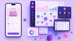
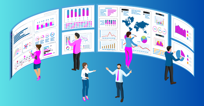
Data visualisation is the practice of representing data visually to uncover patterns, trends, and correlations that might not be apparent in raw data. By using charts, graphs, maps, and other visual tools, data visualisation makes complex information more accessible and understandable, facilitating informed decision-making and effective communication across different domains.
When UX principles are further added, the magic happens. From blockbuster movies to corporate boardrooms, UX-focused data visualisation revolutionises how we understand and use data.
How Data Visuals Impact UX: Visual Clarity Across Different Sectors
- Enhancing Comprehension:
In the movie “Moneyball,” Billy Beane used data visualisation to identify undervalued players and build a competitive team, challenging traditional scouting methods. This example highlights how effective data visualisation simplifies complex data, making it comprehensible and actionable. Similarly, businesses and organisations use data visualisation in UX design to enhance user comprehension. For example, Netflix utilises data visualisation to analyse viewing patterns and predict user preferences, ensuring a personalised and engaging user experience. - User Engagement:
Interactive data visualisations are not just for tech giants. MSMEs (Micro, Small, and Medium Enterprises) can leverage tools like Tableau or Power BI to create dashboards that allow real-time interaction with sales data, market trends, and customer feedback. This engagement is crucial for making informed decisions quickly, even for smaller businesses. - Reducing Cognitive Load:
Imagine if school report cards were just tables of numbers. Instead, many schools now use data dashboards to visualise student performance, attendance, and growth, making it easier for teachers, parents, and students to understand progress at a glance. Effective UX design reduces the mental effort required to understand data, helping in making quick, informed decisions to support student development.
The Hidden Gems: Data Visuals in Everyday Life
- Visual Storytelling: Data’s Superpower Cape
In the world of UX, visual storytelling is like a superhero cape that transforms boring numbers into exciting stories. Charts, graphs, and images turn data into relatable and memorable narratives, helping people grasp and remember the information better. - The Psychology of Colour in UX Design
Colour psychology is the study of how colours affect human behaviour and emotions. It communicates messages without words, influencing how we feel and respond to various stimuli. Consistent use of brand colours across the UI helps create a cohesive and recognisable brand image. Colours can guide users’ actions by drawing attention to important elements, such as a bright red button signalling urgency or a green button indicating a positive action like “Submit” or “Continue.” - Accessibility: Everyone’s Invited
Good UX design ensures that everyone, including people with disabilities, can use and enjoy digital products. This includes:- Alt Text for Screen Readers: Alt text is added to images so screen readers can describe them to visually impaired users, ensuring everyone can understand the information.
- Keyboard Navigation: UX designers ensure users can navigate data visualisations with a keyboard, helping those with motor disabilities.
The AI Advantage: Supercharging UX for Data Visualisation
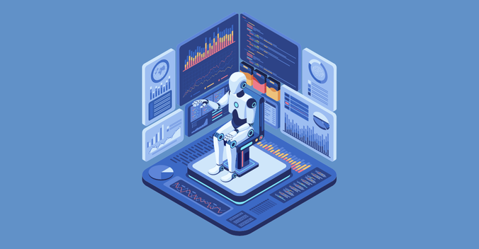
Artificial intelligence (AI) is rapidly transforming how we interact with data. When combined with UX principles, AI revolutionises data visualisation:
- Automated Data Analysis: AI analyses vast datasets, identifying trends and patterns humans might miss, allowing UX designers to focus on crafting effective visualisations.
- Personalised Visualisations: AI tailors data visualisations to individual user preferences and needs, adjusting chart types and highlighting relevant data points based on user roles or interests.
- Real-time Data Exploration: AI powers interactive visualisations that update in real-time, enabling users to see data changes over time and make informed decisions based on the latest information.
The Dream Team: AI and UX Working Together

Imagine this powerful duo: AI, the data analysis whiz, and UX design, the human-centered champion. Together, they can create data visualisations that are not only informative but also engaging and impactful. Here’s how:
- AI identifies key insights and trends.
- UX design translates those insights into clear, user-friendly visuals.
- The user easily grasps the information and makes data-driven decisions.
This collaboration isn’t just about creating pretty pictures. It’s about empowering people to understand complex information and take action.
Emerging Concepts in UX-Data Visualisation
- Neuroaesthetics: Future UX designs might leverage neuroaesthetics, a field studying how aesthetics impact the brain, to create data visualisations that maximise user engagement and comprehension based on neurological responses.
- Blockchain Visualisation: As blockchain technology grows, UX designers may explore visualisations that explain complex blockchain processes like cryptocurrency transactions or supply chain management in intuitive and engaging ways.
- Emotional Data Mirrors: Future UX could include “emotional data mirrors” reflecting users emotions through personalised visualisations. Analysing biometric data and mood indicators in real-time, they offer insights and emotional well-being suggestions.
The Future of Data Visualisation is Now
The future of AI and UX in data visualisation is a harmonious dance between human creativity and machine efficiency. AI will automate complex tasks, allowing UX designers to focus on ensuring that visualisations are user-centric, clear, and engaging. This collaboration will enhance communication and foster informed decision-making.
By prioritising clarity, engagement, and accessibility, UX designers can transform raw data into powerful visual narratives that drive innovation. The intersection of UX and data visualisation is a dynamic and evolving field, poised to have a profound impact on how we understand and interact with information in the future.
Also Read: UX of Data Visualisation